Images ?é?® Ferrari spa/Ercole Colombo, Renault/LAT, Williams/LAT, McLaren, Getty Images/Red Bull, Force India F1 Team, Sauber F1 Team, Team Lotus, Virgin Racing, Motioncompany, Pirelli
I was also wondering about it, but I think I now get it:
There is a slot-gap separator in the middle, where also the DRS mechanism connects; but that’s not where it ends; it extends to run around the top edges of the flap, including the, now triangular, dip in the middle, working like a Gurney.
Because it doesn’t follow the rules for a Gurney but those for the gap-seperator (ie, not counting in the max height of the rear wing!), it is a lot higher/bigger than normal Gurneys could be.
Of course, the fact that there is one separator in the middle (that runs all around the profile) means that, along the bottom edge of the flap, there might be more than 200mm between the separators – Ferrari will be claiming that isn’t so, because it is running all along the top edge, so no separation there at all.
Clever, and simple, once you thought of it. Easy to copy too, I suppose.
Herheijm (@herheijm)
20th May 2011, 12:56
Alonso’s revised helmet design looks awesome..
Mike
20th May 2011, 15:08
Yeah, Vettel should learn from this. :D
The pictures are great@ Especially the Ferrari ones! :D
Fixy (@)
20th May 2011, 13:25
Alonso’s helmet looks more natural with the blue visor stripe!
Deurmat
20th May 2011, 14:43
look almost like a power ranger helmet lol
TommyB (@tommyb89)
20th May 2011, 15:47
Toro Rosso has a new sponsor. They seemed to have taken a leaf out of Sauber’s book by placing white boxes on their car so horribly.
Also it’s meant they’ve got rid of the red nose cone pattern, making it look a lot more like the Red Bull from the front view.
Steph (@)
20th May 2011, 15:59
It just looks like Tipp-Ex
Fixy (@)
20th May 2011, 20:28
On the side of the front wing it is almost ok, but on the sidepods it’s horrible as it is a white box stuck in the blue without meaning.
JT
20th May 2011, 18:31
Alonso’s Helmet is Stunning!!
Fixy (@)
20th May 2011, 18:47
It’s the same, just the different color of the visor’s stripe.
Renato Breder
20th May 2011, 18:47
Great pictures, as always!
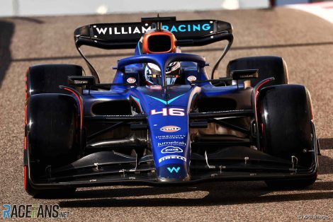
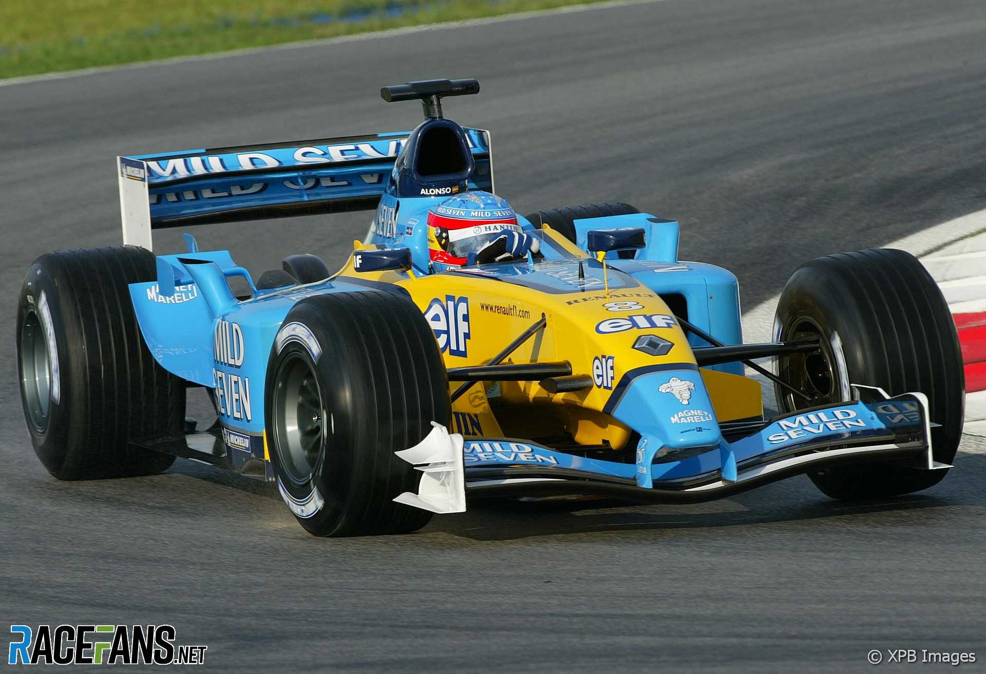
But… where are the Virgin, Williams and Renault´s pictures?
By the way, former Toro Rosso´s livery was more beautiful…
neil
20th May 2011, 20:05
sutil has changed his helmet
new one looks cool
Fixy (@)
20th May 2011, 20:30
Lots more Lotus branding on the Renault.
Fixy (@)
20th May 2011, 21:29
Lots of shots from above! Great!
Ral
20th May 2011, 23:03
I can’t see what the dubious bit of the Ferrari rear wing is meant to be.
But I have to say, it’s nice that they’re pushing the envelope a bit again at least :)
bosyber
21st May 2011, 8:30
I was also wondering about it, but I think I now get it:
There is a slot-gap separator in the middle, where also the DRS mechanism connects; but that’s not where it ends; it extends to run around the top edges of the flap, including the, now triangular, dip in the middle, working like a Gurney.
Because it doesn’t follow the rules for a Gurney but those for the gap-seperator (ie, not counting in the max height of the rear wing!), it is a lot higher/bigger than normal Gurneys could be.
Of course, the fact that there is one separator in the middle (that runs all around the profile) means that, along the bottom edge of the flap, there might be more than 200mm between the separators – Ferrari will be claiming that isn’t so, because it is running all along the top edge, so no separation there at all.
Clever, and simple, once you thought of it. Easy to copy too, I suppose.
bosyber
21st May 2011, 9:14
Oh, I missed a trick: there’s two slot-gap separators in the middle, next to each other, right.
See Scarbs explanation
Romesh82 (@romesh82)
21st May 2011, 3:39
first of all great pics.did anyone notice redbull’s front wing.almst touches da ground….