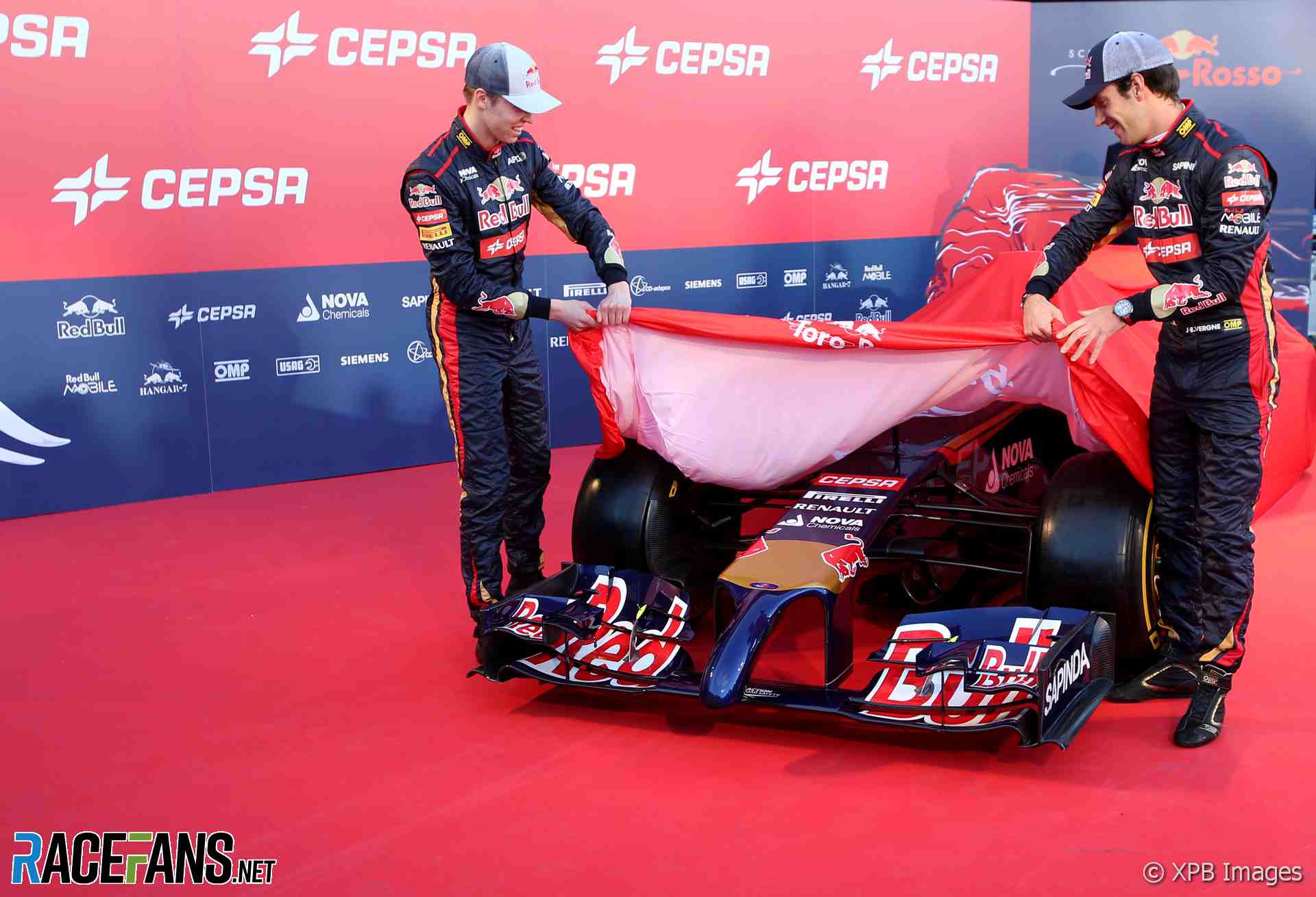
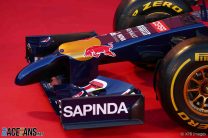
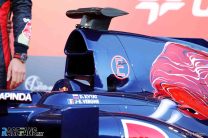
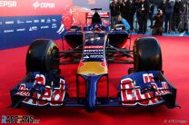
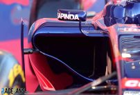
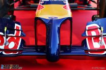
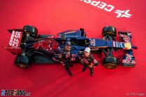
The Toro Rosso STR9 is the team’s first car with Renault power. Here are pictures of their 2014 contender at its launch today at Jerez.
Team principal Franz Tost said the team had made their earliest ever start on the new car: “In 2014 the key parameters for success will be finding the best balance between deploying the power of the engine and managing the 100kg fuel limit per race, the use of the two energy recovery systems and, just as in the past, the tyres.“Apart from the new rules, at Toro Rosso we have also had to adapt to a new engine partner and we are looking forward to working with Renault. One final new element for us is on the driver side, as Daniil Kvyat joins us to race alongside Jean-Eric Vergne. Both are very talented and we expect good things from them.
“With all these changes, some that affect everyone, others that are specific to Toro Rosso, it is really difficult to set targets or make predictions. However, it is clear we have to improve our performance and make a step forward.”
Toro Rosso STR9 pictures
Advert | Become a RaceFans supporter and
Formula 1
- F1 cut carbon emissions by 13% in first year after ‘Covid-impacted seasons’
- Ocon gets Alpine’s new floor design ahead of schedule for Chinese GP
- Fourth time lucky for F1’s sprint race format? Six Chinese GP talking points
- Alonso set to become F1’s oldest driver for more than 50 years
- DRS still does more harm than good but hopefully its days are finally numbered






HUHHII (@huhhii)
27th January 2014, 16:41
Definitely not a looker.
The Blade Runner (@)
27th January 2014, 17:05
Definitely the Barry Manilow of the bunch!
Ean (@ean)
27th January 2014, 17:17
I expect the Red Bull to look the same
Hacked By @bboscat (@mat-k)
27th January 2014, 17:39
i doubt that very much
the nose is thee most crucial part, i belive getting the nose correct will mean the difference between good or bad cooling and transfer of clean air to the back of the car
Mads (@mads)
27th January 2014, 17:52
@mat-k
Why do you assume that Torro Rosso has got the nose wrong?
Hacked By @bboscat (@mat-k)
27th January 2014, 17:58
@mads
i didnt say they did!
i just dont belive adrian newey would give the same nose to there sister team, end of the day desginers want the nose as high as possible, this gives good clean air to run the floor and get it round the sidepods to make the diffusser run as best as possible.
you lower the nose practictly to the ground you now have to find a way to get the air round it and the active the floor. ferrari have it wrong merc and torro rosso have quite good noses, willams, if thats how they run with it is a bit silly, god knows if that lotus picture is true, if it is then, well im shocked.
also i like the whole lower nose as it allows drivers to sit more upright, which i think will allow better driving style/postion
so as said i dont think newey would allow torro rosso to run the same nose being that get the nose right and you have the downforce right,
Mads (@mads)
27th January 2014, 18:09
@mat-k
Aah okay I didn’t think of your post that way.
But Newey isn’t designing the Torro Rosso.
That is the job of James Key and his designers. If they think direction A is better then direction B, then they will pick A.
Newey and his co-workers can come to exactly the same conclusion, without any collaborate effort.
And let’s not overestimate Newey. He is brilliant, but that doesn’t mean that he always gets it right and doesn’t resort to copying ideas from other teams.
memo
28th January 2014, 16:48
i wonder: how much do red bull and str collaborate? it wouldnt be illegal, would it? and both teams would benefit from collaborating…
Osvaldas31 (@osvaldas31)
27th January 2014, 16:43
Looks quite good. At least from this angle every car this year looks cool to me (except Ferrari) and don’t make so much buzz about ugly cars. They aren’t.
Ean (@ean)
27th January 2014, 18:23
This is a good looking car go look at other websites that show different angles and not the garish red back ground
johnno
27th January 2014, 19:04
it has a tongue!
Lotus49 (@lotus49)
27th January 2014, 20:52
That’s not a toungue. It just needs some Viagra!
Steph (@stephanief1990)
27th January 2014, 16:45
Just when I thought the noses couldn’t get any worse.
The gold ends in a weird place on the nose so when I first glanced at the car on Twitter I thought they actually had a pre-2013 nose so that’s a bit of a disappointment.
OppositeLocke (@oppositelocke)
27th January 2014, 17:11
I agree about the gold on the livery.. So far all the teams that have unveiled their cars seemed to struggle with the livery on the nose often making the car look worse than it really should.
Jack (@jackisthestig)
27th January 2014, 17:26
The gold makes the nose worse, it’s as if they are trying to pretend the big dangling thing isn’t there. I’ll miss the old double floor sidepods aswell.
Eoin (@eoin16)
27th January 2014, 17:29
If they painted the actual tip of the nose gold we could call the car “Goldmember”! :)
matt90 (@matt90)
27th January 2014, 17:39
I wondered if any teams would do the finger in a different colour to try and keep our visual focus on the wide part of the nose. So this is the same sort of thing. And it really does not work.
clay (@clay)
28th January 2014, 0:29
So long as it’s not pink…
Meander (@meander)
27th January 2014, 16:46
I haven’t complained about the noses too much yet, but this one I definitely don’t like. It’s like it’s just stuck on there! And the livery isn’t helping, especially not how the gold stops like it’s last years’ nose.
TBH the rest of the car looks pretty neat. The back looks very tight!
Mike (@mike)
27th January 2014, 16:57
To be honest, the whole thing looks pretty unimaginative. :/
@HoHum (@hohum)
27th January 2014, 17:27
@mike, Scarbs analysis from yesterday used exactly this style to illustrate a generic 2014 design.
OOliver
27th January 2014, 16:59
Well the FIA got what they asked for.
Sensord4notbeingafanboi (@peartree)
27th January 2014, 16:48
Sauber Toro Rosso and FI seem to have followed the same philosophy on the nose, It’s early but it looks tidy to me.
Sensord4notbeingafanboi (@peartree)
27th January 2014, 16:50
And extremely ugly… Forgot that.
Sensord4notbeingafanboi (@peartree)
27th January 2014, 17:04
…and this is almost exactly how the nose looks like without any kind of vanity panel as shown by Scarbs on “TRE”. I have a feeling that the Red Bull will sport something very similar if so this is the less atractive interpretation of the rules and to be honest unlike the McLaren or the Lotus or the Ferrari this is far uglier than the stepped nose, let’s wait and see what’s going to be said later today.
SeaHorse (@seahorse)
27th January 2014, 18:27
Yes, @peartree the stepped noses were a lot better than these hanging genitals at the front of the car.
Prisoner Monkeys (@prisoner-monkeys)
27th January 2014, 22:03
It’s a fairly conservative approach, which is really to be expected. The teams know there is a lot to play for this year with the new engine regulations, so the midfield teams are probably not taking a lot of risks in terms of design.
OOliver
27th January 2014, 16:49
These days when they lift the wraps off these new cars, you get the feeling that there should be a +18 warning somewhere. Unlike past unwrapping, the feeling lately is one of undressing and nudity.
graham221228
27th January 2014, 17:23
Definitely reminds me of something from an Ann Summers catalogue
SeaHorse (@seahorse)
27th January 2014, 18:24
Exactly. The hashtag #TOROUNDRESSED would suit the ceremony more than #TOROUNCHAINED
Dan_the_McLaren_fan (@dan_the_mclaren_fan)
27th January 2014, 16:49
It makes me want to post a dirty joke…
din
27th January 2014, 16:50
McLaren’s is smaller, STR’s is bigger!!
If you know what I mean.
calum
27th January 2014, 16:59
Well STR have a bull with it unlike Mclaren. Besides Lotus might enjoy STR more than Mclaren (you know what I mean) :P
The Blade Runner (@)
27th January 2014, 17:24
I think McLaren’s has got more “girth”
Mayank (@mjf1fan)
27th January 2014, 17:32
Meanwhile, Lotus are too happy ;)
Breno (@austus)
27th January 2014, 17:46
But it seems STR needs a blue pill.
spoutnik (@spoutnik)
27th January 2014, 18:07
You forgot that the McLaren’s one is designed to grow!
Master firelee (@master-firelee)
27th January 2014, 16:51
The Livery really doesn’t help here, why wouldn’t you have the gold go to the tip?
Mads (@mads)
27th January 2014, 17:57
@master-firelee
Most likely to stop the dong from standing out too much.
OmarR-Pepper (@)
27th January 2014, 21:58
@master-firelee because then he would be Gold Member’s car (Austin Powers villain ramember?)
AbeyG (@1abe)
27th January 2014, 16:52
Toro Rosso usually look dull and and the livery faded. Its been years but I cant seem to get excited with this team.
The Blade Runner (@)
27th January 2014, 17:17
I wish they’d do more to differentiate themselves from RB. I mean, it’s a blue car with “Red Bull” written on it!
Jarnooo (@jarnooo)
27th January 2014, 18:11
The livery is terrible. Nothing works together. The bull on the engine cover is noisy. The Red Bull logo on the sidepod is obnoxious . The red rear wing looks terribly out of place. The gold not ending at the tip doesn’t look right. The red/gold design in front of the cockpit looks like a generic need for speed decal. The shade of gold they use does not complement the blue.
Tell me this doesn’t look 100 times nicer?
http://i.imgur.com/qf5Wqjb.png
Baron (@baron)
27th January 2014, 18:31
It doesn’t look 100 times nicer.
Jarnooo (@jarnooo)
27th January 2014, 18:50
Perhaps 100 is a bit much, but I do prefer it. I guess I’m kinda angry at the type of livery STR keep putting out.
Lotus49 (@lotus49)
27th January 2014, 21:02
Better paint job but it hasn’t got a schlong!
matt90 (@matt90)
27th January 2014, 19:03
Better, certainly. It still suffers from being a blue car with red logos and yellowish highlights. It’s cleaner, but still just a neutered RBR livery. If Red Bull weren’t on the grid already I’d actually really like yours. But I don’t want 4 cars out there to look the same.
andae23 (@andae23)
27th January 2014, 16:52
I don’t know a lot about livery design, but surely if the car has such an ugly nose one shouldn’t amplify it by putting a gold patch on top of it?
Nick (@npf1)
27th January 2014, 18:04
They also decided to move the bull back further on the engine cover. I’m thinking they don’t even have someone who designs the livery, it’s just some guy in marketing..
Calum (@calum)
27th January 2014, 16:53
That gold bit is there to signify ‘here is where we really wanted to have the nose tip’
Cyclops_PL (@cyclops_pl)
27th January 2014, 16:54
I’m sorry, but that just looks like a V-6 turbo vibrator.
Lotus49 (@lotus49)
27th January 2014, 21:03
Knockout!!!
Ed Marques (@edmarques)
27th January 2014, 16:54
Awful nose.
Just horrible.
StefMeister (@stefmeister)
27th January 2014, 16:57
Wait until you see it front the front:
http://img31.imageshack.us/img31/7943/jr3a.jpg
Todfod (@todfod)
27th January 2014, 17:03
Damn!!!!
I actually thought the car looked great from the side. The front view completely changes my opinion though.
For the STR, I hope that size matters ;)
Sherlock
27th January 2014, 17:03
Ouch…
lewinski
27th January 2014, 17:06
Hahahaha… it is looking worse than even Mclaren’s :D
Cyclops_PL (@cyclops_pl)
27th January 2014, 17:15
Compensating for something?
Sharon H (@sharoncom)
27th January 2014, 18:42
The front view needs an advisory of some sort. Hope FOM have got their camera angles sorted for the season.
Lotus49 (@lotus49)
27th January 2014, 21:06
The BBC will pixellate everything!
Prof Kirk (@prof-kirk)
27th January 2014, 22:15
+1
Deej92 (@deej92)
27th January 2014, 16:58
I haven’t moaned about any of the car’s noses so far, but where the gold ends on this just makes it look awful. If the gold was also on the ‘finger’ area it might’ve made it look somewhat better. That doesn’t bode too well for the RB10’s nose paintwork then.
At least this Toro Rosso gives us something to talk about because usually their launches are the most uninspiring, oh wait…
Darren B (@downwithdrs)
27th January 2014, 17:24
Compare this year’s car’s to this link … and see how ugly they are :)
Nige.B (@nigel2509)
27th January 2014, 17:00
Ferrari still top of the weird league!
Fer no.65 (@fer-no65)
27th January 2014, 17:01
So they got my idea of masking it.
I don’t think it looks any worse than the rest of the cars so far presented. At least the fingertip is masked in dark blue. It’d be even worse if it was all gold and shiny.
And again, chop off the finger, and it looks proper ! even with such a hideous livery (the way they put “Red Bull” on the side looks particularly bad!)
OOliver
27th January 2014, 17:25
We have to be grateful they didn’t cap the tip with some of that gold paint, as they usually have on previous cars.
calum
27th January 2014, 17:03
Hahahaha… it is looking worse than even Mclaren’s :D
Sam (@dsrt93)
27th January 2014, 17:05
Without doubt the ugliest car so far. Looks like they’ve taken the 2013 model nose and just added that ‘thing’ to it. In my opinion, out of all the cars so far the best is probably the Ferrari. I just can’t seem to warm to these new regulations, the stepped noses were tolerable, these are embarrassing for Formula 1.
Dmitry (@)
27th January 2014, 17:06
It’s not even a finger anymore.
montreal95 (@montreal95)
27th January 2014, 17:08
The size of that thing! I hope it vibrates at high speed.
Only to add function to form, nothing else :)
Sam (@dsrt93)
27th January 2014, 17:11
Not a fan.
The Blade Runner (@)
27th January 2014, 17:14
Ann Summers should be sponsoring that nose…
Reminds of when Cameo performed live on Top of the Pops in the mid 80’s!
Mark Thomson (@melthom)
27th January 2014, 17:14
Calling them anteaters is almost too polite.
medicine_man (@vettel81)
27th January 2014, 17:15
Looks like a proboscis monkey :)
http://en.wikipedia.org/wiki/Proboscis_monkey
Darren B (@downwithdrs)
27th January 2014, 17:20
Most of this year’s cars are quite ridiculous. The Ferrari is the only one I can tolerate … and even that looks odd.
I used to buy diecast models of F1 cars … I stopped when the cars got really ugly c2010 …
Darren B (@downwithdrs)
27th January 2014, 17:21
.. and so they called the Class of 2014 The Proboscis Generation o_0
ECWDanSelby (@ecwdanselby)
27th January 2014, 17:26
Massively bored of the phallic jokes now, folks…
Anyway, this just screams ‘bo-ring’ to me. Just looks quite conservative in as far as design, and livery. All a bit of a yawn this one!
The Blade Runner (@)
27th January 2014, 17:29
Did you not see the launch live? Jean-Eric said: “I’m just going to climb into the cod-piece, I mean cock-pit…!” ;)
Boxcar Racer (@mojopixel)
27th January 2014, 17:28
It’s Gonzo from the muppets!!!
Deej92 (@deej92)
27th January 2014, 20:49
Yes! I was thinking of Gonzo but couldn’t get the name! I shall refer to the STR9’s nose as the ‘Gonzo’ nose.
Mayank (@mjf1fan)
27th January 2014, 17:29
Oh god! Why ?? Are we going to see F18+ championship instead of F1 championship .
Dane
27th January 2014, 17:29
Someone put a dildo on that car.
Sri Harsha (@harsha)
27th January 2014, 17:31
STR did the Good Job at rear. It seems they are very innovative. The FW is the worst one though
Baron (@baron)
27th January 2014, 18:36
Explain how they did a good job at the rear. There is a cover there to prevent peaking, or did you expect they would run it with cardboard and gaffer tape?
Baron (@baron)
27th January 2014, 18:36
*peeking*
@HoHum (@hohum)
27th January 2014, 17:34
Could they be courting Durex and Trojan as potential sponsors?
Dan_the_McLaren_fan (@dan_the_mclaren_fan)
27th January 2014, 18:29
Probably Vaseline too…
montreal95 (@montreal95)
27th January 2014, 20:13
@dan_the_mclaren_fan They should definitely sponsor vaseline for the other teams. Just in case they run into the back of them at the sometime between start and finish
frogster
27th January 2014, 17:34
I knew I’d seen that look somewhere
http://scribble.scran.ac.uk/lesleystokes/files/-1/1441/SamtheEagle1.JPG
Aden (@blacksimus)
27th January 2014, 17:40
New name for this car should be Gonzo
Jaanus (@)
27th January 2014, 17:40
Is this schlong really necessary..
obviously
27th January 2014, 17:53
Since they are using half of the Red Bull car now, I expect Red Bull car will look the same, but with a different kind of ugly livery.
GeeMac
27th January 2014, 18:07
Stuff the nose, look at those sidepods, they are TINY!
Barney
27th January 2014, 18:11
The WORST nose , by far! This & McLaren’s look like manhoods, if you know what I mean.
But honestly guys, are the looks THAT important?? It matters how good the cars will be.
Nick (@npf1)
27th January 2014, 18:18
The ‘extension’ has a shape that remind me of some of Sauber’s noses back when they had Sauber sponsoring, mostly the 1995 and 1998 cars. Except they were the actual noses and the Red Bull logo was on them..
DaveD (@daved)
27th January 2014, 18:24
My first thought on seeing that nose was the Red Hot Chili Peppers and their “socks”. The gold paint makes the extension really “stand out” LOL
http://www.kayfabenews.com/wp-content/uploads/2012/08/socks.jpg
Jammers
27th January 2014, 18:35
Perhaps I’m in the minority, but I think that, if it weren’t for these horrifically phallic noses, these cars would look halfway attractive, aesthetically-speaking–what with the narrower front wing, bulkier exhaust/gearbox area, and lower nosecones (bar the tips). Quite possibly the prettiest for some time. Plus, there are some gorgeous liveries to boot (Force India, for example).
SeaHorse (@seahorse)
27th January 2014, 18:40
Anyway, their existence is to just feed the RedBull team, so why couldn’t they produce at least a decent looking car? Now we all know that
#TOROUNCHAINED#TOROUNDRESSEDvjanik
27th January 2014, 18:42
here is another angle. not pretty
Djangles LeVaughn (@royal-spark)
27th January 2014, 18:43
The Gonzo nose.
Juampa Valverde
27th January 2014, 18:43
Such dong probably will make feel unconfortable to the driver/car in front.
Jazzman
27th January 2014, 19:05
It looks like they designed the car, and then realised the nose had to be lower. So their solution was to just glue something with little drag on the front. McLaren and Williams have ‘anteater’ noses, Ferrari a ‘vacuum’ cleaner nose and Torro Rosso a penis nose. Let’s hope the cars revealed tomorrow don’t look as deformed…
Slr (@slr)
27th January 2014, 19:07
On the thumbnail picture for this article I didn’t notice the anteater part of the nose and I thought hallelujah! But then after looking at the picture much closely, I realised how truly horrendous the nose looks.
Patrick (@paeschli)
27th January 2014, 19:27
I think that points out not having the gold on the tip is better no?
I don’t understand why everyone wants to see that ugly nose in gold while TR is clearly trying to hide it with their livery.
Fixy (@)
27th January 2014, 19:18
It’s horrible… but I’m so damn happy with the guys who came up with the livery and masked the tip of the nose that I didn’t expect it to happen and it doesn’t even bother me at all…
sbl on tour (@sbl-on-tour)
27th January 2014, 19:35
think this is the best looker so far
DaveD (@daved)
28th January 2014, 2:06
+1
barkun (@barkun)
27th January 2014, 19:58
so after the ant-eater and the vacuum cleaner we have the Toucan !
nidzovski
27th January 2014, 20:12
we will see a lot of broken noses this year….
maarten.f1 (@)
27th January 2014, 20:19
Hahaha, that’s so funny! All these cars are ugly as heck, but it sure is hilarious!
Lotus49 (@lotus49)
27th January 2014, 21:15
Is there not a danger that, when polishing the nose, it will rise up and fall foul of the regulations.
ken (@kenke)
27th January 2014, 22:23
i saw what u did there,
heheheh
DaveD (@daved)
28th January 2014, 2:09
OK, that is DEFINITELY the COTD as far as I’m concerned!!! :)
MarkM (@mpmark)
27th January 2014, 21:31
definitely the backs of all the cars look sick!
HK (@me4me)
27th January 2014, 21:33
With last years nose on it, this would have been a beautiful car.
Sam (@dsrt93)
27th January 2014, 21:38
It would look so much better if the gold bit on the nose was on the ‘penis’ part, it wouldn’t look like an add on to the 2013 nose then.
troutcor
27th January 2014, 22:43
This one at least has a flow from the front, past the front wheels, past the sidepods and to the rear. An arc, if you will.
That is about as much as one can ask under the current regs.
SauberS1 (@saubers1)
27th January 2014, 22:58
This car is nice as well.
Herp
28th January 2014, 2:10
Do the regs specify whether the frontal appendage may contain functional parts? Although I’m not sure what you could get in there… fire extinguisher maybe?
Mark in Florida
28th January 2014, 2:19
People say that the new Indy Cars look strange. They look like beauty queens compared to these penis nosed horrors!
Barry Miller (@bmk1586)
28th January 2014, 3:26
Looks like Gonzo from the Muppets