All 10 teams which will take part in the 2019 F1 season have revealed their car for the upcoming championship.
But which one has the smartest design and the sharpest livery? Cast your vote below – and check out the winners from the past nine seasons.
Mercedes W10
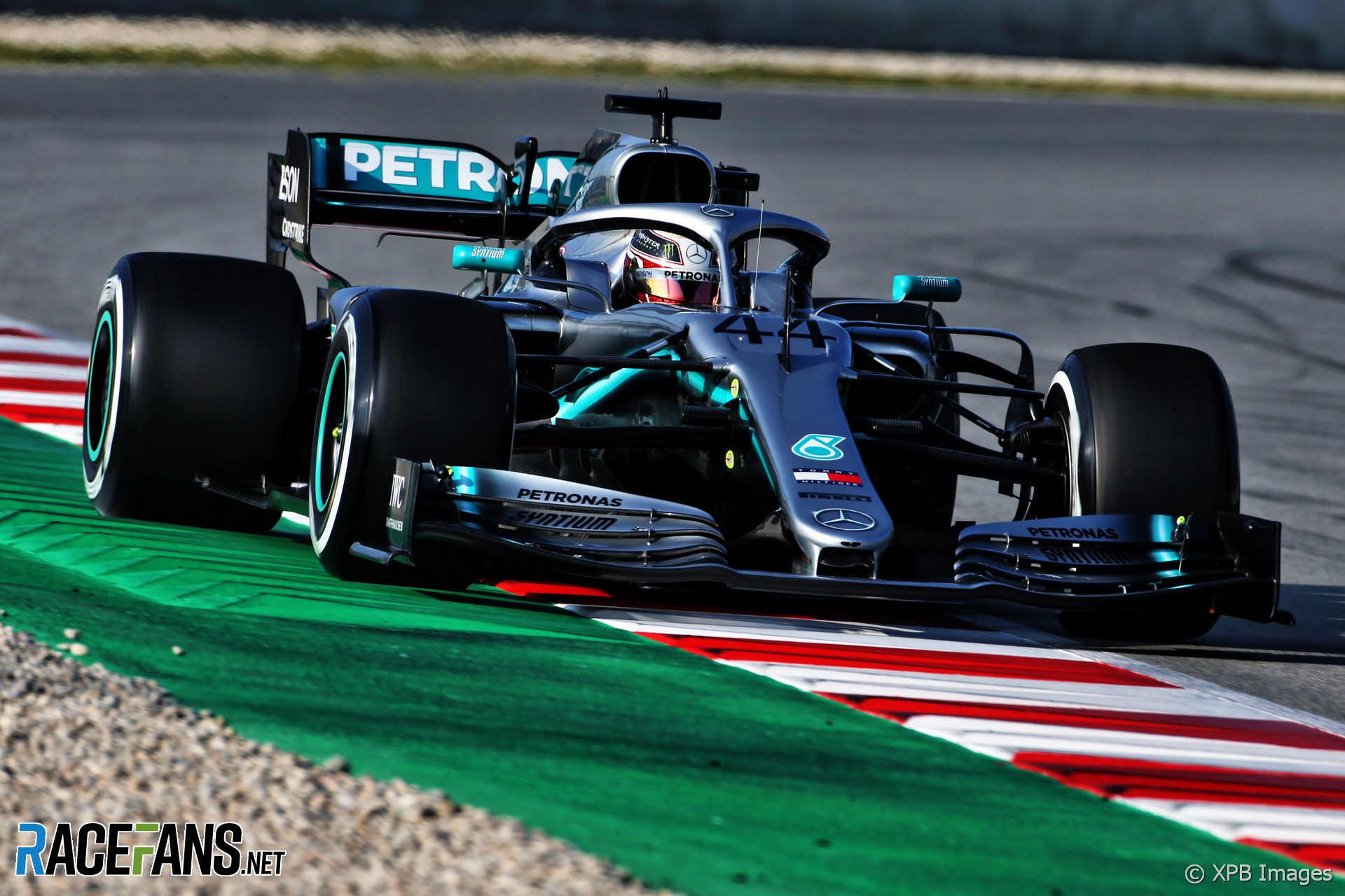
A clear evolution of last year’s title-winning W09, which is the latest in a long line of successful Mercedes creations. However for its 10th chassis since returning to the spot as a full constructor, Mercedes has subtly refined its silver and turquoise livery.
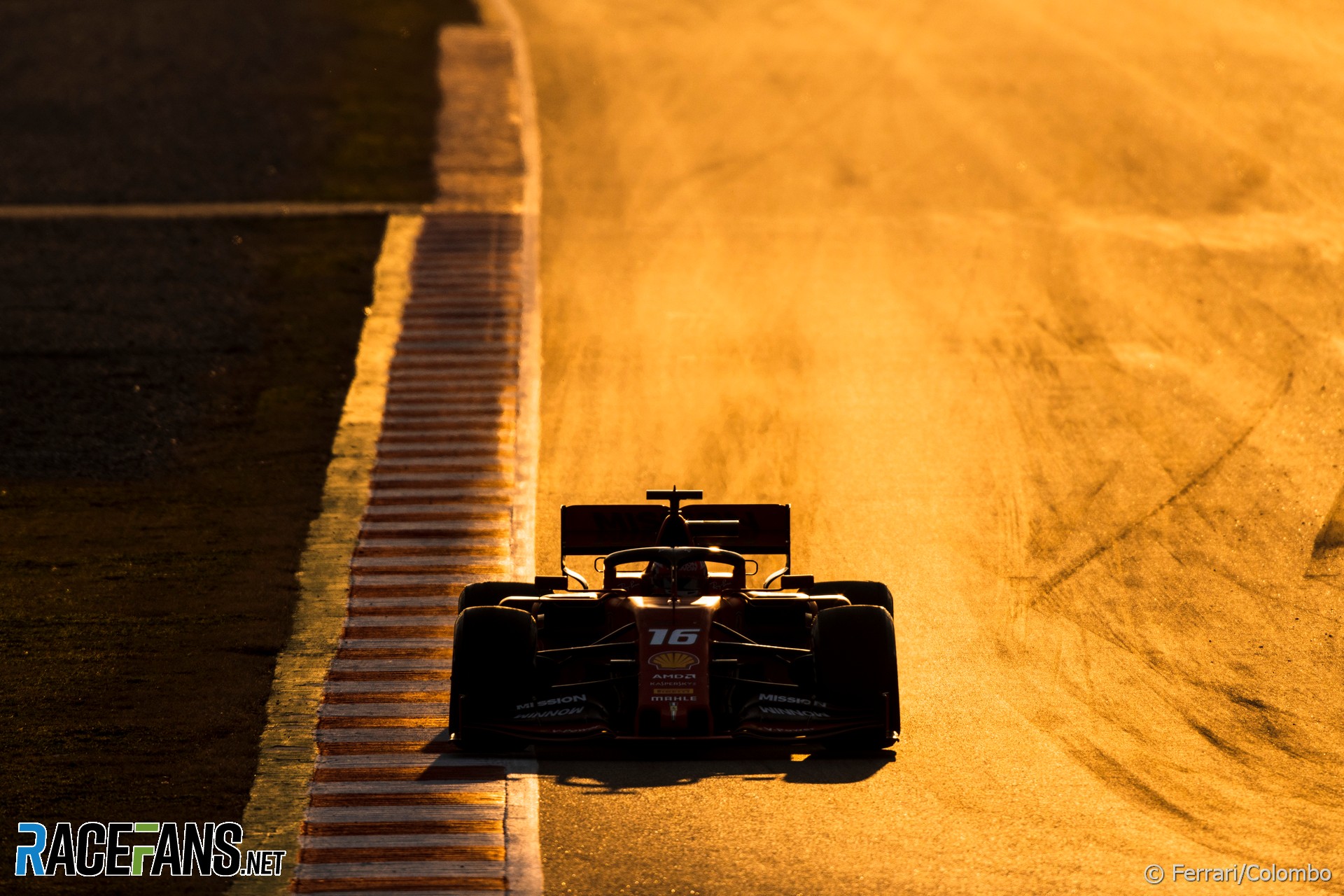
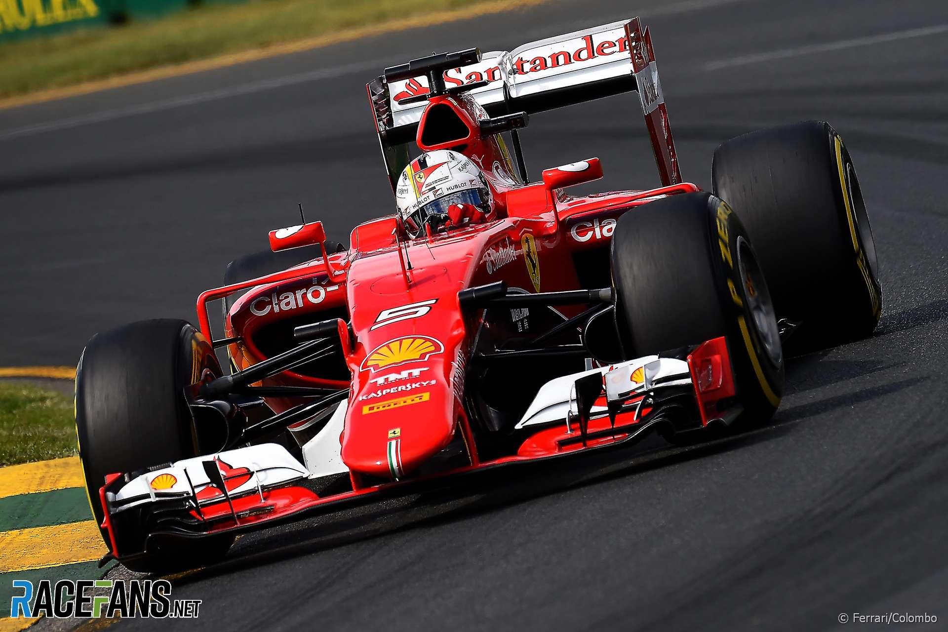
Ferrari SF90
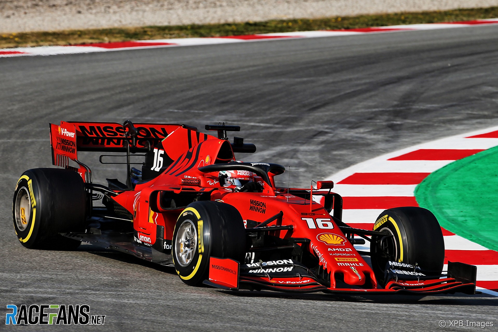
A switch to matt paint to save weight left some wondering whether Ferrari had opted for a more orange hue on its latest car. There won’t be any complaints if this turns out to be the machine which delivers their first championship silverware for a decade, though.
Red Bull RB15
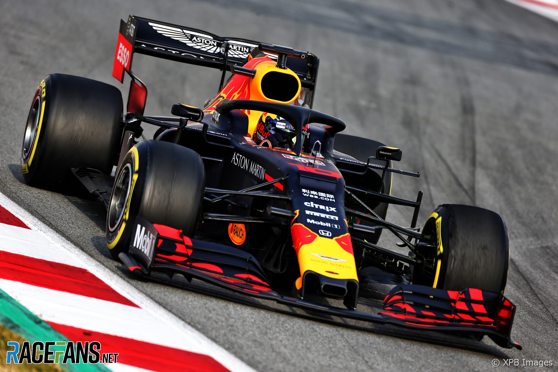
A new Honda power unit but a familiar form and livery for Red Bull’s 15th Formula 1 car.
Renault RS19
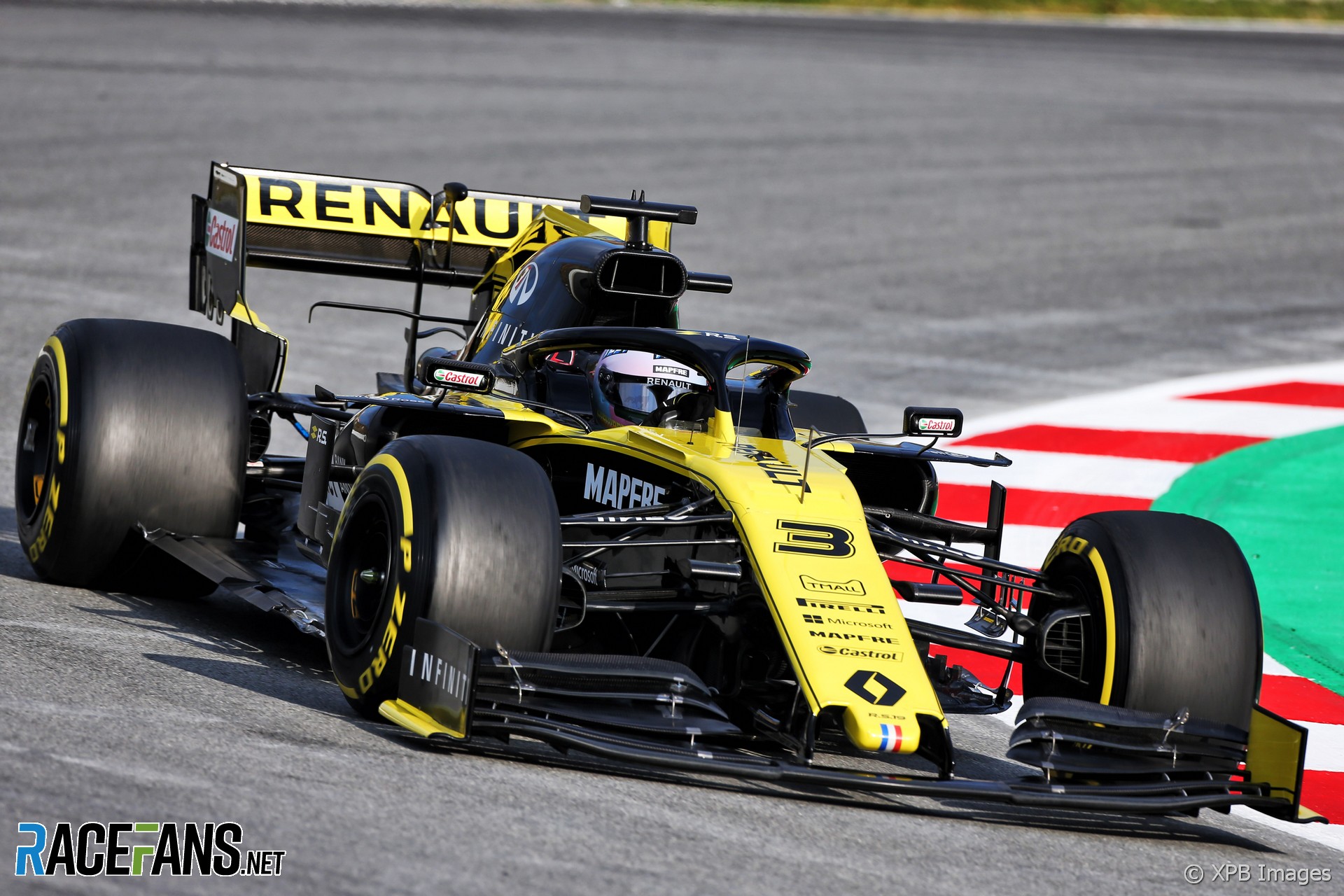
Renault has also kept a similar look for 2019, continuing to prefer more black than yellow on its F1 machines.
Haas VF-19
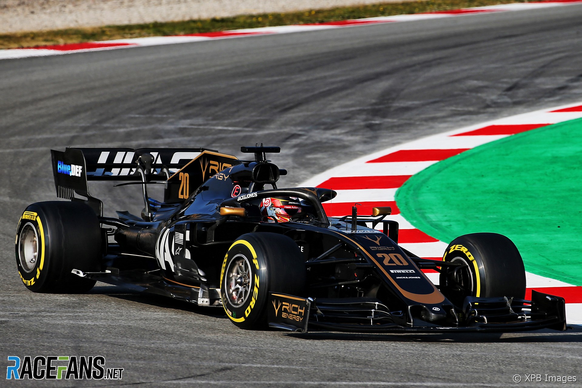
The arrival of Rich Energy and their black-and-gold colour scheme meant expectations were high that Haas’s VF-19 would have more than a hint of JPS Lotus about it.
McLaren MCL34
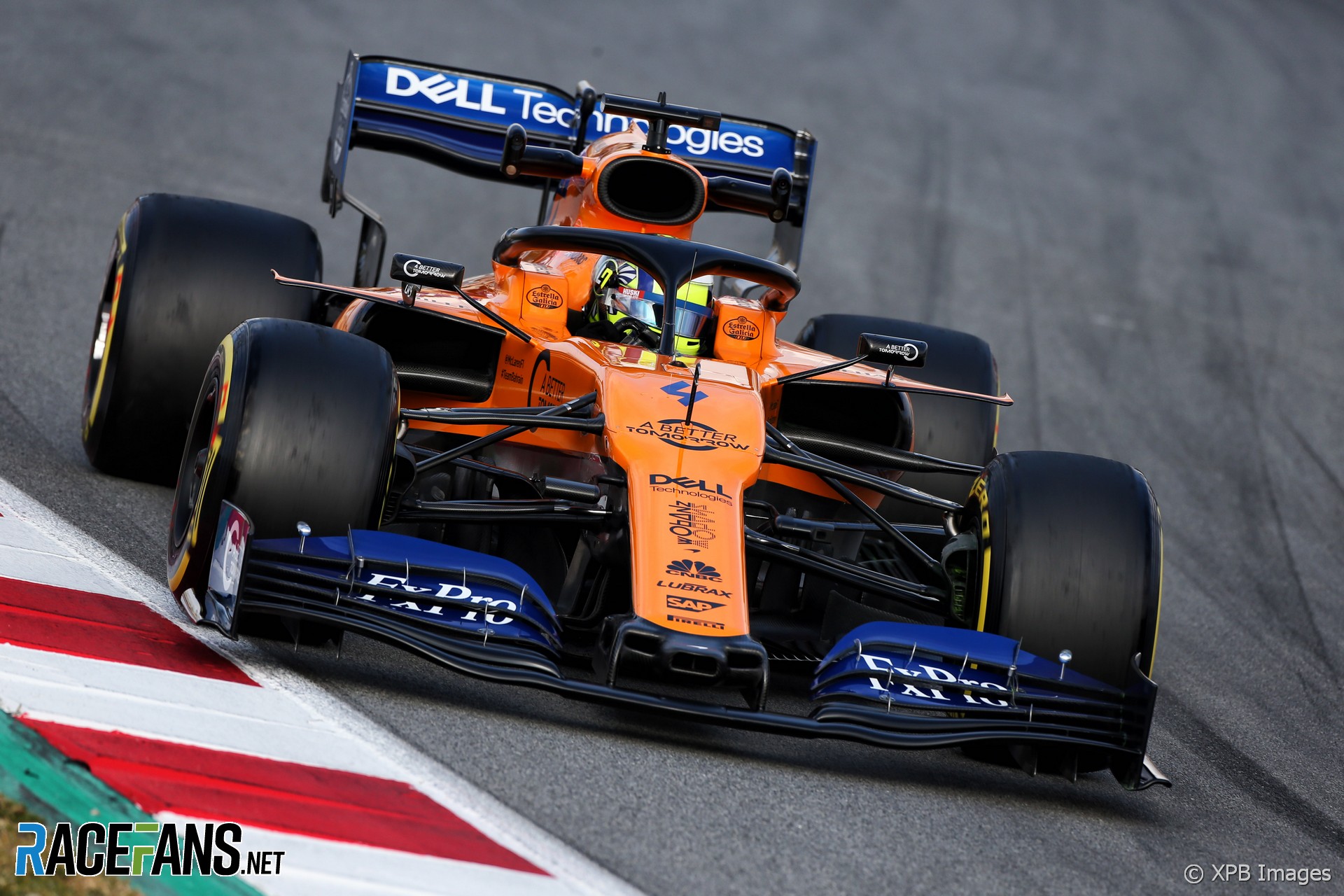
McLaren continues to evolve its heritage livery, sticking with the papaya from last year but has switch to a different shade of blue. Meanwhile the rear face of the rear wing is red in defence to new sponsor Huski Chocolate.
Racing Point RP19
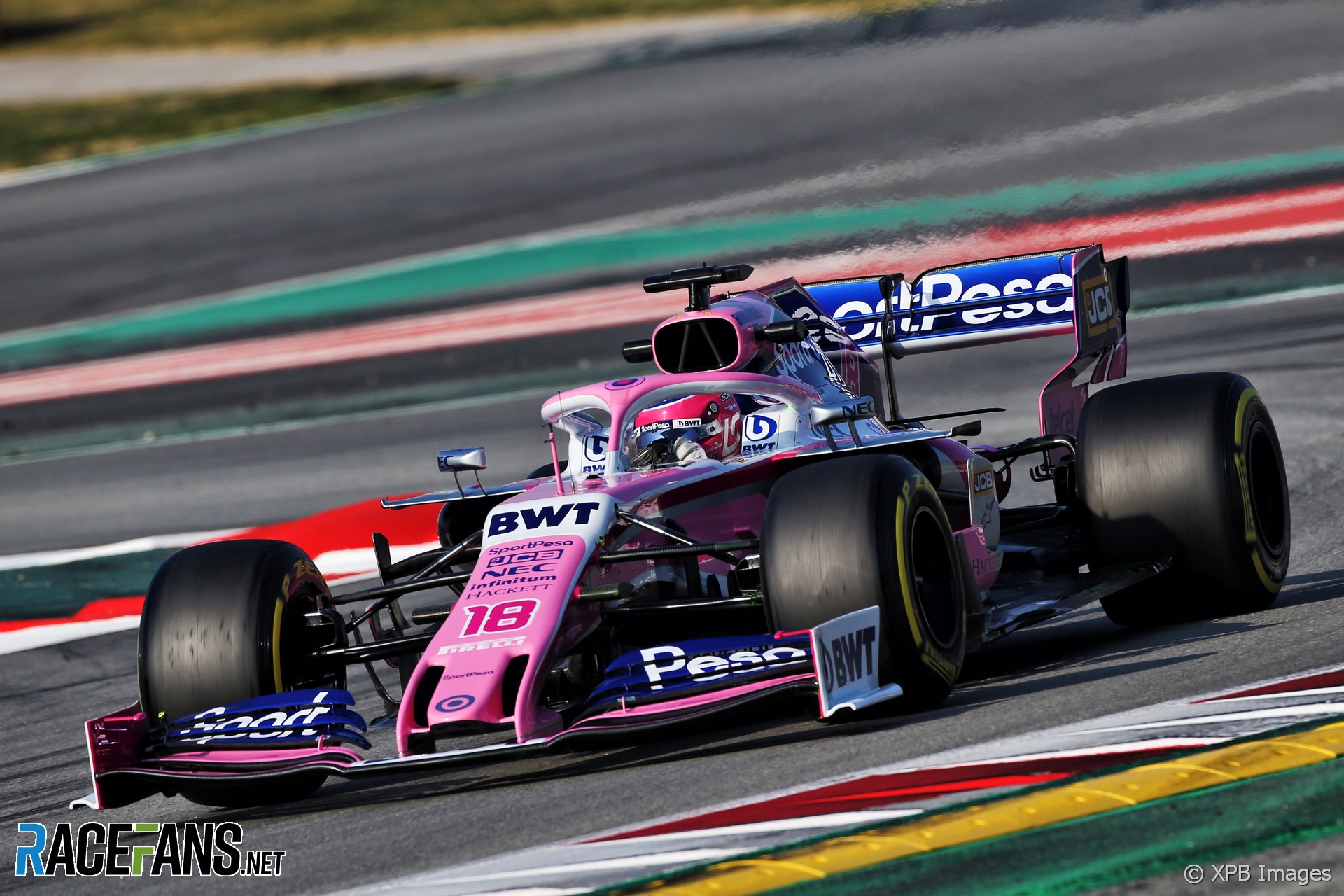
As revealed by RaceFans earlier this year, Racing Point landed a major new sponsorship deal with SportPesa, so its familiar pink now has a splash of blue as will.
Alfa Romeo C38

The team may now be called Alfa Romeo but there’s still an awful lot of Sauber white in its livery. The C38 also features some of the most distinctive aerodynamic features on the grid.
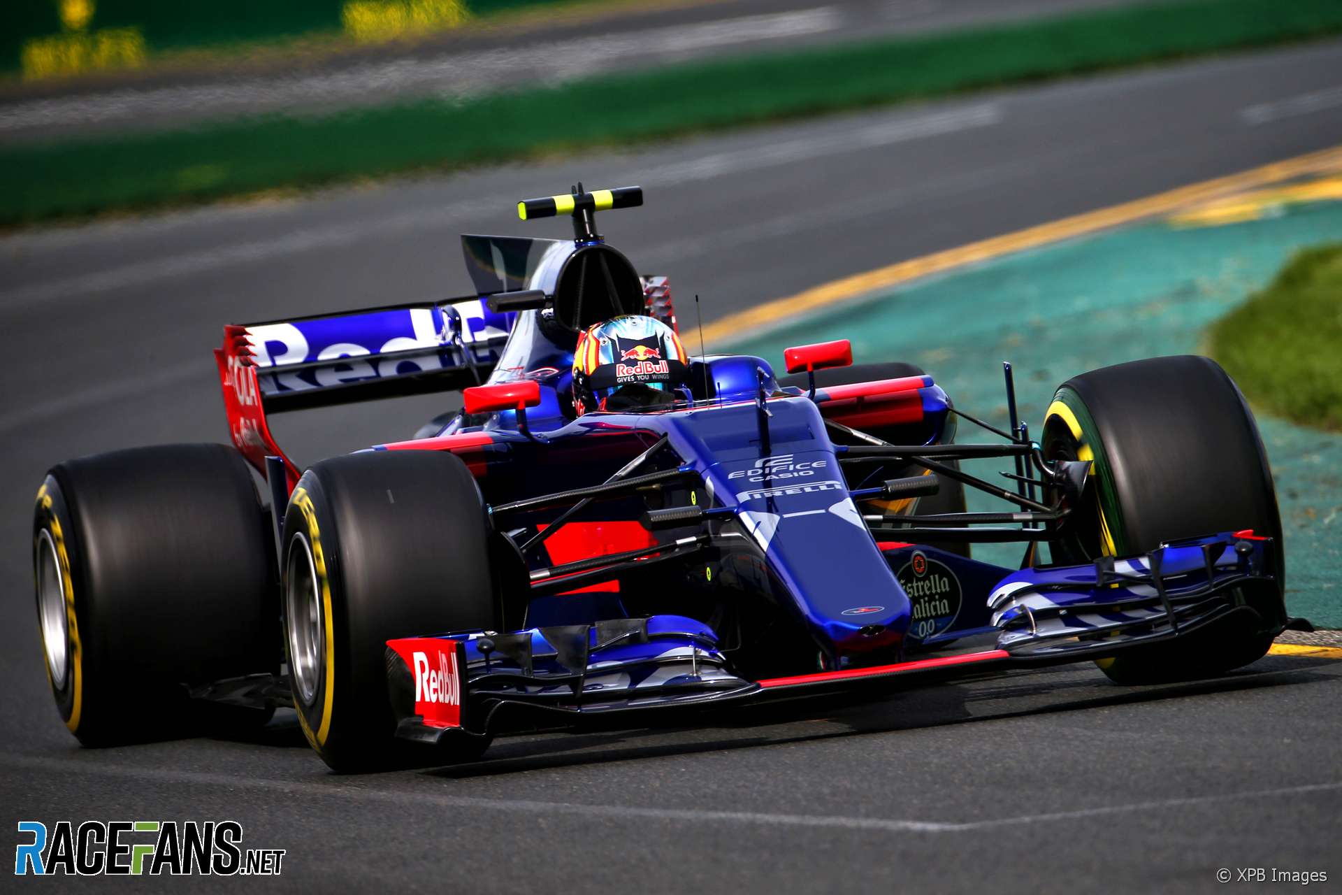
Toro Rosso STR14
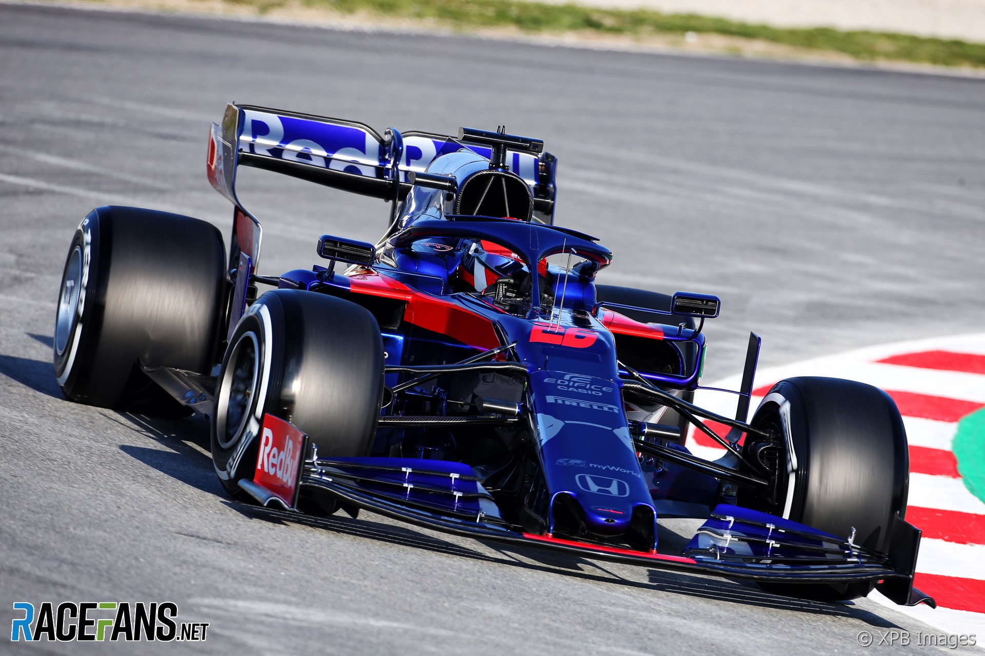
Toro Rosso updated its look a couple of seasons back and has stuck with the same style since then.
Williams FW42
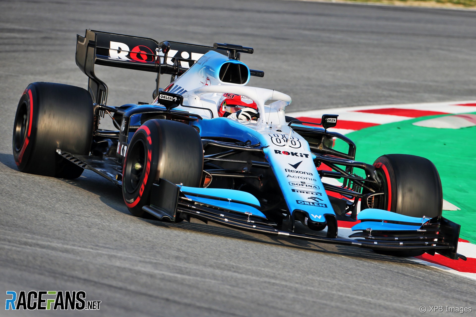
The distinctive Martini stripes have gone, new title sponsor Rokit arrived, but deputy team principal Claire Williams said the switch to pale blue instead of Williams’ more traditional darker shade was something she pushed for.
Which is the best-looking F1 car of 2019?
Which of this year’s cars do you most like the look of? Cast your vote below and join the discussion in the comments.
Which is the best-looking F1 car of 2019?
- Williams FW42 (9%)
- Toro Rosso STR14 (6%)
- Alfa Romeo C38 (12%)
- Racing Point RP19 (2%)
- McLaren MCL34 (19%)
- Haas VF-19 (6%)
- Renault RS19 (9%)
- Red Bull RB15 (3%)
- Ferrari SF90 (21%)
- Mercedes W10 (13%)
Total Voters: 432
A RaceFans account is required in order to vote. If you do not have one, register an account here or read more about registering here. When this poll is closed the result will be displayed instead of the voting form.
Previous winners
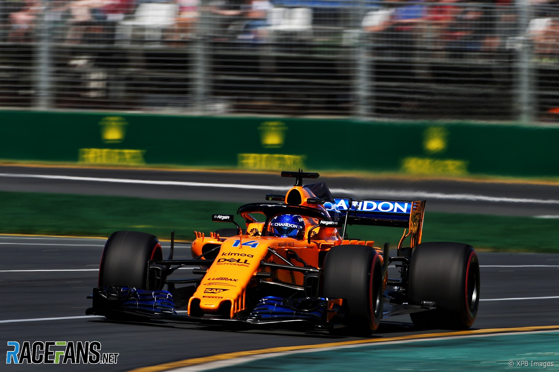
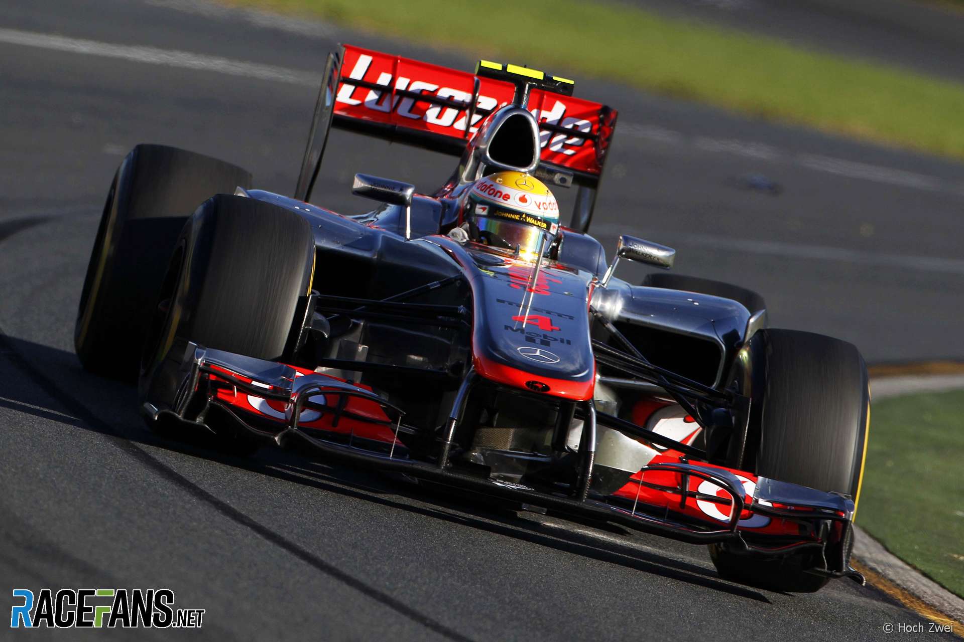
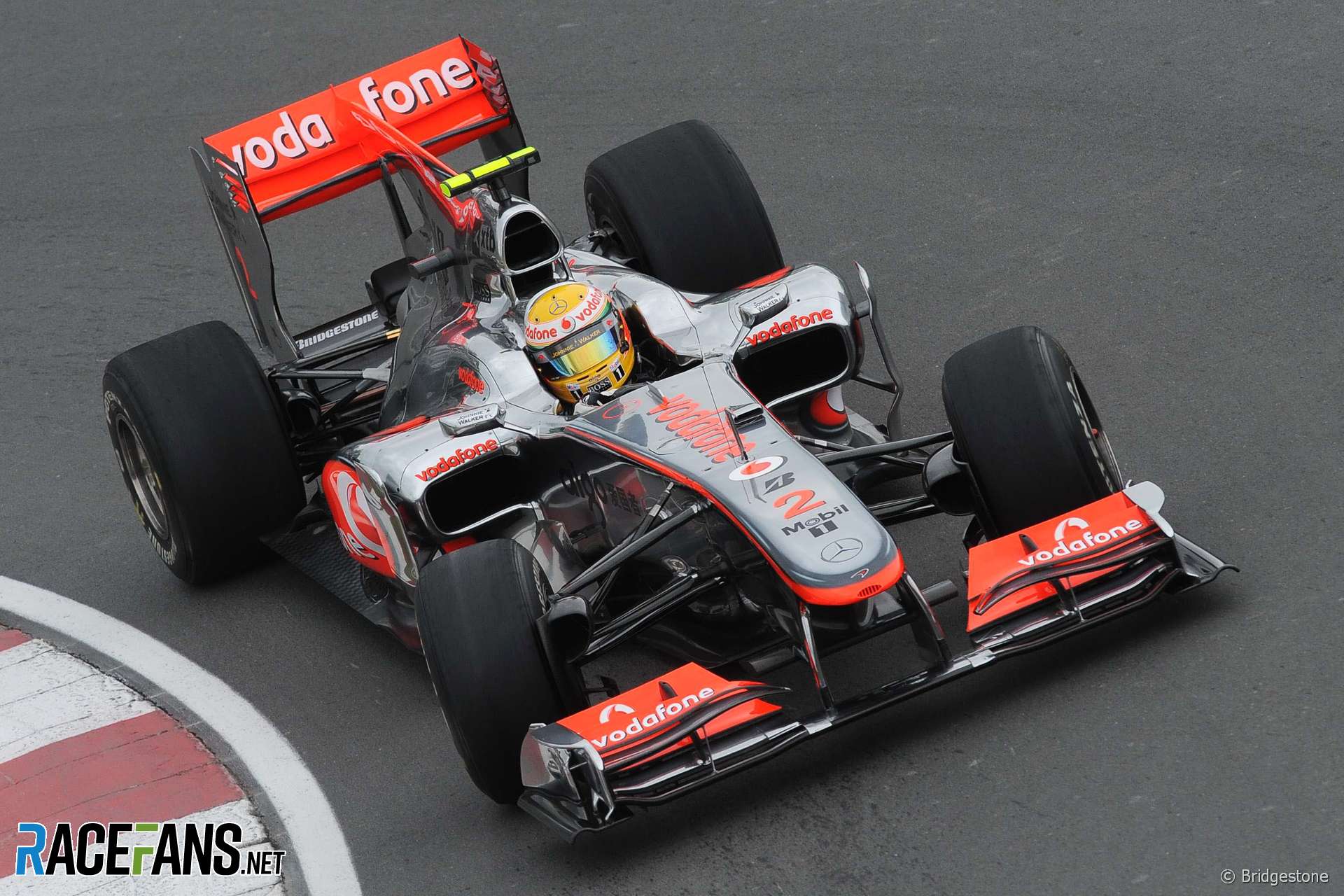
McLaren MCL33
Advert | Become a RaceFans supporter and
Debates and polls
- Will Alonso win a world championship title with Aston Martin?
- How long should Red Bull give Ricciardo to prove he’s not lost his touch?
- Were stewards right to penalise Alonso over his driving before Russell’s crash?
- Are Williams right to bench Sargeant so Albon can race after crash?
- Is the FIA right to make ten seconds the new standard for penalties?




Nick (@notacop)
24th February 2019, 9:07
I liked Williams more at the beginning but now it looks like a toothpaste to me.
kpcart
24th February 2019, 11:12
To me it reminds me of the early 200s mclarens just lighter coloured. Maybe this vote should be without commentary?
petebaldwin (@)
25th February 2019, 2:44
@notacop I know what you mean…. Just needs a bit more red:
https://i.imgur.com/Lg6etK3.png
Panagiotis Papatheodorou (@panagiotism-papatheodorou)
24th February 2019, 9:14
Ferrari for me. When the car was launched I thought it was ugly, but damn on the track is a beauty.
Retired (@jeff1s)
24th February 2019, 13:46
Absolutely. I was at the circuit de Catalunya this week and as Mercedes supporter I gotta assume we all think that the Ferrari is the best-looking car on track. The Mercedes doesn’t really shine, nor the Renault, the Haas, and the Racing Point. The Red Bull, though, looks superb and the Alfa Romeo has a good-looking contrast.
Someon
24th February 2019, 9:22
I don’t understand how people think the 2014 Williams is better looking than the Mercedes, For me the Mercedes blows them all away because of it’s different nose (No pun intended)
kpcart
24th February 2019, 11:13
Do you judged the whole car based on its nose?
ruliemaulana (@ruliemaulana)
24th February 2019, 13:47
But this is a poll on which one had the best look. So nose shape is a big factor. But I still think we should have two category: best look and best body shape.
Ferrari with thin moustache had the best looks. Merc should win best body shape.
topo (@vieste)
24th February 2019, 20:25
I agree with you. I think the 2014 Williams won based on the appeal and nostalgia of the Martini livery. But the Mercedes seem to have the more elegant nose treatment. So, two categories might be appropriate. The current noses on F1 cars are, in my opinion, their biggest detractor. I know this is subjective stuff, but F1 seems to be still stuck in a period of ugly noses.
George O'Donnell (@georgeod)
24th February 2019, 9:24
All the cars look very similar. It would be very difficult to tell them apart if they weren’t painted – the differences are in small details such as front wings, barge boards rather than anything large and fundamental.
It makes me sad – there’s no large scale innovation left in Formula 1. The teams design pretty much 90% the same car, but the development race is all about maximising the remaining 10%. I wish the designers had more freedom to design something wacky – that car might get my vote, and maybe the design would translate to winning on track.
MrBoerns (@mrboerns)
24th February 2019, 9:55
that’s a myth.
the 1967 cars were all basically tubes with wheels and Widendscreen. paint Them all the same and try to figure out Whats what. so were 50ies cars. all mid70ies cars were lotus72 clones with bulkier bodywork. all 1982 cars were wide Flat sqares with a stubby nose around the Driver attached out front.
then they grew slimmer until pretty much all looked aboutish like the mp4/4. Next Year all cars grew airboxes again. then all cars looked Alike until they all grew High Noses from 94. and these cars then all grew into the equally more sqarish shapes of the late 90ies/early 2000s. then all cars grew more and more aerofungus and than We pretty much arrive in this gallery. the cars never were all so different, its one of nostalgia things
Hugh (@hugh11)
24th February 2019, 10:07
Rose tinted glasses…
Dave F. (@dave-f)
24th February 2019, 20:48
No @hugh11, i’m pretty sure no cars had those installed ;-)
socksolid (@socksolid)
24th February 2019, 15:02
Auto union typ C is pretty easily identifiable in all colors :p
socksolid (@socksolid)
24th February 2019, 15:02
And tyrrell p34
MrBoerns (@mrboerns)
24th February 2019, 15:12
@socksolid also, auto union typ C is easily identifiable as not an F1 car
yes, there are exceptions, but they are by far over represented in memory. and to be honest, liveries aside, for most cars from an era, it is just as much about seeing the little detail differences to distinguish the cars as it is today.
socksolid (@socksolid)
24th February 2019, 15:14
I agree 100%. I was more about making a joke because those cars are super easily identifiable.
Dave F. (@dave-f)
24th February 2019, 20:52
Wasn’t ’67 when they all started adding really high wings to almost any part of the car? They certainly stood out
MrBoerns (@mrboerns)
24th February 2019, 21:12
No, you’re thinking of 69
@HoHum (@hohum)
24th February 2019, 22:02
@mrboerns, you need glasses or more knowledge. You missed the 6 wheelers, the shark nosed Ferraris and many other designs that were different in their first year before being copied, and every year the regulations became more and more restrictive leading to today’s situation where variation is restricted to 1 or 2 inches in placement of main elements.
MrBoerns (@mrboerns)
26th February 2019, 11:46
@hohum No, absolutely not. a) those are two examples. see my above comment on the C type. Also, b) you act as if the sharknose ferrari was a totally unique design- well, it hat a fin over the oilcooler. How is that different to ferrari bringing out uniquely shaped sidepods on 2017? it is a small detail to anyone who has even remotely normal middle of the road fields of interest
@HoHum (@hohum)
26th February 2019, 23:23
@mrboerns, uniquely shaped sidepods (cooling air intakes) versus uniquely shaped nose (cooling air intakes), it truly is a small detail, on both cars.
kpcart
24th February 2019, 11:14
Maybe go and watch drag racing? Lots of variety in designs.
Graham
24th February 2019, 15:53
Drag racing in the lower classes may be different but fuel dragsters, funny cars, pro stock and pro mod are virtually identical.
Graham (@cnitallb4)
24th February 2019, 16:05
Maybe for the lower classes, but in drag racing the fuel dragsters, funny car, pro mod and pro stock cars are all now pretty much identical.
Driving (@911gt2)
24th February 2019, 16:37
I could see how you think that. The cars frequently look very similar, shape wise, almost every year, year after year. Some years, there are a few that look just a little different, if you know where to look.
I thought the same this year too, until looking back at the photos, since your post, and I found something that many of the cars designed differently.
The airbox mouth.
Look at the shape for all the cars. Ferrari’s looks the smallest, and the only one shaped like a triangle.
Mercedes, look like they have the largest, widest mouth.
Some have short but wide mouths.
Others have a variation of Mercedes’s design.
Driving (@911gt2)
24th February 2019, 16:54
NOSES
Other differences are the tip of the nose.
Some teams have very similar noses, where others have much more unique designs.
All of these front shots also don’t show the rear, side, or top view.
SIDE PODS
In the past, the side pod shapes and their mouth shapes sometimes had unique designs. You can’t tell in most of these shots.
My understanding is that Ferrari has done something unique again to the rest of the field with their side pods, but it’s tough to see in these shots.
MIRRORS
The mirrors, and how they attach has also been unique in the past, but again, it’s tough to see the differences.
FRONT SUSPENSION
There was an article somewhere that talked about Williams’s unique front suspension geometry, and that other’s might try to disqualify it. It’s definitely unique, but it’s tough to tell from all these front shots.
REAR
I’ve seen shots of the rear of some of the cars and remember see some unique exhaust arrangements. 1 Big. 1 Big 1 small below. 1 Big 2 small left & right.
Red Bull also seem to have come up with a unique, more aggressive diffuser and almost turns it into a mini wing. Additional pieces attached it to the exhaust to keep it from flexing down.
When you look as see all these differences, most people will be able to recognize at least a few unique cars if they were all painted the same color.
MacLeod (@macleod)
25th February 2019, 7:58
I just gave points for livery, chassis, rear and nose so i had a average then selected the car.
Phylyp (@phylyp)
24th February 2019, 9:28
McLaren for me – I like the added blue – and its pattern on the engine cover – that nicely offsets the orange. Very nice to see the livery has come such a long way from the orange/black from a few seasons ago.
MrBoerns (@mrboerns)
24th February 2019, 9:43
but it has those Weird antlers where ferrari introduced the sidepod glasses in 2017
Phylyp (@phylyp)
24th February 2019, 10:14
@mrboerns – I sorta like them, they remind me of canards on fighter jets. :)
MrBoerns (@mrboerns)
24th February 2019, 11:06
hmm, last few years the mclaren was basically a Tu-144- terribly unreliable and when you go fast you’ll run out of fuel @phylyp
Phylyp (@phylyp)
24th February 2019, 12:17
@mrboerns – fair comparison – it even ended midway through a few races with afterburners on.
This year it might be the bulls with their tails on fire. ;)
MrBoerns (@mrboerns)
24th February 2019, 12:24
Hey Kids, still think not having supercruise is cool?
MrBoerns (@mrboerns)
24th February 2019, 12:25
Still, its not like the canards saved it for the lovely tu now, did they?
However maybe the soviet engineers just lacked the chocolate snack goodness to make it work.
Phylyp (@phylyp)
24th February 2019, 14:09
@mrboerns – chocolate is always a better motivator than a bullet. ;)
MrBoerns (@mrboerns)
24th February 2019, 14:52
I really really would like to shop an old aeroflot livery on the Mclaren and then post it with this bogus ‘artist reimagines 2019 f1 cars with vintage airline liveries and the result is absolutely stunning’ bs tagline but i just realized i’m way too lazy to pull it off
ColdFly (@)
24th February 2019, 9:37
No real stand out IMO, but the winners of previous years (Renault, McLaren, Toro Rosso) still look very good.
Haas has improved tremendously, and I quite like the 2-tone Williams implementation.
Also, Ferrari looks fresher with the (temporary?) black on red.
In the end, Renault won my vote (again) for this year.
ColdFly (@)
24th February 2019, 9:39
PS – Also good to see how much the overall look of cars improved from 2017.
MrBoerns (@mrboerns)
24th February 2019, 21:19
did you mean 2016 or are you barking mad ;-)?
Fons (@fons)
24th February 2019, 9:45
Sauber in their love livery was the best one I saw for 25 years. Sadly f1 teams seem to have no balls at all to give those liveries a chance during a regular season.
MrBoerns (@mrboerns)
24th February 2019, 11:09
I actually am really glad they kept last years livery- its really nice. the valentines one, not for me.
Chinmay
24th February 2019, 10:07
Too easy choice. Ferrari by a country mile.
Ben Needham (@ben-n)
24th February 2019, 10:10
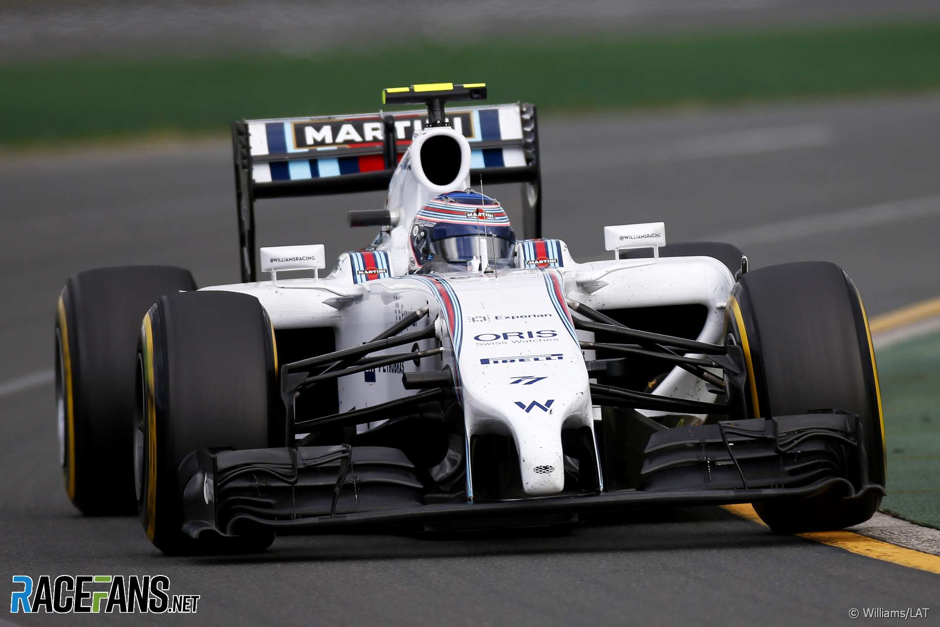
Amazing how the performance of a car quickly changes the perception of attractiveness. Take the Williams FW36; the look didn’t change for 5 years, but only the first year won the award as the slow downward spiral took hold. A big trend seems to be new liveries winning… but this year the Williams and the Haas are the only major overhauls and I’m not a huge fan of either.
This year, I really like the look of the Renault and the Alfa Romeo, while the Mercedes looks mean and quick. I voted for the Renault for overall package. Conversely, not a fan of the Williams or the Racing Point… despite quite liking the pink (poorly executed).
black (@black)
24th February 2019, 10:55
I don’t think the performance plays any role in the perception of attractiveness. The last 5 years there were many nice looking cars that didn’t set the world on fire with their performance…Manor 2016, Toro Rosso 2017, McLaren & Sauber 2018.
In 2014 when the Martini livery was first revealed, it was an instant hit because it was nicely executed and more importantly it was the only white car as I can recall. You could see it from distance and say “there is the Williams”, as opposed with the sea of grey and silver (Mercedes, Mclaren, Sauber). The same goes for the Renault in 2016. Nothing spectacular, just a simle decent yellow car but because of the yellow it was unique and you remembered easily.
Unfortunaly Williams stuck with the exact same design for 5 years. Maybe if the changed the Martini stripes a bit every year, people would remembered it more fondly.
PS : Racing Point’s livery drives me mad. Very nice colours…such a bad execution.
pastaman (@)
24th February 2019, 14:15
Agree about the “new” liveries tending to win. Look at the Renault from 2016, they painted it one color and people thought it was the best livery evar
MrBoerns (@mrboerns)
24th February 2019, 21:20
@pastaman except for Mclaren winning 3 on the trot with a livery that was already in its 4th year to begin with
MrBoerns (@mrboerns)
24th February 2019, 21:31
And during two of these years we saw ‘relaunches’ of iconic and beloved liveries with the BRG Lotus and the JPS Lotus in 2010 and 2011
Alex Bkk (@alex-bkk)
24th February 2019, 10:26
So Williams will not only have the slowest cars on the grid, they will have the least attractive as well. The livery looks like the packaging for a feminine hygiene product. Sad days for them I fear.
kpcart
24th February 2019, 11:25
No it doesn’t…. It looks nice. Not the best and not the worst, but nice. Also let’s wait till Melbourne to see who has the slowest car. Williams have only done constant speed data logging laps and installation laps so far. Russel and Kubica will get a chance to push the car this week, it could well be right in the midfield pack.
Alex Bkk (@alex-bkk)
26th February 2019, 5:16
It doesn’t look nice it looks weak, but those are all subjective thoughts of mine according to my particular bias and have no real basis in what the car can actually achieve. I hope you’re right kpcart. Cheers, Alex.
Alex Bkk (@alex-bkk)
26th February 2019, 5:19
@kpcart Sorry I forgot to add the @to your name.
MrBoerns (@mrboerns)
24th February 2019, 21:33
@alex-bkk
And who ever heard of a racing outfit sponsored by a feminine hygiene product?
mog
25th February 2019, 11:17
Ewwww
Over share….
Alex Bkk (@alex-bkk)
26th February 2019, 5:18
MrBoerns… Perhaps Claire wants to be the first?
Alex Bkk (@alex-bkk)
26th February 2019, 5:21
@MrBoerns Sorry I forgot the add the @ in front of my response.
black (@black)
24th February 2019, 10:37
• Mercedes : Probably their best livery since they returned as a team. I honestly can’t find a singe flaw.
• Ferrari : Very nice twist with the matte paint and the black applications, but the execution feels a bit off…the ugly MissionWinnow logos doesn’t help either.
• Red Bull : Same old, decent but the nothing spectacular. The “wow” factor has definatly wore off since 2016.
• Renault : Nice livery, but a bit dissapointed they didn’t spiced up a bit. Maybe add more yellow, or a bit white, or keep the same colours but change the lines a bit. Something to feel every year different.
• Haas : Complete dissapointment. Just a black car with gold/white logos. They could have been more creative with the gold.
• McLaren : Very nice. Last year’s good looking livery, but they evolved a bit.
• Racing Point : Pink, white and blue work nicely in theory. But it’s way way too clustered with abnormal stripes and logos. Nice idea, very bad execution.
• Alfa Romeo : Perfect. Almost the same as last year, but changed the Alfa logo and fixed the blue line anomaly bellow the engine cover that was diving me mad :P
• Toro Rosso : They keep the great colours but maybe change a bit the red line? A little variation doesn’t hurt.
• Williams : Decent. Not great, not horrible either. At least it is light blue which will help tell them apart from Alfa more easily.
Phylyp (@phylyp)
24th February 2019, 10:51
@black – good summary, I like the patterning Mercedes have applied on the “fin” part of the engine cover, it keeps the spirit of the livery intact while refreshing it for the season.
Sundar Srinivas Harish (@sundark)
24th February 2019, 15:17
IMO, the Haas was a missed opportunity. They should’ve picked either white logos or gold logos, both white and gold simply look out of place. If Lotus/Renault designers managed to convince companies like Genii Capital, Clear, Rexona and Microsoft to use gold lettering, I’m sure Gene Haas could’ve been convinced for gold lettering.
Driving (@911gt2)
24th February 2019, 17:18
In my opinion,
* Mercedes – bla.. They’ve gotten more creative with the colors, but to me, it’s in the bottom 50%.
* Ferrari – I like the WM logos in flat black against the red. I prefer the black against red, than their traditional white against red.
* Red Bull – One of the ugliest, in my opinion, as it traditional has been.
Toro Rosso, same.
* Renault – Since they went with Yellow, I and my spouse, year after year, find it to be the best, or one of the best looking cars. It’s up there again for me.
* HAAS – Really nice, but the white “HAAS” hurts it. They should have made that gold too.
* McLaren – Frequently used to have one of the best looking cars, but for me, personally, I think their orange combinations are one of their worst in ~30yrs. This year, the unique shade of orange with the unique blue, makes it better, but I’d still rank it with the bottom 50% of “Good Looking Liveries for 2019”.
It floors me that it was voted so high here.
* Racing Point – Yet again for me wins UGLIEST car. It’s amazing that this passed their marketing department. I’m sure there are a lot of grumpy employees and that they sell less team gear than anybody else. With Mr. Stroll and his investors now owning the team, and their massive exposure to the fashion industry, I predict this will be the last year of the vomit car and next year it will be one of the best looking cars on the grid.
* Alfa Romeo – Very nice. Better than McLaren and Mercedes, that’s for sure.
* Williams – Weird. I may like it more if it’s really fast. If the blue was darker, more traditional “Williams Blue”, I think I’d like it more.
John Costello (@abbottcostello)
10th March 2019, 7:22
My opinion mirrors yours almost right down the line!
I’ll add:
– Wish Haas would’ve picked a shade of gold closer to the original JPS Lotus
– I like the throwback McLaren papaya, not wild about this years shade of blue
– Good to know I’m not the only one that likes the MW logos on the Ferrari, I think they’ve got a spectacular livery.
– Renault needs MORE yellow, maybe they’ll do an in season livery change again.
I actually voted for the Williams, it grew on me the most over the time since the reveals & I think my sympathy for their plight played into my selection as well.
praxis (@praxis)
24th February 2019, 10:45
“Racing Point RP19”
Jimmi Cynic (@jimmi-cynic)
24th February 2019, 11:07
Do I have to pick just one? They’re all equally ugly stretch-limo single seat racers with Todt thongs. Now with snow plows!
Their beauty is in their performance. Their ungainly form follows function, at a great aesthetic distance.
MrBoerns (@mrboerns)
24th February 2019, 11:11
They look like awesome aggressive scary race beasts from the back though. There was a picture of last years suaber from the back while on the grid (or at the end of the closed pitlane or something)- spectacular!
kpcart
24th February 2019, 11:30
I agree they are too long, but that is because of the heavy and long power units that weigh heaps more than the old v8s. I wonder if they kept the v8s, maybe lowered the revs and added some hybrid to lower fuel economy, how fast those cars would be now, they were so nimble and looked like low flying aircraft on some tracks. Now they just look big, and even though they are slightly faster they look and sound slower.
Mach1 (@mach1)
24th February 2019, 14:16
Is the length to do with the power units? Or the fuel tanks?
I thought their current length is pretty much the same as it was when they had the V8’s with no refuelling?
Or have they got longer since then?!?
@HoHum (@hohum)
24th February 2019, 22:19
@jimmi-cynic, Agreed, it basically comes down to the colour scheme, or for many, brand loyalty. I went with Renault, my only brand new bicycle was black and yellow and it was my pride and joy until I was old enough to drive.
Francorchamps (@francorchamps17)
24th February 2019, 12:20
My top 3 is McLaren, Red Bull, Mercedes (in that order). Yeah RB hasn’t changed their livery in years now, but should that be how we judge them? I think they’re the 3 best looking cars by far.
Racing Point looks like a F3 livery, complete mess.
Williams looks surprisingly not that bad, I like the contrast between the black (tyres, suspension and rear wing) and white/blue.
I don’t get the love for the Ferrari, the black MISSIONWINNOW logos don’t fit.
Overall I think we should be happy to have a grid with so much color, I remember a season (2013, 2014?) where half the grid was black.
Sonics (@sonicslv)
24th February 2019, 12:23
McLaren.
Their livery design team never disappoints. I also loved their new car number font. It looks very stylish and different yet still easy enough to read.
Phylyp (@phylyp)
24th February 2019, 12:38
@sonicslv – honest question… Did you like their livery about 2-3 years ago, with black and orange, and swoopy curves?
I liked their old silver, and the orange/blue since last year, but not the intervening ones.
Sonics (@sonicslv)
24th February 2019, 13:43
@phylyp MCL32? Yes, I actually liked it. I think it still looks good and dynamic in TV, much better than static photos.
MP4-30 is the worst design IMO because the weird red stripe crossing the nose. MP4-31 which basically same all black concept has much better stripes placement and actually looking good aside from the weird car number font.
I think McLaren generally always looking good since West era. Marlboro McLaren also iconic but West livery just taking it to another level. Some of the worst McLaren design is the early too chrome Vodafone McLaren, which toned down in subsequent years and it looks good again. Then of course the worst design in MP4-29 and MP4-30, but MP4-29 is more because of the dumb nose, while the livery itself is just too flat and boring but it look okay after they put giant SAP logo on the sidepod.
Phylyp (@phylyp)
24th February 2019, 14:15
@sonicslv – ha ha, goes to show how different our tastes are. I didn’t like the MP4-30 and 32 (and slightly disliked the -31), but am fine with their liveries before that and after (agree with your comments about their -29 being drab and having a proboscis, but not enough to hate it).
Sonics (@sonicslv)
24th February 2019, 15:12
@phylyp Yea MP4-29 livery alone is not that bad. I just think the grey and black is too flat. Mercedes silver doesn’t really work on F1 cars without some bold color stripes. I still think West era McLaren is the best F1 livery ever XD
@HoHum (@hohum)
24th February 2019, 22:23
Really weird, I think the Mc is the ugliest of the bunch (from above photo) but I guess it will be easy to spot on track.
Alex (@arobbo)
24th February 2019, 12:41
Mercedes – It’s a little different to previous years, but the ‘arrows’ on the engine cover ruin it abit.
Ferrari – The best looking Ferrari I’ve seen in years, nothing wrong with the matte red, but I just wish they painted the Halo red too.
Red Bull – Still pratically the same as last year, I like it, just wish they could mix it up abit.
Renault – I like it really, but I prefered there all yellow one from 2016?
Haas – Probably the most disappointing one, not because it’s bad, but because… ok, its pretty bad.
McLaren – The biggest grower of the lot, reminds me of 2005-06 Renault, thats a good thing.
Racing Point – SPONSORS!
Alfa Romeo – Better than last year, and maybe my favourite of them all, it just looks clean and racy.
Toro Rosso – Loved it when they introduced it in 2017, and it’s still good even though it looks rather similar.
Williams – Another grower, but ROKIT logo just looks out of place on it.
Tough to vote on one, I’ll go with Ferrari.
Pironi the Provocateur (@pironitheprovocateur)
24th February 2019, 12:54
The sidepots on the 2014 Williams are horrendous…I can’t believe we had something so massive and ugly just five years ago. Why is it so, the cooling requirements became so drastic with the new V6 engines?
Phylyp (@phylyp)
24th February 2019, 14:19
@pironitheprovocateur – turbocharging compresses the intake charge air, this compression heats it up, so it requires an intercooler to cool this down (for better efficiency) before going into the cylinders. This intercooler often sits in one of the sidepods, along with the other ICE components like a radiator, oil cooler, etc. I believe the MGU battery/electronics also require cooling, although that is usually ducted (and doesn’t require a radiator in the sidepods).
It’s the same in roadcars that are turbocharged – you’ll notice that in most cars there is plumbing that goes from the turbo to an intercooler near the front grille before returning to the intake headers.
Jere (@jerejj)
24th February 2019, 13:09
Renault.
@HoHum (@hohum)
24th February 2019, 22:25
+1
erikje
24th February 2019, 13:14
To be totally honest.. The British taste or better the lack of taste is most prominent in the McLaren. The papaya with the ugly blue is horrible.
So propably McLaren wins again on this forum :)
Phylyp (@phylyp)
24th February 2019, 14:22
Not British. Not a fan of McLaren. Still voted McLaren. Sorry :)
erikje
24th February 2019, 17:12
Bad taste is not a British monopoly :)
Jimmi Cynic (@jimmi-cynic)
24th February 2019, 19:52
Nah…not true British taste expressed in any of the liveries. That would require a pale yellow mismatched with a hideous floral wallpaper bordered by peach and green ceramic tiles for sponsor logos. ;-)
@HoHum (@hohum)
24th February 2019, 22:29
@jimmi-cynic, you are watching too much “home renovation” TV.
Jimmi Cynic (@jimmi-cynic)
24th February 2019, 22:56
@hohum: Could be true. Have you seen the Beeb’s new “Escape to the Reno” series? They already have the sequel in production: “Escape to the Asylum” ;-)
@HoHum (@hohum)
25th February 2019, 0:46
@jimmi-cynic, Nope, I mainly stick to the franchise that requires 3 of the following sub plots per episode;
1; Insufficient funding
2; Insufficient planning approval
3; A pregnancy
4; A terminal illness.
5; A relationship breakdown.
Jimmi Cynic (@jimmi-cynic)
25th February 2019, 8:22
@hohum: Those are some lofty entertainment standards.
Maybe pass your list onto Liberty – help to make F1 more inclusive in 2021. Although…current F1 does qualify for the 3 minimum, especially by mid-season. The budget cap will unaffordable, new aero regs will be skirted around and Max/Pierre will be true frenemies.
@HoHum (@hohum)
25th February 2019, 12:07
;-)
JayMcG (@jaymcg)
24th February 2019, 13:21
I cannot remember the 2016 Renault at all.
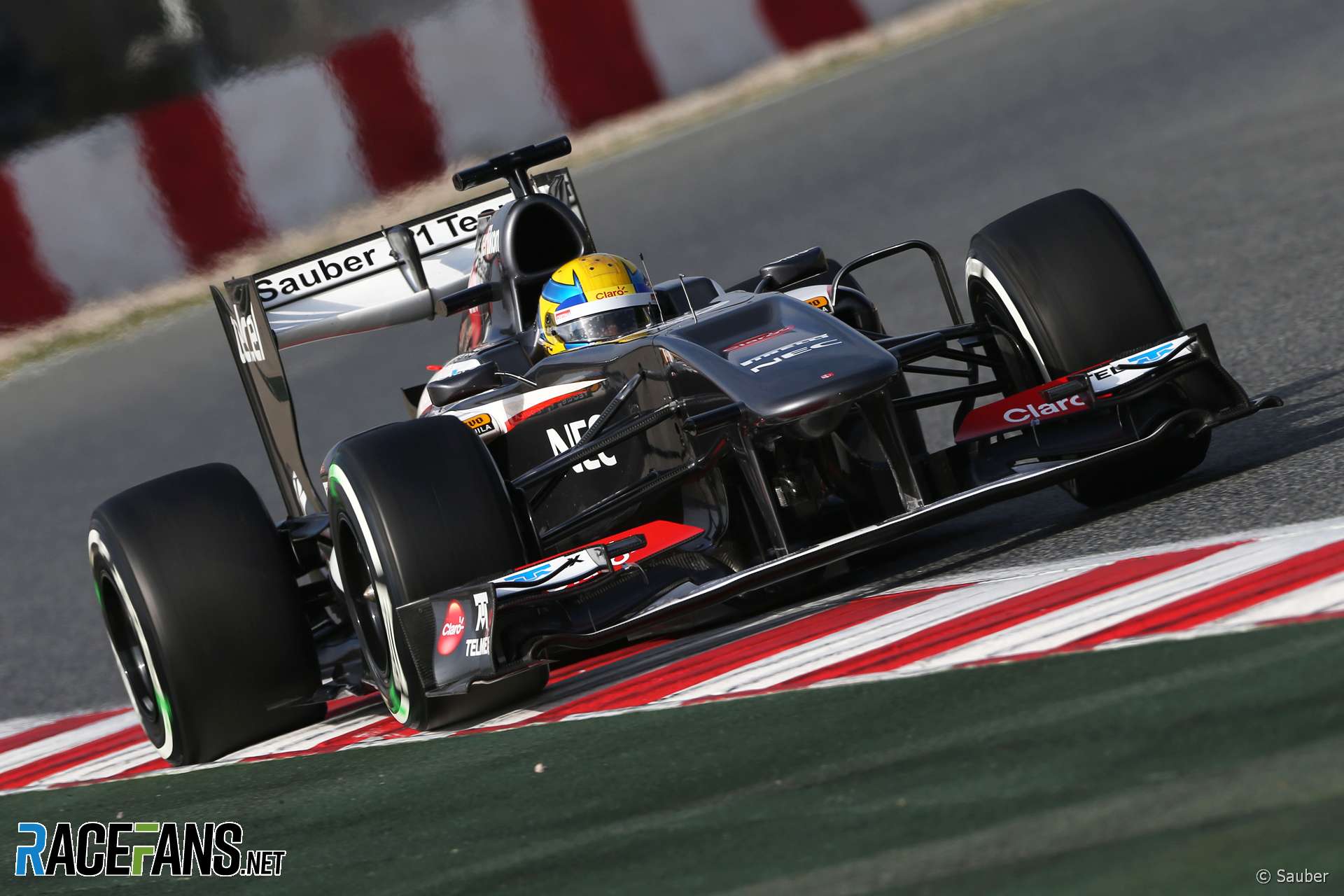
The 2013 Sauber is boring, looks like voters had a brainfart that year.
MrBoerns (@mrboerns)
24th February 2019, 21:25
@jaymcg 2013 was the year the FIA allowed to use a ‘vanity panel’ to disguise stepped noses (which had been loathed) and sauber had one of the more ‘tradidtional’ looking cars in profile. Also back then grey on the grid wasn’t soo much of an issue, sauber had had a blend livery for quite a few years before AND they had some really nice launch photos that brought out the livery nicely. Which is why people liked it.
Thomas Bennett (@felipemassadobrasil)
24th February 2019, 13:30
Renault STR and Ferrari for me. I voted for the Ferrari but looking at its vote count compared to the STR I sort of wish I hadn’t. The Mercedes looks fine, and I suppose it has to stay similar. They have at least tried to change it. The Sauber/Alfa looks dull, I still prefer the late 2000s/early 2010s Williams’s to now, the Red Bull is drab now, the Haas looks sleek enough but a black car is always going to struggle to win me over, the Racing Point is a bit of a mess( and not in an endearing way like 2014) and the McLaren is good but I’m not a fan of shapes on an F1 car.
Thomas Bennett (@felipemassadobrasil)
24th February 2019, 13:34
God, the Sauber being the best reminds me just how bad 2013 was for liveries.
Robbie (@robbie)
24th February 2019, 13:43
For me it has been Mercedes all along, but this year the Ferrari just seems to pop, so I went with them. I do also love the orange Macs and I like the actual RBR car itself but wish they would change the livery.
Mach1 (@mach1)
24th February 2019, 14:16
Is the length to do with the power units? Or the fuel tanks?
I thought their current length is pretty much the same as it was when they had the V8’s with no refuelling?
Or have they got longer since then?!?
Markp
24th February 2019, 14:21
Looking at past winners know team will want to win this poll as none of the previous winners won a championship.
All look great, probably the best year I can remember where none of the cars stand out for looking clunky. I think 2 of the back marker teams look really good, McLaren and Williams.
Neil (@neilosjames)
24th February 2019, 14:25
There’s much to be said for the Mercedes, being the only one without a stubby thumb-thing on its nose, and the paintwork features the best use of the (sickly) Petronas green I’ve seen. But for me it’s between the Renault and the McLaren, with the former just edging it because of how perfect it looks when using the yellow-marked tyres.
Pironi the Provocateur (@pironitheprovocateur)
24th February 2019, 14:28
Mercedes – did a great job with their livery, feels fresh and in the best tradition of their last seasons. Digging the dark grey numbers and the fading grey on the back of their car
Ferrari – looked great during the presentation, but I’m not sure about the matte shade of red, which looks rather orange in the daylight. The black also seemed like a slightly worse idea during the testing, aesthetic-wise.
Red Bull – Honestly, can you go wrong with this livery? No need to change anything, the car looks great.
Renault – Completely the opposite, the livery needed a slight change, more yellow for me. Along with Toro Rosso the two liveries that scream for a greater effort this year.
Haas – My feelings about the livery are the same as about the team – nothing special. Could have been better, could have been worse. The image of Haas doesn’t improve with it.
McLaren – the better version of the last year’s livery, which was quite bland. The shape of the car stands out and makes it one of the most aesthetically pleasing on the grid.
Racing Point – A huge potential, but somehow fails to live up to the expectations. Going back to 2017 scheme would be the best idea, the amount of blue and silver spoils the look.
Sauber – Aesthetically the worst car. The nose, the sidepots, the inlets, everything looks so ugly. It’s quick so it doesn’t really matter, but they would do well if they brought some burgundy to the front of the car.
Toro Rosso – No change at all, so hard for me to judge. They could have done something with the red bits at least.
Williams – I’m quite divided about this one. I really liked it on track, but the execution, mainly around the nose cone, could have been just a bit better.
And I feel that 2011 Mercedes, 2014 McLaren and 2016 Manor also deserve to mention among this decade’s favourites.
Scotty
24th February 2019, 14:32
To me, the most noticable design difference is the air box, it probably doesn’t have much to do with the performance of the car since it is hardly mentioned in the tech articles. It’s all about wings, barge boards, etc. Looking at the Ferrari cars, the different solutions are staggering. The works car has a very compact rounded triangle design, the Hass has a segmented oval and the Alfa is amazing looking with is complex shapes. I’m assuming the bigger the air box the smaller you can make the side pods? That being said, it shows a large difference in philosophy between three constructors solving the same demands of identical PU’s. That’s what makes F1 amazing!
JayMcG (@jaymcg)
25th February 2019, 12:36
This is about the liveries.
budchekov (@budchekov)
24th February 2019, 14:33
+1 with with the Williams, love the blue, ‘can’t miss’ livery.
Fingers crossed they get it together, lets not forget how wonderful it is to see RK back..
Sihrtogg (@sihrtogg)
24th February 2019, 23:07
I can’t understand why Williams is not at the top of this poll already… maybe people don’t like Bounty?
Bullfrog (@bullfrog)
25th February 2019, 11:42
Dark chocolate Bounty fans prefer Alfa.
Adam (@rocketpanda)
24th February 2019, 15:00
I would have given it to Red Bull if they had kept the launch style. Same with the blue barcode one they had not long ago. I like the normal Red Bull colour scheme, but the launch ones are so much nicer.
Williams would look better if it wasn’t for that really lazy Photoshop fade. Admittedly rather like the black and stars on the Mercedes but again their hint at a change wasn’t really a ‘change’ at all. The Renault & Ferrari are predictable, the Haas is a fake Lotus and not as good, Sauber Romeo isn’t bad and the McLaren is just ‘ok’.
I think I’m going to have to vote for the Toro Rosso again – it’s a really nice colour, really clean design. I think it’s the best looking one there.
NewVerstappenFan (@jureo)
24th February 2019, 16:41
Ferrari is always the best looking car, but then in second spot, there are many contenders.
Alfa Romeo for me is P2.
faulty (@faulty)
25th February 2019, 2:03
I don’t know, most of the boomerangs looked glued on at the last minute, and then it makes you look around the rest of the bodywork and you find bits and pieces that do not look organic to the cars.
There’s three cars that have a unitary feeling to them: the Alfa and the Toro look nice, but there is just something to the Williams. It looks good to me for all the things that it seems to lack, all the stuff no one added afterwards. The rear wing vertical strakes which just look awful on the cars that have them because they interrupt the flow of the forms at the back, also, one thing with the white cars is that the halo is hidden away.
Bullfrog (@bullfrog)
25th February 2019, 11:41
I focused on the colours – the cars are such an awkward shape, (no) thanks to the regulations. Nice updates by Merc and Alfa’s red halo is much better than the lavatorial white one. The McLaren looks good in pictures; hope it stands out on TV from Renault and Ferrari. I think the Williams is great – the blue fade even makes the combine-harvester wing look bearable, and I don’t even miss the Martini stripes. They never made the best use of them anyway.
ADUB SMALLBLOCK (@waptraveler)
25th February 2019, 15:51
Tough for me to choose between Mercedes and Ferarri (and I’m a Mercedes fan). I think the Haas looks better than the Renault, but that is mainly the fact I personally do not like the wider noses.
F1 frog (@f1frog)
25th February 2019, 18:05
Here is my order:
1 Renault
2 Ferrari
3 Alfa Romeo
4 McLaren
5 Toro Rosso
6 Racing Point
7 Red Bull
8 Williams
9 Mercedes
10 Haas
bull mello (@bullmello)
26th February 2019, 17:54
Sauber Romeo for me. It looks like a Formula 1 car, whatever that may mean, but it does.
Hon. mention – McLaren. If only they could win championships like they can win top looks on this site.
Ferrari – From a distance, alluring. Up close it is impossible to see past the 35 disgraceful WissionMinnow plasterings vomited all over every corner, nook and cranny on this otherwise decent looking machine. How gauche.