


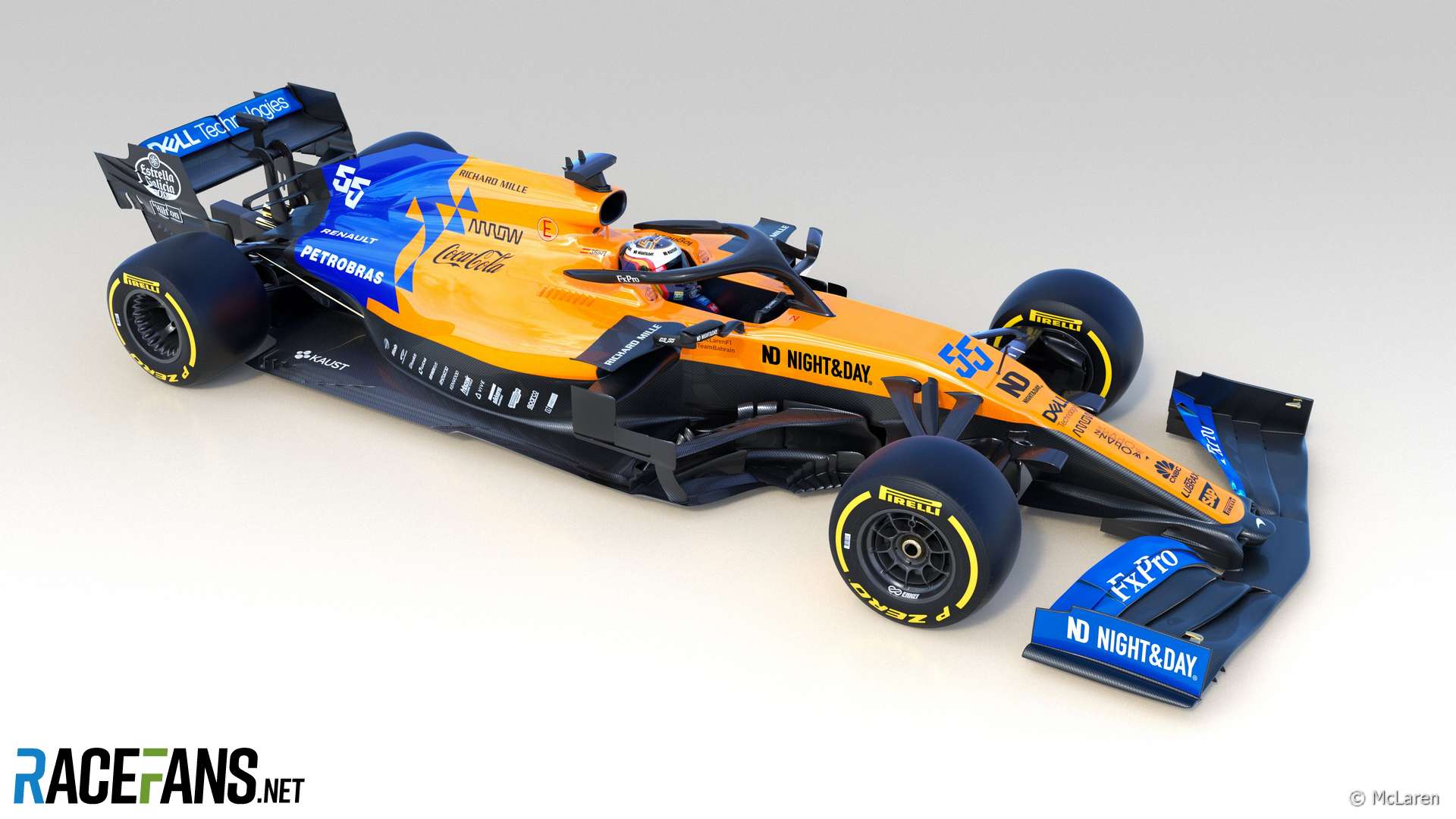
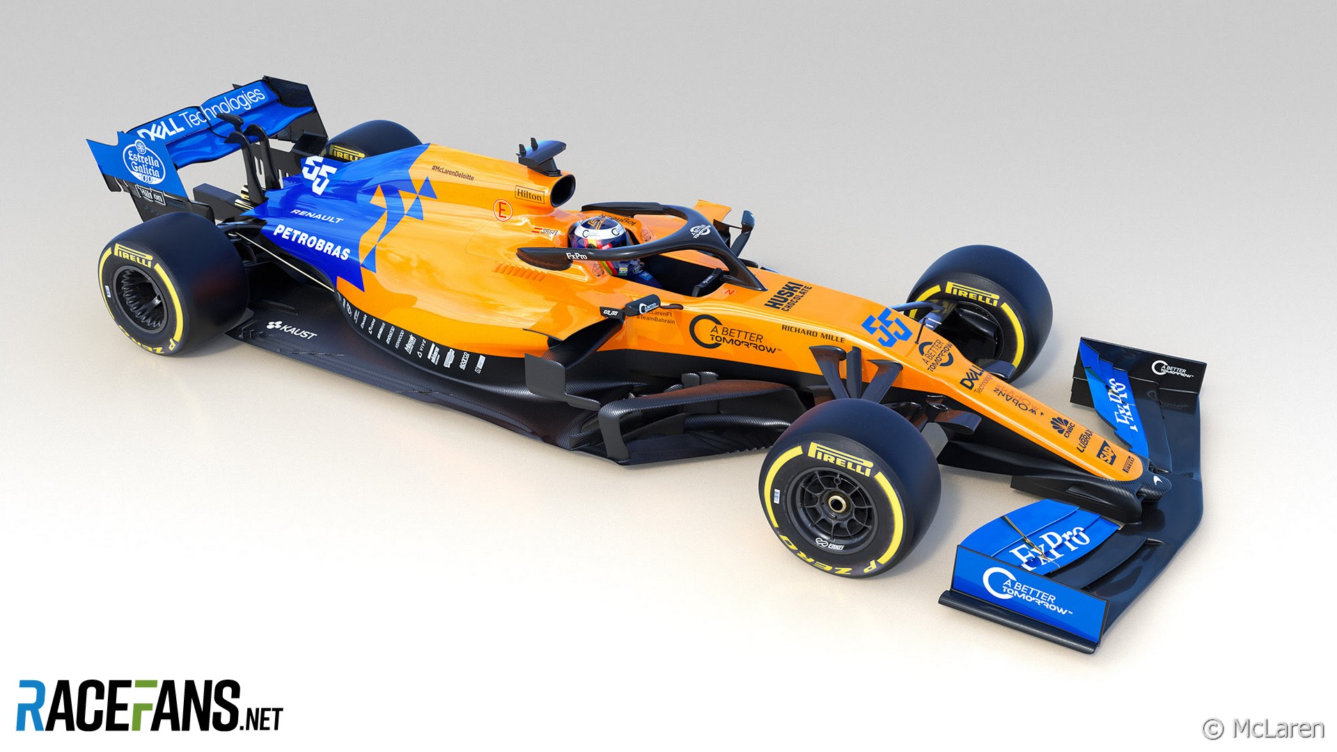
McLaren has revised the livery on its MCL34 for the remaining races of the 2019 F1 season.
The team has revealed a modified “stealth” look for its car following the resumption of racing after the summer break. The orange and blue coloured areas of the car have been reduced in favour of more black, notably on the front wing, rear wing endplates and sidepod vanes.The team is also running the branding of Belgian shop chain Night and Day this weekend. The logos appear in the positions previously occupied by British American Tobacco.
The team’s BAT branding has previously been swapped in favour of other sponsors due to sensitivities around promoting the tobacco brand’s ‘A Better Tomorrow’ campaign in certain markets. Travel retailer Dufry occupied the same positions during the Hungarian Grand Prix weekend and transportation network Lyft’s logos appeared at the previous round.
This article will be updated.
Advert | Become a RaceFans supporter and
2019 F1 season
- Crying in the Melbourne car park at 2019 grand prix was my career low – Ocon
- McLaren Racing reports reduced £71 million loss in 2019
- Kvyat: Hockenheim podium last year was “my biggest achievement” so far
- How the FIA’s new encrypted fuel flow meter targets Ferrari’s suspected ‘aliasing’ trick
- “He smashed my office door”: 23 must-see moments from ‘Drive to Survive’ season two
James
29th August 2019, 11:53
What? Why? I can only think for sponsorship reasons but really can’t work out the benefit… A designed justifying his existence?
falken (@falken)
29th August 2019, 13:34
Why ? Because it’s harder to make out the design in spy shots if it’s black on black.
DAllein (@)
29th August 2019, 11:56
Of course tastes differ, so someone will be disappointed, but as for me – good.
I am not a fan of their orange livery, so the less it is – the better.
Dewald Nel (@ho3n3r)
29th August 2019, 14:04
Agreed. Besides the nostalgia factor, the papaya is pretty ugly as a color on a racing car.
Aussie Rod (@aussierod)
29th August 2019, 11:57
My first impressions were ‘hey that looks pretty cool’. Then I scrolled down to the original livery and could barely spot the difference…
It’s clearly been a long summer break.
Joao (@johnmilk)
29th August 2019, 11:58
McLaren have finally fot their shade of orange right
MrBoerns (@mrboerns)
29th August 2019, 15:59
Jeez Louis that would be one ugly car if you could actually see all the gory clunkiness hidden in the black paint though
Kamto
29th August 2019, 12:07
Same thinking as the Williams bosses- using black/carbon to hide the lack of sponsor-logos. I don’t understand why they are so reluctant to put the McLaren logo on the side pods to fill the empty space. The team has been so lack of direction and it reflects on the livery as well.
Miguel Sampaio (@gordess)
29th August 2019, 12:31
Actually I don’t think that’s the idea. If you look closer, the parts where the addition of black is more prominent are the wings, in which they reduced the blue but the sponsor logos size is the same (they’re basically just confined to a smaller space). Apart from that, they raised the heigth where the black ends and the orange starts (but very slightly so it’s basically the same) and put more black at the rear end of the car (where there never are any sponsors). So I really think they just wanted to reduce the blue and orange because they can.
And regarding to your “lack of direction” comment, let’s face it, they are back on track! They’re the 4th best team and improving, hopefully in a couple of years we can se McLaren back at the front!
Kamto
29th August 2019, 12:46
Not sure I agree with you but I take your point about the livery.
While I think Seidl looks a good appointment, McLaren being clear 4th at the moment seems to me it’s as much to do with other teams faltering badly then them being that much better. Renault, Racing Point and Haas are all worse then they were last year. And the gap to the top 3 is still massive. Of course McLaren challenging the top team would be good for F1. Only time will tell I suppose.
Miguel Sampaio (@gordess)
29th August 2019, 12:21
This is one very tricky game of “spot the difference” XD
RB13
29th August 2019, 14:24
Genuinely can’t see any diff asideom from some different logos which varies race to race anyway quite often.
Alec Glen (@alec-glen)
29th August 2019, 12:22
I think this is all about hiding the aero devices they’ll be using/testing over the second half of the season.
Hugh (@hugh11)
29th August 2019, 12:46
Old one looks great. This one looks great. Although I do slightly prefer each of the changes made to the newer one.
Tyler Smith
29th August 2019, 13:33
All I can see is the mid-2000s Renault.
Hakk The Rack
29th August 2019, 14:50
Oh well, still looks great.
erikje
29th August 2019, 17:45
More black =less ugly.
Better performance and better style. Way to go, McLaren
Jockey Ewing
29th August 2019, 18:24
i dont like it. as if it ‘d be cut half
probably its for hiding details
Duncan Snowden
30th August 2019, 0:05
Because nothing says “stealth” like papaya orange and electric blue.