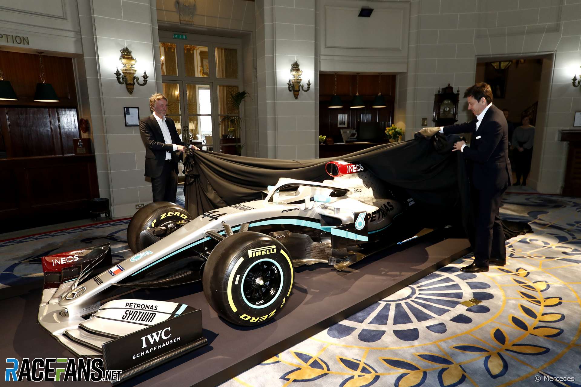
Mercedes has presented its new livery for the 2020 F1 season at an event in London.
While the basic look of the world champions’ livery remains unchanged, the team has added two new sponsors during the off-season. One of these, new long-term partner Ineos was revealed a today’s event in the Royal Automobile Club.AMD, previously a sponsor of rivals Ferrari, has also joined Mercedes. The team will reveal its new car later this week in a private event at Silverstone.
The team’s new look was presented on last year’s car, the championship-winning W10.
Pictures: 2020 Mercedes F1 livery launch
This article will be updated
Advert | Become a RaceFans supporter and
2020 F1 season
- Pictures: Wrecked chassis from Grosjean’s Bahrain fireball crash to go on display
- Bottas vs Rosberg: Hamilton’s Mercedes team mates compared after 78 races each
- F1 revenues fell by $877 million in Covid-struck 2020 season
- Hamilton and Mercedes finally announce new deal for 2021 season
- F1 audience figures “strong” in 2020 despite dip in television viewers


HUHHII (@huhhii)
10th February 2020, 11:58
Not a fan. Also a shame that they dropped the red star. Thought it was a nice tribute to Lauda.
Keith Collantine (@keithcollantine)
10th February 2020, 12:01
@huhhii They haven’t, it’s still there.
Warner (@warner16)
10th February 2020, 12:04
@huhhii No the red star is still there on the car. It’s very much in an identical spot as to where it was last year on the car next to the driver number on the fin tale.
RB13
10th February 2020, 12:15
Don’t usually agree with @huhhii on anything but from those pictures even at full size you really can’t see the red star.
Hakk The Rack
10th February 2020, 12:32
3rd picture above the guys head, left to the 44 number.
RB13
10th February 2020, 12:42
It’s really hard to spot now:
https://twitter.com/MercedesAMGF1/status/1226846856241729536
George O'Donnell (@georgeod)
10th February 2020, 11:58
It looks pretty similar to last year (and the year before that, and the year before that…)
DeanR
10th February 2020, 12:09
Like Ferrari then
Tomcat173 (@tomcat173)
11th February 2020, 3:58
@georgeod If not for small splash of red due to Ineos, is it exactly the same as last year??
Pedro Andrade
10th February 2020, 12:03
Yawn….
Adam (@rocketpanda)
10th February 2020, 12:08
Predictably corporate and dull, to be honest. Not sure why they bothered doing a ‘reveal’ as the red bits for Ineos barely make a huge difference.
Pironi the Provocateur (@pironitheprovocateur)
10th February 2020, 12:17
What a great surprise.
Pironi the Provocateur (@pironitheprovocateur)
10th February 2020, 12:35
Looking at the details, the red doesn’t go too well with the rest of the livery, especially teal. These bits will be distinctive in their F1 history compared to their previous challengers but overall it’s rather uninspired and tasteless.
MrBoerns (@mrboerns)
10th February 2020, 12:23
the silver bit really caught me off guard
Sham (@sham)
10th February 2020, 14:01
I don’t often, as I’m a grown up, but LOL
eljueta (@eljueta)
10th February 2020, 12:23
Gray and dull just like the parent company.
G (@unklegsif)
10th February 2020, 12:30
All these negative comments…. man alive!
These events are put on as marketing opportunity for the new partners, not for your gratification or amusement. And what do you want Mercedes to do, change decades worth of sporting heritage and change the colour just for your pleasure
There is a reason that I rarely read past the bottom of online articles and into the comments, and this just supports it
MrBoerns (@mrboerns)
10th February 2020, 12:37
@unklegsif Well, of course no one expects Merc to change colours. We’re just pointing out that, with everyone on the planet already knowing what the livery is going to look like, it is beyond silly to have a seperate event to launch the livery.
G (@unklegsif)
10th February 2020, 13:09
Its a launch event for the new partners, not the livery itself
Pironi the Provocateur (@pironitheprovocateur)
10th February 2020, 12:39
Forgive us, my lord, it’s surely unpleasant to descend from the Olympus but try to see the things you see. There’s a great disturbance in the colour spectrum right in front of your vision, a colour combination that is hard to justify.
RB13
10th February 2020, 12:46
It’s not the color, but for example look at the 2017 car with the ‘electric’ effect on the front wing through to bargeboard section. Last year they innovated a bit with the stars and gradient on the back. Well the former is now just plain simple teal lines and the latter is more prominent silver and less gradient. The whole thing just looks more vanilla.
Don’t throw a strop at people having an opinion on DESIGN, one of the most subjective topics there is @unklegsif
Phylyp (@phylyp)
10th February 2020, 16:12
Your first para sums up my feelings about the livery very well, the teal Petronas line is boringly plain compared to its earlier incarnations.
Pedro Andrade
10th February 2020, 13:29
@unklegsif They could take the a cue from Renault, who have maintained their corporate colours while changing designs throughout their history…
Qeki (@qeki)
10th February 2020, 16:13
Well I was also hoping for a change for that color scheme and it would please eyes and mind to see something totally unexpected. But as a big worldwide corporation why would they change that livery that they are known for and it’s easy to sell that. If they would change the livery it would mean also changing all the other things (like clothing, fan products marketing things etc.) and that’s not a cheap thing just to change colors of two cars.
Yes it would be great but some could argue why don’t change Mercedes to Mergedes. It’s much more than a color scheme change.
Only Facts!
10th February 2020, 12:36
With new sponsors joining in, they can survive on a reduced Daimler’s quota after the budget cap gets in place.
Ineos deal now stretchs all the way to 2025, along with PU regulations. That’s the new checkered flag for most manufacturers to make their minds, I think.
Hamilton and Vettel now the only question marks for 2021?
Pironi the Provocateur (@pironitheprovocateur)
10th February 2020, 12:42
Hamilton will sign for two more years, Vettel for one more. If he won’t defeat Leclerc this year, his move (possibly to McLaren from 2022) will be on the table.
RocketTankski
10th February 2020, 12:43
eww! hideous that floor is
Dutchguy (@justarandomdutchguy)
10th February 2020, 12:44
RED?!? On a Mercedes?!?
sacrilege
feelings aside, I don’t like the red. doesn’t work with the teal and throws the whole thing off balance. The rest of the livery is similar to last year’s – which was a good livery – but this doesn’t look very good. I know it’s the sponsor’s corporate colour, and there’s a good reason it’s there, but it’s ugly. Kind of reminds me of some of the Total branding on the Renault/Lotus cars
MrBoerns (@mrboerns)
10th February 2020, 13:01
i have the strongest feeling that everyone would commend them on the red if they labeled it as a tribute to Niki
Dutchguy (@justarandomdutchguy)
10th February 2020, 13:29
Not only would they have used a different (brighter shade), it would get old eventually. It might be like that on the short term – and it was, like we saw last year in Monaco, but after ditching the red halo after 1 race, it might not be recieved as well as you seem to expect. (I’m not saying it would be poorly recieved, I expect a somewhat lukewarm reception, especially if it coincides with a major sponsor deal)
P.S. Honestly, the red halo was ugly too. It was a nice gesture, but it wasn’t pretty
GT Racer (@gt-racer)
10th February 2020, 13:07
@justarandomdutchguy
Not the first time, They ran with red numbers on the cars in the 50s.
https://i.pinimg.com/originals/01/b5/62/01b562500f6f14f83e685ce2ee75f2c0.jpg
https://c8.alamy.com/comp/PHW2R6/mercedes-benz-w196-formula-one-racing-car-produced-by-mercedes-benz-for-the-1954-and-1955-f1-seasons-at-goodwood-festival-of-speed-PHW2R6.jpg
Dutchguy (@justarandomdutchguy)
10th February 2020, 13:25
I get your point, but the red numbers are overall a different kettle of fish than the red bits and pieces on the rest of the car. They ran red numbers from 2010-2018 too, and I’d welcome those back in a heartbeat.
Red endplates, airpods, etc.
sacrilege
jamt
10th February 2020, 14:40
A livery not so innovative neither beautiful as the last years, but a beautiful livery does not make car faster, its quite the opposite. Anyway, its looks like the car number 44 its becoming redder even faster than everyone thought..
I miss the old days when the drivers were the one sitting on the tyres
SaturnVF1 (@saturnvf1)
10th February 2020, 15:15
Only slightly worrying they’re revealing their new sponsor livery in the same room Haas unveiled their Rich Energy livery last year.
Phylyp (@phylyp)
10th February 2020, 15:27
@saturnvf1 – I didn’t realize that, nicely spotted. I now recognize the floor, having gone up and checked!
Phylyp (@phylyp)
10th February 2020, 15:18
Oh, Mercedes, what have you done? It used to look so good, and now it’s just… meh.
Not a fan of the solid teal Petronas line, I liked it when it had a “glow” to it, an faded into the silver.
The red airbox, I presume that’s due to Ineos? If so, that’s fine, sponsorship rules.
(BTW, I’d say we’re allowed to complain about the Merc’s livery in particular. After all, it’s the car the TV director is going to show us the most!)
Tomcat173 (@tomcat173)
11th February 2020, 4:03
@phylyp Nicely spotted, couldn’t agree more.
Maybe Mercedes are sandbagging with their livery? Similar to how they will “sandbag” their chances for winning the championship before the season starts, and claim they’re not the favourites.
hellothere
10th February 2020, 15:18
boring and awful
John H (@john-h)
10th February 2020, 15:25
Another oil and gas sponsor… great.
Rick D. (@partsguy20)
10th February 2020, 15:41
Whether or not they intended it as a tribute to Niki, I like that the car looks like it’s wearing a red cap.
The rest of it is predictable. Not bad, they’re not my favorite team anyway, but what did people really expect they were going to do? A team that calls itself the “Silver Arrows” has to have a predominately silver car, and it’s a clear evolution of their previous designs (just like every year has been). There was never going to be anything exciting about this reveal!
Hans Herrmann (@twentyseven)
10th February 2020, 15:59
I like it.. Considering that a dramatic livery change wasn’t a possibility.
The white in the center looks very bright and dazling under those lights and the usual teal swoop gives it a curvy sleek look..
Maybe my expectations were too low to begin with..
DonSmee (@david-beau)
10th February 2020, 16:29
It will look beautiful once it wins!
Niefer (@niefer)
10th February 2020, 17:01
Hope they’ll bring another car to develop the livery.
erikje
10th February 2020, 21:48
It’s a Mercedes, what did you expect.
Sattalyte (@sattalyte)
10th February 2020, 23:38
I think the Merc Silver is pretty iconic by now. I’m used to, and it works well. The new red parts are rather jarring though, and don’t match the colour scheme. I think last years was better.
Gabe
11th February 2020, 1:12
OMG IT’S SILVER!!! HI HO!!!