


Professor Peter Stevens is one of the world’s most sought-after automotive designers, having penned the McLaren F1 road car, which marked a paradigm shift in high performance cars and remains highly influential and acclaimed.
He also designed a number of high-performance vehicles, including the Jaguar XJR-15, Prodrive’s Subaru World Rally Championship-winning car, the Lotus Esprit Mark Two, Lotus Excel and Elan SE as well as BMW’s 1999 Le Mans winner. Less known is that he designed race-car graphics and liveries for Formula 1 teams – including Brabham, Benetton, Prost and Arrows – for Jaguar’s Le Mans winners, and for touring car projects.“I heard Brabham had secured a new sponsor [in Parmalat],” recalls Peter of his first F1 livery gig in 1978, “so I called Bernie [Ecclestone] up, introduced myself and asked whether he would like some new ideas. He said, ‘Get down here by 12’.
“I presented myself and Bernie said, ‘Yeah. Just what we want. We’ve got a bit of trouble actually,’ and took me to the workshop. There’s Niki Lauda, and he’s stomping around this car. It’s light green, dark green, yellow, red, blue, white, gold. Niki said, ‘Bernie, what the hell is this? I ain’t never going to drive a car looks like shit. And this looks like shit.’
When Brabham decided they were going to do in-race refuelling they used aluminium, high pressure ‘beer cans’. “There were these horrible things that looked like they had fallen off the back of a truck. Bernie said to me, “Come have a look.’ I said, ‘You have to have those anodised blue because they just look awful.’ Bernie said, ‘Herbie [Blash, team manager], have those anodised blue.’ Just like that.”
When designing liveries Stevens starts by asking asks himself: Why would people do it? From the team point of view, it’s for the money, but what is it that the sponsor wants to get out of?
“One of my criticisms when I first looked at the Benettons [in 1997] was that they looked like part of a fairground ride, and I asked why they wanted that. A lot of people go into sponsoring cars because of the high profile and the high worth of everything around Formula 1, but it only works if a car exudes that sense of quality and style. Otherwise, it’s a bit of a mystery to me why people would do it.”

His PSD LLP consultancy is currently involved in the design and conceptualisation for a variety of vehicles for home and international markets, while recent (embargoed) projects include low-cost vehicles for developing countries and inner city streets, and high performance electric race car and road vehicles.
He writes internationally on design matters, races a vintage Ford Dry Lakes Hot-Rod, and makes excellent Sloe Gin. With the first cars of the 2021 F1 season due to appear next week, RaceFans asked him to rate modern livery designs. Here are his thoughts.
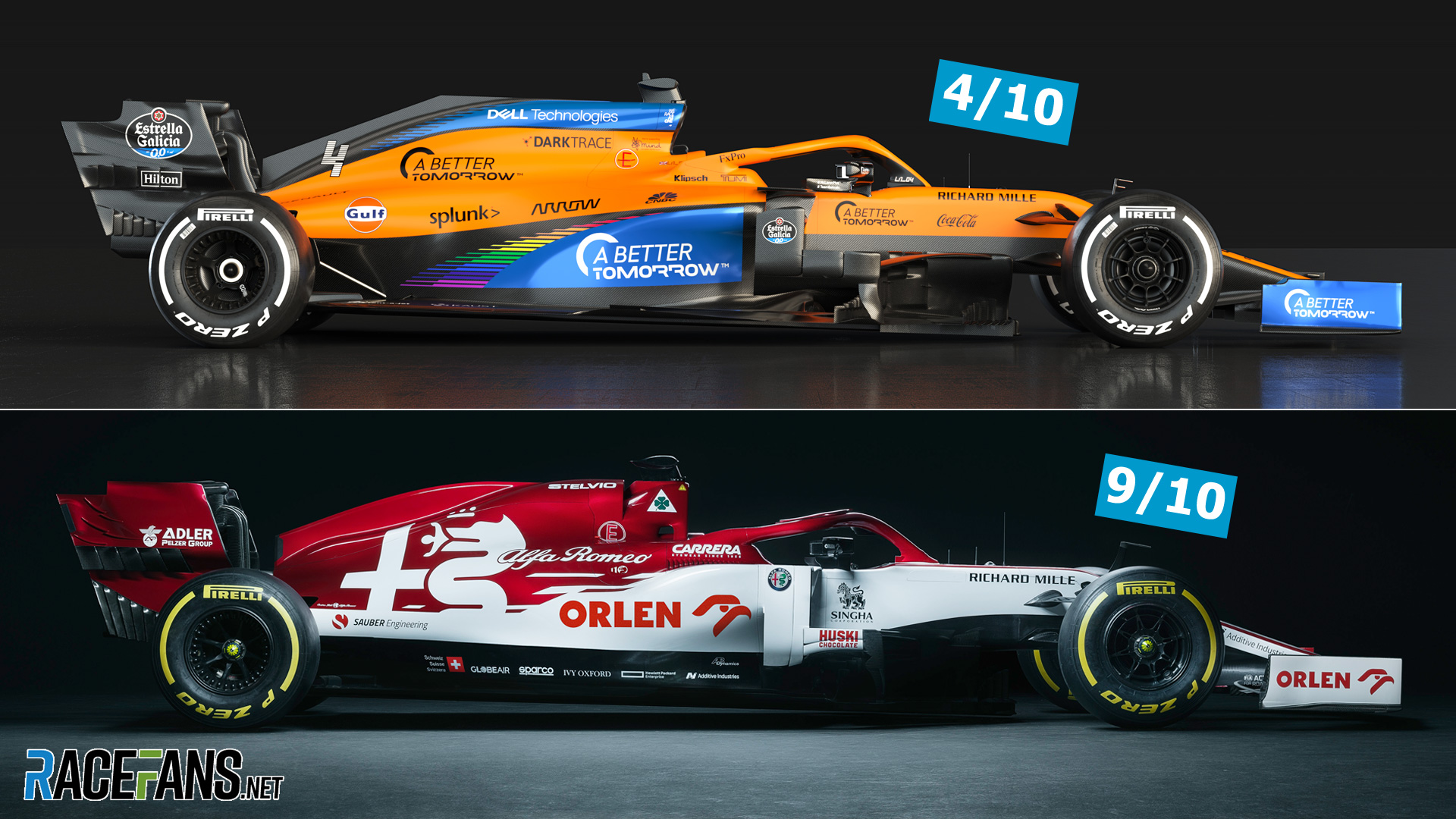
Alfa Romeo
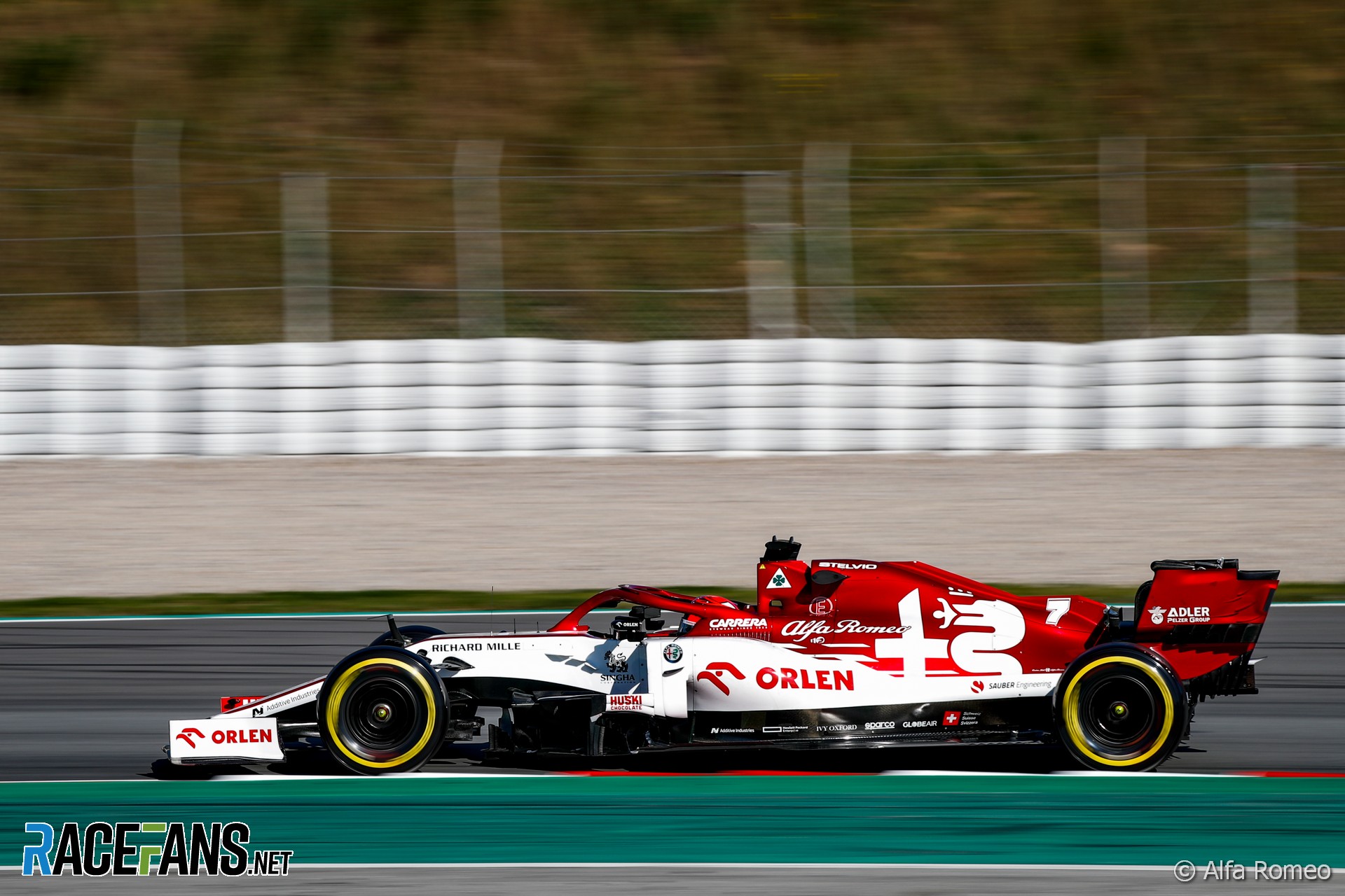
“The thing about Alfa Romeo is they hadn’t been in Formula 1 [since the mid-eighties], so it has to be a very clear, straightforward message. It works well on TV, because of the fleeting moment that you have to register what you’re seeing.
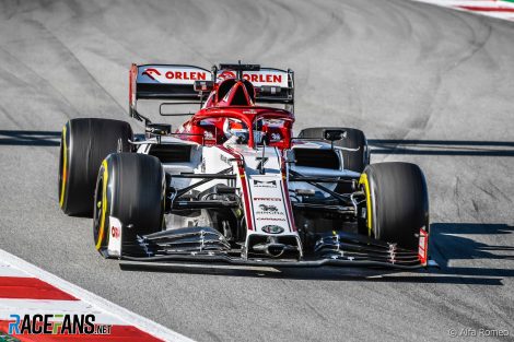
“The metallic red works really well in sunlight, which interesting because it’s not really Italian racing red. They’ve given it that metallic edge, which makes it really stand out. In the past Alfas were a darker red, more kind of brooding red.”
Stevens credits Marlboro – Alfa Romeo’s early eighties title sponsor – for the change from 1950s scarlet to the edgier red used from 1980-83: “(Parent) Philip Morris was pretty good; some of those companies had a culture of good graphics which they brought with them to Formula 1.”
Stevens’ rating: 9/10
AlphaTauri
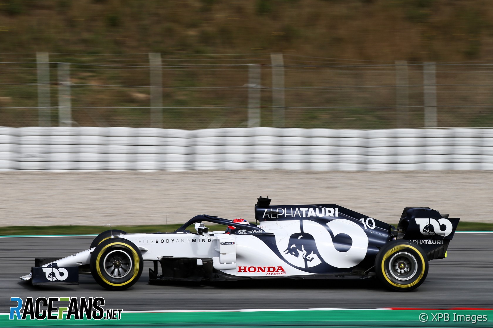
“I have a problem, because if I like a team, then I may be a little more likely to like the graphic presentation – and I like that team. It’s cool. That [Monza 2020] win was just a knockout.
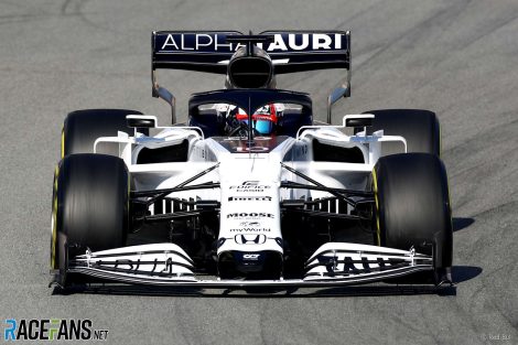
“People recognise the Red Bull connection instantly. Whether that will happen with the clothes is a separate marketing thing, but from a visual point of view doesn’t need to worry us. There’s no doubt, you know, it looks good on the grid.”
Stevens draws parallels to the inverted blue/white Brabham liveries he designed during the eighties, and leaves no doubts that the AlphaTauri graphics are amongst his favourites.
“Dark blue and white, those were our two colours, and anything on the white would be dark blue, and anything on the dark blue would be white. That was it.”
Stevens’ rating: 9/10
Ferrari
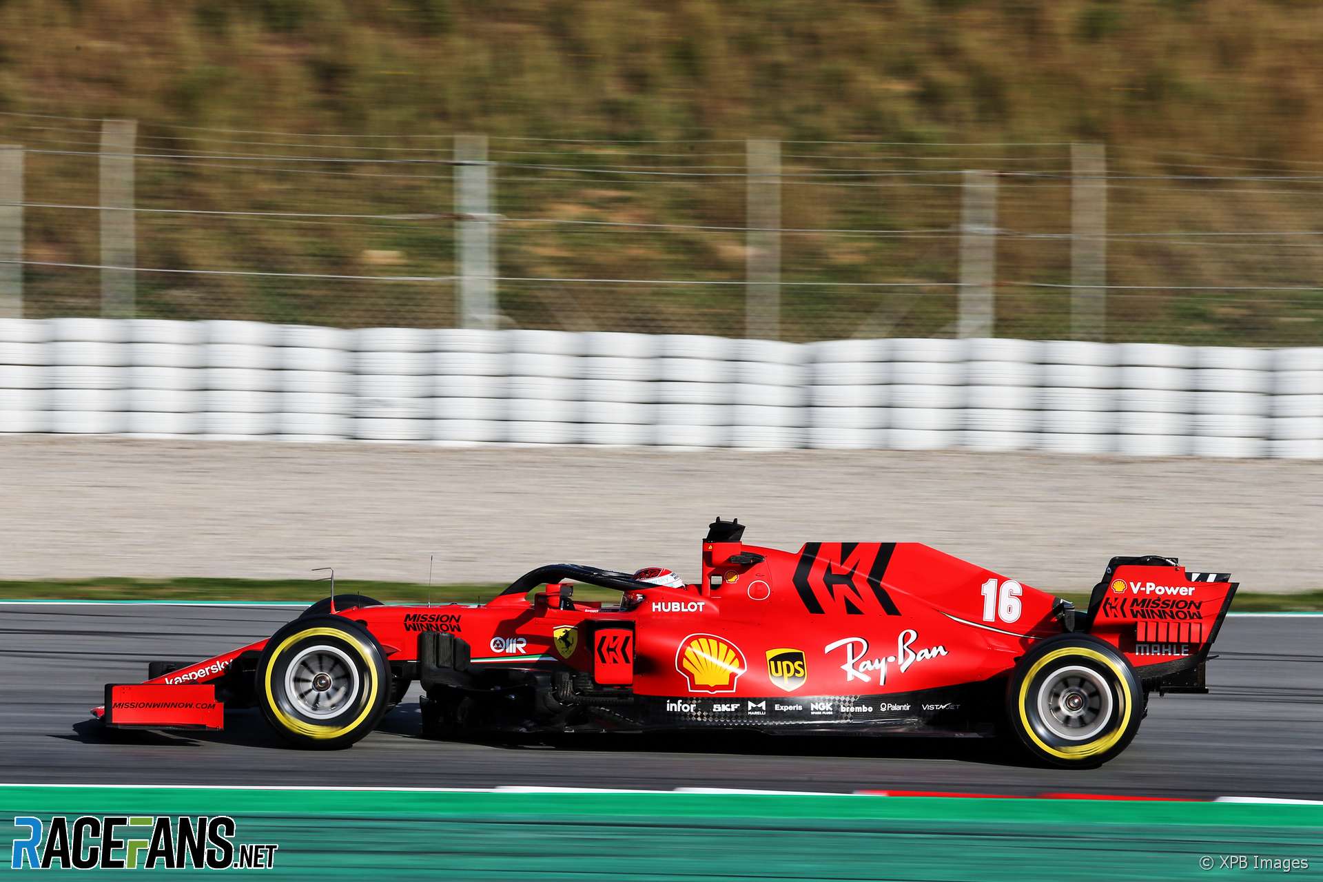
“Ferrari, yeah, it’s Ferrari, it’s red. It’s almost like it’s a matter of ‘It’s red; job done’. But that isn’t really the case because you have Ferrari, it’s an expensive thing they’re marketing, and just painting the cars red doesn’t give the same imagery you get from the road cars, which are kind of gorgeous and expensive and nicely detailed and well built.
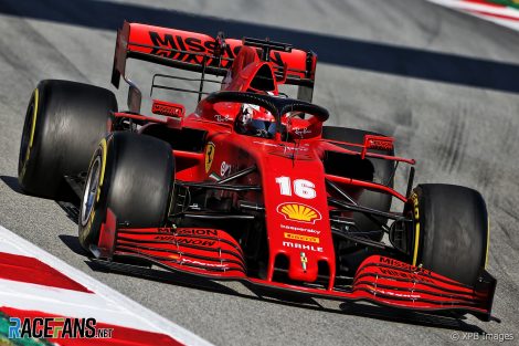
“[The livery] relies on stickers, Shell and UPS. The Rayban [logo] looks cool because it looks almost like it was done by hand, like when sign painters did the cars. Once UPS is a sticker, it’s a sticker. It undermines what I think UPS wants the message to be – we’re fast moving, modern, we understand all this stuff – not ‘We give you some money, and you put a sticker on the car.’
“The matte red – once it’s matte it’s sort of dead, and you can’t read the shape. Which is a good thing if you think the shapes are awful [or you’re hiding things], but at the same time there’s a sensuousness in the shapes that tells you it’s powerful and efficient and all those things. If you hide it with the matte, there’s nothing on the Ferrari to tell you the shape. But, we’d be in trouble if we didn’t have a red car on the grid…”
Stevens’ rating: 5/10
Haas
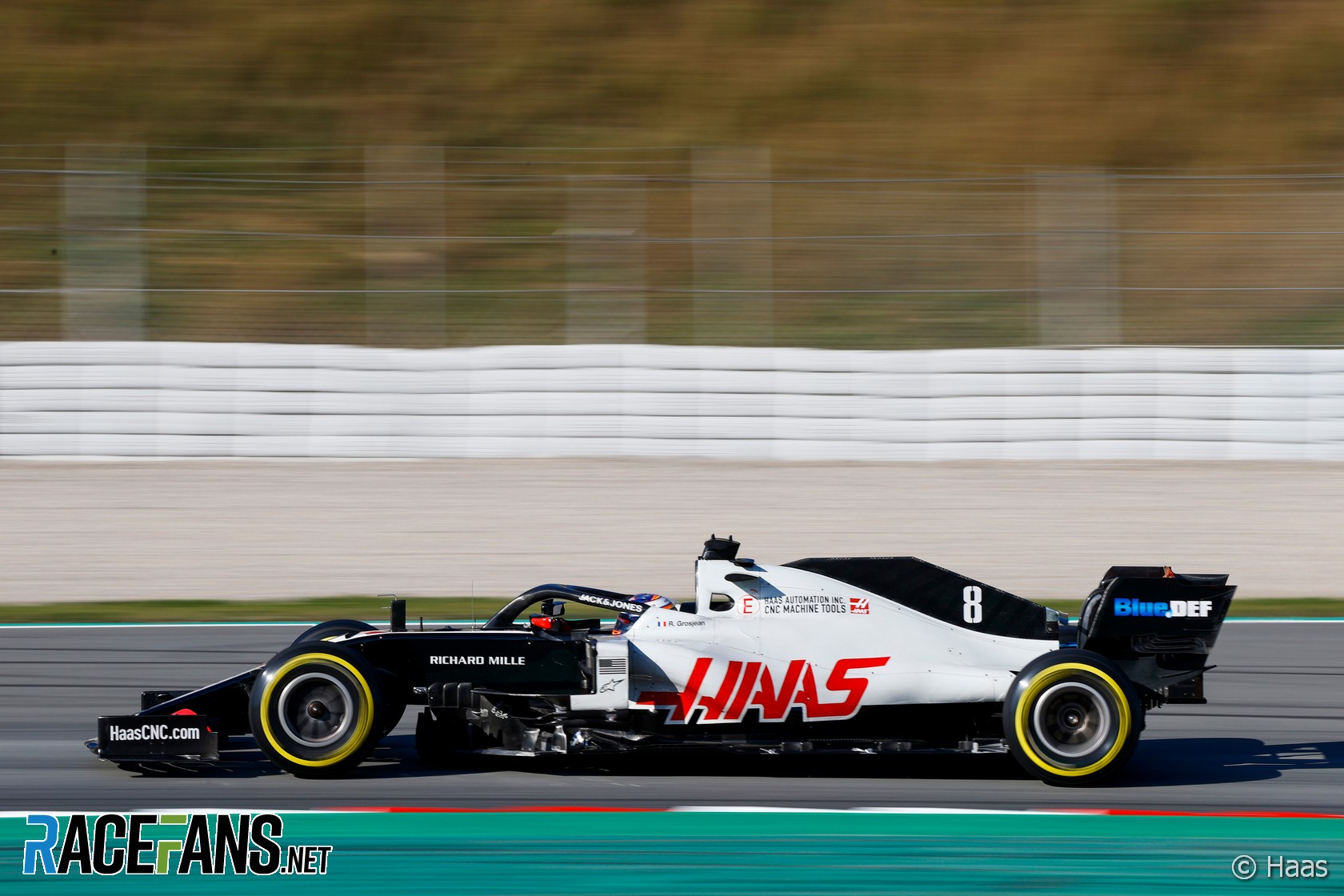
“It’s kind of funny, a black front of the car and a white back of the car. It looks stationary because if you just divide it in these two sections ahead of the radiators, it all goes black because in the side-on views you don’t see the little white [stripe] down the nose.
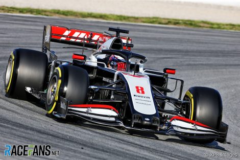
Stevens picks up on the industrial grey colouring font – apt given machine tools are the product advertised. “It’s like the lettering was done with some kind of machine tool, a milling machine. There’s an angle to those letters, you could pick up on the angle [for the rest of the livery]. That’s so strange, people don’t pick up on the bit they have.
“It’s a great brave effort, and I could find myself saying, ‘They’re really in at the deep end, and they can’t really swim terribly well so maybe it’s okay’. But I don’t, because when you have a car that looks ugly, I kind of analyse it in my mind as to why it’s ugly. But people who just look at it just say ‘that’s ugly’, and they don’t need to examine why.”
Stevens’ rating: 2/10
McLaren
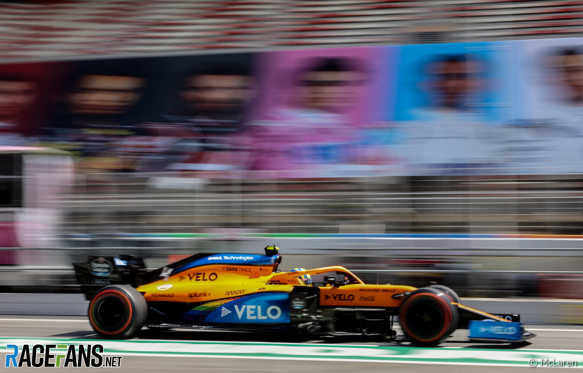
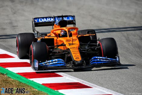
“I used to lay masking tape lines on a car, follow the shape of the car. I used to love doing that, because then I’d look along the tape and tweak it so it flowed with the surface. When I look at the McLaren now, between the blue and the orange on the airbox, that junction line in the side view just kind of wanders about. Same on the side pod: the join lines wander about for no reason.
“[It also depends on] whether you think blue and orange go together, I can’t really argue against it. It’s a subtle range of colours. But the number they put on the fin, it drives me bonkers! They’ve just stuck on a colour, like a club racer.”
Stevens’ rating: 4/10
Mercedes
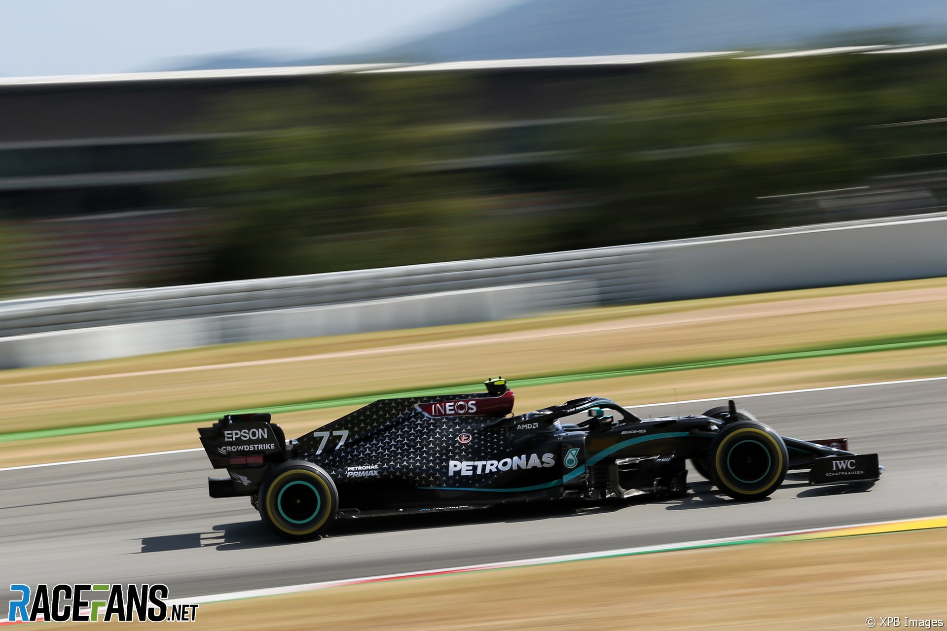
Having run their usual silver livery in pre-season testing, Mercedes unexpectedly switched to a new black colour scheme when the 2020 season began, recognising their commitment to promoting diversity and tackling racism.
“But the bit I really don’t like is that red sticker on the airbox that says, ‘Ineos’ – an afterthought beyond belief. Something that looks like an afterthought never gains the value that there should be in being involved in Formula 1. Having previously been involved with Guy Edwards [known for his last-minute sponsorship deals] it said to me, ‘Oh, somebody rushed up with some money at the last moment, so we’ll stick it on here…’
“The little silver three-pointed stars, that’s a nice thing. But it’s a thing for still photography because you really don’t see it on the circuit, certainly not at speed. But the car, it’s a very strong image and there’s no doubt in a crowded field you really do it pick out. The two things you pick out are the pink [car] and the black theme. If you look far enough down the grid, you might see red…”
Stevens’ rating: 6/10
Racing Point (Aston Martin from 2021)
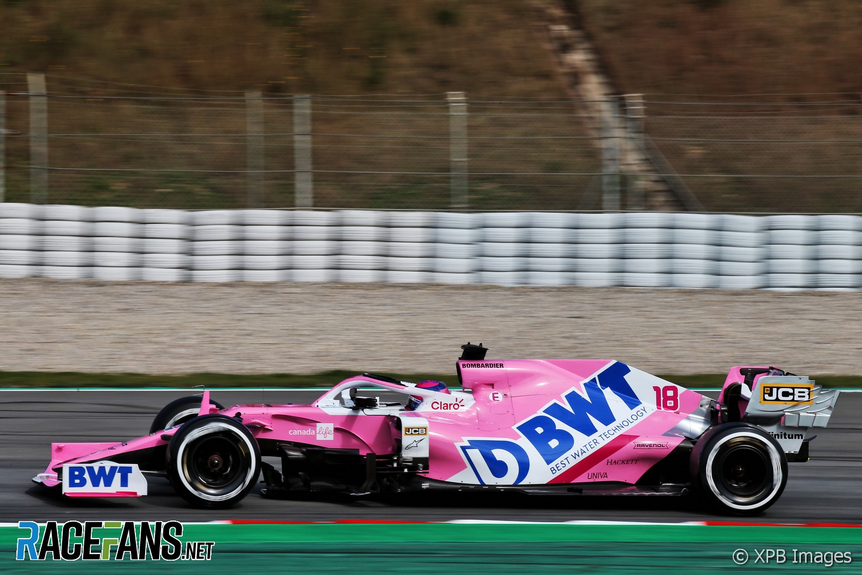
“I think it’s because people don’t really think sufficiently strongly about what they are trying to achieve. Either BWT said ‘Yeah, we love it’ for reasons which are quite obscure, or the person at Racing Point said, ‘That’s what it’s gonna be like.’ Neither of those are good reasons for doing something so untidy.”
The team races under the Aston Martin banner from this year – likely in British Racing Green – which Stevens finds concerning: “I never thought that green actually works that well on TV. What’s interesting is that people rarely, if ever, launch a [road] car in green. Even Aston Martin and Jaguar don’t launch in that. It’s not a colour that jumps off the page.”
Stevens’ rating: 2/10
Red Bull
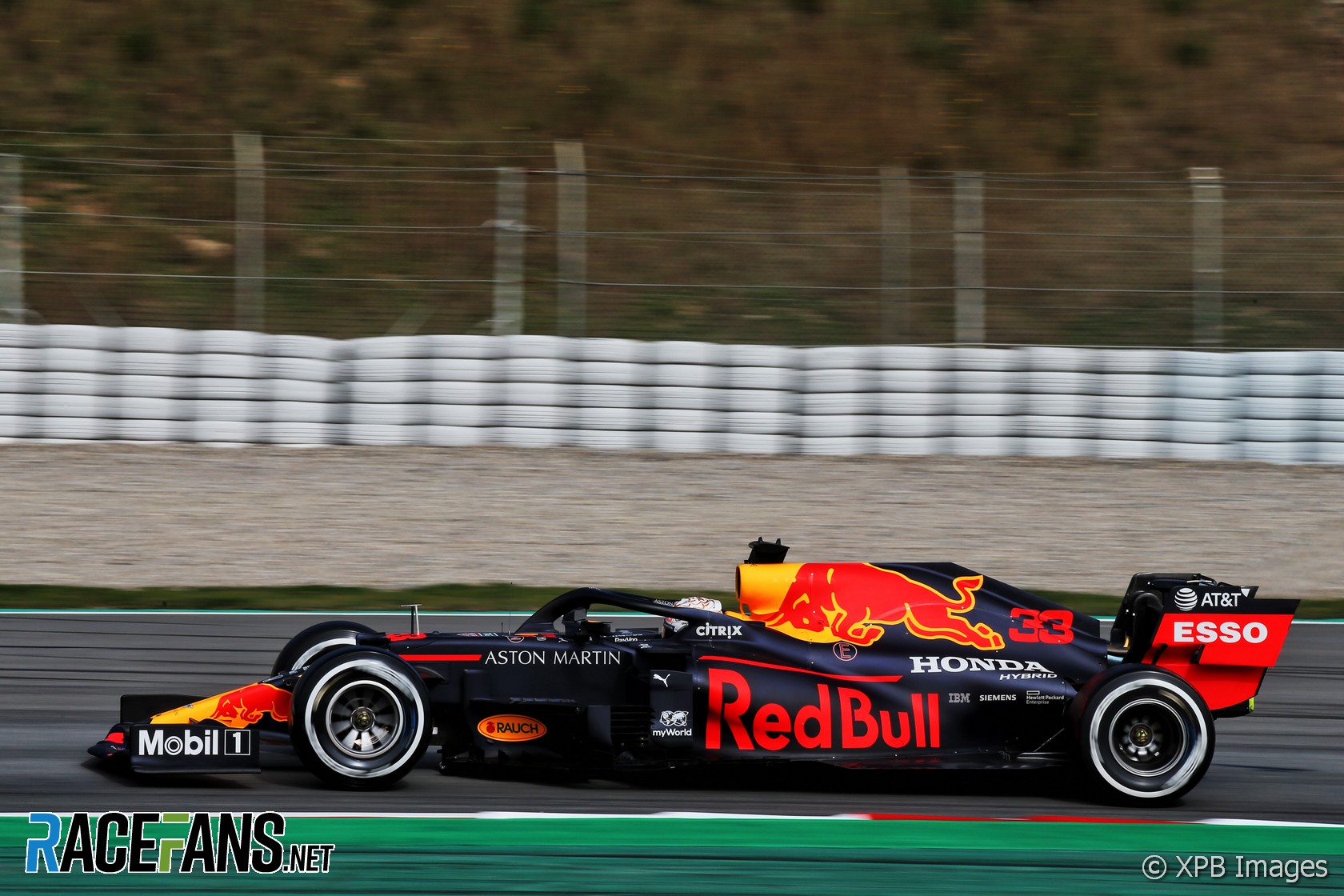
“One of the strongest [liveries]; the way Red Bull handle their graphics it’s obvious somebody knows what they’re doing. There’s an overhead shot of the Red Bull and the letters on separate elements of the front wing could just have ‘ED’ and ‘BU’, and everybody would know it’s Red Bull. That’s a real mark of success, and the bull itself in yellow is just so strong.
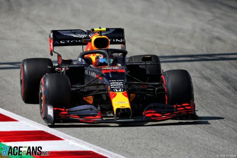
“It’s neat that they use the same red for numbers as for Red Bull. They don’t impose a different colour, and all that thinking really works pretty darn well. It’s cohesive, and quite cunning because it hides all of (designer) Adrian Newey’s tricky bits. It’s a lesson in hiding the interesting bits.
“But the Aston Martin looks weedy on the rear wing, it’s kind of weak. This car says ‘Red Bull’ and suddenly the rear wing sticks its hand up and says in a squeaky voice, ‘Hello, I’m Aston Martin’.”
Stevens’ rating: 8/10
Renault (Alpine from 2021)
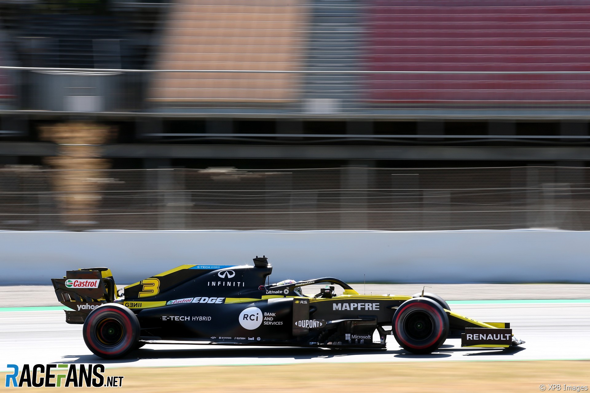
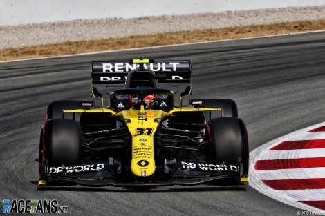
“It’s a shame because I’ve got friends in design at Renault, and they told me they don’t really have a say [in F1 livery design], which they did in that concept, of course. That black and yellow was good.
“Anyway [in 2021] it’s going to be Alpine, which is a wonderful blue. It’s all about marketing business, but I can’t, at the moment, see what the marketing advantage is by calling it Alpine instead of Renault.”
Stevens’ rating: 3/10
Williams
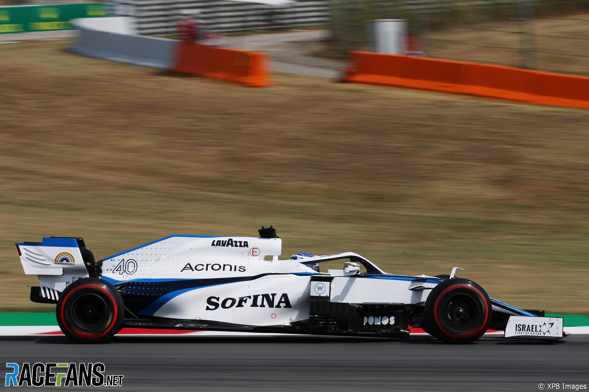
“I’ve watched the downs and downs of Williams, and it’s just colours on a car here. Frank never panicked, but [the livery] represents panic within the company: ‘We’ve got to make it look like this, put some stuff on it.’ It’s a shame, I was sad every time I saw it because I wanted it to look better and go better.”
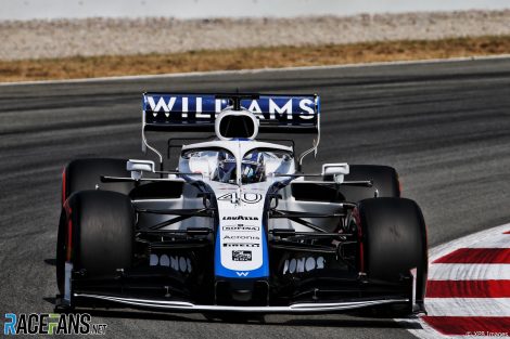
“The tricky bit is they don’t attract me to go and find out who they are,” says Stevens. “The car has to look confident. During that period when McLaren didn’t have many sponsors, it exuded a lack of confidence in what they were doing. I’d hoped they’d have realised ‘we’ve got to make it look like we have all these good sponsors.’ But somebody did a marvellous job to get some sponsorship on there.”
Stevens’ rating: 4/10
Join the RaceFans Supporters Drive!
 If you've enjoyed RaceFans' motor sport coverage during 2020, please take a moment to find out more about our Supporter Drive.
We're aiming to welcome 3,000 new Supporters to help fund RaceFans so we can continue to produce quality, original, independent motorsport coverage. Here's what we're asking for and why - and how you can sign up:
RacingLines
- The year of sprints, ‘the show’ – and rising stock: A political review of the 2021 F1 season
- The problems of perception the FIA must address after the Abu Dhabi row
- Why the budget cap could be F1’s next battleground between Mercedes and Red Bull
- Todt defied expectations as president – now he plans to “disappear” from FIA
- Sir Frank Williams: A personal appreciation of a true racer
Kyle S
10th February 2021, 12:25
He’s entitled to his view but I disagree with many of assessments… beauty truly is in the eyes of the beholder I guess!
Take for example the Renault:
It’s been designed to look yellow when viewed from the front, but black when viewed from the side. It’s clever. I think Sean Bull did a great job designing this (as he has with the new Red Bull DTM liveries)
Kyle S
10th February 2021, 12:26
That McLaren livery would be my pick of the bunch too!
I love the colours.
BasCB (@bascb)
10th February 2021, 14:26
I too like the colours of the McLaren livery. But I agree with Stevens’ assessment that the execution is not quite there. I think the livery could look a lot better using the same colours and more or less the same basic scheme.
SadF1fan
10th February 2021, 12:50
Yeah, except that renaults clever livery is already 3 years old, and the 2020 livery is a really bad copy of that great idea.
Keith Campbell (@keithedin)
10th February 2021, 15:06
It’s funny your reason for liking it is the main reason i don’t like it. It just looks like two separate liveries when viewed from different angles that to me doesn’t seem to come together into one design. I think from in front/above is ok since there is enough black provided by the suspension and tyres etc to provide the contrast, but from the side I would prefer if they used a lot more yellow to keep the overall black/yellow proportions the same.
F1 frog (@f1frog)
10th February 2021, 15:49
I also like the Renault and the McLaren, although the Renault is not as good as it was in 2017.
Frogskin21
11th February 2021, 10:36
Sean Bull didn’t design the livery, it was already like this before he got there – there’s a big design team at Renault.
BasCB (@bascb)
10th February 2021, 13:04
Another really good read!
Joss (@racerjoss)
10th February 2021, 13:15
I’ve never known a designer to analyse car liveries before. Interesting!
Olivier
10th February 2021, 13:22
I agree with his assessment.
Both Red Bull and Alpha Tauri have strong and consistent graphics that are in synch with the car and the spirit of F1. It is a well thought out Design System that works across the brand and in different settings. Unlike the rest of the field that looks like meh, with some of them sub par to F1 standards. With the exception of the silver Mercedes.
SteveH
10th February 2021, 19:51
Agree. What I really like about the Red Bull is the bright yellow flash on the nose. It makes it so easy to pick out and immediately identify. Speaking of identification, I’m surprised the FIA hasn’t made driver’s names mandatory for onboard shots; that would really help identify the drivers in team cars. A couple of the teams do and it helps.
David
10th February 2021, 13:48
Another really interesing close-season article. Thanks Dieter.
I’m not sure I agree with some of Peter’s judgements but no doubt he is far more qualified to make them!
faulty (@faulty)
10th February 2021, 19:12
Thanks indeed, @dieterrencken!
I agree with you David, in that I’m not sure where I stand on Peter’s positions and arguments, but it is so refreshing to have the opportunity to read them.
I think this is a great piece of journalism, it brings up to the attention of the reader certain details that maybe were in the back of her mind, but articulates them in such a way that said reader can now form an informed opinion based on those pieces of information that were provided by the writer and the interviewee.
johnt1788 (@johnt1788)
10th February 2021, 13:58
I would say the complete inverse of his ratings throughout if I were rating them myself. Beauty is in the eye of the beholder for sure.
Tony Mansell (@tonymansell)
10th February 2021, 14:44
You think the Williams design is strong?!
Yep its the beholder alright
Phil Norman (@phil-f1-21)
10th February 2021, 14:05
Something a bit different and an interesting read. Thank you.
John H (@john-h)
10th February 2021, 14:06
Completely agree with the AT assessment, the best on the grid in my opinion.
That Alfa though, I find garish with far too much going on – one of the ugliest on the grid. The way the streaks down the nose have different linewidths is an example of this. For me there is so much going on with the suspension geometry and the suchlike, the liveries need to have a certain calmness to them not to try and compete with the intricate technical elements.
Mouse_Nightshirt (@mouse_nightshirt)
10th February 2021, 14:21
Interesting take on it and I respect his experience in the matter.
I can’t help but feel that his issues with many of the liveries partly arise from a very thinly veiled dislike of the shape of the cars.
cduk_mugello (@cduk_mugello)
10th February 2021, 14:24
Loved this. Really original article. Disagree with some of it but interesting nevertheless!
Derek Edwards
10th February 2021, 14:33
I love that they inverted the BT52 livery in the middle of that season. Dark blue for white and white for dark blue. Maybe AlphaTauri could try something similar this year.
chimaera2003 (@chimaera2003)
10th February 2021, 14:36
It would be interesting to know how much feedback the designers get and how much tweaking goes on.
If I was a title sponsor paying $10m+ a season for the privilege I would probably want to be heavily involved in the process and maybe even seek feedback from clients to see what may work.
Tony Mansell (@tonymansell)
10th February 2021, 14:51
Fascinating piece. Its one area of F1 its easy to get exasperated about but should be easy to fix. If you look at the great designs, almost all were pre CAD, the West colour schemed McLaren was probably the last great overall design in my view.
That Parma Brabham is sensational but the car’s arrow shape definitely helped and its interesting he liked the Alpha Tauri that it most closely resembles in colour scheme.
The cigarette brands ploughed millions into design and the likes of Rothmans, JPS of course and Marlboro were not the work of an afternoon.
The current McLaren is the strongest colour scheme for me and I disagree about BRG, yes it is subtle and difficult to pick up on TV but it IS still picked up and admired. Sometimes you have to be brave
Ruben
10th February 2021, 16:41
And those tobacco-brands made for a lot less sponsors on the car! Makes the life of a designer a lot easier :)
Wonder how BRG is going to work out! AM has enough experience in sports cars for getting the colour right and I think their combination with the fluo yellow can make a striking livery. Hope they can deliver on that.
Tony Mansell (@tonymansell)
11th February 2021, 9:40
Yes i was thinking the BRG with another line through it for contrast. I thought gold but i’m no designer. The aqua blue works well on the Mercedes. We shall see but if i was starting a team id tell the graphic designers, cad is for the engineers, you go get a scale model and work with that. And keep it simple!
Francorchamps (@francorchamps17)
10th February 2021, 14:51
Great article!
STEVENHOLMES
10th February 2021, 15:07
I give him credit for what he has done in the past. The BT52 was one hell of a race car because of its four banger bringing anywhere from 1,000 HP to 75,000 HP as you experts let me know about the documented 1,500 hp BMW. The 52 is such a brilliant test of time racing machine. Still gives me that feeling in my drawers.
Then at the British GP The BT52 shows up painted 100% opposite of its existing colors. Such a great stunt. I ended up digging Piquet as Nelson was such a character in and out of the car. A no BS guy who gave what it took to become a three time champion back in the days of chasing Jackie Stewart’s record of victory. In the better car Nelson was hard to stop. Perhaps among histories great drivers I rate Piquet. Piquet Brabham BMW Eccelstone and Gordon Murray. All became the mark of excellence at a time when turbos ruled the world. So thanks for giving us such a rich history. As for your ratings of the current cars I can give or take your opinions. Most of your comments I question as the simple fact is the Black Mercedes is far and above ALL ASPECTS of every current team. The only other car of merit is appearance or design is the Black to Yellow or Yellow to Black Renault’s. The rest mostly less but each car has some coolness too.
So I thank the effort made to create some classic race machines but as to how the current cars appear his opinion is as valueless as my own. Some look good and some don’t. His opinion based on his accomplishments should have some value but for the most part I like my own opinions better.
mrfill (@mrfill)
10th February 2021, 15:36
I think I need my eyes testing as the bull on the RBR car looks decidedly red to me, on a yellow background.
Does anyone see it as yellow?
ruliemaulana (@ruliemaulana)
10th February 2021, 15:50
Thank you for this article! I love his perspective on branding. And the deadline that every designer face.
Get here by ’12, give us the theme by midday tomorrow.
DavidH
10th February 2021, 15:54
Yeah Red Bull and Alpha Tauri actually feel modern. I’d say the matte red and black Ferrari also does actually. McLaren have a great colour scheme which I hope stays and stays bold. Everyone else is just bad to worse. I don’t get why they still use these silly little whispy lines along the side so often. It looks so dated and just a bit naff. Give us modern graphic design, bold colours (hell even the Deaigners Republic work on the Wipeout machines in the game way back in ‘96 feels more modern than many of these poor designs).
I’m so glad the Racing Point is finally gone. They could have had a super appealing super saturated hot pink but no they’ve persisted with this washed out pitiful pink instead. Truly disgusting. Begone already!
F1 frog (@f1frog)
10th February 2021, 15:54
What do others think was the best season for car liveries? Personally, my favourites are 2017 (particularly the Renault, Toro Rosso, Williams, Sauber, Red Bull and McLaren), and 2014 (particularly the Williams, Caterham, Force India, Ferrari, McLaren).
2020 was good too, and my favourite is definitely the Alfa Romeo.
Ruben
10th February 2021, 16:52
2017 was good! Though I disagree on the McLaren – it feels kind of random to me (weird shade of orange, lines seem to come from a livery-maker in a video game). Renault looks great – they now use a brighter shade of yellow, don’t they?
1999 / 2000 was pretty good in my opinion.
Thomas Bennett (@felipemassadobrasil)
10th February 2021, 17:29
2010, by a mile.
Zafka (@jjlehto)
10th February 2021, 15:58
My view: essentially I only disagree on Alpha Tauri (overrated) and Renault (underrated). Ferrari and McLaren have so much potential, yet the liveries are painfully average.
Ruben
10th February 2021, 16:35
Before this article I didn’t realise the most cars have the bottom half of the visible bodywork ‘painted’ black (or it’s just bare carbon). This annoyed me first with McLaren’s livery, which, instead of being an orange and blue car, seems a black car with papaya and blue (great color scheme) stickers applied to it.
What I find inconsistent in Peter’s critcism is his love for lines following the flow of the car, for which McLaren are being critised. However, there’s plenty of different takes on lines over/along the sidepod (Renault, Red Bull, Williams) and no one else gets it right? Or is ‘Alfa Romeo’s serpentine’ the only correct solution?
I agree that with the extreme coke bottle shape of the current F1-cars the lines over the sidepod towards the rear axle have become less clear. For that I like what both Racing Point and Alpha Tauri have done: approach it as a flat billboard-like surface and just slap a huge logo on it.
Nice article! Will we get a new one in a month and a bit, with the new liveries? I’ve got a thing or two to say about helmet designs these days too, so an article on that would be appreciated too :)
Robert McKay
10th February 2021, 16:41
“This car says ‘Red Bull’ and suddenly the rear wing sticks its hand up and says in a squeaky voice, ‘Hello, I’m Aston Martin’.””
That made me laugh.
On a more general point I think the modern issue is there’s so many different sponsor logos to accommodate that the livery of most teams suffers a bit because of that. The older cars have a classic simplicity because they don’t have to get 4 or 5 different major logos on them.
In that sense then I’m surprised he doesn’t like the Williams one more because it feels closest in spirit to the Parmalat Brabham.
marcusbreese (@marcusbreese)
10th February 2021, 17:24
Great article, I don’t think a huge amount about the liveries other than to make snap judgements on whether I like them or not but it’s interesting to read the thoughts of someone who thinks more deeply about it. I think it’s a real shame we won’t be having the Renault & Racing Point liveries on the grid this year, personally.
@dieterrencken Would it be possible to ask Professor Stevens for his take on the BGP001? I think it’s one of the coolest looking F1 cars I’ve ever seen, although I may be biased as a boy from Brackley plus the amazing story behind it. I would love to hear his take on it (positive or negative!). Thanks.
Omar R (@)
10th February 2021, 18:01
+1 that livery is iconic. I admit I didn’t like it at first, but then some sponsors appeared and it gave it a bit more of character.
Dave
10th February 2021, 17:26
I wonder what he thinks of the 1991 Jordan.
Holmzini
10th February 2021, 20:38
One very cool car Dave. I dig it and your happen to be right on or Solid Link.
Davey
11th February 2021, 8:56
I have no idea what the hell you’re talking about.
Omar R (@)
10th February 2021, 17:41
Great article. I also disagree with some of his opinions but that’s evident, not everyone will like the same.
It would be great to have a second part with him giving opinions about the fan art that usually appears online – and that many times, at least in my opinion – looks better than the real liveries.
jamt
10th February 2021, 17:50
I missed a comment about Ferrari’s special livery. Anyway, very nice article!
Balue (@balue)
10th February 2021, 18:09
Quite interesting and agree with much.
I’ve said it before, but apart from the pink (that we’re finally getting rid of), the Ferrari red could really be deeper and not the signal red now. Not the burgundy which they ran for their 1000th race anniversary, but somewhere in between.
HK (@me4me)
10th February 2021, 20:30
Enjoyed reading this. Great article!
Dale
10th February 2021, 21:21
It’s clear from his designs and those he likes, that he has a thing for one colour on white looks.
Giving the Williams a 4 while he gave other designs a 2 is even more proof of that.
His assessment of the McLaren shows how little he understands the colour wheel and it’s use in design.
No doubt his head would explode if someone ever showed him a Pantone chart …
Dave
10th February 2021, 21:38
Interesting read, and he makes some good points, especially the bit about the Ineos red bit on the Merc looking like an afterthought.
Don’t entirely agree with all his assessments though, I love the Renault and Mclaren liveries (although preferred the 2019 Mclaren) and I find the AlphaTauri one really boring
David B
10th February 2021, 21:47
I’d love to see the teams like Ferrari, Red Bull, Williams etc. try something different & a bit more outlandish for a change. It’s essentially just the same design every year.
Andrey Baydin (@minilemm)
10th February 2021, 22:35
Agree or disagree, loved the article, very insightful. Obviously he eyes some of things I wouldn’t pick up, and that makes me wonder if they only matter to a professional or if they make a big difference when added up, but I just don’t notice.
My professional experience tells me it’s usually the latter :)
DB-C90 (@dbradock)
11th February 2021, 1:48
+1
Great Article. I too wonder whether or not they make a huge difference or whether they’re the sorts of things a professional only would notice. Its a bit like listening to music on a $5,000 sound system Vs a $1,000 system – unless you have incredible hearing, it’s hard to tell the difference.
Tristan (@skipgamer)
11th February 2021, 0:22
Lots to disagree with there. He seems to like simple lines, simple shapes. I love the curves he says are wandering, and the bold pink of the BWT I think is fantastic. Each to their own I guess.
Michael A.
11th February 2021, 5:48
An interesting article, thank you for presenting it to us.
Reference the British Racing Green comments – for me, the 1956/57 Vanwalls were sensational in their green paint. I have two models in my cabinet.
As for red (Ferrari), there was only one Italian Racing Red – the Lancia D50 of 1954/55, especially the separate pontoon petrol tanks version.
erikje
11th February 2021, 11:05
McLaren and Ferrari a bit high score, but I agree with his ranking.
Let’s hope they find the way at McLaren by now. Good drivers, engine but bad design
F1oSaurus (@)
11th February 2021, 16:32
I give that Brabham BT52 livery a 2/10. The ugly BWM color stripes on the front wing are an afterthought beyond belief. Plus the sponsorship just relies on stickers. It undermines what I think BMW, FILA, Parmalat or Michelin wants the message to be – we’re fast moving, modern, we understand all this stuff – not ‘We give you some money, and you put a sticker on the car.’
The Benetton liveries were even worse. Far worse.
It’s also cute when he says that Haas have an ugly car and then doesn’t realize it’s pretty much identical too the Ferrari.
erikje
13th February 2021, 8:07
You are probably colorblind so that does not help when looking at a design.
But it is cute, you seem to think you are better then a experienced designer. Typical internet “expert”.
John Ballantyne
1st March 2021, 0:52
Remember that this guy, talented as he is, did not design the car, he just did the paint work!