


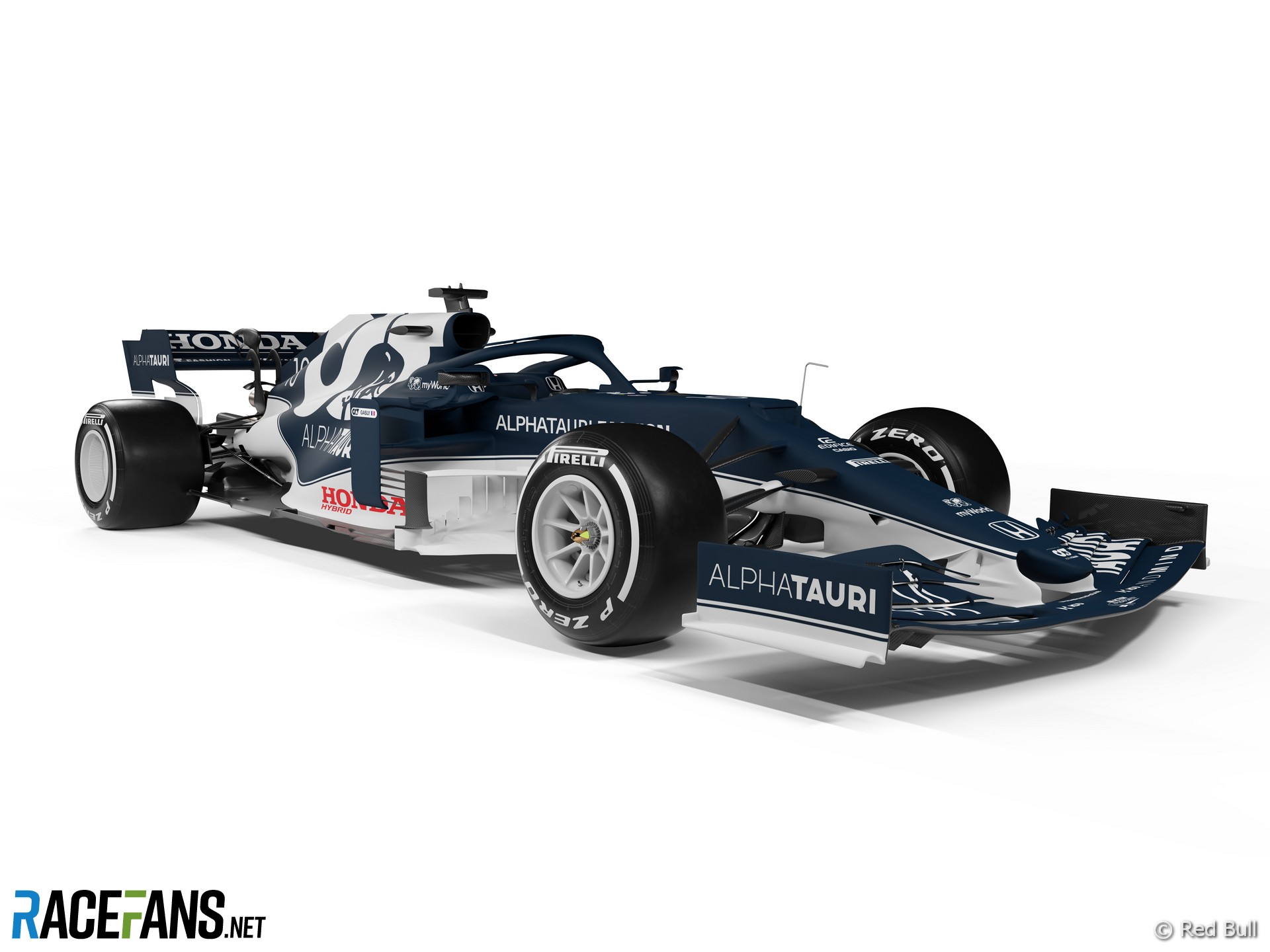
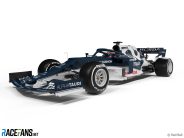
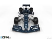
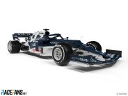
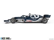
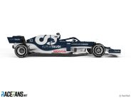
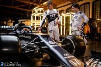
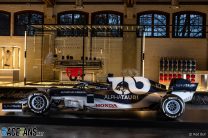
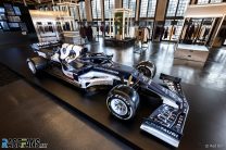
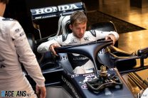
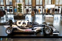
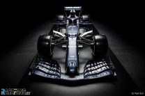
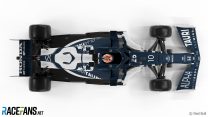
AlphaTauri has become the second team to reveal its new look for the 2021 F1 season.
The AT02 is the second Formula 1 car produced by the team, previously known as Toro Rosso, since its rebranding. AlphaTauri has revealed renderings of its new car and pictures of its updated livery applied to last year’s AT01.“I am convinced that the car will be one of the most beautiful on the starting-grid and a beautiful car normally is also fast,” said team principal Franz Tost.
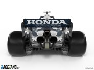
For the fourth year in a row the team is using Honda power units. The Japanese engine manufacturer is to leave Formula 1 at the end of the season but AlphaTauri will continue to use its engines next year.
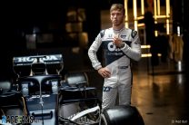
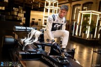
There is one new face in their driver line-up. Pierre Gasly, who joined the team in 2017 and scored a shock victory in last year’s Italian Grand Prix, remains. His former team mate Daniil Kvyat has been replaced by rookie Yuki Tsunoda, 20, who will be the youngest driver on the grid this year.
Gasly scored the majority of the team’s points last year on its way to seventh place in the constructors championship.
Advert | Become a RaceFans supporter and
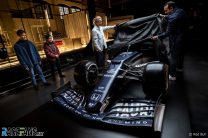
Pictures: 2021 AlphaTauri F1 launch


Advert | Become a RaceFans supporter and
2021 F1 season
- Verdict on error in GT race suggests Mercedes would have lost 2021 Abu Dhabi GP appeal
- Title ‘stolen’ from Mercedes made us ‘underdogs people cheer for’ – Wolff
- Red Bull Racing spent £230m during Verstappen’s title-winning 2021 campaign
- ‘I can’t box?’: Hamilton and Verstappen’s 2021 Abu Dhabi GP radio transcript
- Abu Dhabi’s legacy one year on: How the controversial 2021 finale changed F1
Aiii (@)
19th February 2021, 8:08
I’ll get used to it, I suppose. I really liked the two tone last year, this has a bit too much of the blue stuff for my tastes. Probably still gonna be the best looking livery on the grid alongside Red Bull’s.
bosyber (@bosyber)
19th February 2021, 8:23
Yes something like that @aiii
Good thing we don’t watch in black and white/greytone any more though, with the division and the stripe, I’d wonder about distinguishing this from Alfa Romeo! (name, style, logo on hood, huh ok).
Hm, a pinstripe that makes a saggy detour on a racing car, not sure that works for me. I mean, it starts down the sidepod to follow it’s shape I guess, but then it just goes UP again? Sort of showing how air goes? Still looks like a blockage there …
So, a livery. A bit more change than for McLaren, but not quite sure it’s an improvement or not.
bosyber (@bosyber)
19th February 2021, 10:02
Oh, I do really like those white rims. Fit in so well it didn’t initially register :)
Mikey
19th February 2021, 8:16
Screams back to the parmalat brabham.
bosyber (@bosyber)
19th February 2021, 8:19
But not as iconic.
mirko710
19th February 2021, 17:27
thanks… I knew it was something familiar, italian…
I like it :)
hunocsi (@hunocsi)
19th February 2021, 8:19
Oof. Why mess with perfection? I mean it probably won’t be the worst looking livery this year, but it certainly won’t be the best like last year’s.
Olivier
19th February 2021, 13:12
I agree. Why can’t they take a leaf out of Red Bull’s book?: Stick to one livery, and don’t change the overal look and feel. The Red Bull Livery has become iconic, a graphic marvel with lots of clever details.
Retired (@jeff1s)
19th February 2021, 8:45
Terrible.
John H (@john-h)
19th February 2021, 8:47
Gone from the best livery on the grid to probably, what will be the worst. Awful!
alex
19th February 2021, 11:06
Just hang on there John. I’m guessing some of the other teams are doing their best to take that title ;)
eljueta (@eljueta)
19th February 2021, 8:51
Beauty is in the eye of the beholder I guess, I think it looks amazing.
Balue (@balue)
19th February 2021, 13:55
Same @eljueta
Phil Norman (@phil-f1-21)
19th February 2021, 14:24
Yes. I really like it. I quite liked the 2020 version but this is an improvement in my eyes.
petebaldwin (@)
19th February 2021, 14:28
I preferred the 2020 car to this one but I think this looks great as well
Qeki (@qeki)
19th February 2021, 18:56
That darker blue somehow reminds me about Minardi
ryanoceros666
19th February 2021, 20:56
I agree I think it looks better than last year’s livery.
Pedro Andrade
19th February 2021, 9:09
I also like it. Last year’s was better, but I’m glad when teams take a gamble and change their colour scheme in subsequent years, while still maintaining brand colours. Even if it is not as good, we get variety (I’m looking at you McLaren!)
Pedro Andrade
19th February 2021, 9:12
Although come to think of it… the amount of dark blue teams is getting a bit too much now!
Jere (@jerejj)
19th February 2021, 9:23
Dark blue and white traded places or sort of. I prefer last year’s predominantly white livery, but this one is also decent. I like the greater presence of the Honda text on the car, and I’m referring to the rear wing.
cduk_mugello (@cduk_mugello)
19th February 2021, 9:31
Love this, I think the increased blue makes it more definitive than last year’s car. Look a bit Williams but still really like it. Glad they adapted the livery rather than keeping the same one. Good job.
Patrick (@paeschli)
19th February 2021, 9:32
Better than last yeah IMHO
Gemini (@gemini)
19th February 2021, 9:35
I don’t know why but I love it. It have some retro-ish vibe with those white wheels and that dull dark-blue colour. It reminds me of something. Maybe 80’s rally car? I can’t put my finger on it.
Dave
19th February 2021, 10:53
Downgrade.
Steve Rogers (@yossarian)
19th February 2021, 12:04
What I’m most surprised about is the bargeboards are now white. I thought teams left them carbon fibre black because it help hide the finer details of the geometry from cameras and prying eyes.
Aiii (@)
19th February 2021, 12:30
Yeah, I’m sure the 10.000 dollars worth of camera’s the teams use have a real hard time with those :D
Pat
19th February 2021, 13:12
😆
Adam (@rocketpanda)
19th February 2021, 12:13
I like this a lot. I liked last year’s livery a lot but thought there was too much white and wanted more blue, so this is pretty much perfect.
Euro Brun (@eurobrun)
19th February 2021, 12:20
Anyone else see an inverted Williams 2010-2012 era livery?
Jere (@jerejj)
19th February 2021, 21:45
@eurobrun I do.
Stevan Vasiljević
20th February 2021, 10:18
It indeed looks like pre-2014 Williams, with that color scheme.
Wayne
19th February 2021, 12:35
F1 fans are the moat critical in the best of times. Hahaha!
Pat
19th February 2021, 13:10
My favorite part is the bold Honda lettering.
What a mistake for Honda to leave now. When you beat a manufacturer like Mercedes people take notice.
ryanoceros666
19th February 2021, 20:58
Yeah I’m shocked Honda is leaving now, especially with a Japanese driver at TR.
H68
19th February 2021, 13:44
Looks black on white to me.
It’s a better balance of advertising too.
Overall this car looks formidable
Laughing about the black now, I thought there was another cultural movement going on. I initially thought this is a good looking Black Lives Matter entry.
It’s still good looking even if they used black blue paint. Or wrap….
H68
19th February 2021, 13:46
Of the first two presentations the Alpha Torino seems the better of the two
Bullfrog (@bullfrog)
19th February 2021, 14:17
22 eh? So no chance of Jenson Button making a comeback to take on the two World Champions before him!
DavidH
19th February 2021, 14:38
Urgh what have they done! That blue looks worse. The matte look of last year looked great, felt really modern. This with that awful pin stripe (why F1 whyyy?!) really makes it look dated and not in a good way whatsoever. Absolute step back.
Again I never understand why they like using whispy little lines on F1 car liveries. Last years AT had a bold and modern design, this could have appeared in the early 2000’s easily.
Brian (@bealzbob)
19th February 2021, 14:40
I still love that livery and think it could easily still be the best one on the grid *shrugs*
Win7Golf (@win7golf)
19th February 2021, 14:58
It’s still very ugly, but is 0.1% less uglier than the 2020 livery…
Who does this things…. monkeys?
Dutchguy (@justarandomdutchguy)
19th February 2021, 15:04
What an ugly livery. It poorly fits the sidepods and rear and looks cheap overall
Coventry Climax
19th February 2021, 16:12
I’m dutch too.
I like the looks of this car very much.
Don’t like the ‘new’ name though, Torro Rosso sounded much better.
But then, my opinions are usually far from random.
Holmzini
19th February 2021, 15:25
Better with Black wheels.
Racecar is racecar backwards
19th February 2021, 19:17
I like it purely because it turns the convention of having the lower half of the car in black/carbon fibre on its head.
Robert
20th February 2021, 0:03
I’m with you on that! Liveries should stand out, leaving the bottom half of the car black have become way too common. This is a nice change of trend, finally.
Pironi the Provocateur (@pironitheprovocateur)
19th February 2021, 20:10
I feel the renders don’t do the livery much justice. It looks fantastic in the real environment and I bet it will also look good on the racetrack. I think the last year’s livery was more unique and ellegant, but AT02 offers much smoother shapes and the blue front helped to make it slimmer.
Mog
19th February 2021, 21:44
The clothes in the background are pretty cheesy.