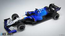
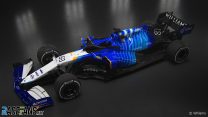
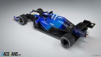
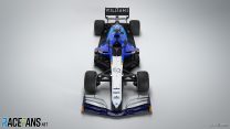
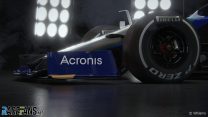
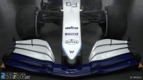
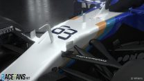
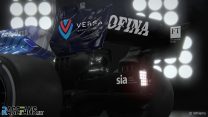
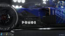
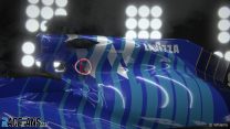
Williams has overhauled its livery for the 2021 F1 season, presenting a new look which reverts to its heritage blue colour scheme.
The team originally intended to present its 2021 livery using an augmented reality app. However this was cancelled when images leaked online after the app was “hacked”, according to the team.Williams is heading into its first full season since its sale by the founding Williams family to Dorilton Capital. Jost Capito has been appointed as the team’s new CEO.
“Williams Racing is a sporting icon, and a team that has forged a reputation of success through sheer determination and grit intertwined with innovation, passionate and skilful race-craft and an absolute desire to win,” he said.
“Highs and lows are typical in any long-established sporting brand’s journey and historic success can be a strong motivator, but it cannot be relied upon to define future success in the modern era of Formula 1.
“Therefore, we have created a fresh new livery for the 2021 car, one that acknowledges our incredible past and retains the spirit, drive and motivation that remains at the core of Williams’ DNA yet looks to the future and signposts our long-term ambition to return to the front of the grid. Whilst we are just starting out on this journey and there is still a lot of work to do, we are happy to see momentum in the right direction and look forward to continuing that progress on track this season.”
Advert | Become a RaceFans supporter and
Pictures: 2021 Williams F1 launch
Advert | Become a RaceFans supporter and
2021 F1 season
- Verdict on error in GT race suggests Mercedes would have lost 2021 Abu Dhabi GP appeal
- Title ‘stolen’ from Mercedes made us ‘underdogs people cheer for’ – Wolff
- Red Bull Racing spent £230m during Verstappen’s title-winning 2021 campaign
- ‘I can’t box?’: Hamilton and Verstappen’s 2021 Abu Dhabi GP radio transcript
- Abu Dhabi’s legacy one year on: How the controversial 2021 finale changed F1




davey (@djdaveyp87)
5th March 2021, 14:05
Me likey. I know they’ll be midfielders at best, but that is a gorgeous and refreshingly different livery!
Aussie Rod (@aussierod)
5th March 2021, 19:47
You should check out DC Graphics latest post on instagram for a concept Williams livery that better fits your description of ‘gorgeous and refreshing’.
bookgrub (@bookgrub)
5th March 2021, 21:38
I think this livery is underwhelming, though perhaps it’ll look better in motion, but that DC Graphics livery is far too visually busy for me.
Aston Martin could have benefited from his concept for them though.
Alonso
5th March 2021, 14:08
Being at the bottom of the grid includes having poor livery? (Haas included)
They Did Their Best (@theydidtheirbest)
5th March 2021, 14:10
Yeesh – Its like 4 different livery options in one Photoshop file, but they forgot to turn off the layers they weren’t using.
Love the introduction of gold back into the William palette and nose to halo is okay but the further you go further back, the hotter the mess becomes.
Euro Brun (@eurobrun)
5th March 2021, 14:14
@theydidtheirbest
Haha, you’re so right. Sadly their best wasn’t too great. I don’t really see the “inspiration from the 80s / 90s cars really. Blue, tiny bit of gold? It’s hardly iconic.
Arrows98 (@arrows98)
5th March 2021, 14:55
LOL! I was trying to find a way to summon my feelings about it, but this definitely takes the cake: it’s EXACTLY like they searched google images for “hi tech wallpapers”, merged the first 4 results into a single psd file (so it doesn’t look TOO obvious) and never turned off any layers…
hunocsi (@hunocsi)
5th March 2021, 14:11
Oh yes. I love that it’s not just different from thethe corporate F1 styles, but also something that mixes the colors and shapes so well together. Very stylish, well done Williams.
Mikey
5th March 2021, 14:15
I think it looks smart, much more interesting than a mostly white car like last year. Yeah there is a distinct lack of sponsors, but hopefully over the next few seasons they can address this by increasing their performance with the new cash injection. Jost Capito has succeeded in many other places so hopefully he can work his magic here at Williams!
Pinak Ghosh (@pinakghosh)
5th March 2021, 14:16
Looks like they ran out of paint or what? The back and lower back end of the car is all black which does not look good from the side profile. Thought the front wing could see a bit of work this year but alas. Good try though with the livery. Something different.
S
5th March 2021, 14:16
Not a huge fan of it, but I certainly appreciate that there is a pattern and graphic design going on here, rather than simply making corporate logos as visible and obvious as possible above all else.
This is where other series such as NASCAR really excel and F1 almost always falls far behind. There’s hardly any imagination in an F1 livery normally.
Todfod (@todfod)
5th March 2021, 14:17
I know Williams is always under financial stress.. But surely they can spend a few more $ to hire a half decent livery guy. If this livery is supposed to be inspired from the glory days of their past.. Surely those years weren’t glorious enough.
Not only are Haas and Williams going to be battling at the back of the pack.. They’re also having a solid contest on most uninspiring livery.
Neil Caine (@neilcaine)
5th March 2021, 14:19
Certainly an eye catching livery, sadly not too many sponsors on there though!
Dan Rooke (@geekzilla9000)
5th March 2021, 14:21
I love the blue stripes on the rear, I would have loved for this to have ran the length of the car down the nose, but the rear is very smart.
The view front on looks a bit drab, but the rear side shot looks beautiful with all that blue.
Ben Needham (@ben-n)
5th March 2021, 14:24
I think this is one of my least favourite liveries in a good few years (including the toothpaste one of 2019…). It all looks like it’s been designed on the official PlayStation game!
Wellbalanced (@alloythere)
5th March 2021, 14:26
The livery is fine. I like it. I don’t really like it or love it.
The thing that stands out for me is lack of sponsorship. No sponsor on the front of the rear ring, none on the front wing, and no main sponsor on the engine cover. Not a good sign.
Hence the livery, which is random, with no sufficiently paying main sponsor to dictate the colour scheme.
Wellbalanced (@alloythere)
5th March 2021, 15:41
Update: the livery is growing on me
AndrewT (@andrewt)
5th March 2021, 14:28
1996 Sauber C15, anyone? : )
SadF1fan
5th March 2021, 14:29
Good deal for Lavazza, the car almost looks like a pack of lavazza blu from the 90’s or 00s.
ferrox glideh (@ferrox-glideh)
5th March 2021, 14:33
This livery strangely reminds me of Rothman’s cigarettes, as much as Ferrari’s somehow makes me think of Marlboro cigarettes. I associate both with lung cancer. That’s “heritage” F1 design for you.
Jockey Ewing
5th March 2021, 16:03
Haha, the stripes reminding me -apart from the color- the slightly cheap Hungarian soft-paper-boxed “Sopianae Multifilter”, which is strong like hell, and was nicknamed “Tiger” by most. Luckily I not smoked a cigarette since 10 years.
So now I nicknamed the car Tiger. Tiger please go fast if Mr. George wants to do so. Especially race-pace-wise, because imo weaker entrants, not so surprisingly, having the most deficit at sustained pace.
My feelings are mixed with this livery, it’s something like 5.8/10 for me, on a linear scale, where there is possible to get a 0 or 1 :) Generally I like the old schoolness or simplicity, looks like the industrial spies dragged F1 liveries towards this direction for the next season. I’m even ok with the stripes, but it became a bit too nothing special :( And, apart from the proportions of colors- with the orange it’s a bit ING Renault color scheme from those unsuccesful years of Renault, you know around the second Renault stint of Alonso. Imo it’s better than that, but sadly reminds me to that not so pretty car as well.
Jockey Ewing
5th March 2021, 16:14
And additionally, imo this year’s livery yet are worse than the previous ones. Not very much worse, but still, almost all entrants came up with a bit worse yet, and on average that clearly means worsening. Although previous season’s liveries were very good on average, with some excellent ones, at this season old schoolness, or kitschiness became a bit too much.
Luke S (@joeypropane)
5th March 2021, 14:39
Wow… that’s a statement. It’s not cohesive at all – which is disappointing when you evidently have no sponsors to consider/integrate in the design. I kinda can see areas where it can be developed and made into something quite unique on the grid, but I think “development” isn’t a word in the Grove dictionary… Look at how bulbous that rear end is compared to other cars shown so far!
Sam Crawford
5th March 2021, 14:40
Looks like one of the generic liveries from the F1 game, and a distinct lack of sponsors.
It’s also too busy, with one too many colours on it, take away the black and remove one of the shades of blue and it’ll look a lot better IMO
Konstantinos
5th March 2021, 14:44
I like the look of the cars in general this year, a lot of updated looks for the better in my opinion. It weirdly seems to me like Mercedes are going to be one of the more boring ones even though the black was a nice surprise last year.
erikje
5th March 2021, 14:48
no place for poor Rich Energy… almost a affront of the red bull colors..
René (@)
5th March 2021, 16:10
Ferrari?
John H (@john-h)
5th March 2021, 14:48
Cover up the back, it looks good. Cover up the front it looks even better. Then combine them, err.. not for me. It’s not a coherent design.
C-
Roth Man (@rdotquestionmark)
5th March 2021, 14:49
Hmm it looks a bit like when you play an F1 Manager game and have a few dodgy livery templates to pick from.
Miltiadis (@miltosgreekfan)
5th March 2021, 14:51
Yikes… Not a fan of it’s execution. Colour wise they chose some decent ones, but the engine cover is atrocious…
The tirquaz lines make no sense and ruin a big part of the livery. Add to this a random “W” that messes up the lines even more,it makes it quite poor for my taste.
Bottom 5 livery of the 21st century for me, even the Minardi of 2000 is better than this.
Fer no.65 (@fer-no65)
5th March 2021, 14:56
Looks like one of those default liveries you can make in iRacing. The kind of paint you see on the rookie class or someone that didn’t load it correctly to Trading Paints.
Not cool, tbh! Looks very weird
ady (@sixwheeler)
5th March 2021, 14:58
The front looks like a good livery, if I cover the back. And the back looks like a good livery, if I cover the front. I do wish they’d just picked one of the 2 ideas to run with
ady (@sixwheeler)
5th March 2021, 14:59
Just noticed @john-h said the same thing!
John H (@john-h)
5th March 2021, 18:46
@sixwheeler actually quite funny how close our comments are! Spooky!
alex
5th March 2021, 14:58
Its ok. I think it would benefit by having gold wheels or at least a splash of gold on the wheels somewhere.
John H (@john-h)
5th March 2021, 18:47
How about platinum?
kpcart
5th March 2021, 15:12
Reminds me of a formula car livery in race sims that dont have FIA licensing. Not bad but meh. Williams first car was white, the blue is only the heritage of its cigarette sponsors, Hewlett-Packard etc.
jlb
5th March 2021, 15:17
F1 2020 editor. Random skin.
Sonny Crockett (@sonnycrockett)
5th March 2021, 15:17
It looks like a cheap, unofficial Chinese toy knock-off of a real F1 car.
kpcart
5th March 2021, 15:18
Actually, it reminds me of a copy of Miller lite Reynard CART champ car livery from season i forget, Max Papis was driver
dot_com (@dot_com)
5th March 2021, 15:37
I’m a little disappointed. It just doesn’t seem to be cohesive. Almost as if several people were standing over the designers shoulder offering some “yeah, add a bit of that, maybe some yellow, oooh, what if we add some lines here” etc. I hope it looks better under the sunlight but it doesn’t really do it for me at the moment.
dot_com (@dot_com)
5th March 2021, 15:37
Also, those stripes remind me too much of the AT&T logo.
Paul Spencer
5th March 2021, 15:47
More Yellow Needed!
DonSmee (@david-beau)
5th March 2021, 15:56
Meh.. an ugly mess. Looks like the lizard in Monster’s Inc. They might have been better off with solid blue. It’s a shame.
petebaldwin (@)
5th March 2021, 15:59
I’m surprised that generally, people don’t seem to like it. I think that looks really smart. Any f1 car looks a bit strange with next to no sponsors but I think that’ll look great on track.
Dave
5th March 2021, 16:02
That shade of yellow feels like a throwback to their Canon Williams days.
wsrgo (@wsrgo)
5th March 2021, 16:16
I guess I’ll never understand why we try so hard to pass objective judgements on matters such as design. But I guess that’s because I got booted out of art class for being too ‘uninspired’ and was forced to study ecology instead.
I mean, I like the livery…
John H (@john-h)
5th March 2021, 18:48
We are strange beasts us humans that’s for sure.
Stephen Higgins
5th March 2021, 16:18
Seems like they hit the randomiser on F1 2020 My Team and said “Yep, we’ll have that one.”
Velocityboy (@velocityboy)
5th March 2021, 16:21
I guess we should just be thankful that it’s not as bad as the red Veltins livery.
G (@unklegsif)
5th March 2021, 16:56
Or black and gold, like a certain bearded hobo publicity junky would have had everyone to believe
Dave
5th March 2021, 20:11
Winfield ;)
Marcus
5th March 2021, 16:35
I really like that the sidepods are so different from everyone elses, hope it’s a winning concept. I like the livery too, cool to see something that stands out.
Sensord4notbeingafanboi (@peartree)
5th March 2021, 17:17
Renders…. how exciting.. Wait a minute, this is what the app supposed to have had. Williams an f1 team, made a 3d model for anyone to copy. What a blunder. That’s like mixing the wrong weather tyre compounds across cars whilst pitting under red lights and leaving the pits with a loose wheel blunder. hope williams managed to not stream their car to anyone.
F1 man
5th March 2021, 17:28
I feel the more I look the more disappointed I am, the front looks OK but the further you look back towards the rear the messier it becomes, it feels like they started off designing it nicely but got bored 1/2 of the way through
Maciek (@maciek)
5th March 2021, 17:40
Well, it’s not very good, but there is something kinda cheesy late 80s/early 90s about it… so there’s that
Jere (@jerejj)
5th March 2021, 18:59
Nice.
Robbie (@robbie)
5th March 2021, 19:23
My very first impression in the initials seconds was, oh cool, but then looking at it further I just think, don’t love it, don’t hate it, and it will probably look cool racing in natural light on the track. I think I prefer it to their previous livery.
RocketTankski
5th March 2021, 19:40
Still looks a bit like a Poundshop toy, but it’s better than last year.
Aussie Rod (@aussierod)
5th March 2021, 19:42
Everyone’s summed it up already really.
Random, incoherent, generic, bland. A complete lack of sponsors, much like Haas.
Sad for a team like Williams. But then it’s not really Williams anymore anyway is it.
Mark (@mrcento)
5th March 2021, 20:18
Not really seeing what many others are who are praising it. I think it’s pretty awful.
The colour combo works and i get the little historical references dotted throughout it, but the shaping ruins it. It’s not at all coherent or modern. It’s just a bit of a mess. The lack of sponsors probably just highlights it all even more (A big sponsor down the sidepod would give a focal point and tie all the bits together a little more), but it screams backmarker IMO. It’s a lot more HRT meets Financially crippled Sauber than it should be.
Captain Pie (@captainpie)
5th March 2021, 23:00
I think it looks quite smart and a bit different in a good way.
Same as Haas though, where are the sponsors??
Robert
6th March 2021, 2:24
Is “Sauberesque” a word?
Thejus Joseph Jose
6th March 2021, 3:27
I suppose there is no rule in FIA that states slower teams should have poor liveries. Haas Russian livery looks better when compared to this. I was in shock for a moment on seeing it. A plain white livery with Williams and Lavazza logos still would be great (remember 2014). The colour combination even prevent to show the sponsors name clearly. Williams can do things better, Lets not forget last year their pit-crew were 2nd best pit crew. So its not like the entire team in in shambles. Also in this era of design minimalist designs are the most appreciated. But this it too bland and below average.
DB-C90 (@dbradock)
6th March 2021, 6:50
Frankly I don’t care at all about livery as long as I can tell which car is which.
All I care about is how well it appears to handle, who’s driving it and is it fast enough.
ryanoceros (@ryanoceros)
6th March 2021, 8:29
I like it but that looks like the 2020 floor
formevic (@formevic)
6th March 2021, 9:54
Ehm, no. Front, middle and back are three different liveries. It mess up whole car silhouette. Lower side full black (like all the grid, to be fair) to hide the more. I don’t like it.
Bippy
7th March 2021, 11:07
Does anyone see the Senna S on the nose or have they stopped doing that now Frank has gone?
Andy (@andycz)
7th March 2021, 14:37
Was wondering about the same… Does anyone know?