


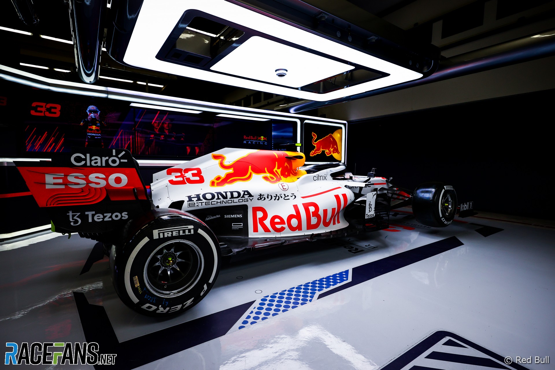
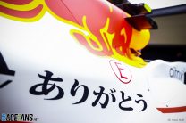
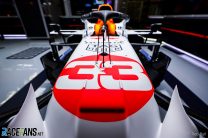
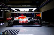
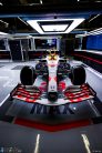
Red Bull has presented the one-off Honda tribute livery it will use for this weekend’s Turkish Grand Prix.
The Japanese engine manufacturer will leave Formula 1 at the end of the season. This round of the championship was originally supposed to be its home race at Suzuka, before it was cancelled due to the pandemic.Red Bull intended to run the livery as a tribute in Japan, but will do some at Istanbul instead, on the cars raced by Max Verstappen and Sergio Perez. The Red Bull livery is styled on the Honda RA272, which was used by Richie Ginther to score the team’s first F1 victory in the 1965 Mexican Grand Prix.
AlphaTauri, Red Bull’s sister team, will also run a revised livery with the word ‘thank you’ written in Japanese on its rear wing.
Following Honda’s departure, Red Bull’s new powertrains division will take over the running of the power units and acquire the intellectual property relating to them. Honda will continue to provide trackside support to them Red Bull Powertrains during 2022, when both Red Bull-owned teams will continue to use its engines.
From 2023 Red Bull Powertrains will take responsibility for manufacturing and servicing the engines. However some connections to Honda will remain through their young driver programmes – the Red Bull Junior Team and Honda Formula Dream Project – which will work together to promote Japanese drivers, having brought Yuki Tsunoda into F1 this year.
Advert | Become a RaceFans supporter and
Pictures and video: Red Bull’s Honda tribute livery
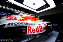
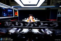
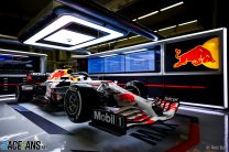
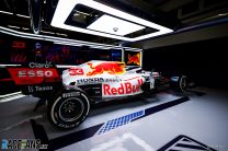

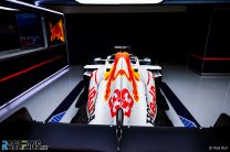
A closer look at the one-off @HondaRacingF1 tribute livery @RedBullRacing will run at this weekend's #TurkishGP.#F1 pic.twitter.com/nkzEe3uHhu
— RaceFans (@racefansdotnet) October 7, 2021
Advert | Become a RaceFans supporter and
2021 F1 season
- Verdict on error in GT race suggests Mercedes would have lost 2021 Abu Dhabi GP appeal
- Title ‘stolen’ from Mercedes made us ‘underdogs people cheer for’ – Wolff
- Red Bull Racing spent £230m during Verstappen’s title-winning 2021 campaign
- ‘I can’t box?’: Hamilton and Verstappen’s 2021 Abu Dhabi GP radio transcript
- Abu Dhabi’s legacy one year on: How the controversial 2021 finale changed F1
MacLeod (@macleod)
7th October 2021, 7:49
That looks great! I wish they drove more often with liveries like this.
EffWunFan (@cairnsfella)
7th October 2021, 7:56
I’ve a feeling I may end up in the minority, and I don’t “dislike” it, but it seems overly fussy to me whereas it is the simplicity that characterises the livery that this pays tribute to.
sumedh
7th October 2021, 8:06
Indeed. I think it is the yellow near the the airbox which makes it fussy. It looks completely out of place when looked at from the front whereas rest of the car is primarily red and white. If that yellow was made white, I would have liked it more.
MacLeod (@macleod)
7th October 2021, 8:30
But that is the Red Bull logo and has nothing todo with the rest of the car. Compared with their other liveries i find this one very simple and nice.
bosyber (@bosyber)
7th October 2021, 8:32
Yes, you are probably right about that sumedh.
To be honest, first pic I saw was the nose, and it reminded me of that HRT. Now, mind you, I actually liked, and still like, the look of that livery, but it took me aback a bit! This livery is nice, but yeah, it gives of a vibe of a tad too busy as you say. Still, good to have a bit of variety (and let’s hope they do better than previous special liveries have tended to with Red Bull and others!).
Danny (@dnny)
7th October 2021, 10:00
I agree with regards to the yellow but would liked to have seen the yellow made red and the red bull white. So the current yellow bits become a red outline of a white bull.
Nevertheless, I still think it is a great looking livery. I wish the FIA would allow teams to sport different liveries for each car in the team (as BAR tried to do) to get more colour variety on the grid.
GeeMac (@geemac)
7th October 2021, 8:04
So the usual livery with the blue parts changed to white…
I still think it’s ace though.
MacLeod (@macleod)
7th October 2021, 13:38
And placed a bif red circle on the nose like the original car..
John H (@john-h)
7th October 2021, 8:29
Bit of a shame they kept the yellow around the bull (why?), otherwise great.
GechiChan (@gechichan)
7th October 2021, 9:37
because it’s part of their logo? In the design industry, this is a capital crime to alter a logo just to suit a one-off creative purpose. It’s either you use the logo as intended in the branding manual, or change the logo altogether and use it on all products going forward.
Mashiat (@mashiat)
7th October 2021, 12:44
@gechichan The bull is the logo, I don’t think the yellow bit is completely necessary. They didn’t have it for their one-off liveries that they had for testing previously, so it shows that they are willing to axe the yellow bit for a one-off if they have to.
GechiChan (@gechichan)
9th October 2021, 16:14
No, the bull is not the logo. The logo on the energy cans is always shown as 2 bulls in front of a yellow sun.
trib4udi (@trib4udi)
7th October 2021, 8:50
In these times of strict budget caps and a tight title race, I can see this livery change is a good priority.
S
7th October 2021, 9:25
It doesn’t cost any extra @trib4udi – they repaint the parts and print new decals off every time they’ve been on the car.
As for the livery designers – they probably aren’t normally assigned to aerodynamics…. They’d spend most of their time designing posters and worthless signage to hide in the garages, or printing on coffee mugs for the staff break room at the factory.
Wayne
7th October 2021, 8:52
Looks nothing like the mclaren of yesteryear to be honest. Thumbs down for me
PMP
7th October 2021, 10:15
I agree. If I didn’t know this is a tribute, I wouldn’t have guessed it. I guess they have to be very careful not to advertise Marlboro.
cduk_mugello (@cduk_mugello)
7th October 2021, 9:04
Why do they struggle to take normal pictures? We don’t need some stylised dark moody shots. It’s not like it’s preseason where they try to conceal the car’s design. From these shots it’s hard to actually get an idea of how the livery will appear on track.
jff
7th October 2021, 9:07
The rake on that car is immense; just see how far they have to lift the front wheels for the car to appear level.
Keith Collantine (@keithcollantine)
7th October 2021, 9:18
When McLaren did their special livery for the Monaco Grand Prix what I appreciated about it was there were no half-measures – it clearly belonged to the tradition of blue-and-orange Gulf liveried racing cars.
But I don’t get a similar impression from Red Bull’s Honda livery because it still retains substantial areas of dark blue. They haven’t ‘gone all in’ on the classic Honda look, which is a pity. Maybe it’ll look better on the track, but realistically these are probably its most flattering angles.
That said, it will be good to have one fewer predominantly blue car on the grid. Losing Renault’s yellow and Racing Point’s pink this year made for a much less colourful field.
EffWunFan (@cairnsfella)
7th October 2021, 9:59
I agree.
And it’s interesting as I commented upon the ‘fussiness’ of this livery, but the Gulf McLaren is also quite busy but gets away with. I think, as you suggest, it is because there is too much “Red Bull” and not enough Honda.
As a said before though. I don’t “dislike. Just don’t “love” it.
Stephen Higgins
7th October 2021, 10:13
To be honest, given that most of the stuff plastered over the car is their own Red Bull logo still, they’ve hardly gone the extra mile. They’ve basically added a bit of white background.
Tiny Honda, massive Red Bull logo
They could have gone for an all white plus red spot and sneaked a little Red Bull in a corner somewhere. They are generating a lot of publicity for a fairly mean effort.
Leroy (@g-funk)
7th October 2021, 15:01
Totally agree. I was excited to see another “throwback” livery this year after McLaren nailed it with the Gulf-inspired throwback livery. But this is just…not as good. I hoped that a company that is as good at branding as Red Bull is would really pay tribute to Honda’s brand in a meaningful way rather than have their own be so dominant. But clearly, their own interests took over and it appears to be less of a real tribute to Honda and more of a token gesture. I had been disappointed that this livery couldn’t be run at Suzuka when I first heard about it, but now I think that is for the best since this seems like a big letdown.
Niefer (@niefer)
7th October 2021, 17:35
Agree with that, though I always found BWT’s all-pink of a poor taste.
Red Pill (@redpill)
8th October 2021, 2:31
@keithcollantine Thats a valid point and thought the same when the presented the PR pics.
But Question: Are F1 teams allowed to alter sponsor logo sizes in the chassis?
I’m fuzzy about it but I think there might be a rule preventing altering of logo’s and size of them in the middle of a season. Either way, I think a solid white car with more Honda more pronounced on it would have been a better compliment.
S
7th October 2021, 9:20
Styled on the RA272?! Where?
I don’t remember huge logos all over that little beauty. Just a white body with a big red dot on it, a couple of small Honda stickers and the driver’s name.
I’ll proudly say that I don’t like it. Not that that counts for anything, but I certainly think they could have made a much better tribute than that.
Illusive (@illusive)
7th October 2021, 9:27
Looks beautiful, the yellow and red makes it look like flames which is why it looks great. But they should have written the Honda in red.
Stephen Higgins
7th October 2021, 10:05
Really narks me with the sharp lines on the sidepods toward the rear where it goes from white to black.
Emanuele (@allyita)
7th October 2021, 10:15
they just put white where usually it is blue.. i don’t like it.
they put in the least possible effort.
Tom
7th October 2021, 12:26
well that looks awful.
Niefer (@niefer)
7th October 2021, 17:35
Not really a fan, but I do like the hiragana bits. Nice touch.
Qeki (@qeki)
7th October 2021, 19:31
HRT F112 (2012) anyone?
Esteban (@esteban)
8th October 2021, 19:25
Not one decent picture from above.