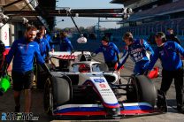
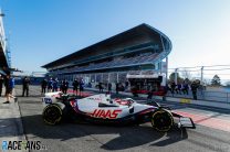
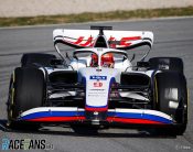
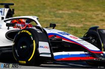
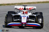
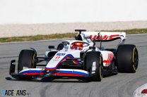
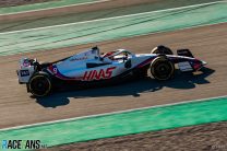
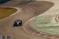
Haas’s new VF-22 has run on track for the first time ahead of the 2022 F1 season.
The team is conducting a shakedown test of its new car at the Circuit de Catalunya today. Nikita Mazepin was at the wheel.Haas were the first team to present renderings of their new car for the upcoming championship, but this is the first time it has been seen running in the flesh.
Pre-season testing is due to begin at the track on Wednesday. All three Ferrari-powered teams have now run their cars ahead of the test.
Pictures: 2022 Haas VF-22 on track
Video: 2022 Haas VF-22 on track
And we are GO!
The #VF22 takes to the track for the very first time in Barcelona 💪#HaasF1 pic.twitter.com/SewwEaAjEW
— Haas F1 Team (@HaasF1Team) February 21, 2022
Pictures: Haas
Advert | Become a RaceFans supporter and
2022 F1 season
- Verdict on error in GT race suggests Mercedes would have lost 2021 Abu Dhabi GP appeal
- Title ‘stolen’ from Mercedes made us ‘underdogs people cheer for’ – Wolff
- Red Bull Racing spent £230m during Verstappen’s title-winning 2021 campaign
- ‘I can’t box?’: Hamilton and Verstappen’s 2021 Abu Dhabi GP radio transcript
- Abu Dhabi’s legacy one year on: How the controversial 2021 finale changed F1



gardenfella (@gardenfella72)
21st February 2022, 9:38
That front wing looks a bit basic when compared to some
Turch17
21st February 2022, 9:46
I agree, let’s see how they will develop before the first race
Srdjan Mandic (@srga91)
21st February 2022, 10:00
It’s interesting how all three Ferrari-powered cars have come up with a similar design on the front wing. Maybe they can direct more air to the Venturi tunnels with this design?! Or maybe it’s just a low drag front wing?!
OOliver
21st February 2022, 11:35
It is a continuation of their inward wing area generating the downforce concept likewise Mercedes continued with their mid wing area concept.
Sam Crawford (@samxc)
21st February 2022, 11:23
No it doesn’t, in fact it’s the opposite, look up ScarbsF1 on twitter, there’s a lot of interesting features on this car, in particular the endplates and around the shark fin (which is actually detached from the engine cover and has a row of cooling louvres underneath it)
Bob
21st February 2022, 15:14
Agree. The end plates caught my eye as well. The shark fin is unique. Looking forward to more detailed photos.
I luv chicken
21st February 2022, 16:03
Now, I’m no engineer, but, on airplane wings the end plates aid in fuel consumption and agility. This is a very interesting advance on previous development.
Qeki (@qeki)
21st February 2022, 9:40
That front wing looks like a russian moustache
hahostolze (@hahostolze)
21st February 2022, 9:44
That front wing is particularly obscene considering current events. Mazepin can’t drive with a Russian flag but he can drive IN a literal Russian flag. Madness.
kpcart
21st February 2022, 11:30
Leave the Russians alone. This is F1. The Russian government is arguably bad, but so is England’s, Australia’s and America’s congress is the worst there can be. Current events? Much worse has happened by the English in history, why can cars run the union jack? Much worse has happened with disputed borders and so called sovereign countries, and it has happened for forever in Europe. Don’t be scared of the Russians. They have got great citizens like every country does. Much worse pay drivers have been in F1, and they happened not to be Russian. Current events are political power plays that happen very often in this planet we call earth. And the history of Eastern Europe which Includes Russia is not well known to too many people . Don’t forget thus team is an American/Russian alliance, put that in context, and the flag colours are the same for both
Bradders (@bradders)
21st February 2022, 13:16
You realise that the issue people take with this is the systemic and state-sponsored doping prevalent throughout Russia? That’s why there is a ban on the display of the Russian flag.
Apart from when scaled up to F1 car size, apparently.
Anthony
21st February 2022, 14:13
What about all the bad things everyone else has done..that doesn’t justify a state sponsored doing programme. And your point about the colours of the flag being the same as the US flag is hilarious. People are capable of interpreting the arrangement of the colours, not just the colours themselves.
I luv chicken
21st February 2022, 16:06
Yur a loony!
BasCB (@bascb)
21st February 2022, 11:33
I agree @hahostolze, it is still a quite blatant middle finger to their ban from sports to show that Russian flag on the livery like this. I hope Haas has their money in the bank when/if further sanctions hit Mazepin Sr. and his companies.
BasCB (@bascb)
21st February 2022, 19:58
Wow, after that speech I just watched, I REALLY hope Haas makes sure they have their budget sorted for the next year (and by then they might merge with Andretti for the future or something!) because I find it quite likely their main sponsor might not be able to transfer too much funds around in the near future.
Bradders (@bradders)
21st February 2022, 13:15
Agreed. Absolute travesty.
amian
21st February 2022, 9:44
Oh boy do I hate how they ruined the appearance of that great looking nose by not painting the tip of the nosecone.
I’m also surprise the teams are still allowed to contaminate the cars with those tiny little winglets as here on the driver’s sides.
Srdjan Mandic (@srga91)
21st February 2022, 9:51
At first glance, their front wing looks almost identical to the ones from Ferrari and Alfa Romeo. That can’t be a coincidence.
It’s interesting how the car didn’t really change that much compared to the renderings, except for the front wing, which looked suspiciously similar to last year’s model.
I’m somewhat surprised it looks so different from the Ferrari and actually more similar to the Alfa Romeo, in terms of side pod design (including air intakes). Then again, Simone Resta was previously at Alfa Romeo, so maybe he took some ideas with him and implemented it on the Haas.
bosyber (@bosyber)
21st February 2022, 10:14
The sidepods actually changed a lot, including their openings getting wider @srga91, now the concept seems closer to what Ferrari is doing while before they had those very short and wide pods that then seemed to be similar in concept to what worked in the last few years.
Srdjan Mandic (@srga91)
21st February 2022, 10:27
Thanks for the hint, @bosyber! I may not have paid enough attention at this area the first time. Now looking at the picture, the side pods really do seem to have changed quite siginficantly, though still not as extreme as on the Ferrari, especially not the air intakes.
BasCB (@bascb)
21st February 2022, 11:32
On top of what @bosyber mentions about the intakes @srga91, the rear wing side profile looks quite similar to the Ferrari one and in the video you can see that the sides of the sidepods are also a lot like the Ferrari ones and especially they also feature the same “dimple”/Bathtub profile on top … . It’s not quite as pronounced, and Haas does have other interesting features (those FW sideplates, the “distached” shark fin)
Seeing quite a lot of “parallel development” that surely doesn’t have to do with engineers from one team being in contact to the other.
bosyber (@bosyber)
21st February 2022, 14:28
@srga91, @bascb waiting for the real-car AT vs. RBR comparison personally, that seems to also have a lot of said ‘parallel’ developement. I think if that’s happening FIA and FOM really should hope both their auditing of development steps, which they supposedly introduced for the year after the ‘pink mercedes’ complaints, and the regular financial audits for the budget cap are up to snuff.
vjanik (@vjanik)
21st February 2022, 10:30
Completely different to the renders. They are clearly going the Ferrari concept route. Its no where near as developed or agressive as the red car, but has the same aero philosophy.
Bullfrog (@bullfrog)
21st February 2022, 10:39
Blimey, it’s Derek Warwick’s car from 30 years ago!
bookgrub (@bookgrub)
21st February 2022, 10:41
That is a staggeringly bland livery. Hard to think of something more boring unless it was pure white, and even then I think it would be an improvement. The VF-17 and VF-19 were dramatically better.
Peter707
21st February 2022, 11:02
I admit Haas VF-22 is bland, however predominantly white livery is not a bad choice per se. Think of the former BMW designs (especially the F1.08).
bookgrub (@bookgrub)
22nd February 2022, 1:33
I agree predominantly white can look good. I just think this particular livery is terrible. The livery of the BMW you mention would, with minimal alterations, have been an excellent fit for the current colour scheme had they not been forced into the ‘Russian flag on wheels’ design.
Sam Crawford (@samxc)
21st February 2022, 11:24
Not as bad as the corporate grey livery they ran beforehand
bookgrub (@bookgrub)
22nd February 2022, 1:40
I much preferred that grey livery, personally. Not the best in design, but perhaps I’m just partial to grey.
kpcart
21st February 2022, 11:35
Looks ok, but not as intricate as other teams… Would be nice to see the simplest car design winning, but not in modern F1. I wonder which team will get the under body aero right. No more high take is a good thing, makes the cars look nicer side on
Sam Crawford (@samxc)
21st February 2022, 13:41
It’s very intricate, look on Twitter. In fact, it’s the most intricate we’ve seen so far
someone or something
21st February 2022, 14:18
@samxc
I think you’re getting ahead of yourself. Because “more intricate than apparent at first sight” ≠ “most intricate design of all”. In fact, the exact opposite may still hold true.
Matthijs (@matthijs)
21st February 2022, 11:41
Looks really bulky compared to some Mercedes-powered cars. It looks like a backmarker.
Srdjan Mandic (@srga91)
21st February 2022, 13:45
Impossible to tell whether it’s fast or not. It all depends how much air the concept can direct towards the floor and diffuser.
According to a CFD analysis of the Ferrari (whose sidepods are similar to the Haas) on f1technical.net, the concept produces much less drag than the FIA’s base model, around 11% less.
You can’t tell which concept works and which doesn’t, just by looking at pictures of the car. Not even a F1 aerodynamicist can do that.
Sensord4notbeingafanboi (@peartree)
21st February 2022, 12:13
Did not know they made ferraris in white.
Jockey Ewing
21st February 2022, 14:07
Meh, and they even altered the Herbie-styled car number :(
Although if the car has to look like this, then I like the placement of the car number on the rear.
Phil Norman (@phil-f1-21)
21st February 2022, 12:16
Interesting that I think, the side-pods and aero approach seems more similar to Ferrari than I was expecting from the original renders of the car issued a couple of weeks back.
It’s going to be fascinating to see who has got this most correct. I am hoping Ferrari, AM, Haas etc but I would not ever bet against Merc and friends. I wonder what Alpine’s approach will be?
Jere (@jerejj)
21st February 2022, 12:50
The front-end & rear wing (or the Haas text positioning) are different from the render images.
Jockey Ewing
21st February 2022, 16:40
What does VF means in the model name?
Venturi Fury? Very fast? Lada VFTS? :) Joke aside, I have no idea.
Srdjan Mandic (@srga91)
21st February 2022, 16:49
The VF is a refference to the first production line of CNC machines produced by company Haas Automation, founded by Gene Haas in the 80s.
Apparently the ‘VF’ stands for ‘very first’, as the VF-1 was the first machine the company produced.
Jockey Ewing
21st February 2022, 18:32
Thank you. Thats seems to be a relevant and not so random name then.
JS
22nd February 2022, 4:40
Can we at least admit these cars look a million times better than the disasters of the last 5 years. Larger overall wheel diameter certainly helps the long wheelbase look less odd.
Jon (@johns23)
22nd February 2022, 6:21
The car looks really clunky to me. No cohesiveness at all