


In the round-up: Zhou Guanyu admits to feeling nervous ahead of his first qualifying session as a Formula 1 driver
Become a RaceFans Supporter and go ad-free
RaceFans operates thanks in part to the support of its readers. In order to help fund the development and growth of the site please consider becoming a RaceFans Supporter.
For just £1 per month/£12 per year you will also be upgraded to an ad-free account. Sign up and find out more below:
In brief
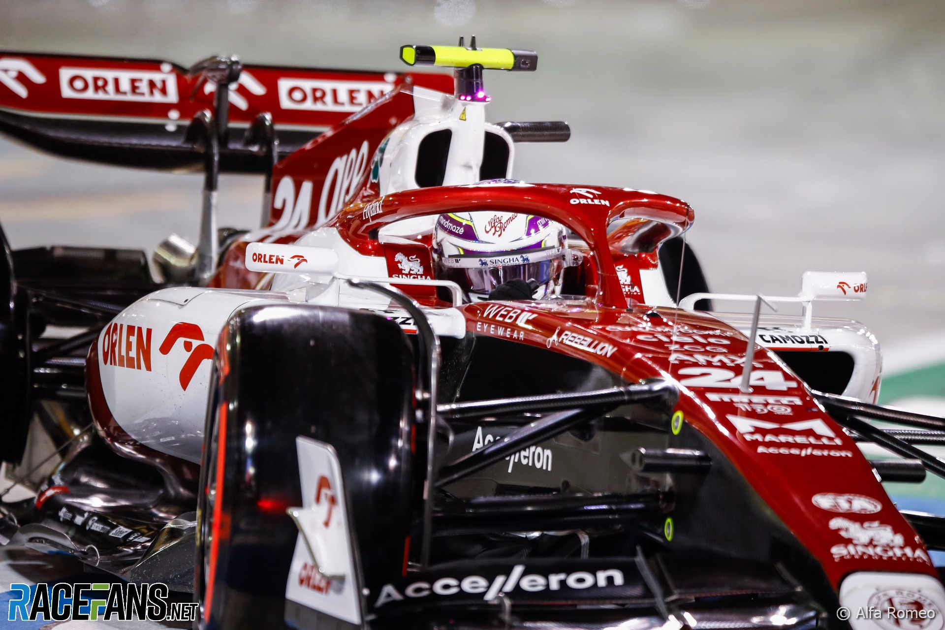
Zhou relieved to overcome ‘nerves and pressure’ on qualifying debut
The only rookie on the 2022 grid, Zhou Guanyu, admitted he felt “nervous and pressured” before his first qualifying session yesterday.“That was the first two things that came in my mind before I jumped in the car,” he said in response to a question from RaceFans yesterday. “Even though I was so relaxed for this weekend, once that qualifying comes, I just really feel that tension.”
However he was thrilled to progress beyond Q1 at his first attempt, and see team mate Valtteri Bottas take the other Alfa Romeo into Q3.
“But I was happy with Q1, a huge relief,” he said. “And then in qualifying two it was about trying to get a bit more out of myself. I think we didn’t manage that perfectly. But nevertheless, I was so happy with the performance so far. I’m very proud with the team with both cars today [doing] good.”
Bearman unaware of track limits risk before lost win
Oliver Bearman crossed the chequered flag in the lead of Formula 3’s sprint race in Bahrain but was immediately penalised for repeatedly exceeding track limits, and lost victory to Isack Hadjar.
However, Bearman said afterwards that he had been unaware of any track limits violations until the penultimate lap. “I knew I did it once, for sure, on the penultimate lap, I definitely went wide but apart from that, I was pretty sure I was either on the white line or leaving some margin,” Bearman explained. “So I didn’t actually know about the penalty until after the race finished, which is quite bittersweet.”
Hadjar said he had also been unaware of Bearman going over track limits. “I got a radio message from my engineer to say you won the race and I didn’t know why,” he said. “He just told me he has a five second time penalty.”
Sprint race winner Verschoor secured Formula 2 return without manager
Richard Verschoor won Formula 2’s first sprint race of the year, returning to the series after his 2021 campaign with MP Motorsport was cut short due to lack of funding.
Verschoor said he had secured his return himself, including speaking to 17 sponsors, as he has no management. “It’s been tough,” said Verschoor, who took the last place on the F2 grid. “I don’t really have a manager or a management. So basically all the partners that I have, I talk to them myself, I even made the sponsor contacts myself.
“There’s been a lot of effort going into that to make sure that I even can have a drive and follow my dreams. But in the end, I have a lot of partners that support me in this in this phase. So that’s why I’m even more proud to get the win today.”
No replacement for Sochi Formula 2 round
The World Motor Sport Council has approved an updated Formula 2 calendar for 2022 with 13 rounds, confirming that there will be no replacement to the two races planned to be held at the Russian Grand Prix.
The absence of a race at Sochi leaves F2 with a more than two-month gap in its season between the penultimate round at Monza from 9-11th September, until the final round at Yas Marina on 18-20th November.
Advert | Become a RaceFans supporter and
Social media
Notable posts from Twitter, Instagram and more:
|@ValtteriBottas sent Mercedes team principal Toto Wolff a WhatsApp message after qualifying saying he's looking forward to racing his cars tomorrow. Bottas starts sixth, sharing the third row of the grid with ex-team mate @LewisHamilton.#F1 #BahrainGP pic.twitter.com/LJlR0Fe5PG
— RaceFans (@racefansdotnet) March 19, 2022
No words, just 😁😁😁#HaasF1 #BahrainGP pic.twitter.com/KYLgGFH1Yc
— Haas F1 Team (@HaasF1Team) March 19, 2022
Thanks mate! Definitely felt very nervous for my 1st quali 😅
— 周冠宇 | Zhou Guanyu 🇨🇳 (@ZhouGuanyu24) March 19, 2022
OK… I know that this 2017 #HungarianGP encounter is an infamous cliché, but I’ve worked with both of them, they’re both great guys, they’ve both been out of #F1 for a while, & in their different ways they both totally nailed #BahrainGP quali today. 💪👏pic.twitter.com/NQuR36Z6IN
— Matt Bishop 🏳️🌈 (@TheBishF1) March 19, 2022
Why me ???
— Théo Pourchaire (@TPourchaire) March 19, 2022
The @fia confirms what was obvious, that their race director failed to follow their rules.
As a result the world championship changed hands.
There will now be a chorus of "time to move on". No one will want to admit how badly this reflects on #F1.https://t.co/F9USeI2Jg7
— Keith Collantine (@keithcollantine) March 19, 2022
- Find more official F1 accounts to follow in the F1 Twitter Directory
Links
Motor racing links of interest:
Domenicali: 'La Formula 1 ha bisogno di più eroi' (La Gazzetta dello Sport)
F1 CEO Stefano Domenicali says that F1 will approach drivers who refuse to participate in the Netflix documentary series Drive to Survive: "If a driver refuses to participate, because he is not presented as he wants, we talk about it constructively."
Gov't welcomes private sector assistance to bring back F1 to SIC (Bernama)
"The Government is looking forward to contribution from the private sector to help bring back the Formula One (F1) Grand Prix (GP) to Malaysia, says Youth and Sports Minister Datuk Seri Ahmad Faizal Azumu."
‘Get in and do it’: Daniel Ricciardo’s horror start to 2022 is no excuse (Fox Sports AU)
Alan Jones: "At the end of the day, it doesn’t matter what you pop your bum in, if you are a proper racing driver, you adapt to what you get. I don’t subscribe to ‘It doesn’t suit me’ and all this sort of crap because you are a racing driver. You just adapt and get in and do it."
Fertilizer, Food Security, Financial Warfare, and Formula 1 (JD Supra)
"On Sunday, as the cars line up for the grand prix, there will be no Uralkali logo racing around the track, and Kevin Magnussen will have replaced Nikita Mazepin as the second driver for the Haas F1 team. Uralkali’s and the Mazepins’ absence portends a far bigger story than a reaction to current events at the highest levels of motorsport."
Get To Know Formula E Driver Oliver Askew (Formula E via YouTube)
"The American driver caught up with us to talk about his transition to Formula E and how he didn't grow up with a motorsport background."
We always endeavour to credit original sources. If you have a tip for a link relating to single-seater motorsport to feature in the next RaceFans round-up please send it in via the contact form.
Advert | Become a RaceFans supporter and
Comment of the day
A new F1 season means a swanky new graphics package for television coverage. But after the first qualifying of the season, @cdavman’s spotted some room for improvement..
Surprised more people aren’t complaining about the dreadful live timing graphics
The old graphics used to update the sector colours throughout the lap as subsequent drivers produced purple sectors.
The new graphics don’t do that, so it now misleadingly shows several drivers at once with purple in the same sector. Makes it very difficult at a glance to see how a lap is unfolding for someone.
@cdavman
Happy birthday!
Happy birthday to Girts, West Pearson, Adub Smallblock and Harsh Barsaiyan!
Newsletter
Get the best of our motorsport coverage after every F1 race in your inbox – sign up for the free RaceFans email Newsletter:
sbewers (@sbewers)
20th March 2022, 0:34
While I agree with COTD that it was difficult to follow, I think they were just having teething troubles with the new graphics and that they are intended to update as the old ones did. At one point whichever driver was occupying P2 was showing as “No time set” which was one of the more obvious glitches. There were a couple of others I noticed too, but I’m pretty sure they’ll have them ironed out within a couple of races so let’s give them time to bed them in.
RandomMallard
20th March 2022, 0:56
I think Zhou did alright. Q2 is a good achievement, and I don’t think many people can reasonably be expected to be right in with their team mate from the get go. I think we’ll see him improve personally. And as I said yesterday, it’s great to see Haas and Alfa fighting that high up in the field after the recent years they’ve each had.
Would love to return to Malaysia. My only worry is this could be another group that talk the talk but never go full in and walk the walk.
On the topic of COTD: how do people feel about the new graphics?
Personally, I don’t mind them. They remind of the 2010-2014 package and the Indycar package, both of which I do quite like. I like the concept and the general looks of it. I just think it’s been poorly implemented. For example, you can hardly see the sector splits anymore during practice or qualifying, and you can hardly see the chequered flag icon at the side of each driver’s name as they cross the line at the end of the session anymore. Both of these have fairly easy fixes that I hope they implement: make the sector split line slightly thicker, and change the contrast on the chequered flag. It’s not like they haven’t done this before; when the previous package was introduced in 2018, the text was criticised for being too small. Within a couple of races thay was fixed. Hope they do that again. And I agree with fixing out the colour coding of the sectors after yesterday, though part of me thinks that it wasn’t a new system of doing the colour coding, but more a general system error (things like George’s S1 on his final lap being shown as purple when he was the best part of a second down).
And then there are the teething issues. These are things that will always come up when something new like this is introduced. The main one I noticed on Friday was the countdown clock re-appearing long before the rest of the graphics after some replays, which just looks a bit odd. The 2018 equivalent would be Firstname Lastname.
But on the whole, I quite like them. There’s room for improvement for sure, but I don’t think they’re awful. What do other people think, and how would you improve them?
StefMeister (@stefmeister)
20th March 2022, 2:37
I didn’t like the 2018-2021 graphics & the best i can sayabout the new ones is that i don’t dislike them any less.
Like with the prior graphics i think elements of them are too big & take up too much space which can end up making things look cluttered. The live speed graphic for example is way larger than it should be.
It’s the same thing i usually hate about the US style graphics you see in Indycar etc… Things are just way bigger than necessary.
I preferred the graphics we had from 2015-2017 as they took up no more room than was necessary & were far easier to read with a much better looking font. They looked much sleaker & less cluttered than what we’ve had since.
Jere (@jerejj)
20th March 2022, 6:49
@stefmeister The 2015-2017 graphics design is also my favorite, followed by the 2010-2014 one.
I didn’t mind the last three-season design either, but I share your view on the new one being unnecessarily big, including live speed.
RandomMallard
20th March 2022, 7:56
Another interesting thing from yesterday is that the F2 and F3 races still utilised the “old” 2018-2021 graphics. Which I thought was quite odd because FOM are usually pretty good at forcing their graphics on anyone at an F1 weekend. I mean the old ones are technically still FOM graphics, but I would have thought they would have wanted one set between all 3 series instead of a bit of a mismatch?
Niefer (@niefer)
20th March 2022, 1:33
Whilst I agree with Keith that this looked bad, nothing reflects worse on F1 than Singaporegate. That was a deliberate farce which, by extent, made the WDC result farcical. They punished those involved but ratified the results, nothing could be more disgraceful than that.
I’m amongst a few around here who called for Masi’s dismissal fairly early on last season, and I’m ‘glad’ that he stepped down but, of all his blunders, they were nothing but mistakes, stupidity, unpreparedness. That is way different from plotting to fix a result. Heck, even spygate was worse.
If people could move on from 2008 with relish, I can’t see why this time ‘The North Must Remember’.
Tommy C (@tommy-c)
20th March 2022, 2:46
I agree. I think psychology though people weren’t as upset because they didn’t realise until we were well and truly into the following season. Imagine if we found out the week before Brazil 2008. That would have changed the context considerably I imagine.
Jose Lopes da Silva
20th March 2022, 9:49
Indeed, and especially because Verstappen deserved it more.
melanos
20th March 2022, 11:03
And the worst part of the crashgate was that it denied the WDC to a well-deserving Felipe Massa and gave a totally undeserved and fake one to you know who. If one result needs to be changed in F1 history it is Singapore 2008
stefano (@alfa145)
20th March 2022, 2:13
cotd spot on
Bulgarian (@bulgarian)
20th March 2022, 2:29
Once China sends support to Putin then Zhou might be banned from F1 as Russian and Belarusian sportsmen are.
Jere (@jerejj)
20th March 2022, 6:46
@bulgarian & Chinese GP.
Tommy C (@tommy-c)
20th March 2022, 2:42
On COTD I noticed and was very confused. The graphic said Russell was 0.9s down in sector 1 but still showed purple… multiple drivers were purple in the same sectors at the same time more than once! So confusing.
On Abu Dhabi, I don’t think there really is any option but to move on now. What solution could be proposed that could satisfy all parties and leave F1 unscathed? I sure can’t think of a neat answer. I think we’ll just have to add it to the list of unsavoury and unsatisfactory conclusions like 1994, ’89, ’90 and ’97 to name but a few.
PaulK (@paulk)
20th March 2022, 3:10
The new graphics are horrible. There are more fundamental problems than just teething problems or glitches. For instance there are several places with poor colour contrast. Who thought grey on black was a good idea?
Jere (@jerejj)
20th March 2022, 6:45
Good for Zhou.
Just end the F2 campaign in Monza.
Slight irony in Bottas’ message.
A separate note from Domenicali’s interview is a request from other Chinese locations – not much point in attempting another race, as long as the already-regular fixture Shanghai event can’t occur.
Sepang would only make a one-off appearance, although I still rate Istanbul Park more likely.
I see COTD’s point, but live timing makes up for that.
The only thing I truly wish is for a smaller position tower, but I’ll get used to everything as always.
Unicron (@unicron2002)
20th March 2022, 6:47
Good to see these comment about the new graphics… I thought it was just me struggling to follows things a bit.
For me part of the issue I had was trying to look up what current position any particular driver was at one time – the team logos had been removed next to the name abbreviations and replaced with their car numbers.
jff
20th March 2022, 6:52
Keith is disingenuous in the way he reports on the FIA report in his tweet and in various articles on this site.
He keeps on repeating his own belief that FIA admitted making mistakes in withdrawing the SC one lap early, and in his tweet even goes one step further saying that the WDC ‘changed hands’.
This is NOT true, the FIA did NOT claim a mistake was made in the ‘early withdrawal’ of the SC.
The FIA report (or summary shared on this site) literally states that the Race Director has full “control (of) the use of the safety car, which ( ) includes its ( ) withdrawal”.
The report also states that 48.13 ‘overrides’ the ‘1 lap later’ rule (48.12) and that “once the message “Safety Car in this lap” has been displayed, it is mandatory to withdraw the safety car at the end of that lap”.
Or read for yourself.
All in all, the FIA is critical about the partial unlapping procedure (which disadvantaged Sainz), but not about the finishing under green decision!
This report confirms that Hamilton was not disadvantaged, or Verstappen advantaged, in Abu Dhabi.
baasbas
20th March 2022, 11:40
Valliant try to point to facts instead of opinios, but we all know what narrative will stick in the long term on this forum
Bulgarian (@bulgarian)
20th March 2022, 13:18
The fact that Max Verstappen didn’t have to fight with Sainz… it is as obvious advantage for Max as it can be. Don’t be a fool and don’t tell lies, jff!
jff
20th March 2022, 14:02
Don’t call me a ‘fool’!
1) you don’t know me;
2) I gave you a factual review of the FIA report. Please argue the facts, rather than calling me names (it only make me believe that you don’t have an argument).
And one would be foolish to think (you see how I use the word differently) that Sainz on 38lap old Hard tyres had a chance to attack Verstappen on almost new Softs :P
Bulgarian (@bulgarian)
20th March 2022, 14:15
The FIA report is neglecting even simple facts – like the fact Max had already 2 pitstops not one.
It is foolish to think that FIA is honest and open about farcial Abu Dhabi. They haven’t even asked questions to Michael Masi during 3 months long investigation (imitation of investigation, I should say). :)))
jff
20th March 2022, 17:10
First you applaud the outcome of the report, and then when it’s pointed out that it’s actually not supporting your narrative (how didn’t you find that out yourself) you talk the report down.
That’s not ‘foolish’ but rather ‘laughable’ or even ‘pathetic’.
Mr Scallywag
20th March 2022, 7:37
I think Keith”s still processing. It could take a while. And to be fair we”be all been there; any mention of Adelaide 86 still stings.
Great, now I”ve set myself off again.
S
20th March 2022, 8:41
I think he’s doing it deliberately, as it’s the most engaging issue this site’s had – at least since I started coming here.
Just the merest mention of Abu Dhabi 2021 and there’ll be dozens, maybe even hundreds, of comments.
It’s okay. Last season only finished 4 months ago….
Oh, and Adelaide ’86? What a ripper! One of F1’s best events ever on it’s own, but made even better still with the context of being the championship-deciding finale.
Pity that the rules won’t allow it to happen ever again.
moctecus (@moctecus)
20th March 2022, 8:15
The new TV graphics really are a huge step backwards.
In addition to the many technical issues, they are a legibility, usability, accessibility nightmare. It’s really remarkable how they made the graphics bigger, more intrusive, and yet somehow still much harder to read. Whose idea was it to take F1’s already difficult to read bespoke font, lower the font size and weight, and then italicize it for good measure? It’s so obviously awful from a legibility and accessibility perspective, that someone from FOM’s design team will have brought it up but was evidently ignored. There are generally far too many legibility and accessibility issues for it to be an accident. The likelihood of every single one of a group of designers overlooking every single one of those glaring issues is basically zero. Mind-boggling how a multi-billion dollar company can just pretend those concerns don’t apply to them and only care about “style” and “branding”.
Key data and information is impossible to read by a combination of bad fonts, font sizes, and colour choices (lap times, drivers positions, and tyre compounds in the tower; race control messages) while unimportant data is made absurdly large (live speed, team radio graphic). The font sizes across the screen are so mismatched and inadequate that glancing from the timing tower to the bottom graphics takes a while to adjust. Many graphical elements are so faint that they are difficult to see at the best of times and near impossible to make out with a less than ideal stream quality (sector times, pit indicator, tyre compounds).
It’s frustrating how they threw out any of the lessons that made the initially awful 2018 graphics tolerable. These had some issues in similar areas, with bad contrasts, small font sizes, and too faint graphical elements. Although even at their worst, the 2018 graphics were more legible and useful than this abomination. You’d think they would learn from those mistakes and not make them again just a few years later.
I have no sure way of knowing how these graphics came to be, but I have some ideas. They obviously borrow heavily from the bold aesthetic of graphics used in NASCAR and IndyCar. So this looks like a change initiated by Liberty Media with the American market in mind. Making such a significant visual change and ignoring all the lessons from the last few years, makes me think a new hire, probably in the marketing department, wanted to put their stamp on F1. And looking at the glaring technical issues and the overwhelmingly negative response from viewers on social media, this was done pretty last-minute and without any audience testing.
Ben Rowe (@thegianthogweed)
20th March 2022, 9:53
I’ll reply with a comment I made on the planet F1 forum when I first saw the timing screens in practice on Friday:
Is this seriously what the graphics are going to be like??
The driver list is at least 25% bigger than last season and you can hardly see through it. I’d even say it takes up as much as 15% of the total screen space which is ridiculous…. It blocks FAR too much of the picture. I just can’t see the logic behind it. They film the cars so close these days that a great deal of the time they are being filmed close, part of the car isn’t visible. Not the fault of those filming, but an oversized chart that can hardly be seen though. At least make it more transparent…
Even the font size of all the other graphics has dramatically increased.
I find it a real shame that F1 footage is starting to look far more game-like with these overkill graphics. I know I complain most years, but if you compare it to footage of F1 for 5+ years ago, there was far more space to view the action while still getting the important info across.
I’m just hoping that enough people think similar to me and they review it after getting some complaints. What we had last year was more than adequate (even if it was still a bit oversized). It is as if TVs are getting smaller and they need to make sure we can read it from a really long way away.
I personally don’t get why they are so desperate to change the look of graphics that are there to tell us the same information. Every few years maybe, but not this often.
It got even worse in qualifying. So much clutter that at least 25% of the action was covered by big black boxes with font so huge, but yet harder to read. Any new viewer will take their time to be able to work out Russell’s number. The diagonal font in dark grey on a black background is next to impossible to read.
The timing screens were so awful that they were full of glitches that we didn’t have before. Even the commentators such as coulthard on Channel 4 say that every time they try and improve the graphics, they become more unreliable and have so much information that most of it is incorrect and glitchy. Would be great if there was a button to turn them off at times so you can watch the action you paid to view….
I agree with your point about mismatched font sizes. Such as HUGE BOLD SECTOR TIMES but a tiny, discrete hard to read bit of text saying s1 for example. This is horrendous for new viewers and has made no improvement at all.
ian dearing
20th March 2022, 11:48
I always wondered how the posters who non stop complain about what Keith publishes live their lives.
If they pass a sweet shop and they don’t want any, do they go in shaking their fists, screaming ‘I don’t want sweets!’
Why don’t they just walk on by if it’s not for them? There are plenty of other shops/articles that meet their needs.
S
20th March 2022, 12:23
Says the first person to pounce on any comment even slightly unsupportive of Lewis Hamilton….
ian dearing
20th March 2022, 13:47
Which has nothing to do with my comment that if an article is not for you, why don’t you just pass it by. And not about Hamilton, despite your efforts to make it so.
S
20th March 2022, 14:23
Well, if a comment is not for you…..
ian dearing
20th March 2022, 14:48
You really want me to explain the difference between a posters comments, and articles put up by those who work on the site?
Or are you just going to keep changing the goalposts rather than answer a simple question?
S
21st March 2022, 5:30
Yes please. Explain away.
Why don’t I just pass things by? Why don’t you just pass things by?
jff
20th March 2022, 14:10
Maybe these posters have been here for years and see the slow deterioration in the quality of this site.
Many have gone, but some are foolish enough (see my other post) to try and improve this site to its old glory by giving some feedback.
Of course you know who they are, and you can always decide to ‘just walk on’.
Bulgarian (@bulgarian)
20th March 2022, 14:18
Yes, Max fans deteriorated this site beyond belief.
jff
20th March 2022, 17:16
Please read this thread again; we’re discussing the site and the editorial choices.
But on the point you make, I fully agree: both the Max and Hamilton fans (at least many of those myopic ones) have deteriorated the comment section here lately. Nothing but repeating the same broken-record position over and over again.
On a positive note: it’s pretty clear who they are.