


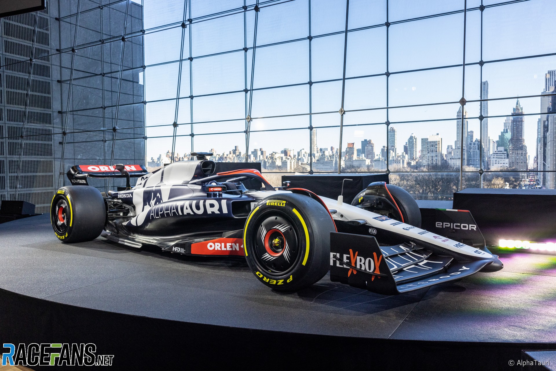
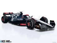
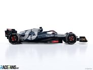
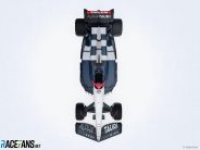
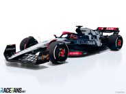
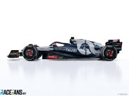
AlphaTauri have revealed the livery for their 2023 Formula 1 car, the AT04, at a launch event in New York.
The team have retained the blue-and-white colour scheme they have run with since their 2020 rebrand when the team changed name from Scuderia Toro Rosso. Sponsors visible on the car, which was a model based on the visual style of the current aerodynamic regulations rather than an example of AlphaTauri’s own chassis, include “primary partner” PKN Orlen, a Polish oil company which has defected from Alfa Romeo after being their title sponsor for three seasons.Present at the launch were team principal Franz Tost and the team’s new driver line-up of Nyck de Vries and Yuki Tsunoda. The car was launched in New York to coincide with the New York Fashion Week and the AlphaTauri clothing brand’s launch in the United States.
“As we know, Formula 1 has seen a huge increase in popularity due to the likes of Netflix and social media over the last few years,” Tost said.
“So it’s extremely important that we continue to grow in this market, which is why I’m pleased we were able to launch our 2023 livery here today in New York City to show our appreciation to the U.S. audience.”
De Vries is going into his rookie season in F1, after a starring debut with Williams last year made him a sought-after talent with several teams. He has joined AlphaTauri after spending the last three years in Formula E where he became world champion in 2021.
“I’ve loved attending my first event as a Scuderia AlphaTauri driver,” De Vries said. “The opportunity to represent the brand at New York Fashion Week has been extremely special for me and really showed me what the brand is about.
“I think partly because my journey has been slightly unusual and longer, I’m even more grateful for the opportunity, more motivated to grab it and hungrier to show what I’m worth.”
Tsunoda meanwhile is embarking on a third season with AlphaTauri and has a best finish of fourth from his first two years in F1.
“My main goal is to perform more consistently in every race, independently from the car’s performance, and to score points more reliably,” Tsunoda said. “I want this year to be my best performance of the three years in terms of getting to Q3 and scoring points.”
Pictures: 2023 AlphaTauri F1 launch


Advert | Become a RaceFans supporter and
2023 F1 season
- FIA president cleared of alleged interference in two 2023 races
- First week viewing figures for new Drive to Survive season fall again
- Max who? Drive to Survive season six prefers its favourite faces
- RaceFans’ complete 2023 season review
- The F1 drivers who pulled off the 10 biggest charges through the field in 2023
Jockey Ewing
11th February 2023, 23:14
The cutest livery yet, I hope they will not alter it :)
I could get away with a bit less red, for example on the halo, and the Flexbox logo on the front wing could have been done in somewhat nicer, smarter way, otherwise: 👍👍👍
Sam Crawford
11th February 2023, 23:14
Will be almost indistinguishable from the Haas
Gabriel (@gabf1)
12th February 2023, 9:04
Exactly what I thought!
Nice livery but a headache for viewers working out who’s who!
Luke S (@joeypropane)
12th February 2023, 16:31
Really? The HAAS is pretty much entirely white from the top view and the whole front wing is red from the Moneygram sponsorship.
The also the whole side of the car saying “HAAS” or featuring the AT logo.
Unless you’re watching view the lowest possible bit-rate illegal stream, I think you’ll be okay.
f1alex (@f1alex)
11th February 2023, 23:21
The trend of “livery reveals” or “season launches” instead of actual car launches really bores and kinda depresses me. I remember the days where every car launch was a huge event, mechanics “assembling” the new car in cologne, the spice girls coming out in Mclaren race suits, even that weird Benetton one with the fish tank. Nowadays we’re not even sure if the “new” car is the real car, and if it is usually it’s just a render hiding all the bits the Tech Directors don’t want you to see. Maybe it’s just rose tinted glasses, but this year is the least enthused I’ve been about “launch season” since I started following F1 in ’01, and that entirely hinges around the fact that every launch (bar maybe the Sauber one) has been a thinly veiled sponsor event, and not an actual F1 car reveal.
My anticipation is now geared towards testing, I can’t really trust “car reveal season” to actually produce the real cars anymore, and if it does they’ll be substantially changed by Bahrain anyway. The new pre-season start is Bahrain Day 1, everything else is fluff for the sponsors.
slowmo (@slowmo)
11th February 2023, 23:39
You can’t even trust what you see in testing to be fair as new bits still arrive at the first race from Red Bull and Mercedes!
Dex
12th February 2023, 0:32
Yep is sterile and boring, and I’d never watch the event and waste time. I just don’t care. Spending a minute on this article was more than enough. I saw it’s not even the car (what “look” means then? Kinda misleading), blah. No originality and innovation, and this is supposed to be F1. They show some renders, drivers say a few lines someone else wrote for them (what he learnt from some American PR guidebook), just beautiful, if you’re a robot you may even enjoy it…
Ben (@scuderia29)
12th February 2023, 9:03
Agree with everything you said, these aren’t car launches, there’s are renders on a model based loosely on the actual car released to give the sponsors a bit of exposure in the pre season, couldn’t be less interested
Niefer (@niefer)
11th February 2023, 23:37
A little less red and it would be a killer!
Jere (@jerejj)
12th February 2023, 7:15
Okay
MrBoerns (@mrboerns)
12th February 2023, 7:32
Yikes.
Olivier
12th February 2023, 7:45
Coherent, balanced, and tastefully put together. I love it!
Shout-out to the bold manga wheel rims. Very fitting!
bosyber (@bosyber)
12th February 2023, 12:45
W/o the red it would look classier, but, that’s the other big sponsor, so they had to make do, but I agree that the designers clearly knew what they wanted and executed that (probably) as well as possible given the constraints. Compare to the HAAS for how a similar color scheme could turn out (and good thing HAAS has the red rounded logo on the back-flanks, that’ll be something to separate these teams from a distance I guess).
RBAlonso (@rbalonso)
12th February 2023, 9:39
Strong BT52B vibes from the top angle.
Tifoso1989 (@tifoso1989)
12th February 2023, 14:31
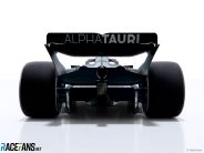
The entire rear end seems to be Red Bull inspired especially with the rear push-rod suspension which is understandable since AT gets transferrable parts from Red Bull technology. The interesting thing is that they combined the shape of the Ferrari sidepods (the openings) with the Red Bull rear bodywork.