


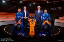
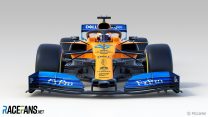
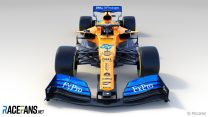
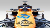
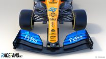
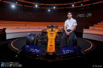
McLaren has revealed its new car for the 2019 F1 season, the Renault-powered MCL34.
It will be driven by an all-new driver line-up. Carlos Sainz Jnr has joined the team from Renault, while last year’s Formula 2 runner-up Lando Norris will make his Formula 1 debut.“I think the car is ready,” said Sainz. “We could go testing today if we wanted. Now it’s time to find the strong points and the weak points and get started with the season.”
Sporting director Gil de Ferran said the team is going into the new season with high spirits. “The feeling within the team is incredible, a lot of excitement and anticipation,” he said.
“Now seeing the car here in its full glory it’s really an incredible feeling. It’s a beautiful piece of art.”
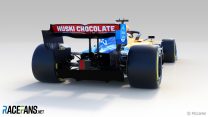
The team has also announced new sponsorship deals with British American Tobacco and Huski Chocolate.


Don't miss anything new from RaceFans
Follow RaceFans on social media:
Advert | Become a RaceFans supporter and
2019 F1 season
- Crying in the Melbourne car park at 2019 grand prix was my career low – Ocon
- McLaren Racing reports reduced £71 million loss in 2019
- Kvyat: Hockenheim podium last year was “my biggest achievement” so far
- How the FIA’s new encrypted fuel flow meter targets Ferrari’s suspected ‘aliasing’ trick
- “He smashed my office door”: 23 must-see moments from ‘Drive to Survive’ season two
Nick J
14th February 2019, 12:09
Still no title sponsor, another year languishing around the top 10 I reckon.
Nick (@nick101)
14th February 2019, 21:41
Question for the knowledgeable – when was the last time McLaren didn’t have a world champion driving for them?
Alan Santo (@alanmclaren)
15th February 2019, 0:36
I suppose it was 2008, with Hamilton and Kovalainen
Derek Edwards
17th February 2019, 23:19
Have they ever had a driver line up that has never been on the podium?
hahostolze (@hahostolze)
14th February 2019, 12:11
Oh wow that’s striking! What a great livery, what a lovely design, some very nice features immediately meet the eye, the bargeboards and nose especially. A car for the neutrals…
hahostolze (@hahostolze)
14th February 2019, 12:18
Just imagine if it’s as fast as it looks… McLaren have arguably the worst driver line-up (after Alfa and Toro Rosso, IMO), that’d be a real shame.
Jesper (@jesperfey13)
14th February 2019, 12:23
Williams’s line-up is worse that McLaren for sure. A rookie and handicapped..
kpcart
14th February 2019, 12:46
You mean f2 champion and f1 race winner
Jesper (@jesperfey13)
14th February 2019, 12:51
Still a rookie and still a handicapped
Jesper (@jesperfey13)
14th February 2019, 12:52
Palmer was champion as well. Look how that turned out..
hahostolze (@hahostolze)
14th February 2019, 13:06
@jesperfey13 if Kubica ever gets back to his previous level he’s miles ahead of Sainz
Jesper (@jesperfey13)
14th February 2019, 13:13
That would be awesome, and he would be mighty fast.. but I don’t see it happening to be honest
Mashiat (@mashiat)
14th February 2019, 14:21
@hahostolze Would Renault have signed Sainz over Kubica if they thought Kubica was the superior driver?
Arun
14th February 2019, 13:21
Not a good thing to say jesper
Joao (@johnmilk)
14th February 2019, 13:46
Question: If the injury was on a leg and not on his arm, would he be a footicapped instead?
MrBoerns (@mrboerns)
14th February 2019, 14:05
Different Question entirely, are we to take any hints from the fact Mclaren chose to not actually RUN their car as most other teams?
Todfod (@todfod)
14th February 2019, 14:48
@hahostolze
Hard to gauge driver line-ups. There are just too many variables right now in driver performance.. especially regarding Kubica and all three rookies. Williams could easily be the worst line up (although I hope not), followed by Toro Rosso, then the incredibly uninspiring Haas drivers… and then McLaren/Alfa seem equally mediocre.
Let’s not forget that even Force India isn’t a great line up… while they do have Perez, he’s paired up with the worst driver on the grid.
So overall, most of the midfield to back marking teams have an uninspiring line up. The only team within the midfield that has an exciting line up is Renault.
ddd (@fandukaja)
14th February 2019, 12:12
Pretty cool livery, but drivers overalls look like construction workers uniforms :)
chupamelachota
14th February 2019, 12:12
ready to be at the back of the grid
Magnus Rubensson (@)
14th February 2019, 12:13
I’ve decided … I like it.
Hope to see McLaren do well in 2019.
MazdaChris (@mazdachris)
14th February 2019, 12:13
Big orange space on the side there, did someone forget to put a sticker on?
ddd (@fandukaja)
14th February 2019, 12:27
Zak left this space for future sponsor deals :)
Arrows98 (@arrows98)
14th February 2019, 16:23
‘This is a cool spot’
Fer no.65 (@fer-no65)
14th February 2019, 12:14
The emptiness of those sidepods!
Adam (@rocketpanda)
14th February 2019, 12:17
I’m sure it’s just because it’s new, but the bargeboard area compared to the Red Bull & Mercedes seems super plain. Colour scheme is nice though.
spoutnik (@spoutnik)
14th February 2019, 18:35
@rocketpanda Indeed. It worries me. I get the impression they wiped the board and made a simplistic design to build on. I hope I’m wrong.
Fudge Kobayashi (@)
14th February 2019, 12:19
I like that a lot!
Fudge Kobayashi (@)
14th February 2019, 12:24
First thoughts, sidepod treatment looks very similar to Ferarri 2017 / Haas 2018
Nose near identical to last year but hidden well with livery
Bargeboard area uber basic in comparison to RB, Merc and to some degree, Renault!
Chris
14th February 2019, 12:21
Wheres Coca-Cola?
Todfod (@todfod)
14th February 2019, 13:05
I was wondering the same. No mention of coke during the launch event either.. He spoke about huski and bat coming on board though
Fer no.65 (@fer-no65)
14th February 2019, 13:43
@todfod Kimoa left too I thought it was going to continue
Todfod (@todfod)
14th February 2019, 14:24
@fer-no65
I’m pretty sure the only reason Kimoa was on the Mclaren was because they didn’t have the funds to afford Alonso
iCarbs (@icarby)
14th February 2019, 12:24
I like it, quietly confident for McClaren I really, really, really want them to have a quick car!
Sonics (@sonicslv)
14th February 2019, 12:44
@icarby Of all misspelling of McLaren, I never understand those who wrote is as McClaren, especially in F1 heavy site. How you could misspell by adding a letter that radically change how it pronounced when there’s a lot of correct McLaren spelling everywhere in this page including some in large bold letters?
iCarbs (@icarby)
14th February 2019, 12:57
Roses are red, Violets are blue
i don’t have an excuse
so an apology will have to do.
Sorry!
McLaren! see done it!
Phylyp (@phylyp)
14th February 2019, 13:05
@icarby – LOL :)
Sonics (@sonicslv)
14th February 2019, 14:18
@icarby As long as you keep spelling McLaren the correct way ;)
qazuhb
14th February 2019, 14:51
I never understand those who write Torro Rosso, especially in F1 heavy site
MacLeod (@macleod)
14th February 2019, 15:18
guilty! typing too fast and send it before looking up!
Dutchguy (@justarandomdutchguy)
14th February 2019, 12:26
they did more with the blue; that’s nice. They also appear to have done an Red Bull 2014 and attempt to hide their “controversial nose”, which i can kinda understand, even if it did grow on me a bit during 2018. their car also looks pretty well covered in terms of sponsors; BAT should still rot in hell
Their side pods look like they’ve been moduled after RB, but what they’ve done to the sharkfin is unique. Curious to see if it works – and if it lasts…
Paul F (@)
14th February 2019, 12:48
They appear to have backed off from last year’s nose to a less radical one. I guess it wasn’t working.
Dutchguy (@justarandomdutchguy)
14th February 2019, 20:03
They appear to have continued in the same direction. The holes are still there
Joao (@johnmilk)
14th February 2019, 12:26
Seriously? They have done a better job promoting Freddos than they did with Huski.
Todfod (@todfod)
14th February 2019, 14:25
@johnmilk
Honestly … how many people are going to see that Huski on the back of the rear wing of a Mclaren? When was the last time a car was even behind Mclaren?
Shaun Robinson (@)
14th February 2019, 14:32
When the other Mclaren retired…
Todfod (@todfod)
14th February 2019, 14:55
@robinsonf1
Or when they get lapped.
Robin Gawne-Sheridan
14th February 2019, 16:25
Both Williams all season long
Robin Gawne-Sheridan
14th February 2019, 16:27
All the cars except Stoffel as he was getting lapped
Karthik (@kart1131)
14th February 2019, 12:27
Now that the rear wing has been occupied by Dell Technologies and Huski chocolate, why can’t they just put “Mclaren” name on either side?
GechiChan (@gechichan)
14th February 2019, 12:28
never seen those wings above the side pods before, are these legal this year, or have always been but no one used the idea? They look interesting, fighter jet almost.
Joao (@johnmilk)
14th February 2019, 12:41
@gechichan RedBull had a similar design last year
Vincent (@vinnivinni)
14th February 2019, 12:29
Why did the choose some tv-show arena for the presentation? It looks like didn’t have a tri-pod high enough to take the picture ;)
ForzaRogo (@forzarogo)
14th February 2019, 12:39
haha, yeah it’s quite small. it’s McLaren’s own presentation area in the technology center.
Kringle
14th February 2019, 12:33
THUNDERBIRDS ARE GO!
Kringle
14th February 2019, 12:37
https://cdn.shopify.com/s/files/1/0475/4549/products/gordon-tracy.jpg?v=1532168538
baasbas
14th February 2019, 15:52
*virtual hat tip*
Luke S (@joeypropane)
14th February 2019, 12:38
By a country mile the best livery so far – the extra use of the blue at either end is very attractive to my eyes!
Also very aggressive looking from the front, those extended side pod wings are very nice.
Shame the wrong Spaniard is driving it, but hope they have a better season and can mix it with the Renault and (now handicapped) RBR cars.
Pedro Andrade
14th February 2019, 12:40
Better than last year, but since I now associate orange with McLaren failure I’m not very thrilled…
Todfod (@todfod)
14th February 2019, 14:35
I remember looking at the Mclaren last year (and even in 2017) and I’ve never felt more underwhelmed. There was nothing innovative on the car.. it was big, clunky and had boat-like packaging towards the engine cover and rear end. Those cars looked like failures from the launch event itself.
At least in 2019, it looks like they’ve adopted some best practices. Their side pod layout seems to be as per Ferrari / Red Bull norm. Their nose cone bears some resemblance to Mercedes (although they have that silly snout at the end). Overall, the car looks kind of basic now, but at least it doesn’t seem as uninspiring as their two previous seasons.
Although I don’t expect much of Mclaren this year .. I think they should be in better shape at the start of this season than they were at the end of last season.
JayMcG
14th February 2019, 15:03
This is the main thing. A very slight improvement will be very welcome. If it’s a car without a fundamental flaw, McLaren should be able to update it positively so there isn’t the massive dip in performance like last year.
The car does look good and nice livery.
Paul F (@)
14th February 2019, 12:44
The openings on the side pods seem to be bigger than is the trend this year but those wings on the side pods are unusual, and connected to the mirrors?
This is the first season in a long long time that they haven’t had a former world champion driver with them, but I can understand why. *sigh*
Ashley
15th February 2019, 7:47
This is basically their first season ever without a race winner in the car!
erikje
14th February 2019, 12:45
By far the ugliest car at the moment.
Maybe a design internship?
kpcart
14th February 2019, 12:47
There will always be someone… Explain your reasoning
erikje
14th February 2019, 14:30
Color combo is terrible.. probably a color blinded designer on a trip. Or someone spilled the paint and there was to little time to correct it.
The poor drivers are even worse… two f1 clownsuites .. terrible
It simply ugly.
JayMcG (@jaymcg)
14th February 2019, 15:08
You’re the only person in the world that doesn’t think blue and orange go well together lol
erikje
14th February 2019, 22:17
Depending on the color orange and blue.
Homerlovesbeer (@homerlovesbeer)
14th February 2019, 12:51
@erikje Saaaay whaaaat???
Psi (@psi)
14th February 2019, 12:56
I agree. It’s like a color blindness test.
wobs
14th February 2019, 12:47
The diffuser area is 100% blacked out, maybe something interesting going on there! A respected podcast reported Mclaren have found a loophole in the regs.
Alan (@alalo)
14th February 2019, 13:59
Ooh what podcast? It feels like a while since a good loophole was found.
pastaman (@)
14th February 2019, 12:49
Looks like they took a lot of design cues from previous generation Red Bull cars
Luke S (@joeypropane)
14th February 2019, 12:57
Considering Peter Podromou spent a LOT of time working directly with Newey, it’s not all surprising.
Coanda (@ming-mong)
14th February 2019, 12:52
very neat package with traits of the top 3. love the livery, very cool. Its just missing one thing, Nando…
kpcart
14th February 2019, 12:53
I like this car because the livery reminds me of mid 2000s Renault
Phylyp (@phylyp)
14th February 2019, 13:06
I like it – more blue to balance the orange. Also, happy to see my worries were unfounded – there’s not Husky (Huskie?) red to throw off the colour palette.
Sonics (@sonicslv)
14th February 2019, 14:16
@phylyp Never look it from behind then ;)
Phylyp (@phylyp)
14th February 2019, 14:21
@sonicslv – ah, dang :)
Well, from the rear its mostly red and blue, which is palatable.
Jere (@jerejj)
14th February 2019, 13:34
The car livery is nice, but the driving suit design, not so much. I prefer last season’s predominantly white color scheme.
Pat Ruadh (@fullcoursecaution)
14th February 2019, 13:44
Yeah Scott Dixon called he wants his overalls back
Markp
14th February 2019, 14:23
Chunky sidepods, plain livery, looks very back of the grid which is about where they are nowadays.
Yoseph
14th February 2019, 14:44
I hope it laps the entire field twice!
petebaldwin (@)
14th February 2019, 14:52
I don’t personally like the livery that much – it’s OK but it looks like something you’d run in a spec-series to try and stand out from the pack (or something a backmarker in F1 would run, for the same reason).
The car itself looks aggressive though and they’ve clearly learnt that Keith will lighten sections of pictures to see what’s going on so they’ve loaded up MS Paint and blacked the whole diffuser section out! It’ll be interesting to see what’s going on there. I’m more hopeful for McLaren having seen their initial design than I was last year.
Duncan Snowden
14th February 2019, 14:59
I told myself I wouldn’t only comment on the liveries this year, but that is nice. I’m one of the (very) few who actually preferred the 2017 one to last year’s, but I like the tweaks they’ve made, particulary the visual “rounding” of the nose. Very clever, and effective.
JayMcG (@jaymcg)
14th February 2019, 15:19
Negativity breeds negativity. If McLaren were at the front people would have loved the 2017 livery, but because McLaren were bound to have another bad year most people didn’t have anything positive to say about it.
It’s a complete new era starting for McLaren now and people are hopeful, so there will be more positive reactions to this decent livery.
Personally I preferred the simple black livery before the orange was introduced. I think they should have kept the orange for when McLaren are doing much better.
JFCVT
14th February 2019, 15:46
A few thoughts:
Don’t like the livery, too messy unlike last year’s one
Although there are new sponsors (the swedish chocolate drink, Sainz’s Estrella Galicia and BAT’s Marlboro-style no-tobacco campaign), the car still looks a bit naked. Also, despite the (mostly fan-led) hype, Coca-Cola is nowhere to be seen
The car looks, at least to the “sofa-engineer” eye, more sophisticated than last year’s one, with interesting solutions in the bargeboards and the by now practically mandatory Ferrari-style sidepods
Finally, i love the new, colourful, driver overalls: 20 years with mostly white ones was more than enough, don’t you think?
PT (@pt)
14th February 2019, 17:15
Which sponsor is “A Better Tomorrow” connected with?
Dutchguy (@justarandomdutchguy)
14th February 2019, 20:05
British American Tabacco.
This is McLaren’s Mission winnow
Wayne
14th February 2019, 19:12
as a McLaren fan they could have went a little more bold and swept with the orange and blue, in fact perhaps the orange could have been a deeper “rocket red” (I think the colour is called) with a bit of metallic and 2 tone effect. it looks like my 5 year old son coloured in the car. no offense to my son… look at the mercs, looks fast, is fast…this McLaren is certainly not the innovative, daring McLaren of Ron Dennis’s time. they now exit to partake not to win. very disappointing on many levels
Sonics (@sonicslv)
15th February 2019, 7:15
McLaren’s rocket red is the red they using in their logo and winning shirts circa Vodafone era.
McLaren’s volcano orange is the modern deeper orange one first used to promote MP4-12C.
McLaren’s papaya orange is the traditional light orange used by Bruce McLaren.
kpcart
15th February 2019, 12:06
I’m surprised more people haven’t talked about the photo from the back that has the diffuser completely blacked out. thejudge13 who some of you know has a couple articles predicting that mclaren have found a loophole in the floor and diffuser, and even one of mclaren engineers left a cryptic tweet that suggests mclaren have something revolutionary, we will have to wait till testing. I hope they pull a Brawn, f1 needs more competition at the front.