


Television coverage of motorsport has evolved dramatically since the turn of the millennium. Live feeds in 4K resolution, helmet cameras and even augmented reality have allowed new opportunities to enhance the viewing experience for fans.
Graphics packages have also changed dramatically even in the last 20 years. From irregular tickers along the bottom of the screen giving occasional updates to race positions, now it’s hard to find a racing series that does not make use of a permanent timing tower on the left of the screen throughout the race so fans always know exactly where their favourite drivers sit in the order.But out of some of the biggest motorsports series on the planet – Formula 1, Formula E, the World Endurance Championship, IndyCar, Moto GP and NASCAR – has the most effective graphics package to keep viewers informed of what the state of the race is? Review each series and then vote for which one you think has the best approach.
Formula 1
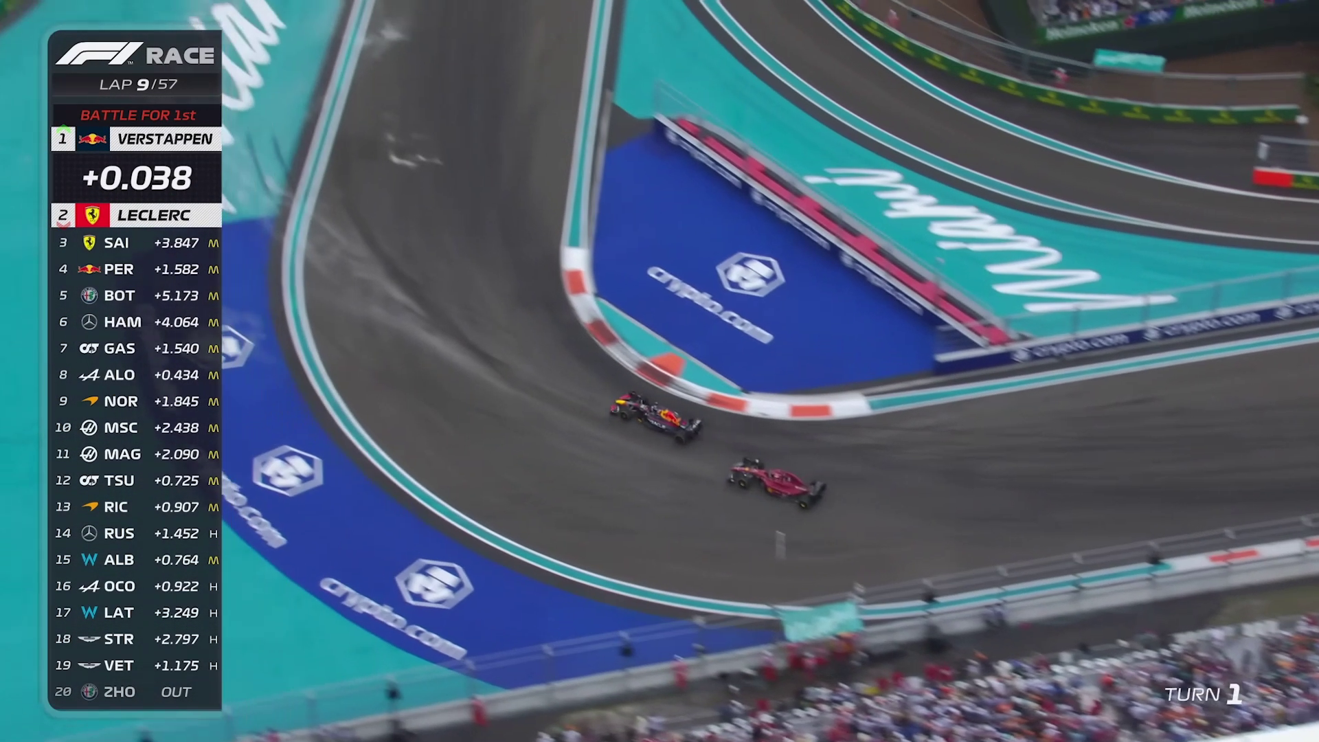
Formula 1 refreshed its graphics package to coincide with the all-new ground effect era at the start of the 2022 season.
A timing tower sits permanently on the left hand side of the screen, showing race positions, driver, team logo and what tyre compound the car is currently running on. Onboard cameras also make use of the Halo protection system around the driver’s helmet to display live telemetry.
Formula E

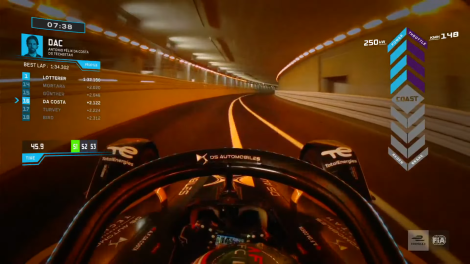
Formula E makes heavy use of the series’ blue branding as a colour to highlight important information like race positions and which drivers are currently using Attack Mode. When a driver has activated their extra power boost period, the duration they have remaining is shown on the timing tower in its entirety.
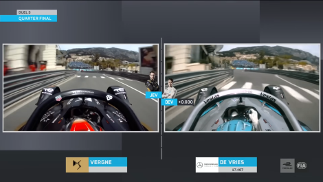
With a move to the new duels format in qualifying, Formula E occasionally uses side-by-side onboard footage where feeds are synced together to show a direct comparison between drivers. A live measure graphic shows which of the two drivers in the duel holds the advantage.
IndyCar (NBC)
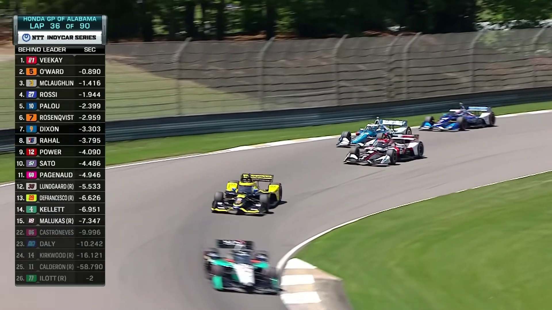
IndyCar’s race graphics by broadcaster NBC are perhaps the most similar to Formula 1’s in terms of look and purpose. Driver numbers are featured far more prominently, with backgrounds reflecting the liveries of each car to help make it easier for viewers to identify cars if they are not familiar with them.
IndyCar also uses picture-in-picture to show replays of incidents at track action while also keeping a view of the live race action the screen at the same time.
Moto GP
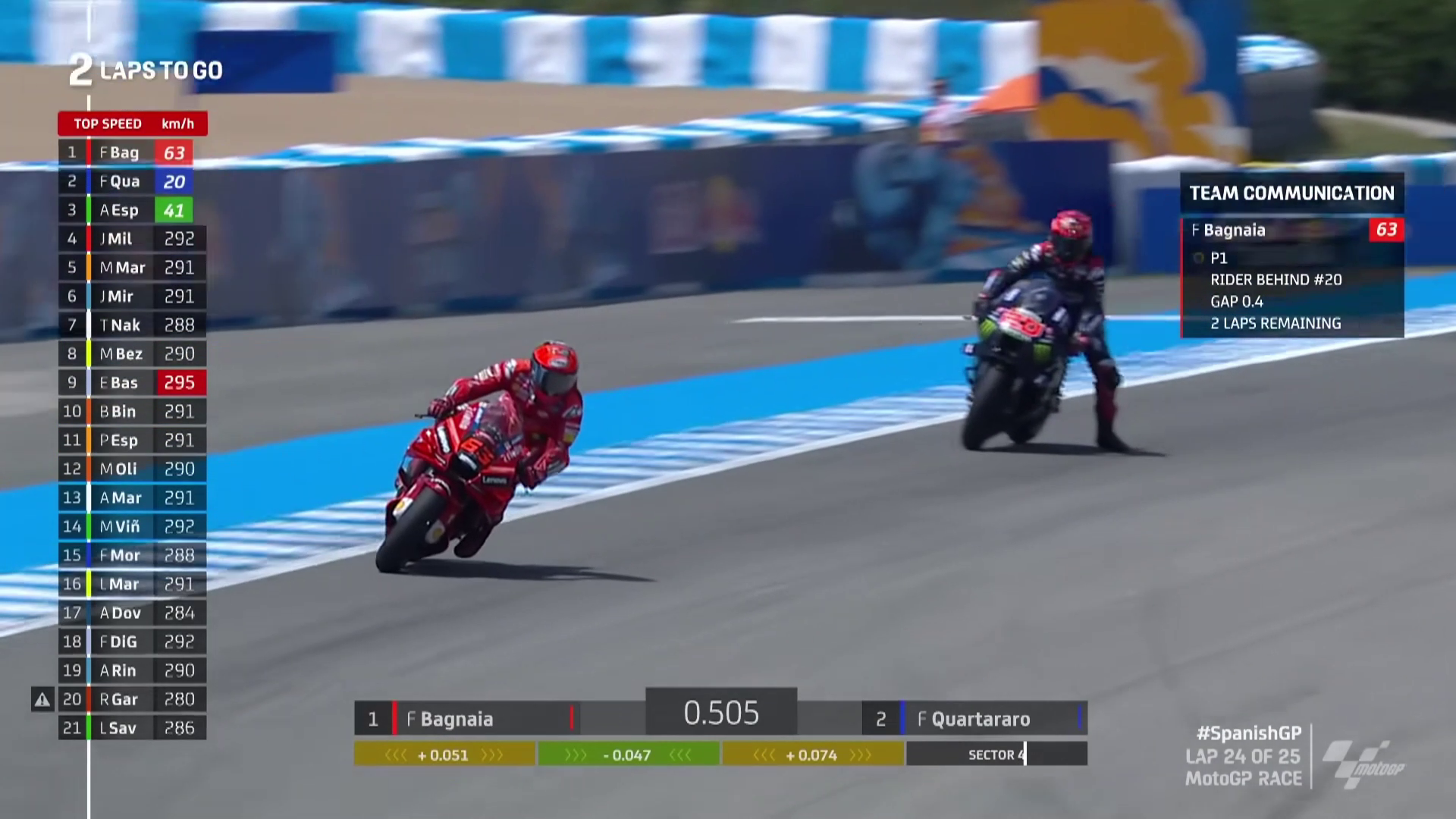

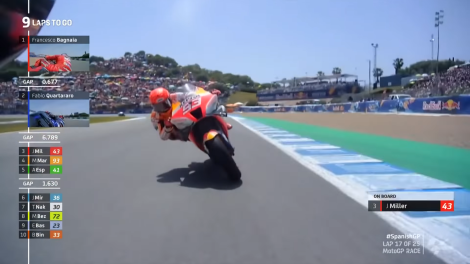
Moto GP’s graphics package has evolved greatly in the last 20 years. Commercial rights holders Dorna have placed major emphasis on trying to present information as clearly as possible to make the sport accessible to viewers who might not be familiar with the sport. Riders on screen will often be highlighted on the timing tower, making it clear what battle is currently being shown.
NASCAR Cup Series (Fox)
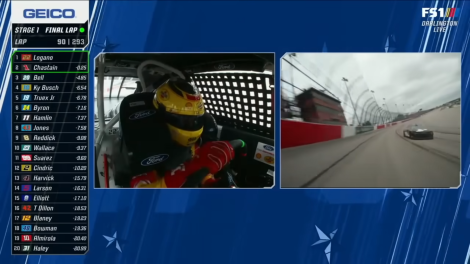
NASCAR’s broadcasting arrangement is different to most other series on this list where coverage of the NASCAR’s top level Cup series is shared between Fox and NBC during the season. NASCAR does have its own graphics package for international broadcasters, but the majority of viewers in the United States will watch with Fox’s suite of graphics.
When NBC takes over broadcasting the remainder of the season’s races later this month on its main network channel and its basic cable channel ‘USA’, it will use a similar suite of graphics to those used for its IndyCar coverage.
World Endurance Championship
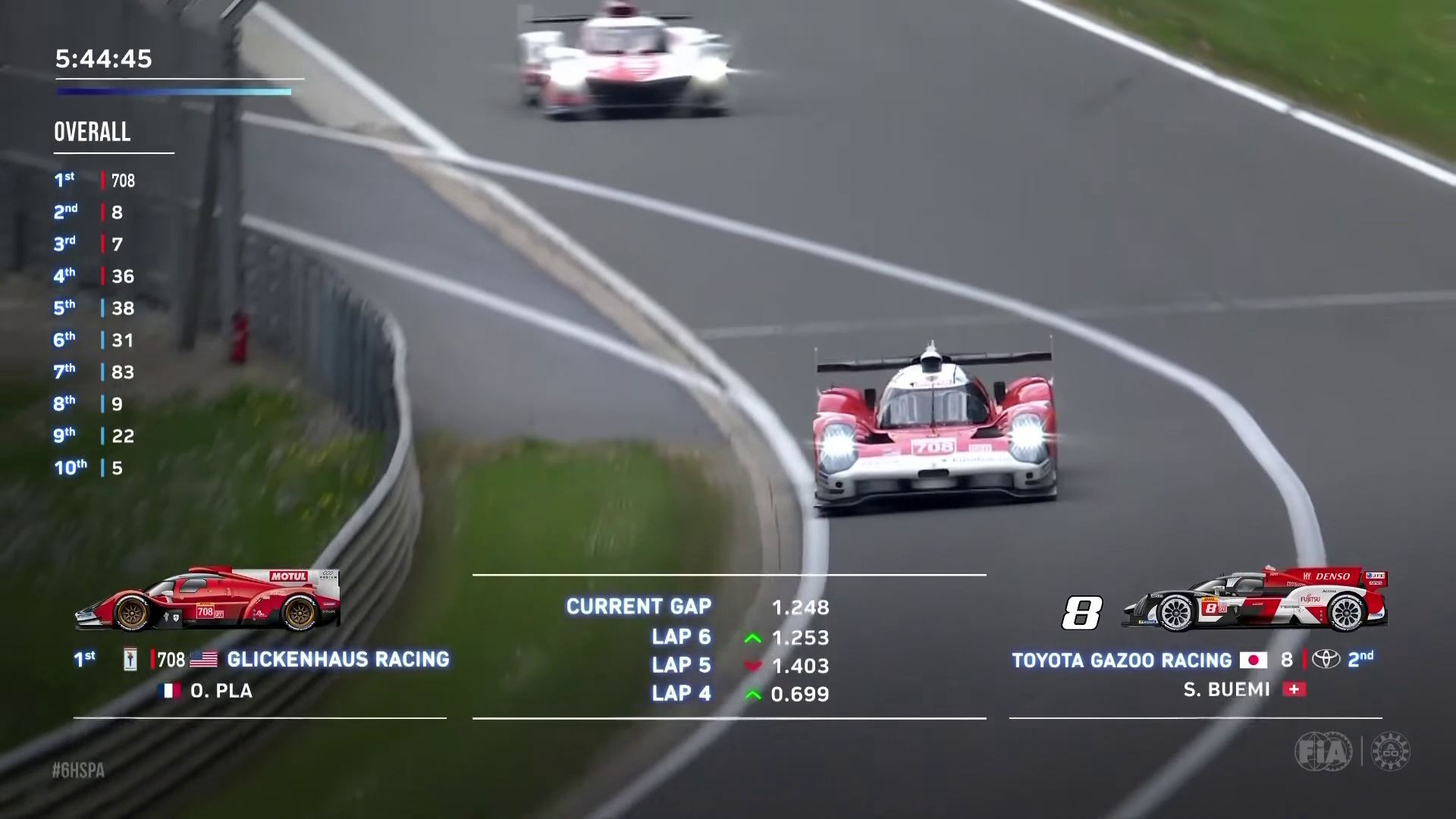
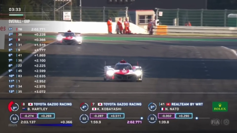
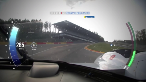
The TV graphics package for the WEC is more minimalistic in design than other FIA world championships. With multiple classes racing against each other at once, each car is designated by a colour representing its class – Hypercar, LMP2, GT Pro or GT Amateur – rather than a colour to represent its team.
The timing information also uses a noticeable translucent shadowing effect over the screen to help the graphics stand out against the race footage.
You say
Which motorsport series has the right approach to presenting information to viewers during races? Cast your vote below and have your say in the comments.
Which motorsport series has the most effective TV graphics package?
- Other (2%)
- World Endurance Championship (4%)
- NASCAR Cup Series (4%)
- Moto GP (36%)
- IndyCar (5%)
- Formula E (4%)
- Formula 1 (45%)
Total Voters: 110
A RaceFans account is required in order to vote. If you do not have one, register an account here or read more about registering here. When this poll is closed the result will be displayed instead of the voting form.
Debates and polls
- Will Alonso win a world championship title with Aston Martin?
- How long should Red Bull give Ricciardo to prove he’s not lost his touch?
- Were stewards right to penalise Alonso over his driving before Russell’s crash?
- Are Williams right to bench Sargeant so Albon can race after crash?
- Is the FIA right to make ten seconds the new standard for penalties?
Ben Rowe (@thegianthogweed)
5th June 2022, 13:04
I think formula 1 is a real mess at the moment. I preferred it back in 2016 when they had 5 drivers at a time with a narrow discrete bar at the bottom centre of the screen. I hate how gigantic the current graphics are and this year it is an even darker shade than it used to be. That including the other current graphics take up over 20% of the screen at times and I find it simply too much. It also annoys me that despite it being much bigger than before, it is somehow harder to read. They seem to feel the need to change the font every single year… First off this year they had some text on a close-to black background that was written in dark grey. Serious lack of thought went into this. They also started showing the full second names of the drivers for a great deal of the race, which is somewhat pointless to me, as it just makes the huge bar much wider than it needs to be. The amount of times the cars drive behind it is annoying. Having recently watched a race from over 5 years ago, you could see much more of what was going on.
I also think they have had a big lack of thought regarding the placement of the pit stop times. Sky and other broadcasters seem to have to have this white rectangle that is likely related to broadcast rights. It wasn’t too much of an issue until the graphics for no reason were moved to where that is. Now, every single drivers pit stop time gets partly covered by it, and if the driver is an Alfa Tauri driver (their pit stop time is in white text) it is sometimes close to impossible to read. I complained to nowtv about this, but it isn’t really to do with them.
How many other things do we simple not need? loads…
Overtaking probability?? how about just watching what actually happens – rather than cluttering the screen with pointless random computer estimations.
The graphics stating how much the drivers tyre is worn out is very annoying. Where do these random percentages even get generated? They never seem accurate.
I remember the negative comments first time that the showed a driver replay where they first of all show you a full screen pre-recorded clip of the driver doing a stupid pose and folding their arms and smugly look towards the camera for 5 seconds. What is the point of this?? What is wrong with a small thumbnail of their face like they used to have while using the time effectively and showing it during the replay. Now they show this on almost every replay when just one driver is involved and constantly end up having to show more replays later on because of the extra time they waste. This was a very dumb decision.
Maybe others think it is cool, but i find some of the onboard halo graphics too much as well. They have got it well placed to use the area that is blocked by it, but the choice of font that they use on the road ahead of the car in my opinion is absolutely horrendous. They make it such a bizarre shape (sort of like a pyramid?) -getting narrower towards the top. I find it so challenging to read the huge numbers at times. I just find it so frustrating to think that it would in fact be so easy to read if they used smaller, less space consuming and simpler font and then it would be fine!
I think Liberty Media are just trying too hard to supposedly make it better and failing. In a similar way to how overkill the Miami Grand Prix was.
Not that this is to do with graphics, but the amount of audio tweaks in the past 2 years (especially this year) have been dreadful. Almost every race there has been this painfully repeated, overplayed pre-recorded crowed cheer. They do it on even the most simple of overtakes at times. Sometimes when they are not even successful. I remember at the start of the Saudi Arabian grand prix, you could here that whoever it was had accidentality pressed the “cheer button” twice close together and the sound overlapped and sounded totally wrong. Then when they showed a replay of the start, you heard no cheer, indicating that it literally was just inserted into the live feed that in reality makes it well – less live.
Well, you can tell I’m miserable about what Liberty have done to the sport…..
Sensord4notbeingafanboi (@peartree)
5th June 2022, 13:08
@thegianthogweed thanks for writing this rant. It spares me the time.
Bullfrog (@bullfrog)
5th June 2022, 15:34
Yes. Plus “crowd reactions” instead of the end of the move on track, I wish they’d show coloured car numbers instead of a pointless team logo, and during qualifying there’s too much going on – sector times and clocks everywhere.
Darryn Smith (@darryn)
5th June 2022, 18:25
The current busyness of the graphics is terrible, but I think the fact that they switch to a replay on lap 3 of the start just when you’re getting into the flow of the race. Then further distractions occur when they actually show all the pitstops. We have dvrs nowadays or youtube and can watch a replay of the start anytime we want. Get rid of the replays and the pitstops as they are far more of a distraction than the silly graphics overload.
Jere (@jerejj)
5th June 2022, 20:24
@darryn Showing start replays around lap 3 (or 3-5 range) has been a common feature for a long time.
Those replays have to get shown sooner or later, so better when a race is in its early phase.
Nothing wrong with showing pit stops either, nor does every single one get shown anyway.
I’ve never had an issue with these things, only directing in Monaco, & when a lone driver gets TV time instead of drivers close to each other.
Thomas Pitts
5th June 2022, 23:00
Just because it’s always happened, doesn’t mean it should. There doesn’t need to be a lap and a half worth or start replays when nothing in particular has actually gone on. If a replay is worth it, fine. But most of the time they are dull.
Coventry Climax
6th June 2022, 1:00
Thank you Ben Rowe. May I add my two cents?:
To me, the main annoyances are, but in no particular order:
– Ask any starting graphics designer which text color shows best on what background color, and you’ll get the same answer with all of them. And it’s not the color combination F1 is using.
– We’re living 2022. F1 spends millions on whatever. How the hell is it possible that sound quality of board radio messages is so utterly poor? Why are some written out (see previous remark) where others aren’t? Want to be inclusive? Race as one? Then start thinking about people that don’t hear well.
– “Session resumes at 14:25 local time.” Great. Care to also show what the ‘local time’ currently is then please? Fools.
– In F1, 2, 3, W-Series and a couple others, you’re in the dark as to who’s who, where on track and in which position, unless you know all the car-/drivernumbers by heart. And they want to increase the viewing numbers? That’s a laugh.
Name and Position on track are useless when you can only see the car-/driver numbers. And that is even if you see those at all, as the car-/driver numbers are usually not all that visible. Proof: Even the commentators and directors mess up on a regular basis.
Look at the Indycar graphics above: Position, Car-/Driver number, Driver name, Time/-delta’s. Now add Tyretype and -age and no. of pitstops/tyrechanges made IN THE SAME GRAPHIC and it’ll start to look like something. There’s more than space enough with today’s widescreens.
– Predictions and analysis like Car performance, Pitstop windows, Tyre performance and aging? All crappy, utter nonsense and consistently wrong. Plus you have to creep up close to the screen with a magnifying glass to be able to read it all – see that first issue again.
– The F1-tune. Man am I fed up with it. Stupid ‘heroic’ computergame tune. Just as bad as hearing ‘Last Christmas’ a 100 times over where once is already more than enough as it’s just the same refrain repeated again and again and again for the entire song. Same with these pre-recorded driver presentation, success and failure graphics. Hamilton trying to look mean. They try so hard to make them all look like heroes, where heroes are actually just made by their actions, not by these silly clips.
– Please, please pretty please do away with the label showing the driver name when we have a forward looking onboard camera? Please?
– Nothing to do with graphics, but do we really have to look at 5 replays of all of the DRS passes all the time? They are utterly uneventful to start with, so not worthy of any replay to start with, but if you really have to, one replay is more than enough please.
I’m sure I’ve forgotten a couple, but fixing these would be already be absolutely super. I can understand they want to reach out to a younger public, but do we all have to suffer just because F1 wants to appeal to four year old gamers?
Coventry Climax
6th June 2022, 1:12
Yep, forgot one:
The special effects louder sound laps or whatever they call them.
LOUD should be the sound level throughout the entire race!
I want to see, feel, hear and smell the on track action full time!
DB-C90 (@dbradock)
6th June 2022, 11:04
Have you noticed that it just seems to be a sound bite played on a loop and not at all related to the car that they are showing?
That sort of silliness just makes me cringe.
Phaedrace (@phaedrace)
6th June 2022, 6:33
I remember back in the 80s/90s you could always identify the driver by the number on the car. It was never difficult and so I always knew who was in the car, despite their numbers changing frequently between seasons. Now, even though drivers have the same assigned number their F1 whole career, I can never – and I mean never – find the drivers number on any car. I don’t know what happened to them, are there too many adverts on the cars? The colors have poor contrast? Camera angles don’t display the number well? No idea. I am often at a loss whether I am looking at Hamilton or Russel, Verstappen or Perez, Sainz or Leclerc. Terrible.
S
6th June 2022, 7:18
As long as it has a high contrast with the background, it doesn’t really matter what colour it is.
It’s made for communication with the team in a pretty loud environment – not for broadcast. The driver’s microphone is sewn into the balaclava. Not sure if you’ve ever tried listening to someone with your ear touching their mouth, but if you do you’ll understand why it sounds like that.
If you want the technical explanation of why it’s so close, it’s called signal to noise ratio.
As if it matters when you are watching TV from another country.
Jump on F1’s website if you really need that – the homepage has the calendar with dual clocks on it for local event time and your time (wherever you are).
They give all of that except “where on track” for most of the race. That’s the main graphic that is taking up most of the screen. They often show the GPS positions of each car on a track map in the lower right corner – but if you want it all the time, well, you don’t get it all for free. There’s enough going on cluttering up the screen already.
Not every car has the driver’s name visible – so unless you know them all by helmet design, you probably won’t know which of the two cars it may be. You literally just said above that you want more visible names…
If something more interesting was happening, they probably wouldn’t show them so much.
And then there’d be endless complaints that you can’t make out what the commentators were waffling on about.
And as for car number visibility – I can’t recall seeing any for years unless they are doing slow-mo closeups. As long as you know a Merc from a Red Bull from a Ferrari and who has which T-Cam colour, you can easily work out which driver it is.
Coventry Climax
6th June 2022, 18:47
Eagle’s eye and a wit as sharp as a razor. Or you’ve got your eyes glued to your 50 inch screen and don’t really care what nonsense they show you and what essentials you miss. Either way, good for you.
But this was MY complaints list and it still stands. Been watching it long enough to know it’s downhill fast.
S
7th June 2022, 3:23
I have a 32″ TV.
But I watch it and focus on the things that matter to me, not all the other garbage.
Still, I’d rather they show me things that are necessary (the cars) and not just tell me about them with words and numbers clogging up the screen.
Coventry Climax
7th June 2022, 23:47
@S:
1969: “The Eagle has landed.” “Small step for man, giant leap for mankind.”
53 years ago. Communications channel meant to operate between astronauts and mission control, and not for broadcast either.
But it was clearer (even on our B/W tube mono TV back then) than the current communications between driver and box.
The point being: If they decide to broadcast things, then be professional about it and make it broadcast proof.
Something similar for my other points.
Rhys Lloyd (@justrhysism)
12th June 2022, 4:36
Small gripe about this rant here, the F1 theme is absolutely nothing like a computer game.
The only game it might sound like (other than the official F1 game itself which uses the theme) is Madden NFL which has an orchestral theme song—but I’m pretty sure it’s actually the theme song from NFL itself, so not really a “game” theme song.
I actually can’t think of any games which have an orchestral theme.
With respect to the theme itself, at first I wasn’t much of a fan, but now I actually really like it and I find it fires me up for the event.
If you don’t like it, hit the mute button.
Mr Scallywag
6th June 2022, 1:30
A large problem is the font itself, it’s not a display font. It’s fine as heading font, but because it’s both extra bold and extended, at a small scale it a) becomes harder to read, so needs to be that bit larger, and b) takes up more room, which is the problem we face now. A totally different font is needed for those more detailed areas, same vibe just a book version or semi bold.
Sensord4notbeingafanboi (@peartree)
5th June 2022, 13:05
The people that voted f1 don’t watch other motorsports. F1 was better circa 2008, the simple tower and good gaps given by thr director, the current graphs follow motogp trends but manage to distract and take too much screen estate from the viewers not to mention the onboard graphs often block out view.
Jere (@jerejj)
5th June 2022, 20:30
@peartree, I voted for F1, but I’ve watched Super Formula to an extent & one IndyCar race thus far (F2/GP2 also, but those graphics have mainly been the same as in F1), so I can wholly compare the respective graphics designs between these three series.
I still prefer F1’s design even though the present one isn’t my most liked since 2004.
drmouse (@drmouse)
6th June 2022, 8:22
I’ll be honest, I don’t watch other Motorsports very often. However, I quite like the graphics in F1 most of the time.
My biggest issues are:
– constant switching between interval and gap gets irritating
– switching to showing no times, just tyres, or really annoying
– when they are focusing on a “battle”, they drop the timing entirely for those drivers… This drives me up the wall! Just when they are focusing on something interesting, they drop all the information about it!
Other than that, the “tower” on the left is pretty clear, and other graphics are not too bad. That said, I used to augment them with the F1 app to get a clearer picture, even running multiple devices to build my own little “mission control”, which worked around the failings.
Fer no.65 (@fer-no65)
5th June 2022, 13:22
MotoGP’s broadcast (not just the graphics) is head and shoulders above F1’s. It’s very well presented, the angles they show are weide so you get a great sense of speed, they never miss the action and don’t cut to silly replays or fan reactions. They also use picture-in-picture a lot, so maybe the battle for 2nd and 3rd is heating up but you’re still watching an onboard from the leader.
CD (@clipperdael)
5th June 2022, 13:30
I wonder why more series don’t show colour-coded live sectors for all cars in qualifying like British GT do. for example.
https://www.youtube.com/watch?v=vseNxhwAONg
Pink for overall fastest sector, green for personal best. It’s just a small extra column in the timing tower but it really helps to show who’s on a good lap. DTM use a similar graphic IIRC.
Alan Dove
5th June 2022, 15:06
MotoGP have done this for a while. Might be some editorial reason or commercial as to why it isn’t embraced elsewhere
SteveR
5th June 2022, 13:59
How about requiring the drivers name on the halo? When the view switches to in-car I have no clue to which of the team drivers I’m riding with until the commentator says something. Several of the teams do show the driver’s name (Haas does, I think) but it would be easy to add HAM or whoever to the halo.
Keith
7th June 2022, 5:39
Yes!
StefMeister (@stefmeister)
5th June 2022, 14:00
I think the current F1 graphics take up too much space & I still don’t like the font as I find it a bit tricky to read for some reason. Still think the 2015-2017 graphics were much cleaner, Easier to read, Less obtrusive & provided more information.
The Formula E graphics aren’t terrible but I don’t like how they darken the whole screen to show the telemetry or how aspects of them move around or make sounds to attract attention. I also think there are some details that get added to the screen during the race that make the screen look just as cluttered as F1.
The NBC/Indycar graphics again aren’t terrible but I have always felt that the graphics used for US Sports broadcasts are far too large & take up too much space. I also don’t like how much they use Split-Screens as I don’t like it when replays for example are shown in a smaller window making it harder to pick out some of the detail.
I’m not a big fan of the style of the WEC graphics in terms of using the dark shading rather than having hard backgrounds behind them. The actual information displayed is fine although at times I sometimes feel like I don’t have some information I need, Something not helped by the commentary at times seemingly not watching the screen.
The MotoGP graphics looks decent but I don’t watch bike racing (Outside of the IOMTT) so don’t want to comment as I don’t know how they actually function. And since I also don’t watch NASCAR i’m also not going to comment on those.
Jere (@jerejj)
5th June 2022, 14:14
This choice might seem biased, but F1 ultimately, although I still prefer the 2015-17 graphic design over the present & previous ones. Perhaps SF & DTM could’ve also been included in the article.
JohnH (@johnrkh)
5th June 2022, 14:22
When I went to my first Moter Race I bought the program and it had the entrants the qualifying times and grid positions for the race. At the back of the book was a chart for each race so I could record the times and finishing positions, that was all. Other than that I could try to look out for the pit boards as the teams hung them out.
I do think that the mountain of information is a bit of overkill, but not as bad as the unnecessary shots of the crowd though.
Will Wood (@willwood)
5th June 2022, 16:28
@johnrkh What race was that, if you don’t mind me asking?
I’d love to know!
JohnH (@johnrkh)
6th June 2022, 2:03
@willwood The Australian Grand Prix at Warick Farm 1969. I’m not sure it was officially part of the WDC/WCC as it was called the Tasman series.
I actually went to see the touring cars Formula One was not often shown on TV back then. Up until that point, I thought Mustangs and Monaros were the fastest cars in the world :))
S
6th June 2022, 7:21
Tasman series was during F1’s off-season.
Just something those guys did for fun, before going back to their real jobs when Europe came out of winter.
Neil (@neilosjames)
5th June 2022, 14:55
Of the ones I see with enough regularity to get used to (F1, FE, MotoGP), F1. Not perfect but they’re the ones I find easiest on the eye, and I’ve become a definite fan of the onboard that makes use of the halo dead space to put up a useful graphic.
FE, I just don’t like the colours and I feel like the tower shifts too often and very obviously when they highlight different drivers. You can’t just glance at it, because it’ll look different to how it did last time.
I don’t dislike the MotoGP ones, but I don’t have the same appreciation for them as I do the F1 graphics… probably because I’m more drawn to check out graphics in car races, whereas in bike racing I generally don’t.
S
5th June 2022, 15:29
Where’s the option for “No graphics”?
Personally, I prefer Super GT’s style – minimal but clean and easy to read.
I don’t need (or want) to know everything all of the time. Just let me see it and enjoy it as it happens, please. Let me be surprised.
I watch for the racing, not the timing and overlays. The fewer graphics, the better, IMO.
pastaman
5th June 2022, 15:58
I think probably MotoGP sets the standard. I enjoy the extra information this year for F1, but really dislike the change to use logos on the timing tower instead of colors. Makes it more difficult to pick out at a glance
Pat Pepper
5th June 2022, 16:36
For many years now, the detail that I find the most frustrating on the F1 graphics is when they decide to show the number of pitstops made by each driver and then keep showing it for quite a long time, at the expense of showing us the time gap between each driver. It’s particularly annoying when they do this after the last round of scheduled pit stops, when it really becomes utterly pointless. Spending sometimes a whole lap telling us that all of the leading cars have made their final stop while eating us in the dark about the gaps between them is quite maddening.
Pat Pepper
5th June 2022, 16:39
Typo in the last sentence: while *keeping* us in the dark, not *eating*.
Darryn Smith (@darryn)
5th June 2022, 18:29
Right. I think there is a heavy bias toward the pitstop data as well as showing the pitstops. We don’t need to see them. I can see a car going down a narrow road at 50 by just looking out my window.
S
6th June 2022, 7:24
You don’t want to know that someone’s made 1 stop, while another has made 3? That has a pretty big impact on how the race will progress to the end…
It’s one of the few things I do want to know.
drmouse (@drmouse)
6th June 2022, 8:27
It’s relatively static data which doesn’t need to stay on screen for a dozen laps at the expense of timing data.
S
6th June 2022, 13:29
I’ve never seen it stay on screen even for one entire lap, never mind a dozen of them.
If it wasn’t there for enough time, you wouldn’t be able to take it all in anyway.
drmouse (@drmouse)
8th June 2022, 12:17
I’ve seen it stay for several laps, and it only takes a few seconds at most to scan down the list to see who is doing what. If it needs to be there longer, why not put it alongside the gaps, or alternate?
Yaru (@yaru)
5th June 2022, 16:56
I like F1 2021 season’s. Not a big fan of this year’s not because of info overload but because of the font type and sizes. It works well on mobile or tablet but weirdly huge on tablet.
F1 frog (@f1frog)
5th June 2022, 17:08
I think more graphics are better. The timing tower on the left, for example, is absolutely essential as it allows you to know what is going on at all times in the battles lower down the field that will be predominantly ignored by the commentary and TV direction. In Monaco, it was interesting to watch how quickly the cars on intermediates were going when not held up, and where everyone came out after pitstops immediately. It also meant you could watch the gap between the Williams drivers and the rest of the pack when Alonso was driving slowly and Latifi and Albon were closing them down. Even if you don’t care about the lower positions, it provides more information about the lead battle as well, and anything the commentary team might have missed, as there’s only so much you can say.
If you watch old races, it is very difficult to follow what is going on outside the top few positions, and you will often hear Murray Walker listing all the current positions in order every few laps, which is a useful reminder but it would be so much better if you could just see all the positions at all times, know every change that happens as it does rather than when Murray tells you, and also just remind you of the current order in case you forget, while it would also allow Murray to talk about what’s actually happening in the race more. The increase in the graphics has massively improved the ability to follow what is going on in an F1 race.
I didn’t vote in the poll as I don’t watch all of the motorsports listed, but for me the F1 graphics are perfectly adequate, and better than the Formula e ones simply because they provide more information.
StefMeister (@stefmeister)
5th June 2022, 20:54
@f1frog The timing tower & lap counter are really the only things I miss when I go back and watch older races as those things do help you follow a race in terms of knowing what lap we are on/how many is left & understanding what is going on that you aren’t seeing & that commentators may have also not mentioned.
On other other hand however when watching older races where we don’t have as much data like the predictive or strategy graphics as well as not knowing things like tyre compounds & some of that other data we have now actually helps make me feel more engaged with the race as well as making the racing feel less predictable as you don’t have as good a read on what everyone is going & how the race is likely to play out as you do now. It’s not just what we see on screen either, It’s stuff like knowing what compounds everyone is on & therefore what there pit windows likely are.
I sort of prefer going back & not having a lot of that stuff as it makes me follow the action closer, Pay more attention to the timing data we did have & think more which makes me feel far more engaged with the race compared to when we started getting more & more data given to us which took away the need to think & follow things as closely as we once did. At times now I feel like i’m just a bystander watching the feed rather than having to think & be as engaged with it as I once did. And not knowing things like compounds & likely pit windows helps make things seem less predictable as you have less of an idea what everyone is doing.
It’s funny thinking back as a lot of the on-screen data & other information we have access to now is stuff that I once called for them to give us, Yet now we have it i’d rather a lot of it be taken away as I don’t like how it’s changed the way I watch & how less engaged it makes me feel when watching.
skydiverian (@skydiverian)
6th June 2022, 4:27
The problem with the F1 graphics is the overuse of AI predicted “stats”, such as the tyre wear graphic. It just feels like an excuse to get another sponsor slot with a brand new graphic.
S
6th June 2022, 7:30
Looking at it from another perspective – having it all there means the TV director can not bother showing a bunch of stuff happening on the track, safe in the knowledge that that timing and positional information is presented anyway.
If they didn’t have all that information on screen all the time, they’d have to actually cut to those cameras to show it.
It’s encouraging them to produce broadcasts that focus too much on the big teams.
drmouse (@drmouse)
6th June 2022, 11:23
I doubt it. More likely they’d continue to focus on things as they currently do, so we’d get no info about what is happening lower down the field unless either something really interesting was happening or the commentators chose to talk about it.
S
6th June 2022, 13:31
The only way to know would be to remove it all and see what they produce, wouldn’t it…
Feedback from such information-devoid broadcasting would inevitably influence and alter their direction decisions eventually.
drmouse (@drmouse)
8th June 2022, 12:15
Anecdotally from my previous discussions with fans, the feedback they would be most likely to receive would be “bring the information back”… Few fans I know would like the information reduced. Of course, this is a relatively small sample, but you are the first I have come across in all my years following F1 who has said they want the amount of info significantly reduced. Some have had issues with specific bits of info, like the “AWS predicted” tyre life etc stuff, but that’s about it.
Leonard ‘Big Lenny’ Persin (@)
5th June 2022, 17:50
The worst part of f1 graphics are when they highlight 2 or more drivers who are in a fight and for some inexplicable reason they remove the gaps between each of them so you have no idea what the gaps are or whether they’re in drs
János
5th June 2022, 22:40
Yes, it’s so annoying sometimes!
Red Andy (@red-andy)
5th June 2022, 18:09
I agree with some of those above who have pointed to GT racing – for me a standard timing tower with race standings and gaps is about all I need, so the GTWorld broadcasts have it about right.
From an F1 point of view I also appreciate the live championship standings because I’ve never been able to get my smooth millennial brain around the post-2010 scoring system. But the rest of it (“striking distances” etc.) can go and sit in a bin.
Also, what’s with this trend of showing the driver’s portrait in the onscreen graphics? I don’t need to know what they look like. I can’t see their face under their helmet, and I’m very unlikely to bump into them in Morrisons. Take them away.
S
6th June 2022, 7:37
The championship points are something that can wait until the race is finished.
And the photos and being used now to enhance the ‘celebrity’ theme that F1 is going for with it’s driver line-up. Even the team bosses are celebrities now.
F1’s marketing aspect is just becoming more overt, that’s all. If you hear the name “Hamilton” or see a photo of Albon in a team/personal sponsor marketing campaign, they want you to immediately associate it with F1. Not with the individual.
Kringle
5th June 2022, 19:07
Less is more if your commentator is half decent.
These days I can watch the race in a foreign language and not miss a single snippet of information, which really demonstrates the dilution of the commentators role.
Ipsom
5th June 2022, 19:24
Wow I’m surprised WEC is so low, it’s almost as good as motogp. Not much different, a bit more info cause the races are much longer
Sonny Crockett (@sonnycrockett)
5th June 2022, 22:19
Dorna’s MotoGP coverage is easily the best.
Some of the most innovative graphics and visual techniques packaged together in a logical manner which enhances the experience.
Nothing ever feels superfluous or there for the sake of it.
János
5th June 2022, 22:39
Right?
And you actually know what’s going on while in F1 they often cut to a slow car just when one of the main competitors is setting a quick lap :D
amian
5th June 2022, 22:24
I hate F1 graphics for showing intervals between drivers instead of gap to the leader (like they did in the past and how every sport in the world is doing). It is utterly useless, because it doesn’t give you a good image of what is going on in the race.
Ajayrious (@ajayrious)
5th June 2022, 22:36
I’ve long stated that the reason the 80’s and 90’s are remembered so fondly is because of a lack of information available about the race.
You had to rely on the commentator (Much missed Murray for UK viewers) to give you the information that they had (which wasnt much) and there was a whole air of mystery and magic about the whole event.
Nowadays we know too much. We know who’s going to make a pitstop and when. We know what tyres they are on and how long they will last. We know that DriverName is going catch DriverName in 6 laps according to AWS.
Its too much. It makes it all too predictable.
And then you have the information overload on top of that which the teams have access too which even more narrows down the areas of unpredictability for the race.
Remmirath (@remmirath)
6th June 2022, 6:29
While I personally enjoy some of the information shown these days (-not- including the AWS attack forecasts), I think you make a very good point with regards to the perceived predictability of racing. It’s ironic that at the same time they introduce a new formula partially aimed at decreasing predictability and push tracks designed to induce mistakes and decrease predictablity, Liberty also continues to pile on the predictive graphics for F1.
S
6th June 2022, 7:40
+1000
drmouse (@drmouse)
6th June 2022, 11:31
Everyone is entitled to their opinion, but mine is the complete opposite to yours. More data made the races more enjoyable for me. I used to sit with my laptop, tablet and phone all showing different data from the live timing feeds, and I’d analyse the data in between races, too.
Having recently become more of a casual viewer, I no longer bother with all that, but reducing the amount of data shown on TV would reduce my interest still further. I want to see the change in gaps, so I can get excited that driver X is closing on driver Y, or see that a driver has a nice gap to slot into traffic. Without the data visible, it’s so hard to follow what is going on throughout the field that I may as well be sitting on a bridge watching motorway traffic whiz by…
S
6th June 2022, 13:38
What do you do when you actually go to the track to watch car racing, @drmouse?
Do you spend all day looking at the timing app on your phone? Or just embrace the lack of data and enjoy what’s happening in front of you and the limited amount you know about it?
Having so much information available and presented constantly is the equivalent of visiting a nudist camp.
Nothing is left to the imagination, or left to find out later – there is nothing to look forward to, because you know it already.
drmouse (@drmouse)
8th June 2022, 12:09
When I go to the track for F1, it’s a completely different situation. I enjoy the racing less, to be honest, as I see much less of it and it is hard to follow when you can only see one small section of track, but I enjoy the atmosphere and other things enough to more than make up for it.
But yes, I do use the live timing app if I can get a good enough signal to try to fill in some of the gaps.
Watching on TV is completely different. You don’t get the atmosphere, the excitement of being at the event, the entertainment, the chance of seeing your heroes in person… Sat at home, I want to see what is happening, and the more data I can get the more enjoyable it is for me.
I’d be supportive of TV companies offering the option of removing many of the graphics and giving a more minimalist view, but forcing that on everyone? That would be one more step backwards, IMHO, and one more reason for me to stop watching.
Thomas
6th June 2022, 11:40
There is a balance to be struck. Arguably the graphics up until 2010 didn’t provide enough information.
Personally, I think the graphics set from 2010-14 struck this balance perfectly. The 2015-17 set started going further in the direction we’re in now, but was still serviceable and a very clean viewing experience.
Since Liberty’s takeover, the 2018-21 set and 2022- set are simply too much. Watching a race in today’s era is basically staring at the timing tower for 1.5hrs. Not a good experience.
János
5th June 2022, 22:38
MotoGP and it’s not even close!
They manage to show up to 4 drivers in detail and everyone’s current sector performance during Qualifying and it doesn’t even look cluttered…
Meanwhile in F1: “Yeah, Verstappen has improved in the last 2 sectors and is about to come over the line but why don’t we watch Lewis Hamilton while he cruises through turns 2 and 3 after having set the 6th fastest time? And why bother showing who else is on a fast lap and what times they’re setting, you’ll see their final position eventually, anyway…”
Passo (@passo)
5th June 2022, 22:51
Just a shoutout to the BTCC graphics, especially in qualifying, which show live relative sectors for all drivers in the tower (yellow green purple) and also manage to fit in the new Hybrid Boost shizzle. Works surprisingly well (the graphics – jury is out on the hybrid stuff)
falken (@falken)
7th June 2022, 19:16
At least it shows when they use it, unlike F1
pastaman
6th June 2022, 1:32
How many people voted for F1 that don’t even watch the other listed series? Poll is kinda useless on this site.
joac21 (@joac21)
6th June 2022, 4:12
Indycar onboard camera rotation makes me cringe
Remmirath (@remmirath)
6th June 2022, 6:23
I don’t watch MotoGP or NASCAR, so I can’t evaluate those. From the screenshots and descriptions MotoGP may well be the best, but I haven’t seen it in action.
Of those I do watch, WEC is currently the best in terms of providing information that’s actually useful to follow the race consistently and no extraneous information, so that’s the one I voted for. IndyCar would be close if it wouldn’t replace the entire timing tower with a sponsor logo every so often… I like some of F1s new graphics, but some are just annoying, and the information rotates through too much. The corner comparisons are interesting, for example, whereas the “car performance” (clearly actually car+driver) and battle forecast/pit lane forecast graphics are purely annoying.
But none of them do what I would actually want to see: the list of drivers/car numbers (I don’t care which) with the gap, the tyres, and the last pit stop all the time, only cycling through if there are enough cars in the field to warrant that. There’s plenty of room for it all. Formula E especially annoys me in this regard because it’s so obvious there would be room if they would only do away with the artsy blue fade on the left of the tower. Basically, I want information that will help me understand the full picture of the race, and nothing more.
JohnGos37 (@johngos37)
6th June 2022, 8:02
Current version of F1 graphics are using Italics to render times, which is a terrible choice that hurts readability a LOT. It’s on the 101 of UI design and on every UI accessibility guide. I’m sure impaired readers are having a harder time reading the times compared to last year.
Marvin The Martian (@marvinthemartian)
6th June 2022, 8:20
F1 graphics are trying to converge with the computer game to give a seamless feel from one to the other. I find the graphics getting more and more intrusive and, certainly with some poor visual directing from the TV crews, they frequently cover the action, especially when there is a ‘battle’.
They may be trying to woo new fans with the graphic similarity to the PC game and they are definitely pandering to the American way of sports presentation of data data data, which I don’t have a problem with, its the spurious bits that get on my nerves.
– Stick to 3 letters for the drivers names but please drop the awful highlight bar for who is on screen in a televised battle. It’s a distraction. Something more subtle without wholesale changes to the side bar every few seconds.
– Keep the sidebar as even as possible with few obvious changes. I hate the ever changing nature of it. After the first couple of corners, the interval is way more important than lap time. Do a lap time segment every few laps and have a bit of commentary on it like they used to do.
– when there is a two or more way battle, please keep the interval times on screen. There is nothing more infuriating than seeing 3 full names highlighted in white appearing on the side bar and have the intervals disappear especially when that battle is not on screen
– We get advertising is key and for the most part, all the AWS stuff is generally low key, but showing pointless graphics just to get AWS on screen a certain amount of times per race as per contract is irritating.
– Too much going on on the halo graphics overlay. Get rid of the pointless highlighting of the car in front, PC game style, it’s a waste of effort and detracts from the actual action. The graphics extend beyond the halo itself and often get in the way of the action. With the mahoosive side bar, big halo graphics and stupidity of target car graphics, there is way less than half the screen not affected by graphic overlay. I like the halo overlay concept, but there is too much going on and its distracting
– Too much repetition of info on screen. Side bar, individual driver graphic boxes and the like all on screen at the same time.
On general principles, I prefer the WEC graphics style although they can be far too big for the screen if the screen direction is a little zoomed in, but when there is lots going on, good broadcast direction limits it to a small translucent bar to the left with very little on it. FE graphics are awful and Indy graphics are too clunky, wide and focussed on advertising space, same with Nascar, although they do suit the directing style of the relevant broadcasts. MotoGP has good graphics leaving plenty of space for the action, but are stylistically barren so by and large F1 is nearly there.
They just need to make them less intrusive during the action (constant flashing and changes are a pain) and take up less of the screen when doing so, and they also need to stop trying to show everyone, everything, all the time
F1 7/10
WEC 8/10
MotoGP 8/10
Indy and Nascar 6/10
FE 4/10
Kris Lord
6th June 2022, 8:44
Is there any motorsport where showing throttle and brake information is actually useful?
We have it on the halo and it’s just pointless.
Surprisingly they brake when they need to slow for a corner, it’s a clever time to use it.
S
6th June 2022, 13:44
Throttle mapping used to be quite interesting when cars had relatively little grip and stability – but modern F1 cars just don’t require anywhere near the same finesse.
KaIIe (@kaiie)
6th June 2022, 11:24
Voted for MotoGP, but there definitely isn’t a graphics package that shines on all areas.
theRealMax (@millionus)
6th June 2022, 16:07
I voted F1 but agree they all leave something to be desired. I watched some Indy last night with sound low cause was watching the kids, and had literally no idea who anyone was or what lap times they were doing or who was catching who unless I had a calculator to hand. I think if you watch something a lit then probably less is more, but if you don’t watch something very often then you’re lost. So a tough balancing act.
Thomas
6th June 2022, 11:26
The F1 graphics have only gotten worse since Liberty took over. The final “Bernie Era” graphics set from 2015-17 was great and didn’t require any further iteration. It is testament to Liberty’s constant tinkering that they decided to overhaul the TV graphics just to set their own territory. A very short-sighted and naive decision.
Not only have Liberty twice regressed in the visual design, but they have also somehow broken the coding and logic of the timing software. The timing package has been unreliable and glitchy since 2018. How this has remained unattended for 4 years really is something incredible, but again it only goes to show the lack of attention and competence from Liberty, sad to say.
One of my personal bugbears with the graphics since 2018 is how the sector/interval split on a flying lap “fades” in rather than “snaps”. When a driver hits the sector checkpoint, it takes a short while for the animation to appear and show whether a drive is above or below the target time. It is very unnatural and loses the immediacy and anticipation of a qualifying lap. Every single graphics set previous would “snap” the sector time on screen the very frame the sector was triggered. Again I have no idea why they changed this fundamental function in 2018.
I agree with other posters that less is more as far as graphics are concerned. I really enjoyed the graphics set used between 2010-2014 because it still commanded the viewer’s attention to understand and follow the race. It gave you just enough information, but not everything. Nowadays the pictures supplement the graphics, when it really should be the other way around.
Unfortunately, F1 will never revert to the “good old days”, as any change to something more conventional will be seen as a backwards step for the casual, attention-deficit audience that F1 tries to hard to cultivate. A real shame and a continued stain on the viewing experience.
Tiaki Porangi
6th June 2022, 11:36
WEC and MotoGP are the best, in that their information is almost minimalist compared to the other series. I’d give Nascar a good score if it wasn’t for the inane commentary.
F1 is trying too many things at the same time and they aren’t working. Some of the information is so pointless (throttle / brake info when braking) it’s annoying, while much of the rest is nerdy and doesn’t do anything for the presentation (pit stops are a particular bugbear for me, the feed just goes ballistic with all sorts of totally pointless info).
The commercial stuff is starting to get out of hand, especially with the AWS this and that here and there.
I don’t know, can they just adopt something like the old Premier League info bar, something small and discreet??
Ed
6th June 2022, 13:54
MotoGP the best by a kountry kilometer.
Formula 1 ought to be ashamed.
Prashanth Ramadas
6th June 2022, 14:26
It is compass related.
Serg (@)
6th June 2022, 23:25
Information overload is all the banners that pop-up when visiting racefans.net.
Keith
7th June 2022, 5:48
Yes!
Keith
7th June 2022, 5:59
Essentially, F1 and Indycar are all I get to see.
For F1 I usually have F1 Live Timing going di the graphics are often superfluous. Some graphic features are fairly useless… e.g. side-by-side kph. You can’t follow at all.
Indycar – I still have trouble identifying cats/ drivers.
Worst is Endurance racing.. I get no knowledge as to what’s going on, whether it be commentary, graphics or what’s being shown (rarely do any of these correlate).
Keith
7th June 2022, 6:00
That was a reply….
Alesici
7th June 2022, 8:19
I have a couple of additional frustrations. Firstly, in all motorsports, once a driver is lapped, the timing just shows that they’re 1 lap down, and no more information is provided on how much more time behind they are, making it difficult to find out how they’re doing against neighbouring drivers. OK, they’re losing, we get that, but they’re still in the race, so still of some interest, so make room to show both their time gap and the fact they’re lapped. This convention still applies when they show the final results, when screen real estate isn’t even at a premium. And it has applied for all motorsport for all time. When will someone fix it???
And specifically in Formula E, they almost always round the % battery remaining to the nearest 1%. The only exception is once they are below 1% remaining, when they round to the nearest 0.1%. So they have the data, but don’t display it. This means that in the brief moments they show the battery data, I have to constantly stare at the data to see when each of the drivers step down to the next 1%, as the entire field now tend to be within about 1.5% of each other. A driver with 0.9% more in the last quarter of the race could potentially use it to make up 5 places, so it really matters. I’m all for minimalism, but this really detracts, as I’d prefer to be able to glance at the data rather than stare at it constantly for 40 seconds to be able to read it properly.
Cam
7th June 2022, 8:37
F1 graphics are good, pity no one has told David Croft we can read exactly the same information he can so there is no point him yelling everything that comes up on screen like he is some knowledge god providing to the masses.
Andre
7th June 2022, 12:04
The whole thing has gone a bit too far. What’s the point of having bigger screens with better resolution, if producers keep cramming more information and reducing size as a consequence? I still struggle to read, despite the incredible technology. I don’t like the new layout because of that.