


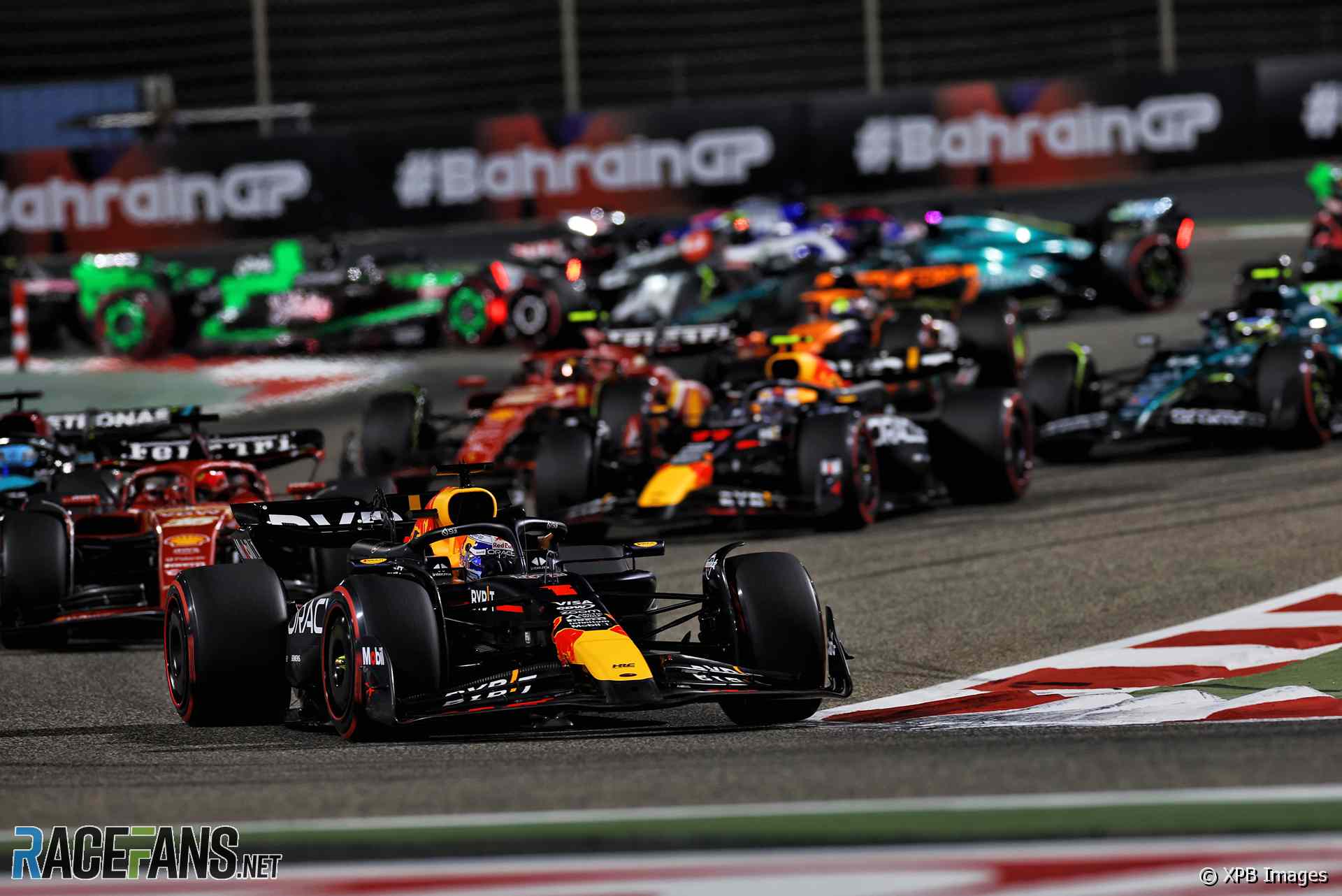
Our motorsport image galleries are packed with colourful, high-resolution photographs of Formula 1 action through the years, as well as other series such as IndyCar, the World Endurance Championship, Formula E, Formula 2 and more.
We publish batches of new photographs every day during grand prix weekends. These can be found through the ‘F1 picture galleries’ option below.
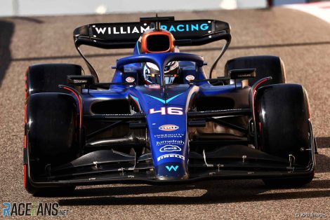
You can also find picture collections of different cars below, from celebrated designs like the McLaren MP4/4 and Williams FW14B up to modern racers like the Red Bull RB20.
Plus, take a look at the changing faces of F1 drivers through the years in our collection of pre- and post-season ‘class photos’.
The 30 newest pictures on RaceFans, updated every day.

Browse galleries of pictures from race weekends, test sessions and other Formula 1 events.
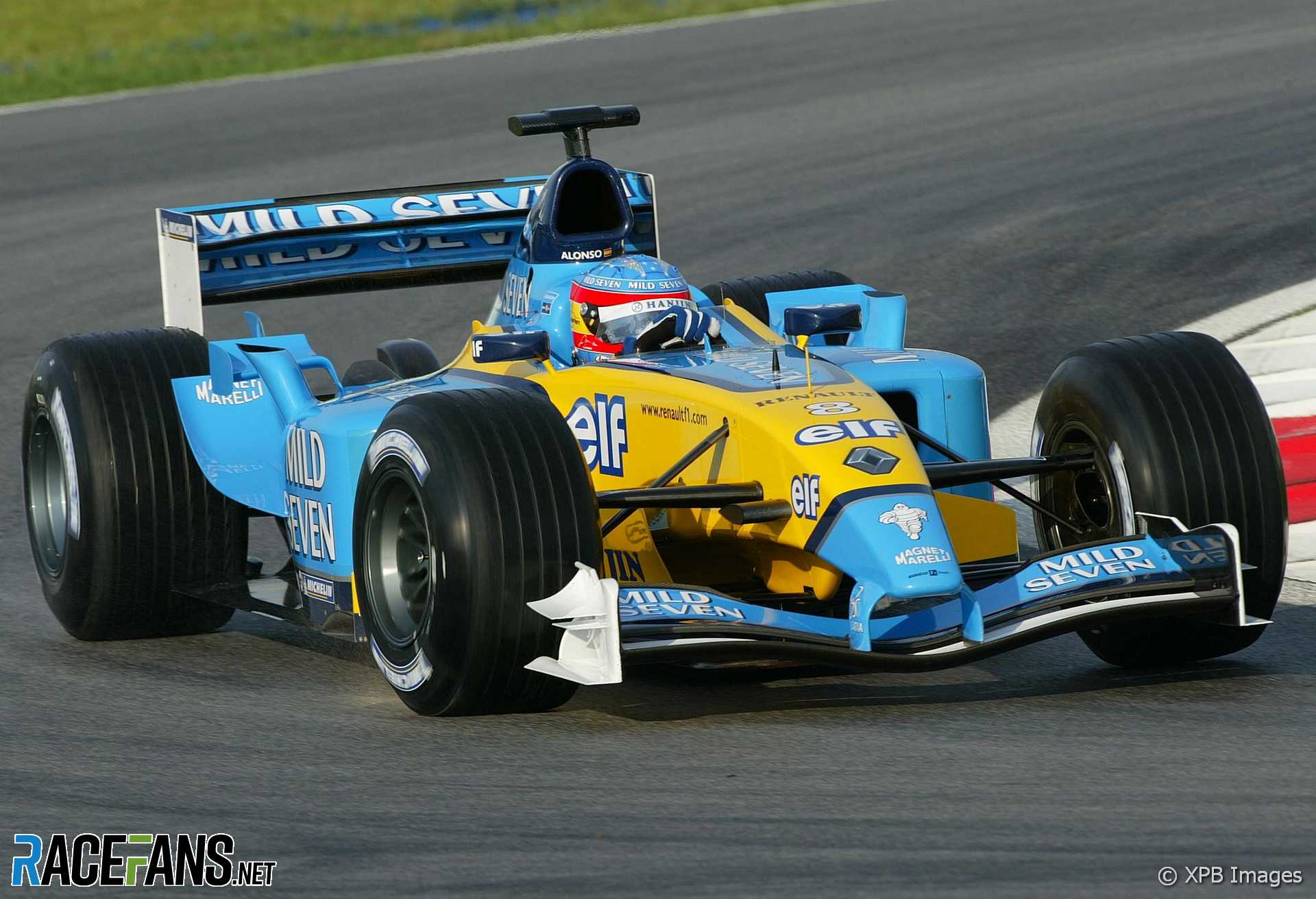
Galleries of F1 cars from different teams and seasons.
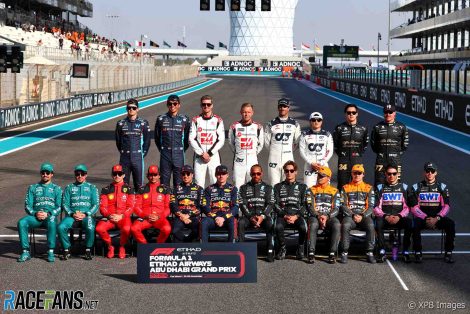
Group photographs of Formula 1 drivers through the years.
Most images on RaceFans are available in dimensions of up to 1920×1280 pixels. Tapping or clicking an image will usually open it in its largest available size.
How to take F1 photographs
Are you heading to an F1 race or another motorsport event and are looking for advice on how to get the best out of your camera? If your race snaps are coming out blurry and bland, check out our detailed guides and tip selections which will show you how to take professional-grade photographs without a trackside pass:
- How to take great pictures at F1 races: Part 1
- How to take great pictures at F1 races: Part 2
- How to take great F1 photos: Your questions answered
- Ten tips for taking incredible F1 photographs
You can find further information on RaceFans’ F1 picture galleries here: