


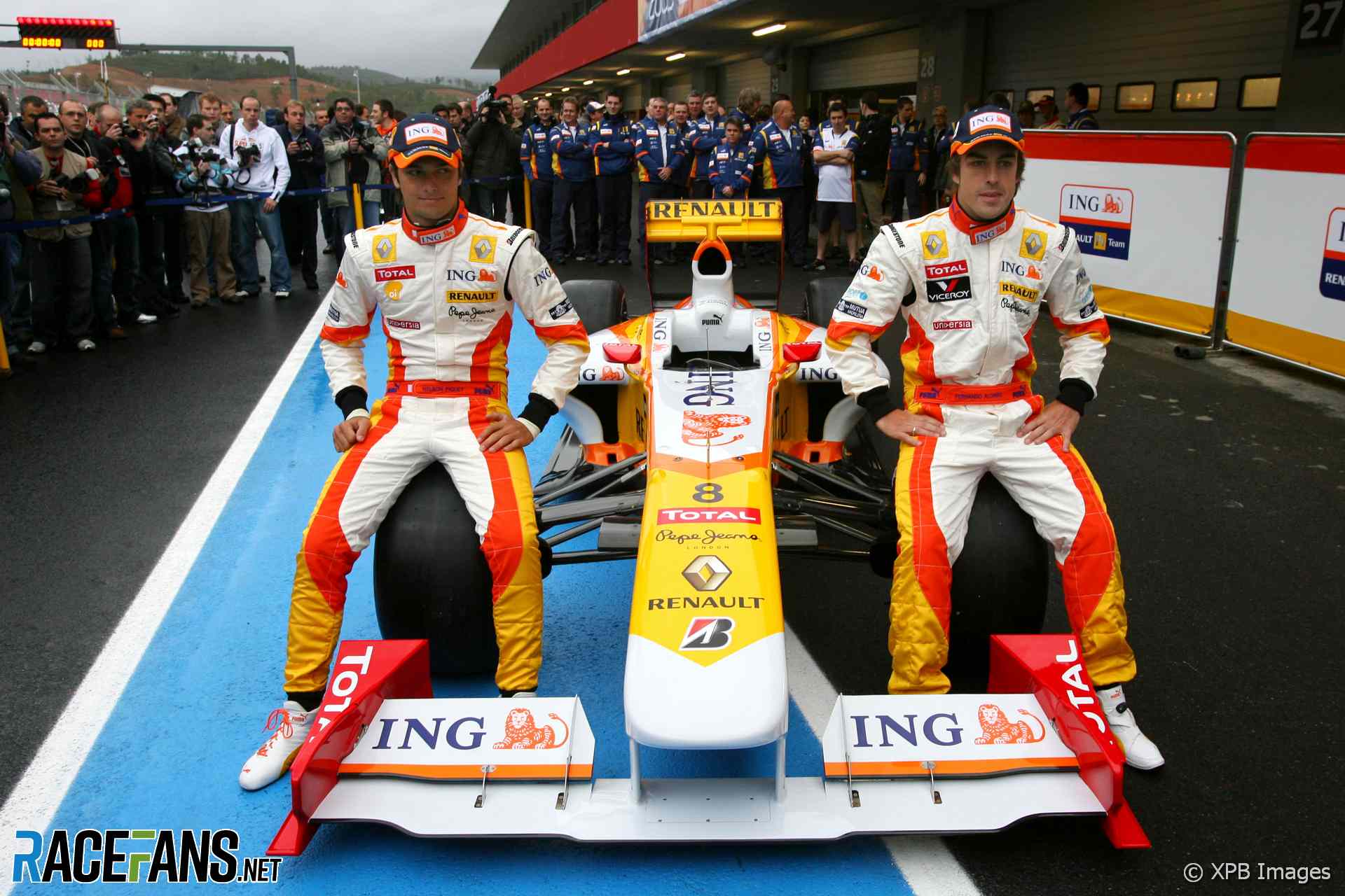
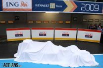
Renault’s 2009 Formula 1 car has appeared for the first time at the new Autodromo do Algarve circuit in Portugal.
The R29 is the car they hope will improve on the performance of the R28 and propel two-times world champion Fernando Alonso into contention for a third title.Alonso starts his sixth season for Renault alongside Nelson Piquet Jnr, who was a rookie in 2008.
Last year the constructors’ champions of 2005 and 2006 partially rebounded from a win-less 2007 campaign. Alonso scored a pair of victories in Singapore and Japan.
Piquet peaked with a second place finish in the German Grand Prix, aimed by a timely Safety Car period, and reached the points on four other occasions. Renault will expect him to do considerably better now he has a year’s driving experience – Alonso outscored him by 61 points to 19 in 2008.
Renault dropped another place in the constructors’ standings last year, ending the season fifth. They will be looking to reverse that slump this year and the extensive overhaul to the aerodynamic regulations should give them the opportunity to do just that.
They ended last season in good shape, scoring almost half of their 80 points over the last four races. That included two wins, a third and a fourth for Alonso.
Having changed both drivers last year, Renault benefit from consistency on that front going into 2009. They also retain much of the technical team which oversaw their championship-winning years, and Flavio Briatore remains as team principal.
Advert | Become a RaceFans supporter and
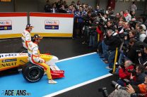
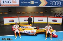
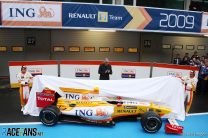
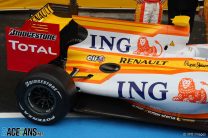
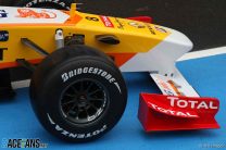
Pictures: Renault R29 launch


Advert | Become a RaceFans supporter and
Formula 1
- Ricciardo needs to show “head-turning form” for 2025 chance – Horner
- F1 Commission defers decision on points change and approves new rear cameras
- Red Bull’s star designer Newey to leave team – reports
- F1 launches free, ad-supported streaming channel in USA
- With fourth format change in as many years, F1 relegated sprint races to a sideshow
Pedro Andrade
19th January 2009, 9:55
Baby-vomit livery.
todd
19th January 2009, 10:00
oooo the old paint job was nice, that’s just horrid…
Eddie Irvine
19th January 2009, 10:02
We have a winner for the worst-looking 2009 formula 1 car…
mail123456
19th January 2009, 10:04
I just hope this car is fast …
if not this will be just a joke …
jose
19th January 2009, 10:06
my god!! how can that car be fast, it seems imposible.
It can become a world champion… in the worst looking cars list, in the history of the sport.
Tim
19th January 2009, 10:07
The ING livery was never great but this is even worse. The wedge shaped nose, shark fin engine cover and acres of rear bodywork don’t help – currently the leading contender for ugliest car of the year.
Pete Walker
19th January 2009, 10:08
MY EYES, THEY BURN!!!
Kudos to whoever came up with a livery even worse than the 07/08 one, thats some achievement!
Dank
19th January 2009, 10:11
I thought for a second that McDonald’s had become Renault’s new sponsor.
Awful looking livery.
DG
19th January 2009, 10:14
Looks like a Hotwheels or a Transformer….
todd
19th January 2009, 10:14
now i know why there’s more photos of the team and helmets rather than the car…
ajokay
19th January 2009, 10:16
I think I just threw up in the back of my mouth a little.
That car is nasty, and it’s giving me a migraine.
Tom
19th January 2009, 10:23
Horrible from every angle, and way too bright for a Monday morning. Particularly the big ING billboard on the back. I hope it blows over in a crosswind.
No wonder Alonso’s signed for Ferrari, he’s had enough of looking ridiculous
Loki
19th January 2009, 10:33
Yuk Yuk Yuk Yuk Yuk!
What a disgustingly appalling disgrace to the grid. What phenomenal catastrophe has bestowed Renault and their sponsors to roll out such a vile looking sick-for-an-excuse-of-a-car? Can you actually make it anymore hideously horrendous if you tried??
If it doesn’t do well then might as well tie the fat lady, who can sing, to it.
Someone should lose their job for this monstrosity.
….and *breathes*…
bialy
19th January 2009, 10:33
I hope it will be as fast as ugly !
Pedro Andrade
19th January 2009, 10:53
If it is as fast as it is ugly then Renault will walk away with both championships.
ukk
19th January 2009, 10:34
these guys are breaking the record for UBER-UGLY car :-) :-) :-) with this livery they outclass BMW and Toyota by lightyears! :-)
poor Alonso :-(
Adrian
19th January 2009, 10:55
So please tell me there’s a mix up and this is an interim livery…
Also, I thought the shark fin engine covers were banned this year???
Ben
19th January 2009, 11:48
Toyota didn’t have one on their launch car but when they debuted it on track yesterday it had a shark fin.
First spec change to the car less than 3 days after being launched.
Nathan
19th January 2009, 10:56
The nose is horrible. The shark fin is horrible. The livery is horrible. The car is horrible.
Santi
19th January 2009, 11:05
Is there any chance of being hidden the real car? I read somewhere that Alonso said “the car in January is not going to be the one in March”
Are they trying to avoid being spied their aerodynamics? I hope so :-((
Amy
19th January 2009, 11:07
holy crap thats the ugliest car I have seen in a long while
At the time I never thought I would say it, but I really miss the liveries Alonso had in his championship years!
Mick
19th January 2009, 11:08
I think Renault will win this year ‘cos all other cars will want to stay very far from this ugly looking thing. Don’t like the front nose at all. I think it will look a lot different at Melbourne, but the livery can’t change… and that’s a problem! But the rules are crazy different, so the car with the most radical change in design from last year may have a chance. Still ugly… or fugly… or blfugly!
Arthur 954
19th January 2009, 11:08
The forced expression in Uncle Flav and the driver´s faces says it all : the ugliest livery in F1 history. Among other things, the distribution of colour areas makes the car look fat and ungraceful : that large white area at the widest part of the car, around the air intakes, is like if a man with a very big beer belly wears a white t-shirt. The most basic rules of design have been disregarded.
By this action, the team has cheapened the market value of their sponsors : it makes ING and Renault look like cheap brands. On the contrary, any sponsor whose name appears on the elegant McLaren will automatically be perceived as a classy brand.
What Renault has done goes against all rules of marketing and good busines procedures. If I were ING I would order a new livery unveiled for the first race in Australia.
However, I hope that they are very fast and they contribute to a close 2009 season ! good luck !
ajokay
19th January 2009, 11:45
It doesn’t look *quite* so bad front-end on. The orange stripes all but disappear, and the sections of white and yellow are better balanced.
Marco
19th January 2009, 11:51
I think the livery looks way better, it’s just the car is a bit ugly, especially the nose.
Mandev theorum
19th January 2009, 16:33
I completely agree with you. I think the livery looks good!!!
DanielPT
19th January 2009, 12:00
Makes me vomit and 2007-2008 liveries look fantastic!
Ben
19th January 2009, 12:04
Its weird, nothing lines up!
Look at the orange on the overhead air intake, it doesn’t carry onto the sharkfin. It needlessly dips down and becomes a line rather than solid.
And on the side of the nose, the yellow-white diagonal border on the side doesn’t line up with the red-white diagonal border on the under-nose fin.
Its almost like a 5 year old did the colouring in, just basic stuff which makes the whole paint look disjointed.
If they fixed those up so the whole thing flowed more along the car it would look so much better.
yorricksfriend
19th January 2009, 12:17
seems to be a negative response to this livery.. i like it though
Keith Collantine (@keithcollantine)
19th January 2009, 12:43
F1 Technical explains the front nose:
PJA
19th January 2009, 12:53
Worst looking 2009 car launched yet. That front nose looks big and quite boxy, like something I would expect to see in a lower Formula.
I thought the blue/yellow paint scheme they had upto 2006 was good, the last two years not so good but it eventualy grew on me. But this new paint scheme has to be one of the worst for a top team in quite a while.
Avto
19th January 2009, 13:41
The way this car looks has nothing to do how fast it will go around the track. I say it’s a very original design. What I want to know is this, all of the cars so far except Ferrari and their fans Toyota, who have a blind hope in Ferrari design, have gone with the most obvious route of using sidepods for compensating lost downforce, they shaped sidepods in a way to make up for the banned aero parts. While Ferrari and Toyota have gone with the old toute and made the sidepods even tighter at the back. Why? Either Ferrari is wrong or all the other teams are.
yang
19th January 2009, 13:43
omg.. omg.. now even the 2008 renault looks very beautiful now..
schumi the greatest
19th January 2009, 13:51
the nose looks terrible if you look “back at it”
hope renault have got it right this year so we can see fernando v lewis part 2!
sajonaraman
19th January 2009, 13:57
Ugly corours. I hate the combination of the shark fin and new body lines. It’s still better than TF109 though…
Keith Collantine (@keithcollantine)
19th January 2009, 13:58
Regarding the livery, I’m glad they’ve gotten rid of the blue – I’ve never liked it since the first ‘new era’ Renault in 2002. To me this marks a step towards the classic old Renault liveries – although nothing like as cool as the one-off yellow and black retro paint scheme they created in 2007.
So we now have yellow-white-orange-red instead of yellow-white-orange-blue. I think the red is a better fit than the blue.
But my, have they ever done a bad job of designing the car based around those colours? All those lines at the back make it way too busy, and the cumbersome shape of the vertical extension on the side of the front nose doesn’t help.
Worst-looking 2009 car so far? I’m afraid so.
If you reckon you can do better send in your 2009 F1 car designs here.
Adam
19th January 2009, 14:04
Begs the question; who’s going to be buying 2009 Renault Merchandise this year?
:)
Jonas
19th January 2009, 14:05
The new livery does not look good, the previous one is much better. If they’re planning to put more yellow, then they should follow the classic “all yellow” Renault.
Btw, I missed the old Mild Seven Renault F1 livery. :(
Loki
19th January 2009, 14:07
In some respects, maybe Alonso likes the colour scheme as it harks back to the championship winning pairing of his Asturias flag’s colours to his Renaults livery back then.
Except now, it’s the Spanish flag colours.
Maybe an omen (most likely not, as was the coincidence the first time round).
RQ
19th January 2009, 14:08
It is rather ugly isn’t it… Yellow? I know sponsors dictate… Where is the cool blue? Alonso will make it fast… He has the same knack of doing that as Schumacher…
Captain Caveman
19th January 2009, 14:10
@ avto
I would have to agree, it is hard to see the design of the car with the current livery, but if you have the chance to view the files (images) in black and white, it become clearer as to what they are trying to do.
In B&W the car looks quite nice and elegant, although I am undecided about the nose. It seems a deliberate ploy not to convey to the world, what they have planned for the first race.
But hey, at least we have something to talk about now. ( Could even have been last minute changes to accommodate fact that car failed it crash/chassis test last week)
Hey here is a thought, adjust your TV’s to B&W and with a bit of luck if there is any overtaking we can reminisce and pretend we are back in the 40’s
As for sponsors, if it does tie into their corporate colours, then they have their own marketing departments to blame.
Luke
19th January 2009, 14:14
i cant stop crying, it’s so goddamn ugly. could this be a decoy? look at the car at the very top of the team page. very different nose, same ugly livery.
http://my.ing-renaultf1.com/en/
Keith Collantine (@keithcollantine)
19th January 2009, 14:27
I can’t see any different picture on there I’m afraid Luke. The reaction to the car by Renault’s fans is quite different to on here though.
prateekf1
19th January 2009, 18:08
Keith, I’m sure this is the banner image he was speaking of
http://img141.imageshack.us/img141/8656/ingzh9.png
If you look closely, the nose cone is longer and lower making the nose section look like a 2008-2009 hybrid part.
Keith Collantine (@keithcollantine)
19th January 2009, 18:52
Ah thanks for that Praveek – I wonder if this was their original nose design before it failed the crash test?
anirudh
19th January 2009, 14:24
OMG….. I can’t feel my eyes :'(
Isn’t Total supposed to be new to F1???
Loki
19th January 2009, 14:54
I think Jordan had Total on their B&H car.
Rob R.
19th January 2009, 17:19
Why are people complaining about the colours? Look at that nose!
Luke
19th January 2009, 14:33
Keith, its the car in the top banner. check out the nose, looks like last year’s.
Keith Collantine (@keithcollantine)
19th January 2009, 14:52
I’m pretty sure that is last year’s car, at Singapore – you can see the dark blue of the old livery.
Adam
19th January 2009, 14:36
Cant say the colour scheme annoys me as much as other ppl, the blue/yellow needed a change – and last year’s looked abit like cat puke tbh. This year’s one is abit different and i dont mind it.
Good plans to have the shark-fin on the car for the launch, as Alonso has said a couple of weeks ago – the car we launch wont be what we race. Renault are trying to keep things quiet.
Romain De Grosjean as 3rd driver isn’t a bad idea – alike Piquet, Kovalinen, Flav likes picking young drivers and establishing them in the team b4 giving them a drive. Feel a tad sorry for Di Grassi but i guess he’s the type who wants to be driving in a race seat somewhere.
Bassfighter
19th January 2009, 14:45
well… I actually like it a bit :P
but there is 1 thing what is very clearly: you are blind if you can’t find this car on the grid
chaostheory
19th January 2009, 14:50
Oh yes- the ugliest 2009 F1 car. My, its even worse than that BMW prototype. Lets see if BMW can beat Renault in uglyness tomorrow.
Robert McKay
19th January 2009, 14:58
It’s butt-ugly, and the nose-on view in particular is awful. Side on it’s not that bad, I guess.
Having said that, I’m loathe to criticise them for the simple reason that they are at least distinct, given that over the past few seasons everyone else has been either mostly red, mostly white or mostly dark blue, Mclaren excepted.
Adrian
19th January 2009, 14:59
Does that nose remind anyone else of the nose of the Williams Walrus car a few years back. Not how the wing attaches, but the width of the nose-cone itself.
Would be interesting to know if any of the designers at Renault used to work at Williams..!!
muckymuck
19th January 2009, 14:59
Maybe the ugly color scheme is to hide the ugly bodywork? […barf…] Excuse me.
Arthur 954
19th January 2009, 14:59
Somehow I have the feeling that the car will be fast and that Alonso has a good chance of winning the WDC. At the very least he will be up there fighting for it.
This ugly livery however will make the car go slower due to the embarrasement of the drivers ( about 0,15 secs. per lap ) On the contrary, driving the elegant Mclaren must give the drivers such pride, that they go 0,15 secs. per lap faster.
So, in spite of the 0,3 secs per lap disadvantage because of ugliness of livery, I think the car itself will be a good design and fast.
Gav
19th January 2009, 15:10
Ugh thats the WORST livery i’ve seen in recent times….
Chaz
19th January 2009, 15:14
awful nose…
Luke
19th January 2009, 15:31
keith, what photo are you looking at? when you click on the link, thare is a banner at the top of the page with two pics, one i s a 3/4 view, and one is a side detail. the car has the brand new livery, this years front wings with TOTAL sponsorship, and it has a different nose. it’s right at the top. i can email it to you
Adrian
19th January 2009, 16:08
It does look very much like this year’s car apart from the nose. Same wings, same rhubarb and custard livery and same heavily sculpted bodywork.
Perhaps the nose on that car is one that failed the crash tests and the nose on the launch car is a temporary one…though it’s a little too innovative to be temporary methinks….
Wouldn’t be the first ugly car to be fast…
Victor
19th January 2009, 15:55
Even as a fan of the team, I have to admit this car is far from a looker. I’m blaming the EU for this, because it’s because of the tobacco sponsorship ban that we have these liveries now instead of the Mild Seven livery, which especially in 2004-2006 looked brilliant.
I just hope it’s fast. Unfortunately, we have 2 very long months until we can actually find out… As for the car itself, there are some very interesting touches. Combined with an upgraded engine, hopefully this will get the team back towards the top.
StrFerrari4Ever
19th January 2009, 16:17
my renault’s livery is just so disgusting the mild seven one and team spirit one was good especially at france when they had a special design but now its just a complete joke and that nose looks weird hopefully it will look better as the season progresses cant wait for str tho that big bull will look as mad as ever without all those aerobits
diseased rat
19th January 2009, 16:18
I’ll be contrarian and say that I quite like it. I love the curved sidepod design, it’s very flowing. The whole look of the car is let down by the shark fin though, without that it would look really slick.
red
19th January 2009, 16:31
This car looks like a mash-up of condiments: mustard, ketchup, and mayo. Gorgeous.
Joe
19th January 2009, 16:33
This is the ugliest F1 car since the williams tusk car.
Jack
19th January 2009, 16:43
I like the fact that the BBC’s F1 site, which has to be neutral, described the car as “vivid” – the ultimate understatement.
matt
19th January 2009, 17:56
The annoying thing is, if the colour and shark fin were gone, the pictures of the back of the car, especially around the exhaust, looks really elegant. Also, I saw a picture of McLarens first test and they ran a 2008 wing. I thought the point of unveiling a new car was to test it.
K
19th January 2009, 18:19
Ugliest car since the 2001 Minardi which incidentally was also driven by Alonso.
IDR
19th January 2009, 18:25
What to say, I’m out of words.
I only hope the car will be fast and competitive, if not, somebody will have to pay for making the ugliest design of the grid (up to now).
The downside of the nose looks quite strange. It seems like an independent piece that has been added for some reason. (¿Crash Test? ¿Hiding the real design?)
Alejandro
19th January 2009, 18:59
I think it looks fine. I was going to say the nose looks pretty raw until i saw that f1technical link Keith posted, one has to wonder if they’re onto something. On the other hand I also recall ALonso saying this would be totally different from what they’d use in Melbourne.
EDIT: does anyone know what the letter E below and on each side of the air intake stands for? it’s very hard to see on this Renault, but most other F1 cars have a large ‘E’ right there. I know the N in front of the cockpit is to let marshals et al know where to manually set the car in neutral, but this E i have no clue
Victor
19th January 2009, 19:24
The E means a partially exposed electrical connector as far as I know. At least in the early 1990s The E marked the slots into which the onboard cameras could be plugged.
Speed Demon
19th January 2009, 19:06
Hmm, appears that this car’s been in a fight and has got a swollen nose as a result. Still, at least the livery’s a bit more co-ordinated than before, with a definite Spanish flavour…
Dank
19th January 2009, 19:08
Get rid of the garish red and replace it with a darker colour and voila!
http://img413.imageshack.us/img413/5028/r28wi7.jpg
A half-decent looking car!
Pedro Andrade
19th January 2009, 19:49
The front of the car still looks ugly, but that new livery improves it a lot. Good work, ever considered applying for a job at Renault? ;)
Chicken McNuggets
20th January 2009, 15:43
Notwithstanding the technicality that Total’s colours aren’t black, of course.
Alejandro
19th January 2009, 19:53
Victor, thanks!
Dank, I had seen another version with more yellow, but the black one looks better. Also note a small nosejob on both :)
http://www.mundomotorizado.com/foros/download/file.php?id=19506
Wesley
19th January 2009, 20:06
OH WELL!…..we won’t have a hard time spotting THAT one on the track will we?
I think my eyes are still crossed!
StrFerrari4Ever
19th January 2009, 20:13
who knows maybe total and elf could combine and give renault some superoil or bring back jungle juice like in turbo era :) just a thought
Sush
19th January 2009, 20:38
I’m finding I can’t look at it, the livery with the stripes on the shark fin are messing with my eyes.
Paige
19th January 2009, 20:46
Have Renault hired the (soon-to-be) laid-off Honda engineers who conceived the Dumbo ears and tasked them with designing their front nose? Or maybe they brought aboard the old Williams wrenches who gave us the brilliant Walrus nose. Either their engineers have discovered something that’s going to be absolutely brilliant, or that car won’t make knock-out qualifying once this year.
That’s a horrible looking car; there’s no way around it. I didn’t think the 2009 spec BMW that we’ve seen in testing could be topped in its horrible appearance, but it truly has. For one, how can Renault forgo the French blue? That seems criminal to me.
Paige
19th January 2009, 20:49
Also, I see that Ferrari have kept the Shark Fin. Hasn’t this been banned as a part of the scrapping of aerodynamic attachments?
Keith Collantine (@keithcollantine)
19th January 2009, 21:25
No, ‘shark fins’ (or ‘anvils’) are legal.
Robert McKay
19th January 2009, 21:33
That works, I like it.
Hollus
20th January 2009, 0:13
To Loki and K,
Maybe Alonso has in his contract that he is allowed to paint the cars himself?
Regarding the old blue renaults, no, the cyan color was not meant as a reference to Asturias, it was in other marketing things before, it was accidentally just a PERFECT match to the asturian flag, made even better by using the same yellow of the flag too. I recall being in Germany at the time and Niki Lauda getting it completely wrong for the TV. I think the race was Barcelona and there was this grandstand with dozens of gigantic Asturis’ flags. He was impressed that so many people had come to the race with Renault flags… That was on friday practice and he must have had somebody correct him because the next day he explained that they were not Renault flags, but Oviedo flags, wrong again!
Jay
20th January 2009, 1:40
Lets hope it goes fast!
It needs a dark shade or two to improve the livery I believe, but it would be better of they just re-do the livery. I didn’t expect anyone to be worse than Force India, but this one takes the cake!
How the hell am I going to buy my customary Fernando Alonso merchandise this season?!..crap!
motion
20th January 2009, 3:36
I own a Megane and think it looks good, but this is ugly!
AlvinK
20th January 2009, 4:10
ugliest car of the current launched cars..yuck..really crappy look, crappy liveries, another colour added to the bunch of colours…dang…
Paige
20th January 2009, 4:15
Keith,
Do you have a place where I can read a condensed, yet detailed, version of the new technical regulations, so I can see for myself what’s legal and what’s not? Because it’s quite disconcerting to see things like that Shark Fin on the Renault and the “Bridgelets” on the Ferrari front wing while being under the impression that such devices are now banned. Thanks.
Keith Collantine (@keithcollantine)
20th January 2009, 9:15
Alianora’s working on one – it’s a big job though! First two parts are here:
http://formula1home.com/forum/weblog_entry.php?e=629&sid=ab1bb11688be533c7cb721f146f5e488
http://formula1home.com/forum/weblog_entry.php?e=631&sid=ab1bb11688be533c7cb721f146f5e488
Pink Peril
20th January 2009, 4:56
I actually don’t mind the colour scheme – at least you’ll be able to see it on track. And no danger of mistaking it for another team !
While perhaps it could be a bit tidier, overall, a splash of colour appeals to me.
Won’t be buying any team merchandise this year, though ;)
Mick
20th January 2009, 6:43
It’s growing on me since yesterday. Who knows what a few wins will do. I may even buy the merchandise. All that matters to me is that it’s fast, and by the comments coming out of Renault about how happy they are with the wind tunnel testing, I’m sure the aero package is as good as it is different. I’d like to know more about the chassis. The Renaults guys also say that they’ve got back most over the engine power deficit, and they were very innovative with other aspects of the car last season, which may still be able to be translated into this package regardless of the rule changes. I’m optimistic, and Alonso seems to be as well.
YeaMon
20th January 2009, 16:37
Seems like the when the designers threw-up all over the blueprints, it translated into everything else.
andy
21st January 2009, 15:47
I’m somewhere inbetween shocked/horrified and laughing. I’m guessing Alonso is getting paid more this year?, he’d have to be to be seen dead in that. Poor guy. Whoever designed the livery needs putting out of their obvious misery! =/
I just hope its fast, but it doesn’t look like it wants to be. I think I will have to mute the colours on my tv come F1 time. Shocking! awful! ergh!
staggaington
21st January 2009, 16:08
u kno the 2009 cars were starting to grown on me after seeing mclaren, ferrari and williams, but then renault and bmw completely spoiled it! i think the FIA & FOTA needa to make restrictions on how many different colors can be used on a car and ban colors that can temporarily blind other drivers!!
GeorgeK
21st January 2009, 18:21
I made it my screen saver as a shock treatment when I get drowsy…….works like a charm!
The nose is so clumsy it has to be an interim design. But it is so ponderous I’d be embarrassed to show it.
Rich
1st February 2009, 1:20
Looks to me like the realy old f1 cars from some angles with the big nose etc
GarethW
9th March 2009, 21:31
That is the most disgusting F1 car I have ever seen the colours don’t even match. Who the hell thought it would be a great idea to have red with orange and yellow a mean come on Renault you could have thought of better a colour to go with the yellow and orange.
Gusf1
26th March 2009, 18:53
Poor F1 cars for these 2009!! and too bad for all of us!! What other things will be for 2010??? No doubt, the ugliest car ever…
mourododock
14th December 2009, 22:57
Hey there – Wow, what a great forum
Just registered and wanted to say hello.
WeretertBag
22nd December 2009, 0:13
With our software, you may send 10,000 emails per day, thats 300,000 emails per month! Send mass amount of emails! Email Marketing made easy. With this software you will need a 3rd party hosting company and set up an email account with this company ($14.95 per month only when you use it) This is the best emailing software on the market. This software lets you customize all of your emails and sends an email every 11 seconds or so. This is by far the easiest emailing software to use. JUST SEE THE VIDEO. IF YOU NEED EMAIL ADDRESSES, WE HAVE THEM FOR SALE!!! EMAIL MARKETING, MASS EMAILING, MASS EMAIL, send out a lot of emails everyday, send out many emails, send emails without getting blocked, send thousands of emails everyday, send thousands of emails by email marketing. start sending bulk emails today.See http://www.adlinkcorp.net for demo video, email me at sales@adlinkcorp.net
bellanw
7th May 2011, 23:27
Sometimes non-standard due to you – this is sheerest helpful !
קורס אנגלית
photobooth New Jersey
13th October 2011, 20:18
A buddy quizzed me and my friends the best place most likely will buy top of the line majestic booth in Malver Pa.
http://client.alexa.com/common/images/logotrafficRankings.gif