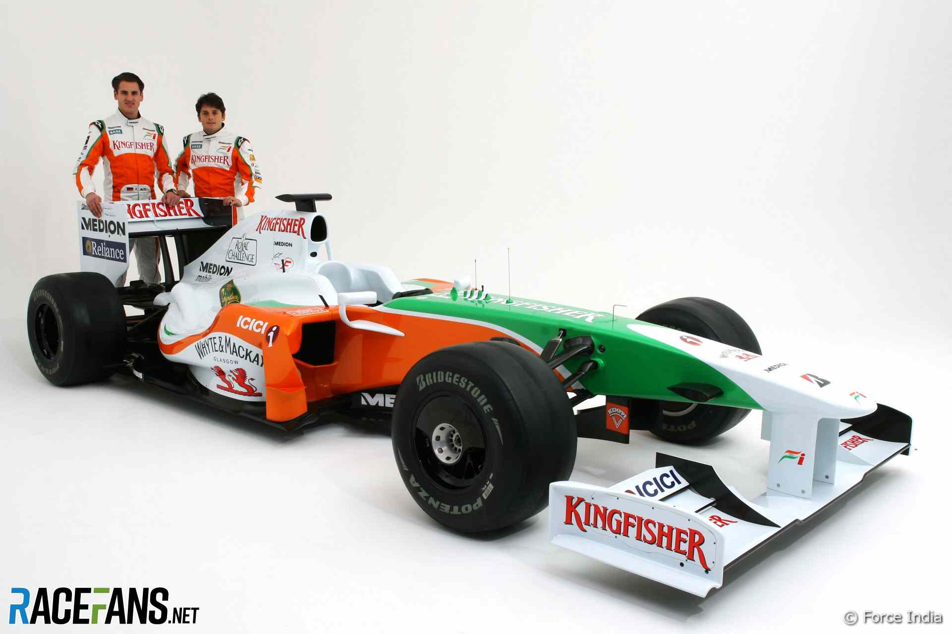
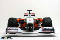
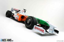
Force India’s VJM02 was due to break cover tomorrow but Anirudh has dug out some early pictures of it on Force India’s official website.
They confirm the impression we got from the Force India calendar earlier this year that the new car replaces the bright red flashes of 2008 with orange and green. More pictures below.
Advert | Become a RaceFans supporter and
2009 Formula 1 cars
- Red Bull RB5 officially revealed – pictures (2009 F1 cars)
- BMW F1.09 unveiled – pictures (2009 F1 car launches)
- Renault R29 revealed in Portugal – pictures (2009 F1 car launches)
- Williams FW31 introduced in interim livery (2009 F1 car launches)
- McLaren MP4/24 revealed – pictures and video (2009 F1 car launches)
- Toyota reveals the TF109 – pictures and video (2009 F1 car launches)
- Ferrari F60 launched at Mugello – pictures & video (2009 F1 car launches)
Thanks to Anirudh for the tip!




Adrian
28th February 2009, 9:16
Why are the drivers holding up a Barclays Football trophy (sorry I don’t know whether it’s the premier League Trophy or the FA Cup)..??
Keith Collantine (@keithcollantine)
28th February 2009, 10:10
Your guess is as good as mine!
David
28th February 2009, 15:41
it is the premiership trophy
Gman
2nd March 2009, 5:42
Do any of Vijay’s corporations have some sponsorship and/or ownership in the curent EPL champions? Perhaps that is one solution.
anirudh
5th March 2009, 7:16
Whyte & Mackay(presently owned Mallya’s UB group) used to sponsor Leeds United and presently sponsor Hibernian F.C.
ajokay
28th February 2009, 9:25
Ahh, so it was like the calendar suggested. At least we won’t be mistaking it for a McLaren this year. I like the green and orange livery.
Can’t say the same about the car though, it looks pretty awful, all ugly and bumpy. Another interesting take on the wingmirrors though.
I shan’t be expecting too much again from them this year.
Adrian
28th February 2009, 9:45
Any who thought we we going to see a McLaren clone were worrying for nothing!!
James
28th February 2009, 9:57
I agree about the livery. I suspect VMM had a say in that! Also the nose looks suspiciously familiar…
Now, it could be that White & MacKay sponsor two cars, but I distinctly remember them re-affirming their commitment to McLaren, and Hamilton took the car for a spin at their Glasgow factory a couple of months ago. Not just technology sharing methinks! ;-)
Adrian
28th February 2009, 10:07
It’s Diageo that sponsor McLaren under their Johnnie Walker scotch whisky brand…
Whyte & Mackay is part of the United Breweries Group which is headed by one Dr Vijay Mallya…
Loki
28th February 2009, 10:02
I much prefer this livery over the previous one. Though the bright colours make it look a little childish, and I don’t like Serif typefaces on an F1 car…don’t really go well with an F1 car I think.
Pretty much indifferent to the car design, but I’ll stick my foot out that, aesthetically at least, I prefer this to most of the other cars we’ve seen so far.
That trophy just makes them look ridiculous.
Adrian
28th February 2009, 10:02
Just a thought, this may be the only car that looks okay with the soft Bridgestones on…
gabal
28th February 2009, 10:08
We haven’t seen ex-Honda yet ;)
I like more colour diversity on grid so this is ok in terms of recognition…
Adrian
28th February 2009, 10:28
From what I’ve read on various sites their new livery will be mainly blue…
(One site said quite like the old Prost colour scheme…)
Kester
28th February 2009, 10:13
Interesting mountings for the mirrors, and the sidepods have an interesting shape.
Pete Walker
28th February 2009, 10:22
Definitely an improvement on the livery and although several of the companies are Dr Vijay’s, its good to see the team has a healthy looking sponsor portfolio.
I’m wondering though, why no Mercedes-Benz badge? I guess the top manufacturers only like to be associated with one team? I think Toro Rosso should have Ferrari on the engine cover too, a la the old Minardi-Ferrari days.
Its going to be very interesting seeing how this car performs in the two test sessions before Melbourne.
Gman
2nd March 2009, 5:44
I was thinking the same thing about the M-B badge- they have their name and logo all over everything at McLaren.
Scott Joslin
28th February 2009, 10:24
I would like a bit more green would start to look like a 1990’s Benetton
Dougie
28th February 2009, 10:28
I quite like it, sure its no Mclaren, Ferrari or Williams but its interesting nonetheless. I think the livery is much better than last years and different enough to the others to be welcomed, especially as its no dogs dinner like the Renault.
I like the wing mirror mounts and other small details to assist in the aero, they’ve obviously given it lots of thought. With the Merc in the back and McLaren tech dotted around I think it should go well, points finishes on the agenda anyway.
Damon
28th February 2009, 10:29
Finally a car that has more than 2 coulours, although it doesn’t stray much away from Toyota’s livery.
So far it looks pretty dull and monothematic in F1.
Mono-coloured cars:
Ferrari – RED
Red Bull – BLUE
Double-coloured:
McLaren – Silver + RED
Toyota – White + RED
Sauber – White + BLUE
Williams – White + BLUE
Renault – White + Yellow
Poli-coloured:
Force – White + RED + Greeen
Adrian
28th February 2009, 10:45
Is there only 2 colours on the Renault, god that makes it an even wore paint job than I already thought it was…
EGC
28th February 2009, 11:09
Renault has 3 colours, White, Yellow and quite some Orange :-)
Tobo
28th February 2009, 14:52
Another nerdy correction- the new Force India livery is more orange than red, and the Williams is predominantly blue with white, not the other way round
James
28th February 2009, 10:31
Adrian – (DOH!) Thanks for pointing that out. I don’t drink that blended rubbish so I clearly got them confused! ;-)
Varun
28th February 2009, 10:52
It looks more like the Indian Flag
tozz
28th February 2009, 16:26
um, that’s the point…
Mark
28th February 2009, 10:54
The livery is ok but I don’t think the car looks very innovotive compared to the likes of red bull. I think that the premiership trophy is the closest they’ll get to actually winning any silverware even with McLaren help.
sumedh
28th February 2009, 11:12
The sidepods are very Mclaren like. Nose toyota like.
Livery is good..
Renault should take a lesson from Force India. Its possible to make a good looking car using more than 2 colors. May be then; they will make something other than fruit salad looking cars.
Gman
2nd March 2009, 5:45
I think comparing the Renault to a fruit salad may be more of a compliment than you may be wishing to them ;)
Lustigson
28th February 2009, 11:24
Although not the most beautiful livery of all time, it certainly stands out with orange and green on a white base.
Kallan
28th February 2009, 11:57
I think renaults 08 car succesfully used more than 2 colors, in fact by the end of the year i admired how it looked at television distance, it was quite distinctive. I dont know why I am the only one to think this, but I agree that this year replacing navy blue with red has made it too bright. My point is how they look in studio and on tv is a bit different
anirudh
28th February 2009, 12:05
The McForce India is here guys!(althought it looks very much differnt from McLaren)
About the trophy, I think they are trying to make up for last year’s pointless season.
Tols
28th February 2009, 12:21
Is that a 99 Jordan with a paintjob?
Al H.
28th February 2009, 12:27
Well at least that’s one car that will look good with the green-striped tyres
Smitty
28th February 2009, 12:38
Almost as pretty as the Williams and Red Bull livery, clean and to the point.
Again, Force India treading a different design path to the crowd. I hope they score more points this year.
Chaz
28th February 2009, 12:40
Alas it looks distinctively bland and dare I say ugly…
Damon
28th February 2009, 12:54
I think the car is most similar to Arrows from 1998:
http://www.interrace.de/de/angebot/fahrzeuge/formel1/images/1998-arrows.jpg
And no, it doesn’t at all look like Jordan 1999, haha.
Come one, that Jordan was a beautiful car!
http://www.gemmrig.de/hhf/pictures/pic_hhf_1999_jordan199_team1999_01_600x400x16m.jpg
anirudh
28th February 2009, 13:43
wot an ugly background for the second pic
Tobo
28th February 2009, 14:54
Damon Hill doesn’t half look left out on the Jordan picture as well. No wonder he lost his confidence mid season!
ruudtobz
1st March 2009, 5:40
yeah, the best looking and best performing Jordan in f1, the 1999 jordan mugen honda
Matt
28th February 2009, 13:42
Has anyone noticed the front suspension is identical to the MP4/24?
anirudh
28th February 2009, 13:56
they have not tested KERS yet i guess!
Fer no.65
28th February 2009, 14:34
sad it’s not red…
because it could have been very similar to Castrol’s Toyotas from rally :) and that would be nice…
it’s better than last year tho, but not as good as the williams!
sajonaraman
28th February 2009, 15:56
Someone must have used crayola crayons in designing process. A bit childish colours in my opinion, but at least it differs from the rest of the grid, with an emphasy on McLaren. I’ll keep my fingers crossed for Force India. Underdogs deserve at least that.
Oliver
28th February 2009, 16:06
With this, Renault cant feel lonely anymore:-)
Journeyer
28th February 2009, 16:09
Where’s the “Powered by Mercedes-Benz” badge? I don’t see it anywhere.
Oliver
28th February 2009, 16:16
Those mirror mounts are a subtle way of adding those mid way wings/fins that were on the cars in previous seasons.
Whewbacca the Cookie
28th February 2009, 16:21
At least we won’t have a mix-up with the McLarens on screen anymore.
F1Yankee
28th February 2009, 16:40
let’s celebrate force india’s new colors with a little music:
http://www.youtube.com/watch?v=q-5MLPzRjls
rob ijbema
28th February 2009, 17:05
i like it!
one of the best looking cars of 09 both shape and livery
much better than that bland looking williams…
anirudh
28th February 2009, 17:39
I’ll tell you guy If F1 were to look good FIA should BAN WHITE COLOUR IN LIVERIES
KingHamilton
28th February 2009, 17:55
Wow I didnt know Force India had won the premier league! Blimey, the things you learn
Gman
2nd March 2009, 5:48
Indeed, perhaps now they will have an entry in Sperleagua Formula ;)
John H
28th February 2009, 18:01
I like it too.
But yes – too much white in F1…. I want to see a black car like a Minardi!
Whewbacca the Cookie
1st March 2009, 8:05
Your comment made me remember the old Shadow of the late 70s.
Gman
2nd March 2009, 5:47
If Williams had stuck with that all-dark blue scheme they have run in thesting over the past few years, we would have something similar to what you’re talking about.
GeorgeK
28th February 2009, 18:49
Great paint, ugly car. Exhaust looks illegal as well, similar to Ferrari’s first short exhaust tips this year.
The lighter colors allow us to see detail better than dark liveries.
Damon
28th February 2009, 18:58
It’s funny how many of you here call the colours of the Indian flag childish :| Hmm…
And there are actually two huge similarities to McLaren:
1. The overall proportions of the chassis (vide -> side view).
2. An extremely high nose, which in both cars is higher then the wheels, making it look like and F3 car. (I don’t mean the nose-cone, but the whole of it.)
Loki
28th February 2009, 19:11
When I called it childish, I was in reference to the bright orange and green used. I didn’t (mean to) direct the ‘childish’ term towards the Indian flag, even though it’s the same colours, and I certainly didn’t mean any offense.
Bright orange and green are attractive colours for a child, though – it’s just basic colour psychology.
John H
28th February 2009, 19:20
No pics of the diffuser? hmmmm.
sas
28th February 2009, 19:49
great liveried car. However will the fia let them slip through the net with exaust tips.
Brendan
28th February 2009, 20:44
Does the car say “Powered by Mercedes-Benz” anywhere on it? I guess it’s been standard for the Ferrari customer teams not to advertise their engine supplier on the livery, but all the other customer teams do.
Pink Peril
1st March 2009, 0:14
Jury is still out on this one – need to see it in the flesh so to speak before I can decide if I like it or not. Having said that though, it’s nice to see some green in the field that is not on tyres or the team-formerly-known-as-Honda’s shorts….
manatcna
1st March 2009, 0:39
I agree with you, sajonaraman.
The first thought I had was ‘It must be a plastic model’
The Indian flag looks great in these colours, but I really can’t say I like this livery
It’s only redeeming feature, in my opinion, is we’re not going to confuse it with anything else on the track,(unless the ex-Honda car has a similar paint job)
Stealthman
1st March 2009, 1:46
The car looks like something pulled out of the early 90’s. ‘Nuff said.
LoudHoward
1st March 2009, 3:05
I quite like what they do with their mirrors and so forth, they have some clever interpretations. Still, I expect they’ll be down the bottom again.
Jess
1st March 2009, 5:29
Why is the car on wets? was it raining?
Phil
1st March 2009, 16:56
IIRC they are always used for shakedown tests as using those tyres doesn’t count towards your testing mileage.
Oliver
1st March 2009, 9:34
The test was at Silverstone, even if it was dry, its always safe to have wets on
Dexgul
1st March 2009, 10:26
Nice livery …….could have done a better nose job mirrors looks very nice but at the end it all comes down to the race track……………cant wait for them to start
Striay/iceman
1st March 2009, 11:45
Looks ugly to me! also looks like they have copied some pieces in every teams? cars!
“McIndia” LoL!!!!!
Striay/iceman
1st March 2009, 15:47
GUYS!!!!!!!!!!!! there is testing today in Jerez! ferrari Mclaren…. all the teams except for Torro Rosso
the times are :sebastian Vettel 1.19:055 87 vueltas // Felipe Massa 1.20:572 58 vueltas // Kamui Kobayashi 1.20:699 79 vueltas // Nico Rosberg 1.21:277 62 vueltas // Robert Kubica 1.21:518 38 vueltas // Giancarlo Fisichella 1.21:584 23 vueltas // Pedro De la Rosa 1.21:831 86 vueltas // Nelson Piquet 1.22:011 51 vueltas
Striay/iceman
1st March 2009, 15:55
Sebastian Vettel 1.19:055 87 laps // Felipe Massa 1.20:572 58 laps // Kamui Kobayashi 1.20:699 79 laps // Nico Rosberg 1.21:277 64 laps // Robert Kubica 1.21:518 38 laps // Giancarlo Fisichella 1.21:584 23 laps Pedro De la Rosa 1.21:831 86 laps // Nelson Piquet 1.22:011 51 laps
Striay/iceman
1st March 2009, 15:59
these are the times at Jerez on the 1st of march at 4:00
Striay/iceman
1st March 2009, 16:01
Vettel 1.19:055 87 laps // Felipe Massa 1.20:330 63 laps // Kamui Kobayashi 1.20:699 79 laps // Nico Rosberg 1.21:171 71 laps // Robert Kubica 1.21:292 47 laps // Giancarlo Fisichella 1.21:584 31 laps // Pedro De la Rosa 1.21:831 94 laps// Nelson Piquet 1.22:011 52 laps.
Keith Collantine (@keithcollantine)
1st March 2009, 17:39
Thanks Striay – post here: 2009 F1 testing: March 1st (Pictures)
Striay
1st March 2009, 19:53
LOl! thanx for mentioning my post and name on the 2009 F1 testing: March 1st (pictures) YEY ME I’M REALLY HAPPY NOW!!
todd
2nd March 2009, 3:10
wow some new colours on the grid, i like it
Gman
2nd March 2009, 5:51
It looks quite good overall- much better than last season, and now there will be no confusing it with the McLaren. I really like the colors, and clearly that may turn a few more heads back in India.
The photos of the drivers walking with helmets in hand looks very much like some McLaren PR photos from the past few seasons- I wonder where they got that idea from?
PJA
2nd March 2009, 9:53
At the moment I not that fussed either way by the looks of the car. It’s not great but it’s not terrible. At least the livery is different to the other cars and we won’t mix it up with the McLaren anymore.
Some earlier posts commented on liveries with three colours, one of my favourite liveries of all time was the Williams on the late 1980s early 90s of Blue/White/Yellow.
MF
4th March 2009, 14:13
It looks a little like a 2000/01 era Arrows in terms of the car shape..
I can’t help thinking that this season’s cars have reverted to the look of those at the turn of the decade.