


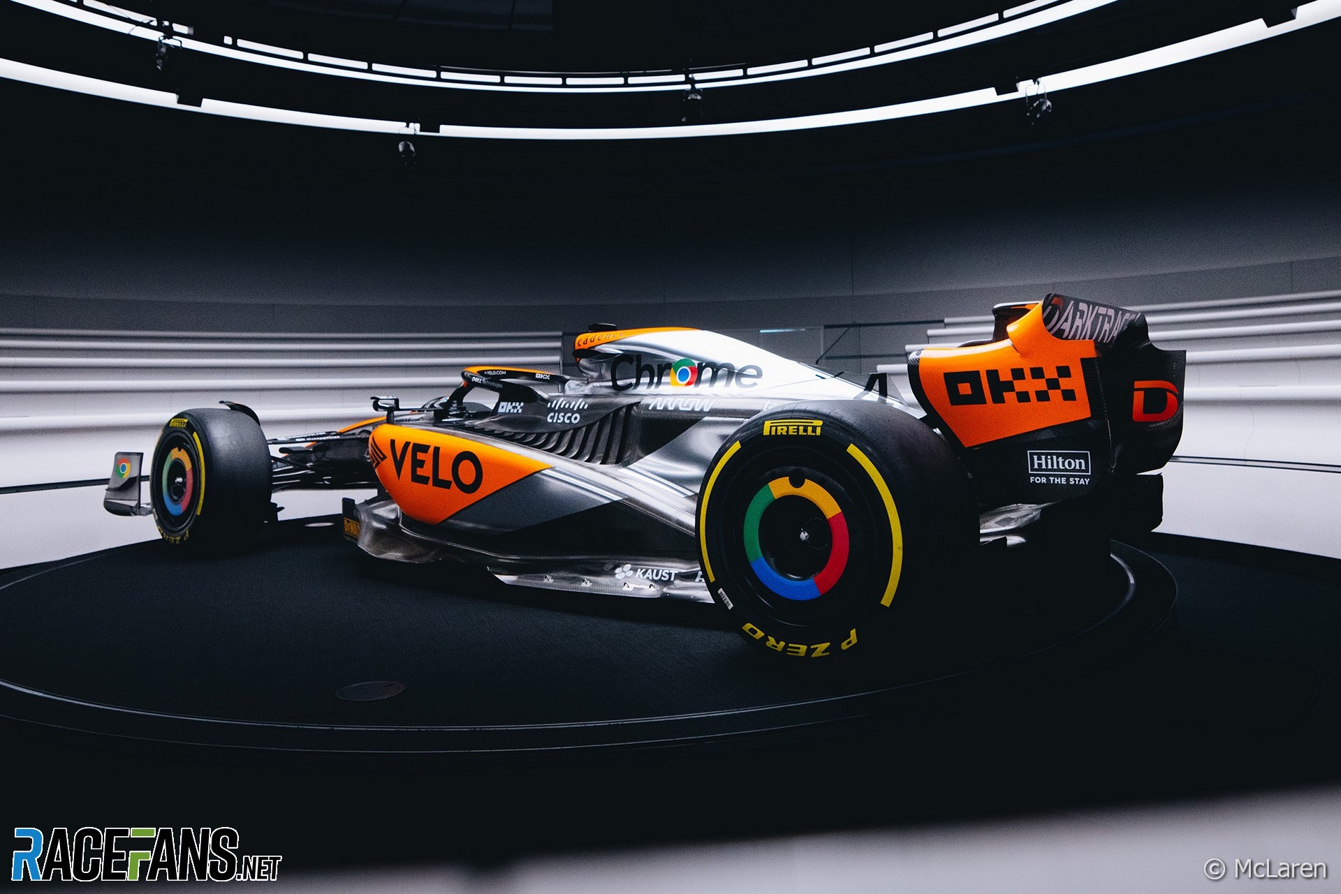
McLaren has revealed a special ‘chrome’ livery it will run at this weekend’s British Grand Prix.
The team is running the livery as part of its 60th birthday celebrations. It is intended to evoke the colours its cars ran in the last time one of its drivers won the world championship – which was Lewis Hamilton’s triumph in 2008.The special branding has come about in conjunction with one of the team’s sponsor’s, Google.
“The fans will hopefully really enjoy this,” said McLaren Racing CEO Zak Brown, calling the design “a nod to our history of when we last won a world championship in 2008.”
Lando Norris said he had urged the team to run a livery recalling its successes of the late 2000s.
“I’ve asked Zak pretty much since I joined to make the car chrome again because that’s when I started watching Formula 1: 2006, 2007, 2008. That’s what made me fall in love with McLaren. So it’s nice to be able to bring this back in the modern era and drive a little bit of what inspired me to be a Formula 1 driver in many ways.
“It’s such a big, historic part of McLaren. It’s nice to bring it alive and especially at Silverstone for our home race.”
This article will be updated.


Advert | Become a RaceFans supporter and
2023 F1 season
- FIA president cleared of alleged interference in two 2023 races
- First week viewing figures for new Drive to Survive season fall again
- Max who? Drive to Survive season six prefers its favourite faces
- RaceFans’ complete 2023 season review
- The F1 drivers who pulled off the 10 biggest charges through the field in 2023
asd
3rd July 2023, 18:25
Chrome is nice. If only the orange parts were arranged in a better looking way.
Bullfrog (@bullfrog)
3rd July 2023, 18:25
Paved right up to the edge of the gravel – that’s how to do track limits!
(the pillars are a good deterrent too)
Michael Brooks
4th July 2023, 6:25
Lets see them disregard track limits now
Fer no.65 (@fer-no65)
3rd July 2023, 18:27
They could’ve painted it purple and yellow and it’d be as reminiscent as that iconic vodafone livery as this one…
Yellow Baron
3rd July 2023, 18:42
Is it just me or does it looks silver/dark grey rather than actually chrome
Username
3rd July 2023, 22:08
“Matte chrome” lol actual chrome paint would be too heavy so they use silver and grey to save weight
Bullfrog (@bullfrog)
3rd July 2023, 22:34
It’s indoors, or at least under cover. But that’s how it’ll look under the dark clouds of a traditional Silverstone sky!
Darryn Smith (@darryn)
3rd July 2023, 18:44
What’s with that stupid orange color they keep using. The red would be a more traditional McLaren color and look better. I don’t see Red Bull trotting out Stewart racing tartan.
George (@george)
3rd July 2023, 19:19
Not sure if serious…
Marcelo Couto (@totof1)
3rd July 2023, 20:00
Marcelo Couto (@totof1)
3rd July 2023, 20:00
https://primotipo.com/2016/07/18/the-colour-papaya/
anon
3rd July 2023, 20:45
@darryn as noted by Marcelo, that “stupid orange color” is in fact the traditional livery of McLaren’s cars, having been chosen by Mayer, one of the founders of the team, to be the colour of the works team. It was extensively used in Formula 1 in the 1960s and early 1970s, as well as in the many other areas of motorsport that McLaren competed in (Can-Am, Formula 2, Formula 5000 etc.).
When you say that “red would be a more traditional McLaren color”, you are presumably referring to the Marlboro tobacco liveries that McLaren would later switch to. However, since those were the corporate colours of Marlboro, that livery was not a “traditional McLaren colour”, but instead followed whichever teams Malboro chose to sponsor – BRM used that livery in the early 1970s, Williams used a similar red and white livery during the mid 1970s and Alfa Romeo used an almost identical livery to McLaren in the 1980s.
Darryn Smith (@darryn)
3rd July 2023, 22:33
It’s so long ago and this team has less to do with that team than Red Bull does with Stewart. The orange just seems totally stupid. McLaren is the name. The team has more to do with Dennis’s Project 4. It looks terrible.
Short Circuit (@jjohn)
4th July 2023, 6:42
Sorry for dropping in, guess people already can find this but here’s a photo of one (bit of tyre wear) Johnny Rutherfords .
Short Circuit (@jjohn)
4th July 2023, 6:43
https://live.staticflickr.com/5475/10828705993_25b972df33_k.jpg
Arthur Zakaryan (@arthurgd3)
3rd July 2023, 18:45
Looks nowhere near as good as the LH era McLaren with title sponsor Vodafone livery. The current McLaren is way too busy looking with its livery.
Qeki (@qeki)
3rd July 2023, 18:49
Why its so messy. From one angle it looks orange, from another chrome, from another black…
Proesterchen (@proesterchen)
3rd July 2023, 19:08
Nifty activation opportunity for their sponsor.
Jere (@jerejj)
3rd July 2023, 19:54
Cool
Yellow Baron
4th July 2023, 7:43
Was it both McLarens that had the upgrade last weekend?
MichaelN
3rd July 2023, 19:58
Always fun to reference the history of a team.
The upgrades Norris (but not Piastri) had last time around also seem to have put them somewhat in range of Mercedes and Alpine, so that’s a positive too. Still a long way to go to repeat that 2008 title, but I suppose that’s the same for everyone at the moment.
Esploratore (@esploratore1)
3rd July 2023, 21:01
Hopefully, referencing a title contending car will make this car as fast as that relative to their competitors, but I won’t hold my breath!
But yes, they at least caught up with merc and aston in austria, though the performance won’t be the same all races, aston at least was much faster in canada.
Dutchguy (@justarandomdutchguy)
3rd July 2023, 21:42
Amazing. Everything they change on their livery makes it better than the normal one
Ruben
4th July 2023, 3:05
It’s good that they’re not too successful right now, otherwise they’d pull this one out of the bag as a retro livery in 20 years again and then we have to look at it again.
Nick T.
3rd July 2023, 23:53
You would have thought they’d use the Google Chrome sponsorship to bring back the chrome, but maybe it weighs too much.
The Ron Dennis cars always looked great, especially the a) the just silver and black of the late 90s b) the chrome cars and non-chrome silver, black and c) Marlboro MP-4/5B. There were a few exceptions: the 2015 MP-30 had a livery that made look like a Manor Marussia.
These new McLarens are too busy. The Google Chrome (ironically non-chrome) wheels are cool, but it looks bad on the air box.
Fun fact: Ron Dennis and the technical staff used to have fights over the paint. He was all about presentation and wanted the car painted after EVERY weekend, but it added weight and tons of work.
Bobby (@shakenbake)
4th July 2023, 2:21
I love it. I understand when people say it’s messy as there’s still lots of carbon areas for weight saving. But that’s the same with most cars on the grid. And for the people saying to use the red of the noughties era… that would be a horrible clash with the papaya. They can’t drop Papaya, that is the McLaren colours now, as it was in pre-West/Vodafone and it’s awesome.
MacLeod (@macleod)
4th July 2023, 7:42
Chrome is even heavier then the normal paint but it looks very nice indeed.
Keith Campbell (@keithedin)
4th July 2023, 8:19
Would have been better if they’d done a near identical livery but replaced the Vodafone red with the orange. I don’t think this one is particularly special.