


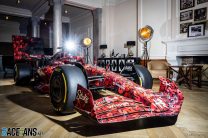
Alfa Romeo will run a livery based on the ‘Art Car’ design they revealed earlier this year at the Dutch Grand Prix.
The Swiss-based team launched its art car, designed by graffiti artist ‘Boogie’, in January. It has already been displayed at a series of public events and the letter-filled livery has been added to the official Formula 1 driving game F1 23.The ‘Art Car’ itself will appear at Zandvoort this weekend in the circuit’s Fan Zone, then sold at auction to raise money for charity Save the Children, but more notably features of its design will be incorporated into Alfa Romeo’s garage in the pit lane: the cars will feature updated liveries and the team’s trackside infrastructure will be changed to have a matching visual identity to the cars.
Alfa Romeo described the design which will appear on Valtteri Bottas and Zhou Guanyu’s cars this weekend as “a tribute livery to the Art Car, emblazoned with Boogie’s distinctive art.” It issued the image above which closely resembles the design shown earlier this year. The team’s garage panelling, garage nameboards and drivers’ suits will also be revised to complement the new look.
“This project has brought Alfa Romeo F1 Team Stake closer to the fans in each phase of its development,” said team representative Alessandro Alunni Bravi. “It has been an exciting, ground-breaking journey the team has been proud to undertake, alongside trusted partners and an inspiring artist.”
It is the second race in a row that Alfa Romeo have revised their livery, having added neon green elements to its usual black and red livery for the Belgian Grand Prix. That too was made available on F1 23, as the use of one-off or themed liveries become more frequent in F1.
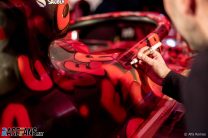
Pictures: Alfa Romeo livery
Alfa Romeo presented their art car livery earlier this year, with some differences to the sponsor logos compared to the version above.


Advert | Become a RaceFans supporter and
2023 Dutch Grand Prix
- Azerbaijan GP defeat was key to record-equalling run of wins – Verstappen
- “Too early to say” if podium signals return to form for Aston Martin – Alonso
- Verstappen makes history with unbeaten hat-track in first home races
- Perez is ‘doing his job and will be our driver in 2024’, Horner insists
- Ferrari had the “sixth or seventh fastest car” at Zandvoort – Sainz
HUHHII (@huhhii)
23rd August 2023, 11:34
Starting to long for the days when FIA limited the amount of special helmet liveries and car liveries to one per season. It’s getting seriously out of hand.
SjaakFoo (@sjaakfoo)
23rd August 2023, 12:04
I too hate fun.
PacificPR (@streydt)
23rd August 2023, 16:02
Fun is overrated. I for one will dial back the saturation levels on my TV to make it bearable.
melanos
24th August 2023, 11:46
Do not watch Barbie, I respectfully suggest (there are also other reasons but I won’t go into them)
Dex
23rd August 2023, 17:33
I’m glad you’re so easily entertained (and I’m not sarcastic, good for you sir). I don’t like over-saturation with “special” gimmicks and that hunger for attention and cheap PR points. Special liveries are interesting, but they are special only if they happen on rare, special occasions. Plus, I prefer tasteful liveries, this is hurting my eyes (but that probably is a matter of taste after all). Fun or not, this looks like a random generated texture, I see no effort involved, so I don’t show any appreciation. A “special livery” no one will remember after a few weeks. To be fair, I’ll give one example that I find positive, to my liking that is, and that is Red Bull’s white special livery that I actually preferred over the regular one (but, of course, they would preserve their own visual identity). That livery looked nice, not random, and it actually had a point, important or not.
Olivier
23rd August 2023, 15:57
I am a fan of how Hamilton and Max Verstappen change their helmet appearance: the graphic layout of their helmet remains untouched, but the colours do change.
Regarding the car liveries: The graphic layout of the car’s visual identity should remain untouched. There could be a play with colours and graphic elements added to the existing layout, like Red Bull tastefully did with their Miami car. Despite these changes, from afar, it really did look like a Red Bull car. A bit similar to what Hamilton and Max do with their helmets.
S
23rd August 2023, 12:57
They should be running liveries like this all the time. It’s much better than the usual one.
Too bad they always have to please the stuffy corporate types first.
Perhaps one of the best visual positives of a series such as Indycar in comparison to F1. Their field always looks far more vibrant and interesting than F1 ever has. They actually want people to look at their cars and take notice of the differences from week to week.
Meanwhile, the top teams in F1 are still running basically the same liveries they were 10 (and more) years ago – minus the spaces left black to save a few grams.
GeeMac (@geemac)
23rd August 2023, 13:21
I like the idea, but I fear this may not be the best race to show it off. That livery would have worked better under lights.
Jockey Ewing
23rd August 2023, 19:18
Yes, I am quite uncertain how it will look like under floodlights.
Something else – one half of me thinks that it is a nice livery, or by some means I like this effort,
but in the end the other half of me says: it would be a nice challenge to generate something very similar with a short script (and I consider it far from difficult, you know you just have to throw on letters at random positions with different rotations -although as I see, most of these letters are not randomly rotated-, so I think of a script generated texture – you run it many times and take the one what you like the most). The harder part would be to fine tune it to resemble graphitti/to look good at most runs.
Although, if someone not likes my idea apologies, this livery looks quite good and polished in some aspects, considering some of its details. But this is what seeing these densely packed enormous amoint of letters made me to think.
asd
23rd August 2023, 13:55
“designed by graffiti artist ‘Boogie’”
– And in this moment I already knew it was gonna be garbage. I’m all for new livery designs, but it can only be done well by people who understand motorsport liveries, i.e. who understand the distance and perspective racing cars are observed from.
S
23rd August 2023, 14:11
Alfa Romeo, themselves, are calling it an “art car” livery.
It’s specifically designed to not look like the boring corporate liveries race teams typically go with in F1.
PacificPR (@streydt)
23rd August 2023, 15:57
I really fear that a lot of the designs you see on the cars are actually concessions and watered-down versions of much nicer designs – designs that are endlessly adjusted and tweaked in order to satisfy every sponsors marketing and ceo department before being signed off and getting an okay. Hence a lot of uninspired and weird design choices in the current liveries. So I really like that Alfa Romeo and Stake are doing this – something bold and fun!
MichaelN
23rd August 2023, 16:38
You’re not wrong, but they’ll probably work in some slow motion close-ups to highlight this one-off livery.
PacificPR (@streydt)
23rd August 2023, 16:10
On a nostalgic note. Look up the beautiful art version of the 1993 Ligier. It was used for the Japanese and Australian GP. You can find it here
Jockey Ewing
23rd August 2023, 19:24
I have not seen it yet, or I do not remember. I reallly like it.
Unicron (@unicron2002)
23rd August 2023, 21:13
@streydt I like it too!
melanos
24th August 2023, 11:50
Much needed link
cdfemke (@cdfemke)
23rd August 2023, 17:57
I dont get it, is money more important than seconds, as they realise they can’t win anyways??
What happened to the “we cant even paint the car because of the weight” we had at the start of the season??
Arhn (@arhn)
24th August 2023, 11:55
“Art”