


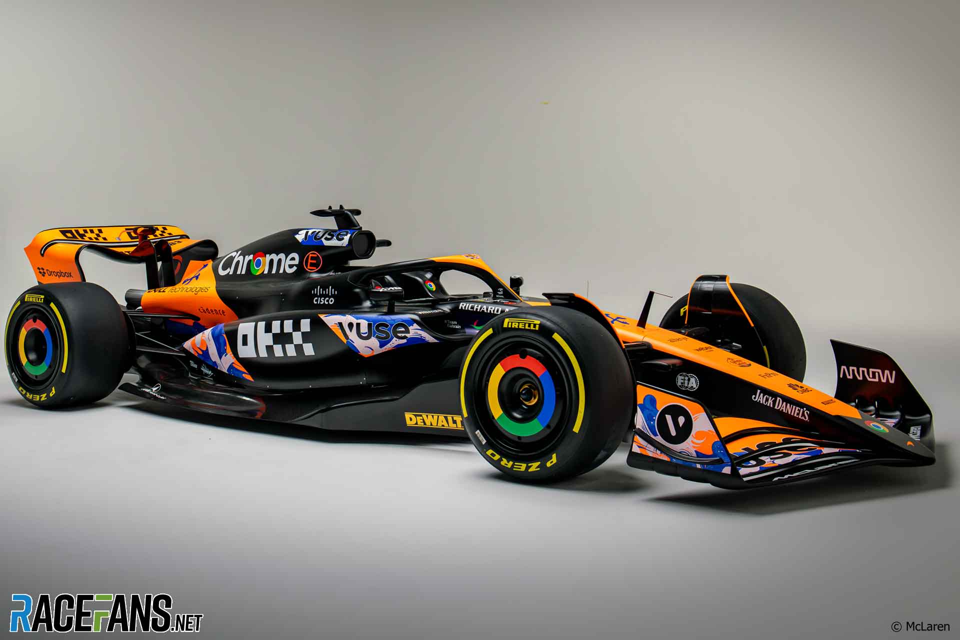
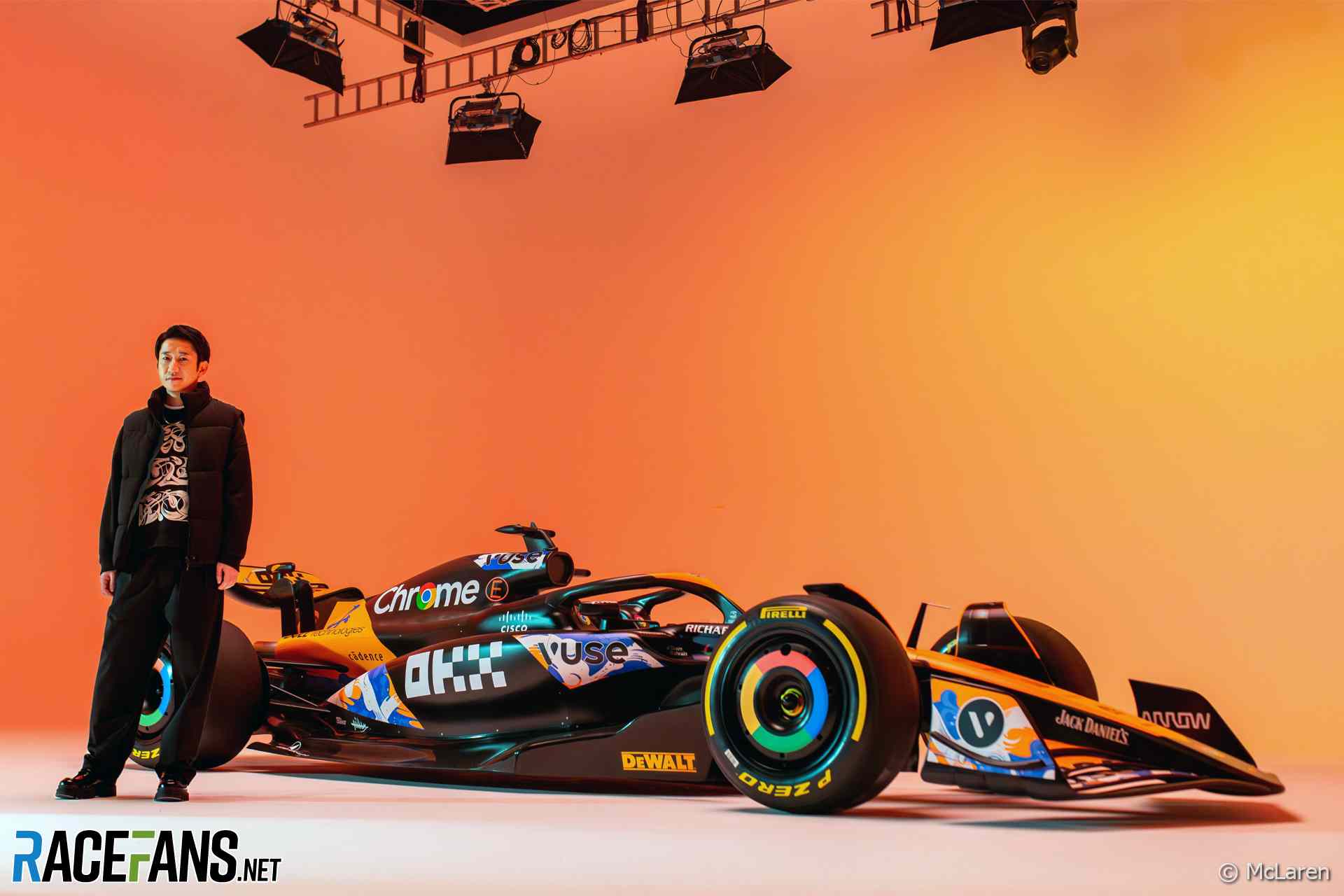
McLaren has revised its livery for this weekend’s Japanese Grand Prix.
The team has shown off a revised look for its MCL38 drawing attention to the branding of sponsor British American Tobacco.Japanese artist Mitsuru Kamikubo, who specialises in calligraphy and graffiti art, designed the special graphics for the car. His artwork is based on Edomoji, a form of traditional Japanese calligraphy, and inspired by the work of Rahab Tantawy.
The design by Kamikubo, also known as Miltz, will appear on the team’s cars for the upcoming round at Suzuka only.
McLaren regularly adjusts its livery during the course of a season to draw attention to different sponsors or acknowledge landmarks in its history. Last year it ran a special design at the Monaco Grand Prix to celebrate its successes in motorsport’s ‘Triple Crown’ of events, including the Monte-Carlo street race as well as the Indianapolis 500 and Le Mans 24 Hours.
McLaren also ran special liveries for sponsors at the British, Singapore and Abu Dhabi grands prix.
This is the fourth year McLaren has produced a variation on its livery to promote BAR, since Formula 1 loosened its restrictions on teams altering the look of their cars. “We have seen the successes of the campaign in showcasing the incredible creativity of these talented and undiscovered artists for the world to see on our race cars,” said chief marketing officer Louise McEwen.
“When I first became a freelance artist, I never thought an opportunity like this was possible,” said Kamikubo. “This is the biggest international project I have ever done.
“As I continue to build my profile as an artist, I want my artwork to champion the rich traditions of Japanese writing culture, such as Edomoji, but with a modern twist. From my work with local businesses in Japan to the McLaren Formula 1 team, there are so many beautiful stories to tell through art.”
Don’t miss anything new from RaceFans
Follow RaceFans on social media:
Advert | Become a RaceFans supporter and
2024 Japanese Grand Prix
- “Am I in a race here or what?”: How Ferrari aced their Suzuka strategies
- Suzuka showed Mercedes “have a more stable platform” now
- Ferrari’s strategy gains in 2024 are “purely down to the car” – Sainz
- Tsunoda ‘at Verstappen and Alonso’s level’ with Suzuka performance – Marko
- Japan was first race where Red Bull’s winning margin was bigger than last year
Dex
3rd April 2024, 11:24
On one hand they try to sell tobacco products to our children, on the other hand they (F1 teams) preach about going green, “diversity” and whatever else sounds PC at the moment. I don’t mind such sponsorships to be honest, but I don’t understand the morality of moralizing.
SjaakFoo (@sjaakfoo)
3rd April 2024, 11:30
Nobody’s going to avoid coming out as a hypocrite when taking money for marketing. It is what it is, the team needs the income. It’s not like you’re going to see Lando sucking on a vape pen on the grid.
Dex
3rd April 2024, 11:47
My point is that they can avoid the hypocrisy by not pretending about other social issues. Ecclestone, for example, would’ve probably sold his own mother, but he wasn’t preaching to the masses. Now I come to appreciate what we’ve had more… Bad guys were bad guys and we didn’t have mother Theresas.
Keith Collantine (@keithcollantine)
3rd April 2024, 12:00
Indeed not, because it’s forbidden under the rules.
I was amused to see, in a 1984 F1 race video I was watching the other day, Keke Rosberg having a surreptitious pre-race drag, while standing on a grid of 26 cars brimmed with up to 220 litres of fuel each…
theRealMax (@millionus)
3rd April 2024, 16:13
:) ah the good old days…
Mayrton
3rd April 2024, 12:33
I agree. Being open about being completely inconsistent when money is involved would be more honest. F1 is drenched with dubious deals and co-operation with sometimes shady countries. We all know it. It would be better to say “Yes, we are hypocrites but at least we work on some goals oriented at improving the future of society. We can’t win on all fronts at the same time and everything we do do is something more than doing nothing, while on the other hand and at the same time we will sometimes yield/give in to bring in the money”
cdfemke (@cdfemke)
3rd April 2024, 16:44
It looks confusing and is an overly busy design . There is so much going on there, nobody can really read anything when its moving. If its stationary nothing grabs the attention because of all the graphical noise
pcxmac (@pcxmac)
3rd April 2024, 17:29
at least with a pack of cigarettes you are getting a material ‘good’ in exchange for being told to fork over your ‘green’. And in a world where people believe in moderation, tobacco products, not laced with harmful toxins, are not the most terrible thing in the world.
Moshambles (@moshambles)
3rd April 2024, 11:30
2 days late for April Fools, Keith
MichaelN
3rd April 2024, 11:32
Little changes on the livery are always fun to see; I don’t see the Japanese angle necessarily, but that’s probably due to my ignorance of the style.
The occasion for this is rather disappointing. I thought Ferrari was the only team to still associate with these businesses. Unfortunate that McLaren continues to do the same.
Yellow Baron
3rd April 2024, 17:09
It looks like irn bru
Tristan
3rd April 2024, 11:43
Just what the McLaren livery needed, more noise with zero design sense…
PacificPR (@streydt)
3rd April 2024, 12:02
Nice one, in some parts the V is hardly visible and all you read is USE!
Nick T.
3rd April 2024, 12:54
I see no identifiable tobacco sponsorship. Just their longstanding Vuse brand vape stickers. Their livery is dam* ugly either way.
SteveR (@stever)
3rd April 2024, 16:04
Call me stupid, but what is the large white sponsor graphic the looks like DHX?
Nick T.
3rd April 2024, 17:19
No idea. Really effective marketing. Looks like OKX to me. Due to the X, I’m going to guess it has something to do with a crypto scam.
SteveR (@stever)
3rd April 2024, 17:56
Yeah, you’re right, crypto indeed. You’re also correct about the effective marketing; when a fan has to search to find out who the sponsor is, something ain’t right with the branding.
Jere (@jerejj)
3rd April 2024, 13:36
Teams mostly only do marginal tweaks rather than proper temporary livery changes.
Fer no.65 (@fer-no65)
3rd April 2024, 14:33
It looks half done.
cduk_mugello (@cduk_mugello)
3rd April 2024, 14:50
That car is a complete mess
Nick T.
3rd April 2024, 17:20
The livery? Couldn’t agree more.
An Sionnach
3rd April 2024, 18:14
Yes. I’ve no idea what all the colours are for. Where should I look to see the design mentioned in the article. It makes my eyes hurt. The McLaren must be the ugliest car on the grid.
SteveP
3rd April 2024, 20:15
There’s a vivid fluorescent green car on the grid, and you say the McLaren hurts your eyes?
An Sionnach
3rd April 2024, 23:39
Yes. I remarked on the awful colours of the Sauber when it was released, but even then it was apparent that it is still somehow compelling. This is just a mess of unfocused tomfoolery. Orange is a pretty awful colour on everything but oranges. The etymology of the word is interesting, as is the fact that there was no word for the colour before the fruit burst onto the scene.
PlosslF1
3rd April 2024, 14:54
Sauber are the closest thing that looks like a cigarette packet these days.
I surprised B&H haven’t paid to put ‘Bitten & Hisses’ on the car :)
KentHarwood
3rd April 2024, 22:37
Okay….. what am I missing? I’ve scoured that photo, and I just can’t spot anything that remotely looks like the BAT logo (which makes it hard to believe that it’s being ‘highlighted’). Somehow, there was a board-meeting at BAT, and they decided that it would be great to pay McLaren to change their livery to not-at-all display their branding. Isn’t it a bit ironic that they only way they’ll get any publicity is if the media tells everyone that there’s a connection? So… how about you guys don’t mention it? Oh… too late….. Oh well, maybe SkyF1 can ensure BAT gets their day in the sun.
An Sionnach
3rd April 2024, 23:42
If you’re not Google, DeWalt, Richard Mille or Jack Daniel’s, your sponsorship money may be going to waste…
Euro Brun (@eurobrun)
4th April 2024, 8:20
You don’t need to see it. They’ve achieved their aim of having Racefans advertise BAR for free.