


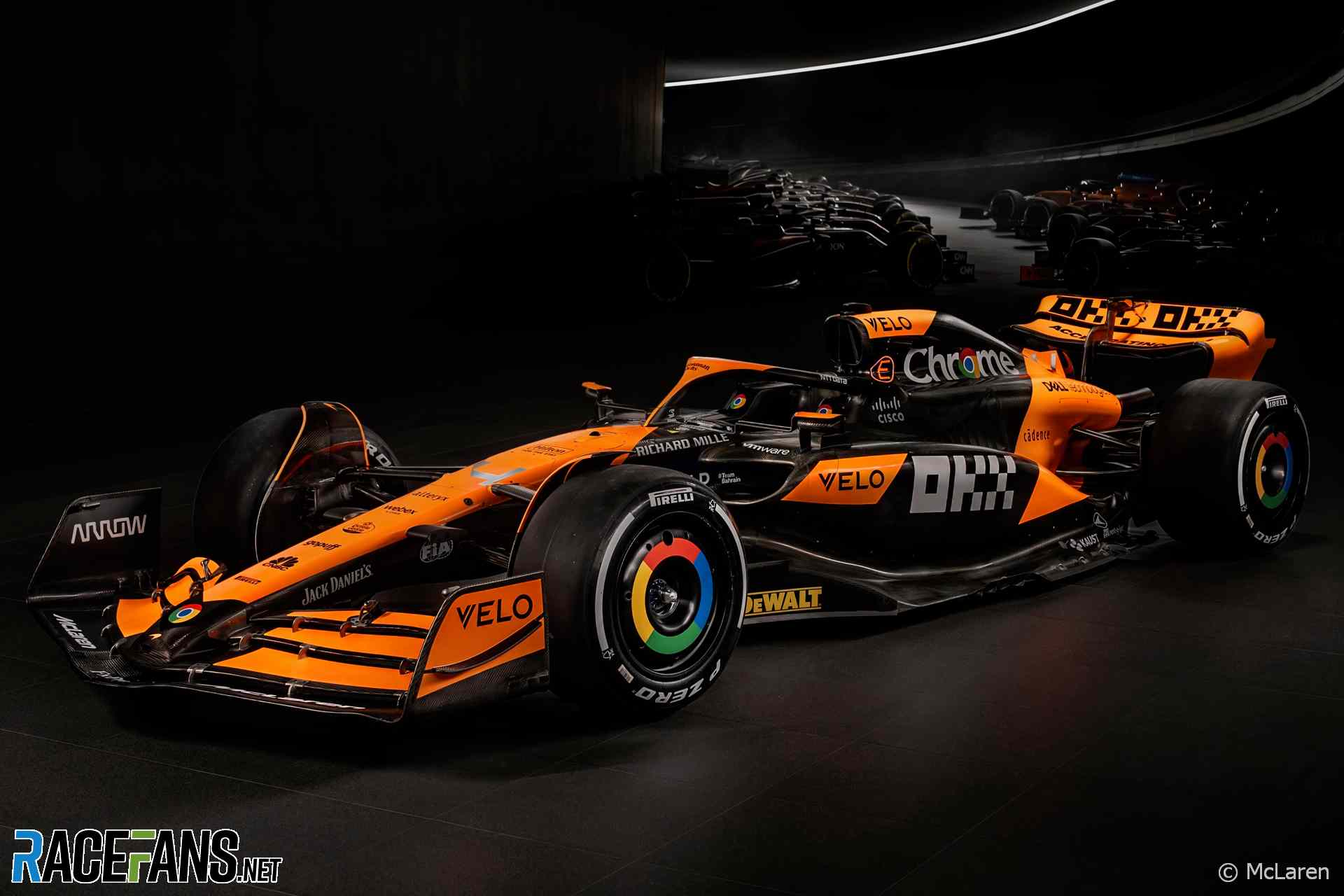
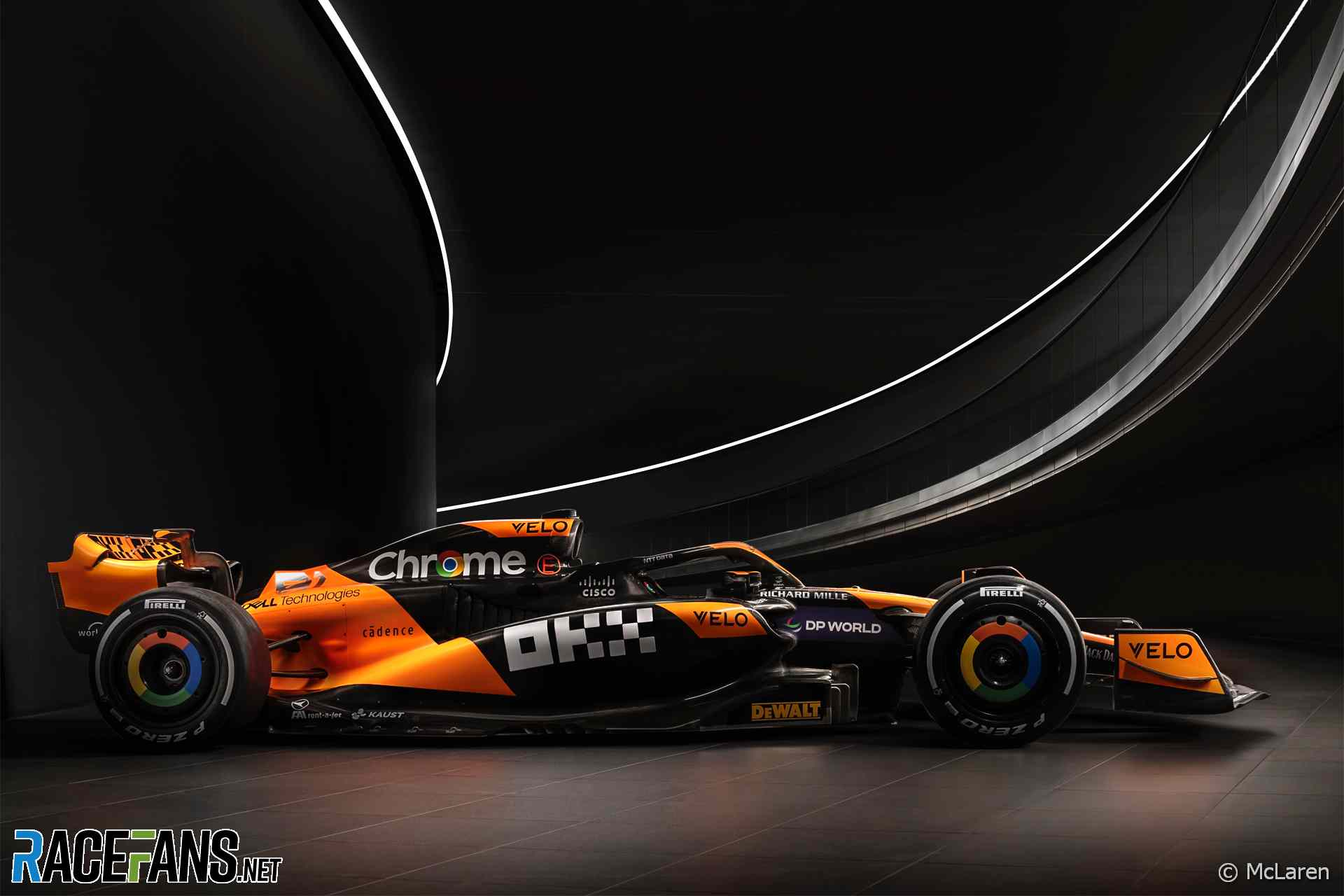
McLaren has presented the livery its car will race in during the 2024 Formula 1 season.
The team will revert to their regular naming convention for Formula 1 cars last year having broken their recent trend to mark the team’s 60th anniversary last year.McLaren is yet to reveal the design of its new car, which will be launched on February 14th. But it has revealed its colour scheme in images issued today.
They head into 2024 off the back of a promising campaign the previous year. The team finished the season in fourth place and took seven podium finishes from the last eight races as a strong development push gave them a strong claim to being the second-quickest team behind dominant champions Red Bull.
“We didn’t start 2023 as we wanted,” said McLaren Racing CEO Zak Brownm “but Andrea [Stella, team principal] and the team did a great job following the organisational restructure coming into action, and the hard work continues as we carry that excellent momentum into the 2024 campaign.”
Lando Norris and Oscar Piastri will be team mates for a second year at McLaren.
“I’m confident the exciting pairing of Lando and Oscar will continue to create more mega memories together after such an impressive second half of last year which saw the team finish fourth in the championship with 302 points,” said Brown. “These are all steps forward from the year before as we continue our mission to push and compete at the front of the grid.”
Advert | Become a RaceFans supporter and
Since the new year began McLaren has welcomed the arrival of two major hires in its technical division: Rob Marshall, technical director for engineering and design, and David Sanchez, technical director for car concept and performance.
The team’s new car will carry the name MCL38, it revealed. Last year’s car was called the MCL60.
This marked a departure from the team’s recent nomenclature, which began after Zak Brown took over in charge of McLaren Racing, and is the third used by the team. Since 2017 the team’s car names have used the prefix MCL, beginning with the MCL32.
The team carried on the numbering used when Ron Dennis and his Project Four operation took over McLaren in the early eighties. The first car produced under his leadership, originally called the MP4 and later referred to as MP4/1, was a pioneering design featuring F1’s first carbon fibre chassis.
The MCL38 will be the 71st F1 car produced by McLaren. The first was the M2B, which team founder Bruce McLaren entered in six rounds during the 1966 season. Prior to that the team built an experimental, unraced single-seater called the M2A. Its first design, the M1A, was a sports car.
The team hasn’t won a race since 2021, when Daniel Ricciardo scored the only victory for an ‘MCL’-era McLaren in his MCL35M at Monza.
Get all the 2024 F1 race weekend dates plus test and launch details on your mobile device using the RaceFans F1 Calendar
Advert | Become a RaceFans supporter and
Formula 1
- F1 CEO Domenicali wants more than six sprint races per year
- Hulkenberg named Audi’s first F1 driver for 2026
- Ricciardo needs to show “head-turning form” for 2025 chance – Horner
- F1 Commission defers decision on points change and approves new rear cameras
- Red Bull’s star designer Newey to leave team – reports
Ω (@omega)
16th January 2024, 17:37
Had to look up a picture of last years car, the blue stripes are gone, so I guess this is indeed a “new” livery.
Ω (@omega)
16th January 2024, 17:38
Edit: nvm just saw the livery of the singapore GP, this is nearly identical but for a few tiny changes.
BasCB (@bascb)
16th January 2024, 20:55
thanks for checking that, now I don’t have to do it anymore. Yeah, hard to see any differences really.
David B
16th January 2024, 17:41
Still sticking with the ugly wheel covers.
AlanD
19th January 2024, 16:15
Isn’t that because they are sponsored by Google, so they don’t really have a choice if they want the money.
Asd
16th January 2024, 17:46
Terribly generic. I very much dislike that the car isn’t really black but an ugly dark shade of grey, because it’s not painted, it’s just bare carbon fiber (they only make it look blacker for the pictures). And as for the orange… I dislike everything about it. McLaren’s had and still has the worst livery in F1.
PacificPR (@streydt)
16th January 2024, 18:08
Just had a major Déjà vu. Something tells me the whole 24 season will be like that in all aspects..
Asd
16th January 2024, 18:17
Actually, that’s a great idea for an article!! @Keith Collantine
What were the 2 most similar F1 seasons to date? Similar in terms of general results in both WCs and general look of the seasons based on drivers, teams, cars, circuits, narratives etc.
I’ve always seen 1993 as a copy of 1992, just with Mansell replaced by Prost.
Trayambak Chakravarty (@major-dev)
17th January 2024, 13:05
2012 and 2013 also come to mind for some reason
Ciaran (@ciaran)
16th January 2024, 18:24
Much better without the blue! It’s a nice improvement over 2022.
mmertens (@mmertens)
16th January 2024, 18:32
Indeed, last years one was a mess, this is a better one for sure, less is more in this case. But the abysmal wheel covers are there to stay it seems.
Jere (@jerejj)
16th January 2024, 19:26
Nice livery design, even if only marginally different from the recent past.
Sonny Crockett (@sonnycrockett)
16th January 2024, 19:30
Not exactly revolutionary but I still like it.
Mind you, I’m a McLaren fan and orange is my favourite colour so I’m hardly representative!
Roth Man (@rdotquestionmark)
16th January 2024, 20:03
Stunning this. Much cleaner for getting rid of the blue.
Bullfrog (@bullfrog)
16th January 2024, 20:06
First of many special one-off liveries for ’24.
Wish they’d go orange and white like one of Senna’s McLarens, but that would probably weigh too much…
Tristan
16th January 2024, 21:24
Vom… I don’t understand how anyone can like this. I think it comes down to the mish-mash of sponsor logos. The pixelated OKX next to the allcaps VELO and then Chromes completely smooth sans-serif font, along with it’s forced use of colour.
I just can’t find anything to like about it…
AlanD
19th January 2024, 16:19
You know, I’d not even realised that was what that was. I looked at it and just saw a strange chequered flag design.
Lucky
16th January 2024, 23:36
The color scheme reminds me of the Orange Arrows of the early 2000’s…
MacLeod (@macleod)
17th January 2024, 7:50
And last year McLaren …..
EffWunFan (@cairnsfella)
16th January 2024, 23:52
It just looks like they have made some weight saving, so they can afford to paint a little more of the car.
Maciek (@maciek)
17th January 2024, 3:15
It’s not the worst, but a few little tweaks to give the orange more flowing lines against the black could make it quite a bit nicer.
Jungle
17th January 2024, 10:33
I agree
Jungle
17th January 2024, 10:37
It doesn’t quite pop
Asd
17th January 2024, 12:42
And if you look at the 2000 or 2001 Arrows livery, then you see how bad and un-flowing this one is.
It’s like a mix of different concepts, you’ve got:
– a Marlboro throwback at the back
– 3 small and random trapezoids: on the sidepods and the top inlet that don’t flow with anything unless it’s a perfect sideview
– a painfully generic long strip of orange on the nose, not flowing with anything, although its diamond shape near the cockpit tries to align with the side trapezoids, but fails to do so. And then it goes to the halo with no sense.
– the front wing looks like covered with random orange stickers
Olivier
17th January 2024, 19:37
Papaya is a great color to work with. And yet. Here we are, looking at a dull sticker car.