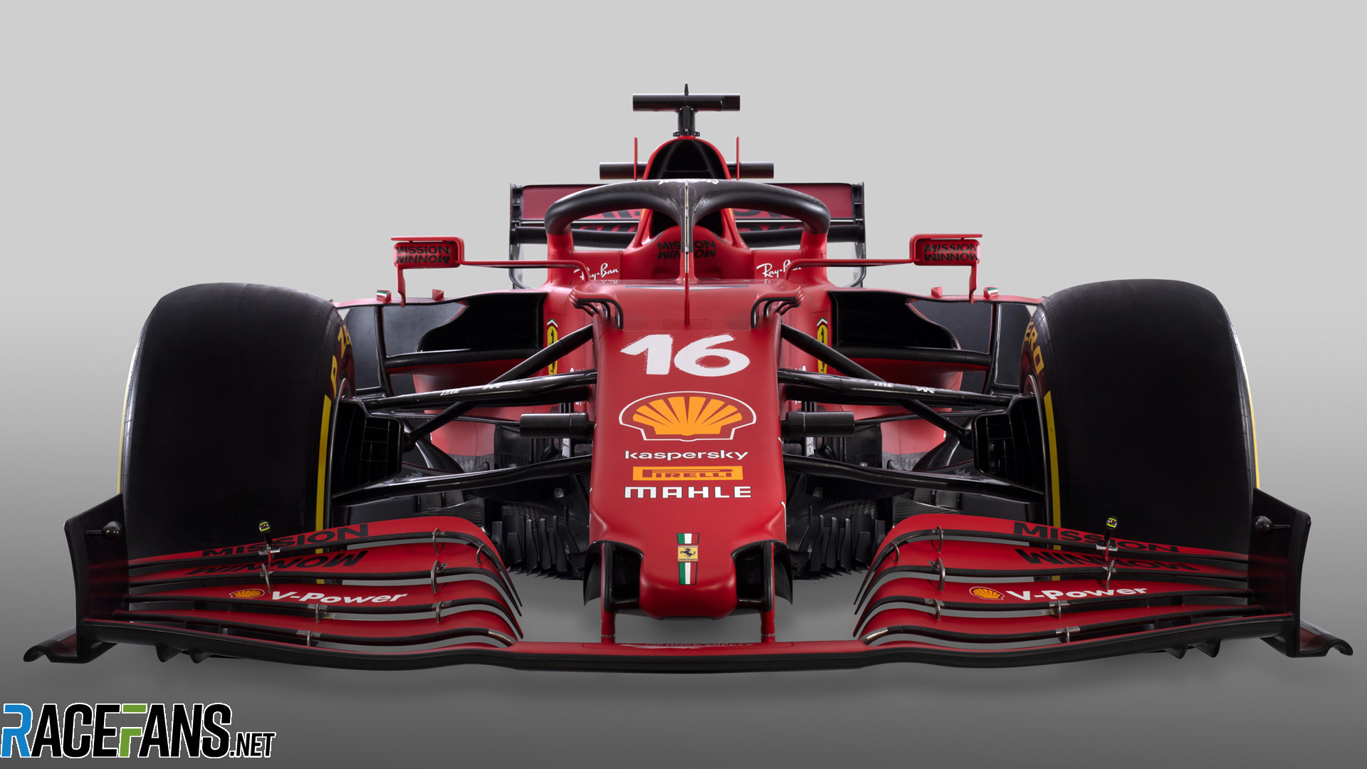
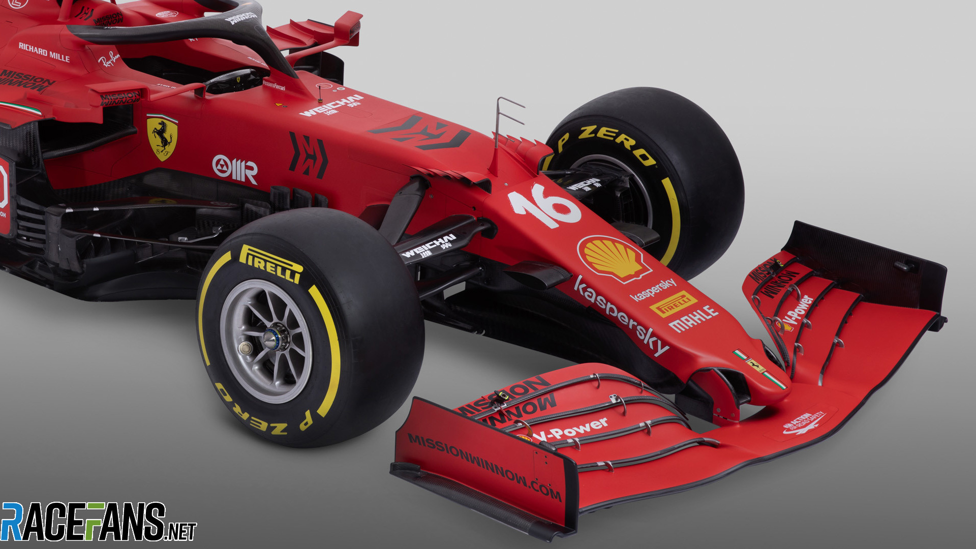
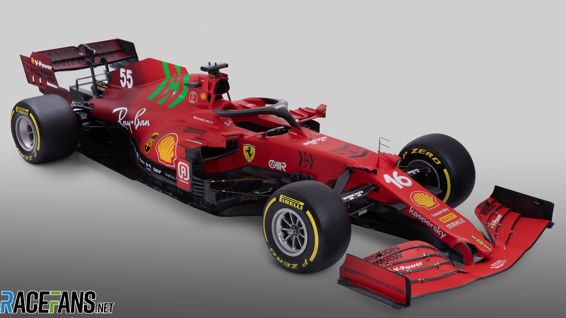
Ferrari has revealed the SF21, its new car for the 2021 Formula 1 season, to be driven by Charles Leclerc and Carlos Sainz Jnr. The car features a mix of their signature red and some burgundy paintwork, towards the rear, reflecting the livery used on early Ferrari cars and their 1000th Grand Prix look.

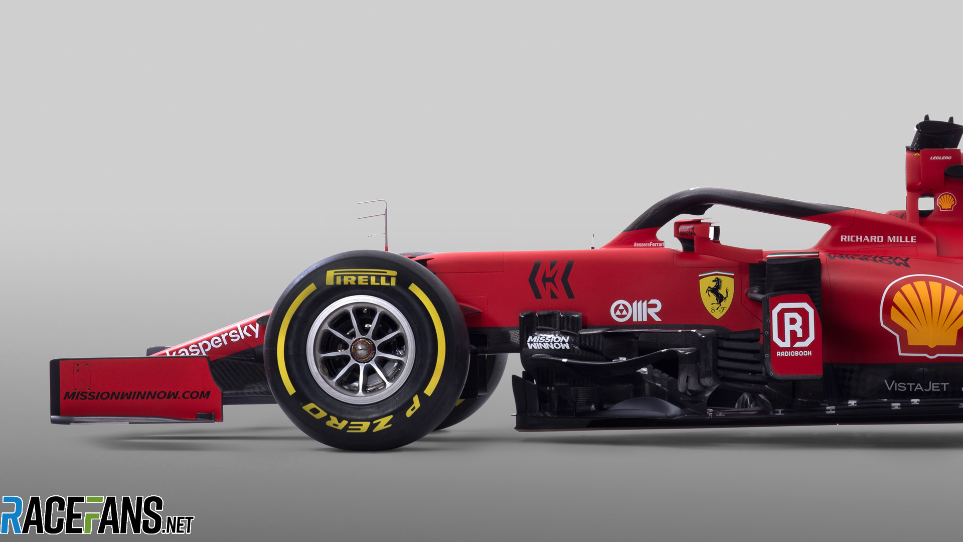
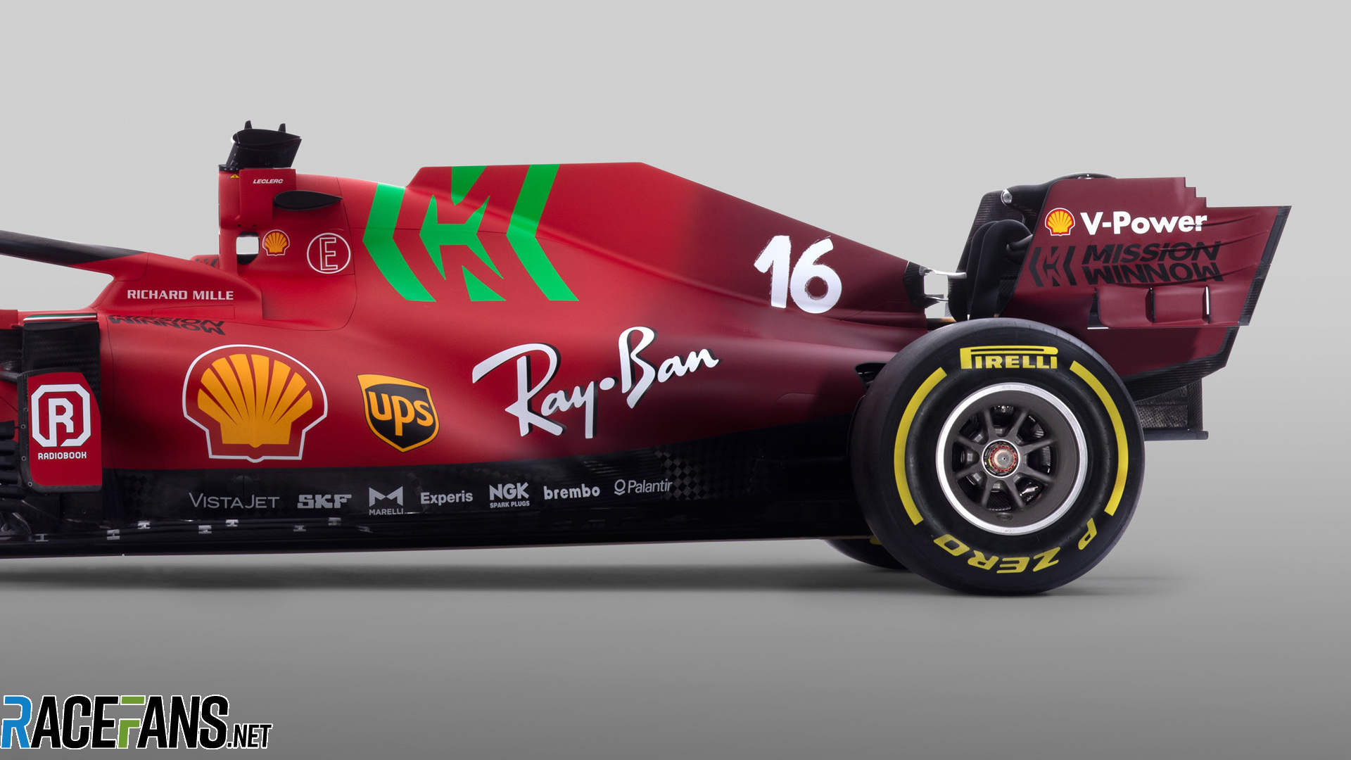
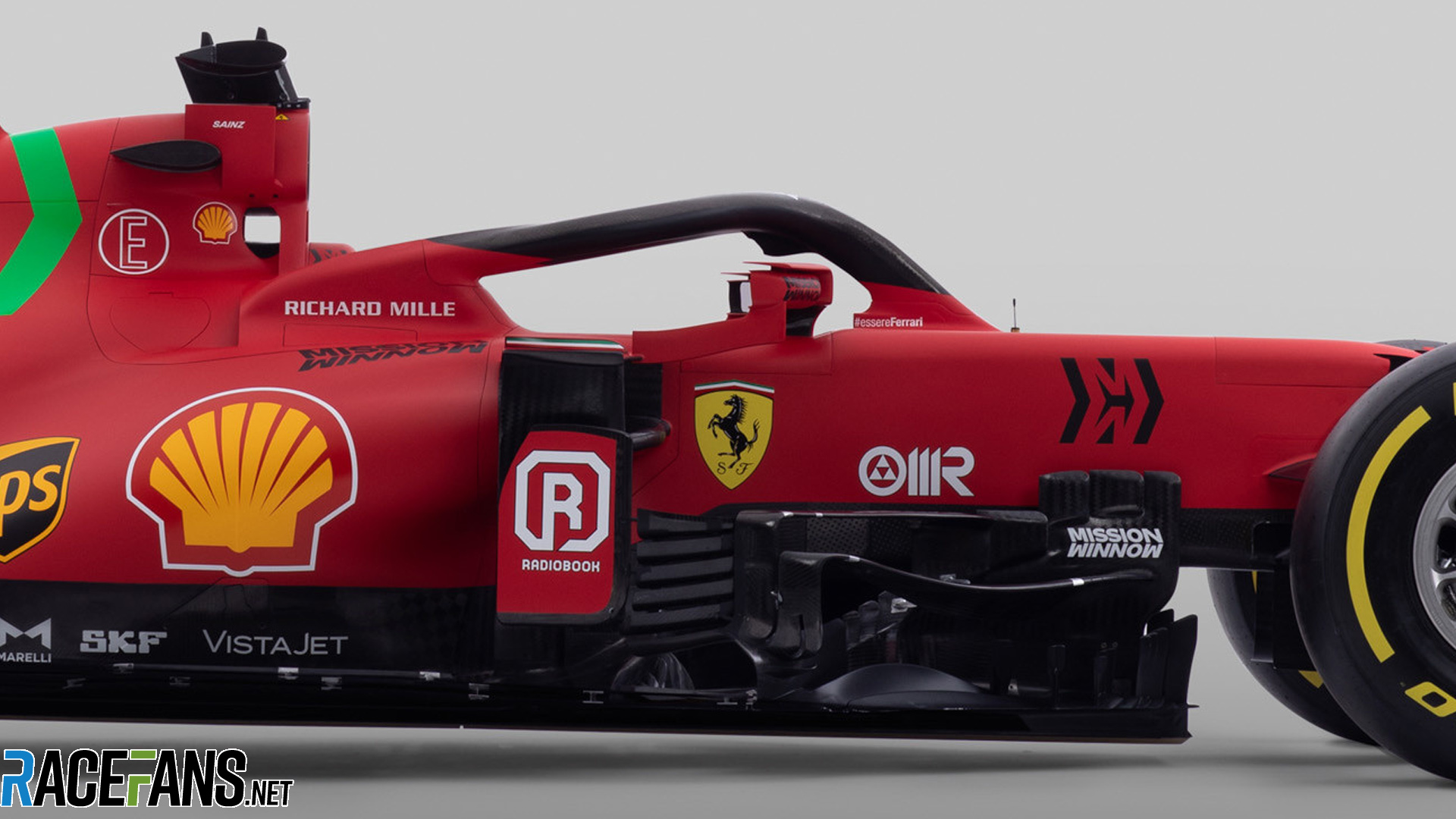
The SF21 has substantially updated sidepods, with major changes to the midsection of the chassis creating a much more dramatic curve towards the rear as well as new carbon fibre work towards the floor.
There are also substantial updates to the nose of the car, including cerrated winglets and a reshaped nose to improve airflow.
Advert | Become a RaceFans supporter and
2021 F1 season
- Verdict on error in GT race suggests Mercedes would have lost 2021 Abu Dhabi GP appeal
- Title ‘stolen’ from Mercedes made us ‘underdogs people cheer for’ – Wolff
- Red Bull Racing spent £230m during Verstappen’s title-winning 2021 campaign
- ‘I can’t box?’: Hamilton and Verstappen’s 2021 Abu Dhabi GP radio transcript
- Abu Dhabi’s legacy one year on: How the controversial 2021 finale changed F1


Ben (@b3ndy)
10th March 2021, 13:30
That. Is. Horrendous.
Sacha Gortchakoff (@gosac)
10th March 2021, 13:31
Why ?
RG1X
10th March 2021, 14:08
For me, the horrible MW logo and the colour blend to the darker rear.
MCG (@malrg)
12th March 2021, 6:03
I agree, I don’t mind the idea of the colour blend, I just think it looks like a clumsy last minute idea, should have blended more gently and gradually…too blunt.
anon
10th March 2021, 14:54
If what Leclerc says is true, the Marlboro logo wasn’t meant to be green and was changed at the last minute – and many would say that it shows that it is a botched change.
D@m@7@ (@domo70)
10th March 2021, 13:31
I like it actually…
Biskit Boy (@sean-p-newmanlive-co-uk)
10th March 2021, 17:35
Me too, its “Christmassy”. Let hope it delivers as quickly as Santa
D@m@7@ (@domo70)
10th March 2021, 17:54
Lol …. I doubt he will be as fast as Santa Delivering.
faulty (@faulty)
10th March 2021, 13:32
I’m of the opinion that the horrible Marlboro Chevron has been tested to have better mnemonics if green when watched at speed.
Z
10th March 2021, 13:35
That or it stands out more and causes controversy getting everyone to talk about Mission Winnow more and who they are and thus more money for Marlboro. Which is what we’re doing…
Only Facts!
10th March 2021, 14:19
The last ugly livery with touches of green to win races was Brawn GP back in 2009.
All they had to do is paint the car red! Shiny. Sponsors in white or black (some Shell yellow ok…).
I can see Vettel saying: Honestly? Come on guys, I thought you were better than that!
Beat Williams by a long margin in the “too much going on” department.
JC
10th March 2021, 15:14
That BGP001 livery is among the finest ever raced! Not like this monstrosity.
Zop
11th March 2021, 6:31
The color scheme on the car is a resemblance of the Italian flag. This is why the logo is green.
theRealMax (@millionus)
10th March 2021, 17:50
Agree.. Blurrgghhhh.
Dkor (@dkor)
10th March 2021, 19:26
I’m getting a sort of “high school art project that went wrong” vibe.
Red Andy (@red-andy)
10th March 2021, 13:31
Someone’s sneezed on the engine cover.
Sacha Gortchakoff (@gosac)
10th March 2021, 13:33
GOOD launch event in my opinion.
Sovereign address by John Elkann !
Qeki (@qeki)
10th March 2021, 13:48
I liked how he wasn’t sitting but speaking like “This is it. Now we win. No matter what!”
vjanik (@vjanik)
10th March 2021, 13:33
Very interesting nose tip. Sculpted to scoop more air into the holes.
BeauRivage (@bruno)
10th March 2021, 13:33
Beauty car! Different type of front nose
faulty (@faulty)
10th March 2021, 19:38
What do you mean different? It’s the Alfa caped crusader!
Mashiat (@mashiat)
10th March 2021, 13:33
Absolutely hate that green on that livery. Why would they subject our eyes to this atrocity?
Tifoso1989 (@tifoso1989)
10th March 2021, 14:05
So you could unconsciously think that Mission Winnow is green and environment friendly and have nothing to do with PM.
spoutnik (@spoutnik)
10th March 2021, 17:51
They had no tokens for a nice paint job unfortunately, it’s their primer.
PStaffan
10th March 2021, 13:34
Best looking car this year, like the colors and all the sponsors has the right size on the right spot.
Sacha Gortchakoff (@gosac)
10th March 2021, 13:34
(nice idea to sprinkle some Green to the Red & White)
Sacha Gortchakoff (@gosac)
10th March 2021, 13:34
(nice idea to go back to the initial Burgundy)
evan
10th March 2021, 13:34
The dark red fade looks like a bad repair job
I don’t think i’ve ever seen a good looking gradient on an f1 car
Gabriel (@naylamp)
10th March 2021, 15:59
McLaren/Mercedes West livery is still one of my favorites.
Mark (@mrcento)
11th March 2021, 2:23
I think the darker red, and it’s position, makes it look like there’s been an engine fire and it’s charred and smoke damaged the back end a little….
Would probably look far better if the transition was a little further forward on the car.
Aiii (@)
10th March 2021, 13:35
I’ve no doubt Mission Winnow has added a whole laundry list of new buzzwords as to why their dumb not-Marlboro logo is now neon green, but boy does that look bad.
I’m also not really sure why there’s that weird but radder sudden gradient to burgundy at the end of the car, it clashes like mad with the regular red. Yeah, really not feeling this one.
Colin
10th March 2021, 13:35
The MW logo is so in your face it looks horrible.
Ben (@b3ndy)
10th March 2021, 13:36
I would have thought it was obvious, but beauty is in the eye of the beholder:
The bright green against the Phillip Morris red is garish
The location of the MW branding looks wrong
The gradient to the beautiful scarlet red is too tight, someone left Photoshop in default mode.
While we are at it, there are three different yellows on that car.
Olivier
10th March 2021, 14:08
+1 I agree. I cannot believe they managed to screw up what was supposed to be the easiest livery:
1. The gradient is a nice idea but horribly executed.
2. The colours of the car are indeed full of inconsistencies. It is not only the yellows as you rightfully pointed out. E.g. if the green is supposed to refer to the Italian flag, then why have only the big Mission Winnow in green and have it black elsewhere on the car? Speaking of which, the black Mission Winnow logo is hardly readable on the back wing.
Ben (@b3ndy)
10th March 2021, 15:25
A gentle fade from Marlboro to Ferrari Red across the whole car would have been a much nicer touch, as it stands at the moment it looks very similar to my Max Power days. A couple of cans of spray paint later the Nova ST is ready for the road.
If the MW branding was bigger I think it would look better, it just looks like an afterthought .
As you mentioned the mix of non complementary colours really offends. Someone was paid money to do this.
F2
10th March 2021, 20:39
@b3ndy
You mean Nova SR right? : )
I quite like it but the green Marlboro, I mean Mission Winnow logo, is a pig, and the fade towards the rear is way too abrupt, it’s a real spray can job as opposed to an airbrush job.
BasCB (@bascb)
10th March 2021, 14:57
Good summary there @b3ndy. The version Shell put out on their own media channels without the MW green splurge (I guess they do not want to be seen to advocate tobacco) does look somewhat better, but still not well executed.
Mashiat (@mashiat)
10th March 2021, 13:36
But going away from the livery, I’m surprised Ferrari has stuck with their thicker front nose philosophy when I think basically everyone else (bar Williams and Haas, which isn’t a good sign) has followed Mercedes’ footsteps in going for the thinner front nose. The tip of the nose is different for sure, reminds me of the Williams front nose from 2015.
BasCB (@bascb)
10th March 2021, 14:58
They did not have the tokens to spend on it @mashiat, since they used them at the back.
As Craig Scarborough pointed out, they did do similar work to some others in changing the nose a bit for as far as they could without having to spend tokens there.
János Henkelmann
10th March 2021, 13:36
Maybe the darker red part in the rear is a hint towards a more radical livery change for next year?
Just like the one they had in Mugello last year…
Pironi the Provocateur (@pironitheprovocateur)
10th March 2021, 13:39
The livery is fire. The design – we will see. They definitely took turn to follow Mercedes rear design, bu the Mercedes is already miles aheah with their development. The front has finally undergone some change, but I can’t get rid of the feeling that this is just an interim solution.
DavidH
10th March 2021, 13:41
That green is horrible, as is the horrible fade to a turgid shade of red at the back wing. Why??? Just glad they kept it matte red and there’s no white on it (I HATED when they had little or big bits of white anywhere near the livery).
Euro Brun (@eurobrun)
10th March 2021, 13:41
All good except for the green. Should have stuck to white, but obviously they want us to talk about the sponsor. I will only mention the ugly green splodge.
Euro Brun (@eurobrun)
10th March 2021, 18:11
Also, is the driver number written in conic sans?
Balue (@balue)
10th March 2021, 13:42
The signal red is too bright and the burgundy too dark. They should try and mix them.
Chris Peetz (@chrispeetz)
10th March 2021, 13:45
I like the shoutout to the Mugello GP livery.
But seriously.. The Winnow logo? Pure abomination that that pathetic Philip Morris stunt is still a thing.
Pironi the Provocateur (@pironitheprovocateur)
10th March 2021, 13:46
My livery ranking after the launches (surely will change after seeing the cars on the track)
10. Haas
9. Williams
8. Mercedes
7. McLaren
6. Ferrari
5. Alpine
4. Red Bull
3. Alfa Romeo
2. Alpha Tauri
1. Aston Martin
Pat Ruadh (@fullcoursecaution)
10th March 2021, 14:11
Sounds about right
Qeki (@qeki)
10th March 2021, 13:50
I like it. I don’t like it. I like it. I don’t. At least it is memorable.
MrBoerns (@mrboerns)
10th March 2021, 13:50
Damn, now i actually WANT them to race with missin winnow logos. Cheeky buggers.
MrBoerns (@mrboerns)
10th March 2021, 13:52
Also they should finally dump that stupid mat paintjob. It was a fun trend when it started, we all had a good time, but let it GO. Especially if you are Ferrari.
Hazel Southwell (@hazelsouthwell)
10th March 2021, 13:57
@mrboerns unfortunately chroming the cars has a thermal effect – I’ve always been disappointed we lost the ultra-shiny look in FE
ColdFly (@)
10th March 2021, 16:47
I also understood they (also) need less paint for a matte finish on carbon fibre; thus saving (top) weight.
@HazelSouthwell
But that might be an urban legend.
Hazel Southwell (@hazelsouthwell)
10th March 2021, 17:10
@ColdFly It does have an effect! Several teams (RB, Ferrari) have said their cars are lighter painted matte, to a significant degree.
Obviously some cars do still have shiny paint so it’s a trade off some of them are willing to make.
Jere (@jerejj)
10th March 2021, 13:51
The green doesn’t really fit in with the red.
topo (@vieste)
10th March 2021, 13:53
This one should have been simple. But sadly, they still managed to make it look bad.
Formula 1 has a serious problem in making their cars look good.
sealfive
10th March 2021, 13:54
The livery is almost as bad as your photo cropping.
Alex
10th March 2021, 13:57
I like the white driver numbers – at least an old codger like me can actually read them!
Phil Norman (@phil-f1-21)
10th March 2021, 14:02
Not sure I like this very much. I don’t like the green splodge as some have called it. It’s just not Ferrari.
I am also not a fan of the matte finish. I prefer my Ferraris shiny like my own (he lied). One of the weaker liveries I would say for 2021.
cduk_mugello (@cduk_mugello)
10th March 2021, 14:22
Hope most races won’t feature any mission winnow rubbish. That would really clean the livery up.
Dave
10th March 2021, 14:23
Total downgrade.
Dane
10th March 2021, 14:25
The car looks great!
The paint job….not so much. Who thought red and neon green go well together?
Phil Norman (@phil-f1-21)
10th March 2021, 14:26
So here goes my 2021 livery ranking:
10. Haas
9. McLaren
8. Williams
7. Ferrari
6. Mercedes
5. Red Bull
4. Alpine
3. Aston Martin
2. Alpha Tauri
1. Alpha Romeo
With a big gap between 6. and 7. onwards.
zomtec (@zomtec)
10th March 2021, 14:27
Don’t like the red turning to burgundy. Either or…
Maciek (@maciek)
10th March 2021, 14:29
Interesting details, including the funky sidepod intakes, but that fluorescent green… egads
gardenfella (@gardenfella72)
10th March 2021, 14:41
What a shambles of a ‘livery’. It looks like some boy racer threw some random decals on a car, complete with ‘shopping list’ along the bottom.
As for burgundy, here’s a quite from the film Kinky Boots…
Phil Norman (@phil-f1-21)
10th March 2021, 18:39
I think the red turning to burgundy looks like something fresh and healthy e.g. a strawberry or tomato, going off and rotting. I really don’t like it together.
Chris Wright (@chriswrig)
10th March 2021, 14:46
Looks like there’s been an engine fire!
Jem (@j1jem)
10th March 2021, 14:46
Jockey Ewing
10th March 2021, 14:52
Huh, not may favourite Ferrari livery yet.
I expected something else when I read that it will be two tones of red. I don’t understand the quite suddenly changing, but otherwise quite (imo too) simple gradient here. No gradient, or be more creative.
Although the car number which wants to look like as it was some kind of handpainted job from the old days is charming, that’s the best part for me.
Jockey Ewing
10th March 2021, 17:40
Although, the number looks much better on the burgundy rear, than on the front. Probably of it wants to look hand painted, then they could come up with different imperfections per number, although I don’t know whether that would be permitted.
matt88 (@matt88)
10th March 2021, 15:00
I hate those “MW” stamped all over the livery, and the green one is obscene. Bring back the barcode, if this is its “evolution”.
Srdjan Mandic (@srga91)
10th March 2021, 15:00
I hope the FIA bans the Mission-Winnow-logo from the car. It looks so ugly and doesn’t add anything to the car!
Apart from that, I think it looks pretty cool. Interesting tip on the nose (probably the most Ferrari were allowed to change in that area, without spending any tokens) and really slim rear. It’s like day and night compared to what they had in 2020.
If they made a considerable step on the PU and sorted out the rear (their biggest weakness on last year’s chassis), they should be fighting at least for best of the rest with, probably, Aston Martin.
The Dolphins
10th March 2021, 15:02
I’ve noticed an upward curve in the floor just ahead of the rear wheels. It’s not visible in these photos but it was on the launch video. I’m curious to see the benefits of this and I wonder if Mercedes has something similar they were covering up in their launch video.
jlb
10th March 2021, 15:06
So much disrespect for the brand is what is showing the new direction since Mr. Marchione’s death. And this new decoration is the latets confirmation of that.
Wellbalanced (@alloythere)
10th March 2021, 15:08
That’s a perfectly nice looking car- I’m happy with that. You could say it’s a bit of a mess, but for me it seems to work.
Now we have seen them all, I am surprised to say that I think the Merc might be my least favourite. Hear me out… I really liked last year’s; black all over, and I thought the Mercedes star detailing throughout looked good. This year: the black is largely (if not entirely) plain, and is surrounded by a wedge of burgundy and silver on the engine cover. It just doesn’t look as good to me.
I’m not sure I absolutely love any of them this year- many are a bit fussy (Ferrari, Mercedes, Alfa Romeo, Torro Rosso, Williams). Others are simpler but not quite brilliant (McLaren, Alpine, Aston, Haas).
I think probably the Red Bull could be up there as the best, though it’s marginal. The Aston Martin could have had it, but the pink detailing put me off.
Anyway, it takes half a season or so to work out which cars you actually like. A work in progress.
matt88 (@matt88)
10th March 2021, 15:32
https://twitter.com/ShellMotorsport/status/1369649253086339078/photo/3
Shell definitely shows a better version!
CC
10th March 2021, 20:08
Proves that the car looks better with the green omitted. The clumsy transition between the two reds remains, and a simple, crisp border between the two shades would be an improvement.
However, as long as the car is fast they could paint brown spots all over it. Would just be happy to see more competition at the front.
Maciek (@maciek)
10th March 2021, 22:03
So much better without the green abomination
Chris Horton
10th March 2021, 15:39
Not good, disappointed.
The green logo is horrifically ugly. Wasn’t a fan of the Mugello burgandy or the ‘hand painted’ numbers either. Now I’ll have to look at them for a whole year.
And the transition between the reds. What the hell. What a mess.
C’mon Ferrari.
Jack (@jackisthestig)
10th March 2021, 15:50
Ooh no, that green on black gives me GBH of the retina.
Gabriel (@naylamp)
10th March 2021, 15:56
I am a Ferrari fan. I usually like its livery. Nothing extreme, just pure Rosso Scuderia, a little bit of white, a little bit of black. But this looks ugly. Two tones of red plus… green??? More green and this would look like SSS (Santa’s Single Seater).
Sensord4notbeingafanboi (@peartree)
10th March 2021, 16:08
So ugly it hurts. On the other hand even with the tokens situation this is the most changed Ferrari in years.
ColdFly (@)
10th March 2021, 16:31
I quite like the yellow on red on yellow arrow, apparently showing in which direction to go.
But not sure it’s still needed now Vettel has moved on ;)
ColdFly (@)
10th March 2021, 16:36
Of course green on red on green.
Confused it with the Shell shell.
bull mello (@bullmello)
10th March 2021, 16:42
As usual Ferrari has the most overused MW logos on their F1 car. Numerous smoke related logos on theirs makes all of the AMD car logos look better on the Merc.
And the green mixed in? Green MW is being ecology minded? Or the M green is in Menthol color? Sorry touch.
I respect Leclerc and Sainz to have really good seasons in this car, maybe win at times. But, the PM money is a sellout for Ferrari.
Rodber
10th March 2021, 17:29
The high gloss scarlet of thee early/mid 2000s was breathtaking. This…. not so much.
ray
10th March 2021, 17:42
Not sure why so many negative comments, looks quite nice in my opinion.
Then again it’s a Ferrari,so I suppose its fair game for every tom, dick and harry to have a pop!
iCarbs (@icarby)
10th March 2021, 18:04
Car to beat perhaps, I do like the nose. Best looking car for me so far.
sumedh
10th March 2021, 18:17
Kudos on the design. They are trying something new (especially the nose).
But livery!! The red to burgundy transition is too sudden. And green? Mission Winnow stands for climate change?
Neil (@neilosjames)
10th March 2021, 18:33
I like that, apart from the green and the driver numbers.
More nice looking cars this year than for a while.
Seppo (@helava)
10th March 2021, 19:02
For a car whose livery has only one job (be red), they’ve botched this up in so many ways it’s shocking. The green MW is hideous. The fade to burgundy is arbitrary and too abrupt, and the gradient is a really poor choice as it leaves a whole variety of brownish reds in the gradient that are all fairly ugly. That there are both green AND black MW logos is strange. The “hand-painted” number looks completely out of place with the crisp sponsor decals, and looks more like comic sans than it should.
On top of that, while it might be effective, the new nose is … unattractive. It’s still got the “fat nose” concept, but now it’s not just fat, it’s fiddly.
Ugh. While I’ve found Ferrari’s generic red to be a fairly boring livery, at least it was usually elegant. This is just a disaster.
mmertens (@mmertens)
10th March 2021, 20:59
Fully agree with you, this one is horrendous, worst Ferrari livery ever.
Win7Golf (@win7golf)
10th March 2021, 19:18
Are almost all teams trying to have the worst livery in 2021
Green logo, realy ???!?!?!?
RocketTankski
10th March 2021, 19:22
It looks like they took inspiration from a cut and shut at the demolition derby. Oh well, as long as it goes faster than last year all is good!
Ben (@scuderia29)
10th March 2021, 19:22
Eurgh, the fade, the green, the matt, the number font, looks like a bad Forza livery, probably the worst looking ferrari in my lifetime (the 2014 ferrari puts up a fight)
MG1982 (@mg1982)
10th March 2021, 19:44
Not a looker for sure. The green, 2-tone red, 1950-60s Mille Miglia-Targa Florio racing number style, that nose etc….. a minus. They were going in the right direction with the 2015 nose, too bad it was just a one-off for them in the hybrid era.
Steve (@)
10th March 2021, 20:04
It is tragic isn’t it that we are reduced to looking for tiny novelties in the nose and that the colours are the main launch event. So sad in comparison to the excitement of the 70s and 80s when every launch carried the promise of something new and exciting. Roll on 2022’s launches at least we might get one year or two of novelty, unless the CFD computer software in each team decide on one ultimate shape which is the same as every other CFD computer’s solution.
Steve (@)
10th March 2021, 20:08
Now that the cynical MW logo green on the common red background really only shows the Marlboro arrows can it be banned once and for all please for the cigarette advertisement it, and its awful website really are.
Balue (@balue)
10th March 2021, 20:28
Scarbs take: https://www.youtube.com/watch?v=8X6ah24k-Zc
bull mello (@bullmello)
10th March 2021, 21:59
Thank you for the link. Good info from Scarbs.
Samich
10th March 2021, 21:32
Only a very small amount of vomit from my stomach entered my mouth.
aloftw
10th March 2021, 21:58
Both driver faces showing some incredulous thoughts…
roadrunner (@roadrunner)
10th March 2021, 23:39
Well, well, well. The car itself looks quite slick, the livery… not so much. Red and purple plus neon green is a bolt combination. But beauty is in the eyes of the beholder, I guess… And if she’s fast she’s a beauty anyway.
ryanoceros (@ryanoceros)
11th March 2021, 0:54
Worst livery for 2021 but there are a lot of interesting aero elements. I’m curious if we see all these during testing and if they will stay on the car throughout the season.
Too many clashing colors. Definitely designed by committee and if there were any artists on that team they were clearly not heard! Ferrari should have picked red or burgundy not both especially if they were going to throw in a vivid green PM logo.
Jon (@johns23)
11th March 2021, 4:09
Only the back end where its burgundy looks great! Seriously go back to the gloss red Ferrari. It is just the livery though. Car looks interesting, yet boring.
DB-C90 (@dbradock)
11th March 2021, 7:21
Like I’ve said before care factor about livery = 0. Lets see if its fast enough.
Bring on testing :)
Michael A.
11th March 2021, 7:42
Another ugly mess, looks as if a spray painter slipped up on the colour matching after a bodged repair.
Here’s hoping the engine is up to the job this year. We shall see!
Scott (@sgford54)
11th March 2021, 14:52
The car looks great and the bit of green is a different touch from their normal livery and I see nothing wrong with that. The livery should update a bit every season. What is with all the hating on the car???????