


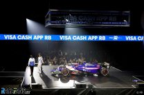
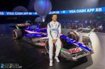
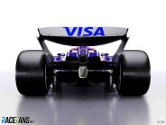
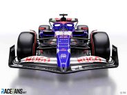
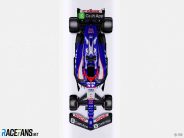
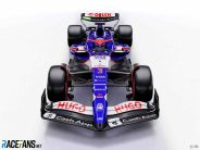
RB, Red Bull’s second Formula 1 team, has revealed the first images of its new car following its rebranding.
The team competed as AlphaTauri last year and was previously known as Toro Rosso between 2006 and 2019. Its third name under Red Bull ownership was revealed last month.The team has been officially entered as ‘Visa Cash App RB’ in reference to its two title sponsors. While the company which runs the team is called Racing Bulls, ‘RB’ does not officially stand for anything.
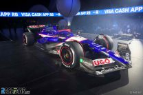
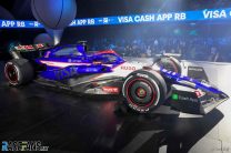
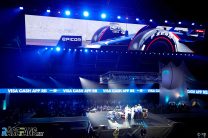
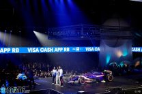
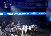
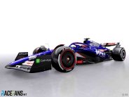
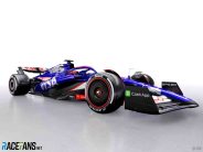
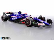
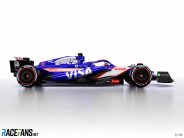
RB held a launch event for its new car, the RB01, in Las Vegas on Thursday night and also issued renderings of how it will look.
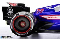
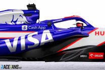
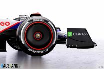
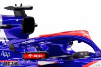
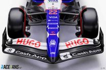
The team’s new sponsors feature prominently on their heavily revised livery, which also bears the names of other new additions including watch manufacturer Tudor and clothing brand Hugo. Red Bull’s clothing line AlphaTauri, which previously leant its name to the team, no longer appears.
The dark blue and white livery used from 2020-23 has also been replaced with a combination of a brighter blue and white sections with red trim.
The latest change of identity for the team comes as Red Bull set new goals for it. While it has previously operated as a junior squad which existing to give upcoming Red Bull Junior Team drivers their first experience of F1, as RB it has also been set the goal of competing for the top prizes in F1.
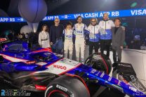
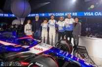
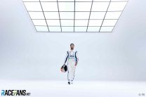
Daniel Ricciardo and Yuki Tsunoda will continue as its drivers. Together they are the team’s most experienced driver line-up during its ownership by Red Bull, with over 300 starts between them.
The pair attended the launch along with Amna Al-Qubaisi, who is backed by the team in this year’s F1 Academy series and will race in their colours. New team principal Laurent Mekies and CEO Peter Bayer were also present.
Advert | Become a RaceFans supporter and
Pictures: 2024 RB01 F1 car


Advert | Become a RaceFans supporter and
Formula 1
- “You need to be more on it”: 12 unheard radio exchanges from the Chinese GP
- F1 CEO Domenicali wants more than six sprint races per year
- Hulkenberg named Audi’s first F1 driver for 2026
- Ricciardo needs to show “head-turning form” for 2025 chance – Horner
- F1 Commission defers decision on points change and approves new rear cameras
Fer no.65 (@fer-no65)
9th February 2024, 6:48
Silly name aside, that looks very good.
MGus.ai
9th February 2024, 10:53
I’ve heard some calling in VCARB F1 Team.
Pat Ruadh (@fullcoursecaution)
10th February 2024, 12:41
Vegetarian carbohydrate
Tristan
9th February 2024, 6:59
Yeah agreed, I want to hate it but I just don’t…
Yellow Baron
9th February 2024, 13:46
As long as they aren’t suddenly P2 in the championship after working with the 1st team
PacificPR (@streydt)
9th February 2024, 7:06
Yikes.
US_Peter (@us_peter)
9th February 2024, 7:09
The VISA Cash Grab in all its (lack of) glory.
BasCB (@bascb)
9th February 2024, 12:33
Pretty much yeah. The tone of blue and the silver bull on the hood remind me of one of the better STR liveries, but the whole livery is really not great. But hey, they have the Cash Grab money.
Jere (@jerejj)
9th February 2024, 7:22
Decent-looking & reminiscent to 2017.
Bullfrog (@bullfrog)
9th February 2024, 8:58
Yes, back to Toro Rosso colours. Surprising lack of imagination (like the name) but that car looked great in their last season.
The white bits are a mess, but at least they’re not black, and stop it looking like a Williams.
bosyber (@bosyber)
9th February 2024, 9:06
For me the white ‘bands’ with red trim sort of work, especially in the threequarter front view, with Honda and Hugo both on there, it looks sort of consistent. The green bits, well they are minimised to be on the black endplates and black part of the rear wing, suppose they had to go somewhere. It is slightly messy, but I like the colours and I suspect it will look good moving on track.
BasCB (@bascb)
9th February 2024, 12:34
Hm, to me it rather looks like that great STR livery diluted with a Haas like white with a red strip next to black at the front. And that ugly green “app” sign, sigh.
Messy IMO.
Asd
9th February 2024, 9:15
No no no, the white bits are GREAT. They create strong, straight lines, which is needed on a modern F1 car. Modern F1 cars are terrible collections of chaotic, irregular curves and bulges.
Crawliin-from-the-wreckage (@davedai)
9th February 2024, 7:28
“I’m Excited”
Very clever placement of side VISA logo. Could almost look like USA at a glance or at speed.
I luv chicken
9th February 2024, 12:55
Thank goodness, there’s no more ultra cheesy Italian fashion show, car reveal. ( remember the first one, for Alpha Tauri? ) That clothing line is embarrassing. This year’s car reminds me of an unfinished STR design project. It’s ok, I guess, sort of in line with all the other crap liveries.
GeeMac (@geemac)
9th February 2024, 7:48
It’s not perfect, but it isn’t bad.
Zann (@zann)
9th February 2024, 7:52
Visually that’s a complete mess! Lol, it’s actually worse than random shapes, like lots of different students had to do banners without knowing what they were going on
It fits the awkward name I suppose, and the son-of-drinks-company thing generally
Mal Ross (@malross)
9th February 2024, 8:51
Amen. Staggered others seem to like it. It’s like loads of different sponsor decals were blowing around in the wind and this car is the result of what just happened to get caught on it.
Tim
9th February 2024, 18:58
I wouldn’t even call it student’s work – kids in kindergarten paint cars like this. One of the worst, ugliest liveries I’ve ever seen in my life.
HAL
9th February 2024, 8:05
At last a car with a real paint job ! Repeating myself, I know, but they should force the team to paint most of the car…
Still wonder how we will call the team in a few month ;-)
MurasamaRA300 (@murasamara300)
9th February 2024, 8:06
Minardi
MichaelN
9th February 2024, 8:16
Red Bull shouldn’t have four cars.
But that said, this is at least a proper livery. It might not be too everyone’s tastes, but it’s much better than all these bare carbon shenanigans. So at least on that front, nicely done.
Tifoso1989 (@tifoso1989)
9th February 2024, 9:45
MichaelN,
Especially in the time when credible entries like Andretti are blocked.
SteveP
9th February 2024, 16:03
The TR/AT/VCARB does actually have a PU sorted out, rather than assuming one will turn up somehow to fill a two-year gap
Tifoso1989 (@tifoso1989)
9th February 2024, 16:32
You forgot to mention that both the Red Bull teams were able to go beyond 2021 with Honda thanks to a bailout from the F1/FIA with the introduction of the engine freeze regime in 2022. The rules explicitly state that no team will be left without a power unit supply.
Cronies
10th February 2024, 5:11
They had a engine agreement with Renault, with no arm twisting from the FIA. This helps Renault, and they have indicated that would still owner it.
MichaelN
9th February 2024, 17:35
All teams are guaranteed an engine. That’s in the rules of the sport. While the situation for Andretti in 2025 is simple (Renault has to supply), it’s admittedly more of a mess in 2026 when Honda, Renault and Audi will be one-team suppliers.
Anyway, these rules were specifically put in place to placate Red Bull, who ruined their relationship with their engine partner, and lost their second engine partner. At which point F1 went semi-spec and froze and equalized all the engines just so Red Bull could continue servicing their “Honda” engines.
The sooner the engine freeze is dropped the better.
amped
10th February 2024, 13:22
They don’t have four cars…
Perhaps try thinking for yourself for once!
Asd
9th February 2024, 8:19
Wait, what?! They called the car RB01?!? RedBull’s first car, in the 2005 season, was RB1.
The livery is very nice, though I wish everybody would also start painting those aero appendages on the sides of the cockpit.
SteveP
9th February 2024, 16:04
A definite end date on this series then.
RB09 would be followed by…
Effwon (@effwon)
10th February 2024, 12:20
RB010…?
Can’t wait for Rubens Barrichello to launch a team with the RB001 to further the madness.
MadMax (@madmax)
9th February 2024, 8:19
Old livery looked better in terms of color combinations, etc. Also silly cash-app name doesnt help.
And I am surprised alcohol marketing is allowed on F1 cars (neft vodka), while smoking brands were banned some 30 years ago.
MurasamaRA300 (@murasamara300)
9th February 2024, 9:16
Credit cards are the source of many problems too (overspending and over-borrowing).
Looking at you, VISA Crash App and all your banking buddies swimming like Scrooge McDuck in un-earned billions.
But the car looks nice. :)
Ludewig
9th February 2024, 8:44
I don’t really like it that much, but it gets higher marks just for using enough paint.
Fer no.65 (@fer-no65)
9th February 2024, 8:54
The white that goes diagonally to the top of the front bucklehead reminds me of the Arden liveries in the mid 2000s
Christopher Rehn (@chrischrill)
9th February 2024, 9:12
I’m really concerned that the amount of color they can put on this is a sign of things to come. Will Visa Cashapp RB Toro Rosso AlphaTauri Minardi be the second fastest car this year? They are clearly not in need to lose weight in terms of the paintjob.
Phil Norman (@phil-f1-21)
9th February 2024, 9:48
Despite the silly name the car’s paint job is actually quite attractive, by today’s standards. At least it has some paint on it!
I think F1 should mandate that a certain percentage of the cars have to be painted. I don’t know what this would be, 70/80%? That would get around this issue and they would all be effected equally.
Tristan
9th February 2024, 10:42
What issue though? “oh, my eyes wont be pleased”
Let the teams do whatever it takes to get them the performance they need to make the difference. It says a lot that they *are* foregoing maximum branding to compete for those midfield positions. I’m all for it.
Can’t recognize the cars is rubbish, as if everybody’s never seen a horse race. All the have is a helmet and jersey to be recognised by. Sure there should be a minimum amount of identifier, but we’re far from needing that to be mandated, I reckon.
Phil Norman (@phil-f1-21)
9th February 2024, 11:37
Well you obviously have no interest in the aesthetics of the cars. I do. As do many others who have made similar comments. I like to see the colours and whether you think so or not, it does to identify them when they might be similar and are speeding past at 200 mph. Not such an issue on TV I realise.
If it was left to you we would end up with the whole field just in black carbon fibre with a few sponsors decals on them. That would be awful in my opinion.
Asd
9th February 2024, 12:44
Oh Tristan, Tristan…
F1 is not music to be listened to, not perfumes to be smelt, not fabrics to be touched. It’s a form of entertainment to BE WATCHED. And the only way to enjoy it is to WATCH IT. So if there is something poor about the visuals, which can be improved, it should be improved. How difficult is it for you to comprehend, mate?
“as if everybody’s never seen a horse race”
Guess what – horses look better when non-painted. Duh! Hahah, dude, are you serious?
The absurd comparison is fundamentally nonsensical anyway. You cannot deem an aspect of a sport irrelevant only because it is irrelevant in a completely different discipline.
In horse racing they only hire the smallest men as jockeys as to save weight. Should F1 teams also hire only the smallest drivers for the same benefit?
Whilst in dog racing, there are no jockeys! Should the horses also run by themselves then??
In rallying, they don’t build any stands or seats for the spectators and those people usually stand at an arm’s length from the cars. Should F1 therefore also not care about preparing fan stands??
Tristan, come on man, drink a coffee or sth mate.
Tristan
9th February 2024, 14:58
Yeah yeah. I know it’s not popular, cars should be pretty.
Still don’t think it’s bad enough to be necessary yet though.
SteveP
9th February 2024, 16:13
Would you like to explain that one to the people at 5Live Sports? – radio is a bit short on the visuals, but they seem to do OK
Then there’s the BBC commentary on radio and online, with no visuals. Most Sky subscribers like to improve their experience by removing the Sky sound from all accounts.
An Sionnach
10th February 2024, 12:20
“Most Sky subscribers like to improve their experience by removing the Sky sound from all accounts.”
Great! I must try it. The official F1 TV commentary isn’t available where I live due, I think, to Sky holding the rights. Anything has to be better than them, although Martin Brundle or Jenson Button sometimes shining a light into the deluded fantasy world of their pundits brings occasional relief.
Any advice on good audio streams to use? Is F1TV even any good? It seems less partisan from the online highlights.
SadF1fan
9th February 2024, 10:07
Hmmm, my first thought was, Did they give the livery designer time off?
I expected alot more from a marketing team, more fun and inventiveness. Like the Duracell battery on Qilliams and the Google wheel caps on the Mclaren.
Sumedh
9th February 2024, 11:04
Reminds me of the 2017 Toro Rosso which looked a bit like a Red Bull can. I remember that car won the best livery contest on this website too (or at least was a front runner)
Sonny Crockett (@sonnycrockett)
9th February 2024, 12:08
Same.
I even bought the soft-shell jacket that year (and I’m a McLaren fan!)
Coventry Climax
9th February 2024, 11:49
What the heck is Domenicali doing there? (picture 3)
I downright detest that man.
Makes me uneasy about him being there for having other ‘interests’ as well.
Or is it just -suitably him in my opinion- ‘anything for a free l(a)unch’?
SteveP
9th February 2024, 16:15
TANSTAAFL
SD is probably making them pay.
An Sionnach
9th February 2024, 12:05
Hmm… looks like a can of Red Bull, even though the colours don’t exactly match the can. The blue of Visa and the white and red of Orlen. Cash App is more prominent in the name than on the car.
Is the abundance of paint indicative of their confidence in the car’s performance? If it’s good, then perhaps Red Bull will give us what’s needed when one car is dominant: a competitive team mate for the best driver. Is Max now competing against three team mates? I don’t fancy their chances…
I don’t really like the colours, even though it does look a bit better on video. I’m not terribly interested in all this, though, so I’ll leave a note scathing review of myself than any car. Perhaps the Steak one looks the best so far. Doesn’t so much tread as stomp all around the line between ugly and bold, being somehow both horrendous and visually compelling.
An Sionnach
9th February 2024, 12:09
*more scathing review of myself*
Sonny Crockett (@sonnycrockett)
9th February 2024, 12:07
Looks pretty good if not better.
There are some big name sponsors on that car which suggests serious intent.
Tommy C (@tommy-c)
9th February 2024, 12:26
Yep, that’s definitely a Toro Rosso!
Peter707
9th February 2024, 12:32
Has the colors of the mundane ads, but at least easily discernable among the plethora of black+something cars.
Peter707
9th February 2024, 12:36
(well, not sure about this last one, dark blue often looks almost black from distance)
Chris Horton
9th February 2024, 13:16
Not great. Not terrible.
One the other hand, the teamwear looks awful. Like some 80’s shell suit or something.
Jockey Ewing
9th February 2024, 14:25
I do not like the color scheme, its a bit white-red-blue for my taste, the old school silver+blue Toro Rosso livery was better, and the white liveries of AT from the recent seasons were better too (especially the first one with the white rims). As a quick fix I would go for swapping most of the white for the silver, as the silver is bang on in this livery. Although the images of the car are renders, so we may never see them under the same ambient lighting, and of course red and white are the colors of many of their sponsors.
I like the photos of the drivers alongside their car numbers more, that is cool.
JR Love (@dermechaniker)
9th February 2024, 14:47
Odd, the renders show VISA on the side pods in high visibility silver, yet on the car in the launch photos the VISA is in carbon black and nearly invisible.
Really, it wasn’t until I looked at the renders that I even saw it had VISA on the side.
I wonder which way they are going to actually run it.
Phil Norman (@phil-f1-21)
9th February 2024, 15:12
A very good spot. I had not noticed that. Maybe it was blacked out for some legal or presentational reason. I cannot imagine it will be black when the car actually gets on track.
Rascasse
10th February 2024, 7:23
It’s not in carbon black on the live launch car. If you look carefully at some of the other pics, the Visa and Red Bull logos are painted chrome. In some of the shots they are reflecting the dark room which makes them look black. On track it should look pretty stupendous, and a nice departure from all the matt liveries of late.
David B
9th February 2024, 17:31
Not a fan of the name & my initial thought on the car was mixed but i think i actually really like it. Has a vintage style livery to it.
An Sionnach
9th February 2024, 18:24
If RB does not stand for anything, then RB means RB! What else can happen when the letters “R” and “B” come together tin the world of racing?
Rubens Barichello
Richard Burns
Roberto Bussinello
Ronnie Bucknum
Imre (@f1mre)
10th February 2024, 7:22
Red Bull
Rory Byrne
Ross Brawn
An Sionnach
10th February 2024, 12:14
Byrne and Brawn – of course! I missed some obvious ones there!
PJ Gaudie (@moogleslam)
9th February 2024, 18:53
I’m a big Ricciardo fan, but even that can’t make me like those colors. One of the ugliest color schemes I’ve seen in recent memory.
pcxmac (@pcxmac)
9th February 2024, 21:55
not sure the floor looks that great with the strakes and all. RBR’s car from last year looks like it was much more rearward biased in terms of downforce from the floor, so looks like the philosophy of the car is still pretty different. Will be interesting to see how the current RBR car’s floor pans out. Rear looks okay, not too much interference, not that great though. Better than what Mercedes have put out in the last two years by miles though.
Newfangled (@newfangled)
9th February 2024, 23:20
Awful team name, excellent livery. Looking forward to seeing it on track.
sam
10th February 2024, 18:00
Childish Name of a team. RB01 not red bull, ok.